🚀 DataHorse is an open-source tool and Python library that simplifies data science for everyone. It lets users interact with data in plain English 📝, without needing technical skills or watching tutorials 🎥 to learn how to use it. With DataHorse, you can create graphs 📊, modify data 🛠️, and even create smart systems called machine learning models 🤖 to get answers or make predictions. It’s designed to help businesses and individuals 💼 regardless of knowledge background to quickly understand their data and make smart, data-driven decisions, all with ease. ✨
pip install datahorseWe’re using an Irish dataset as an example to demonstrate how DataHorse simplifies data analysis. This example showcases how our tool can handle real-world data, making it easier to work with and understand.
Setup and usage examples are available in this Google Colab notebook.
import datahorse

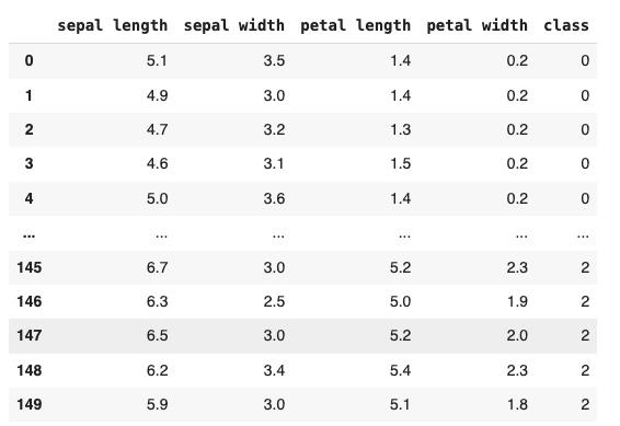
df = datahorse.read('https://raw.githubusercontent.com/plotly/datasets/master/iris-data.csv')
Data transformation means changing data into a format that’s easier to work with. This can involve fixing errors, combining data, standardizing formats, or changing how data is organized. It helps make sure data is clean, consistent, and ready for analysis or other uses.
df = df.chat('convert species names to numeric codes')Data analysis involves examining data to find useful patterns or insights. In DataHorse, data analysis involves using natural language to interact with and understand your data. Instead of writing complex code, you can ask questions and get insights directly. This simplifies finding patterns and making decisions from your data.
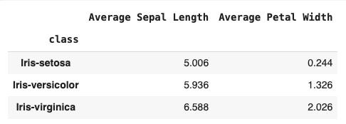
average_measurements = df.chat('what are the average sepal length and petal width for each species?')Data visualization with DataHorse means turning data into easy-to-understand charts and graphs using simple language. Instead of just numbers, DataHorse creates clear visuals that highlight patterns and trends, making it simpler to understand and analyze the information quickly.
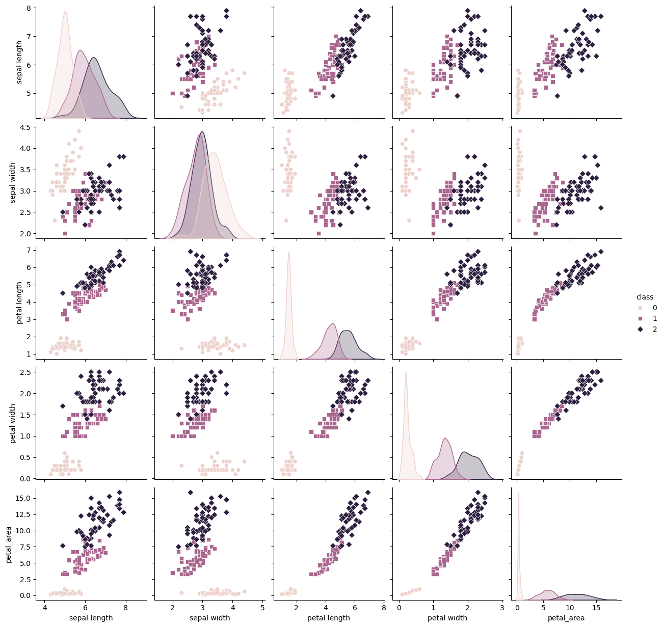
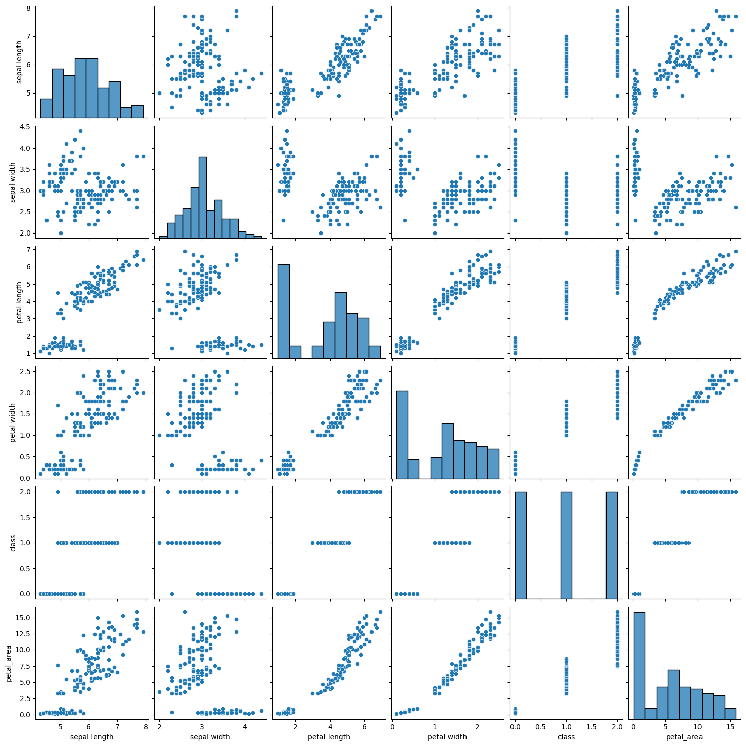
df.chat('Display a pair plot that shows scatter plots for each pair of features and includes color-coding by species.')df.chat('Show a pair plot that includes scatter plots for each pair of features, and histograms along the diagonal to show the distribution of each feature.')Found a bug or have an improvement in mind? Fantastic!
Got a solution ready? That's even better!
Ready to share it with us? We're all ears!
Start at the contributing guide!


