IBM Plex Devanagari needs a redesign!
Abhay2Agarwal opened this issue · 1 comments
The Latin version of IBM Plex is no cap my goto eversince I came accross it. It has got the corporate feel, highly legible, great kerning, and yeah, no homoglyphs. Plus, it is available in all versions, i.e., sans, serif, and mono. It is unique, with distinctive features, eg: angled terminals.
But when it comes to the Devanagari version, it has to be one of the worst Devanagari fonts I've ever used. As much as I love the Latin version, I hate the Devanagari version. I just can't see myself using it, but I want to. Devanagari is one of the most adopted writing systems in the world and one of the most complex as well. Have a look at the first 5 alphabets of both Latin and Devanagari versions:


Now, have a look at another font, Anek Devanagari:
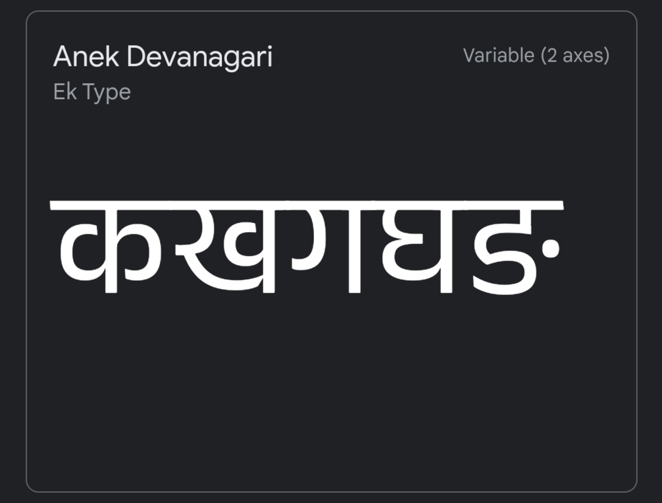
IBM Plex Devanagari possess little to no features of the Latin version, whereas the other font does. Anek typeface supports all major Indic scripts, tho, and all of them are equally good with similar specs.
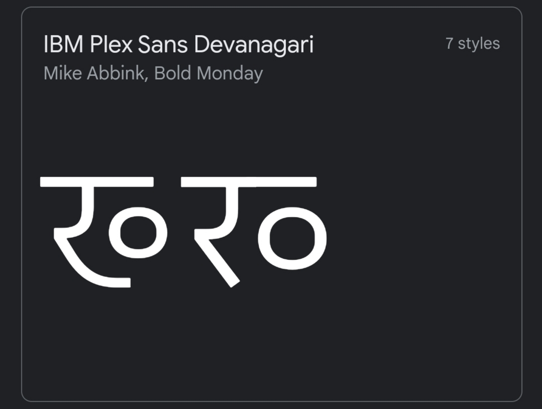
Further, there is a homoglyph issue, which I'll get to now. Look at the 2nd character ख, it looks quite similar to रव. It becomes even more confusing when in half forms, i.e., ख् and रव् respectively. It seems like unnecessarily added, for which no one asked. Please do it the Anek Devanagari way. This could be added as an alternate glyph for the intended users.

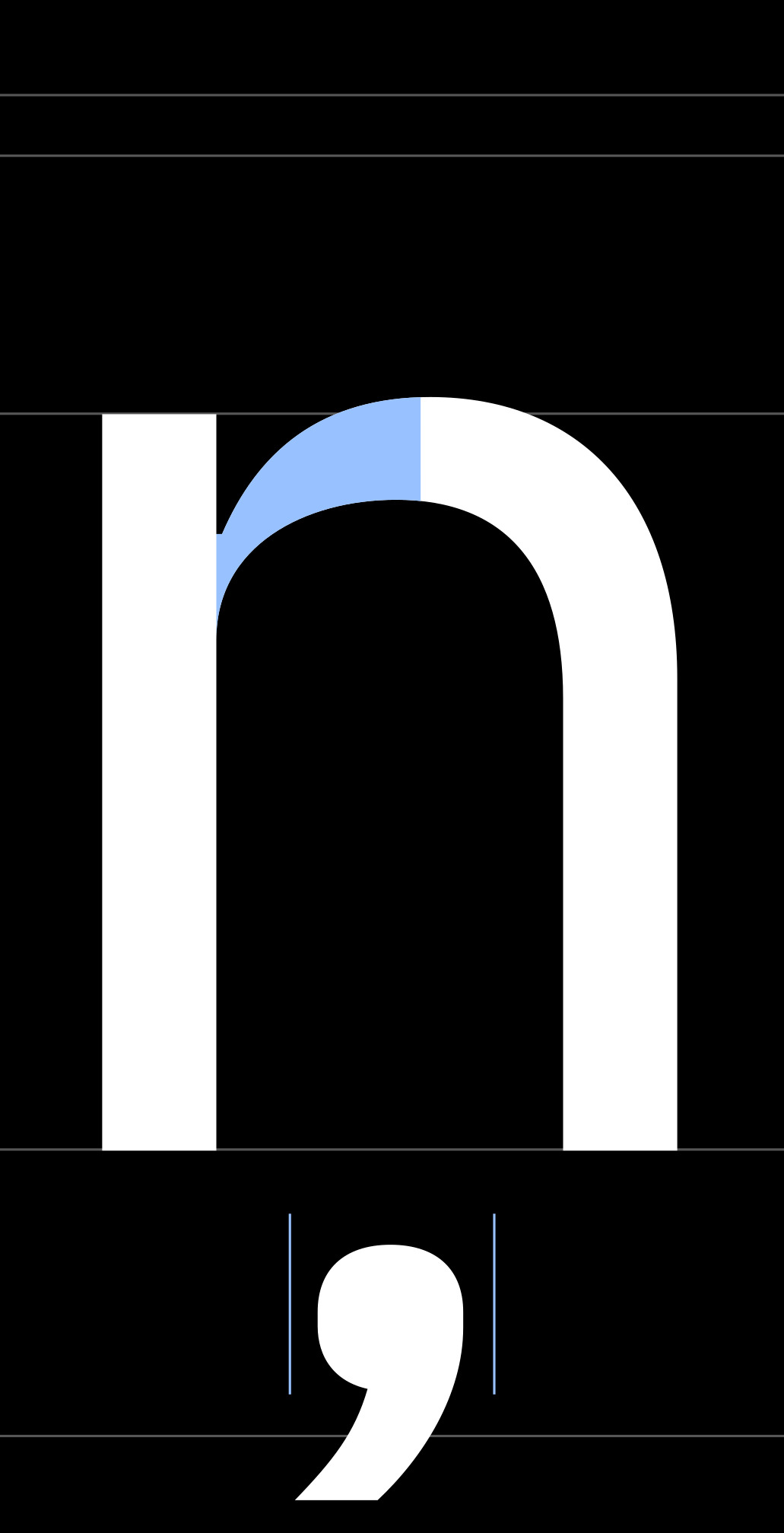
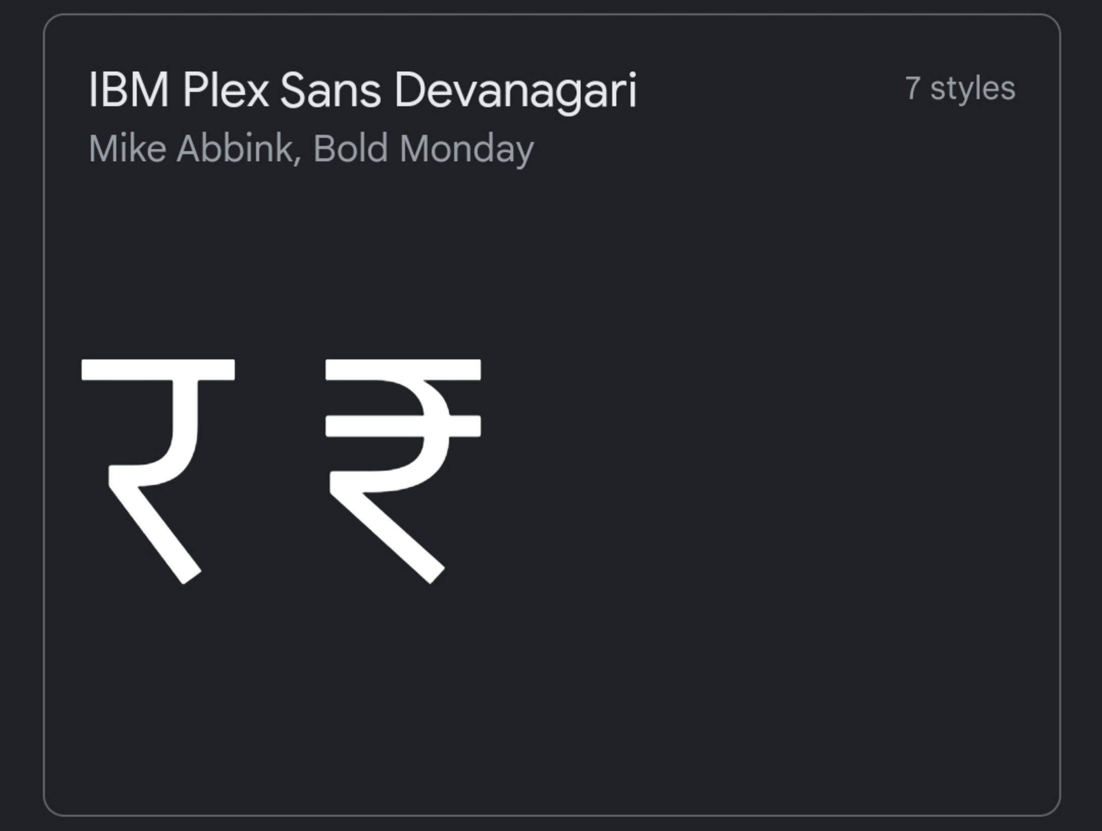
Furthermore, personal opinion, I don't like the designing of र, it looks a bit off to me. Whereas ₹ symbol looks perfect to me. If you can, remove the mid horizontal line from ₹ to make it र and also other similar characters like स, ख, and य too. It will for sure look distinctive, and IBM Plex.
Furthermore, the characters ध, भ, and थ don't look like they belong to the same typeface.
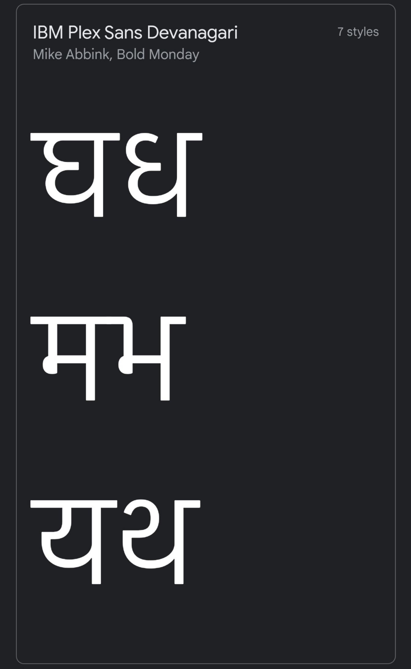
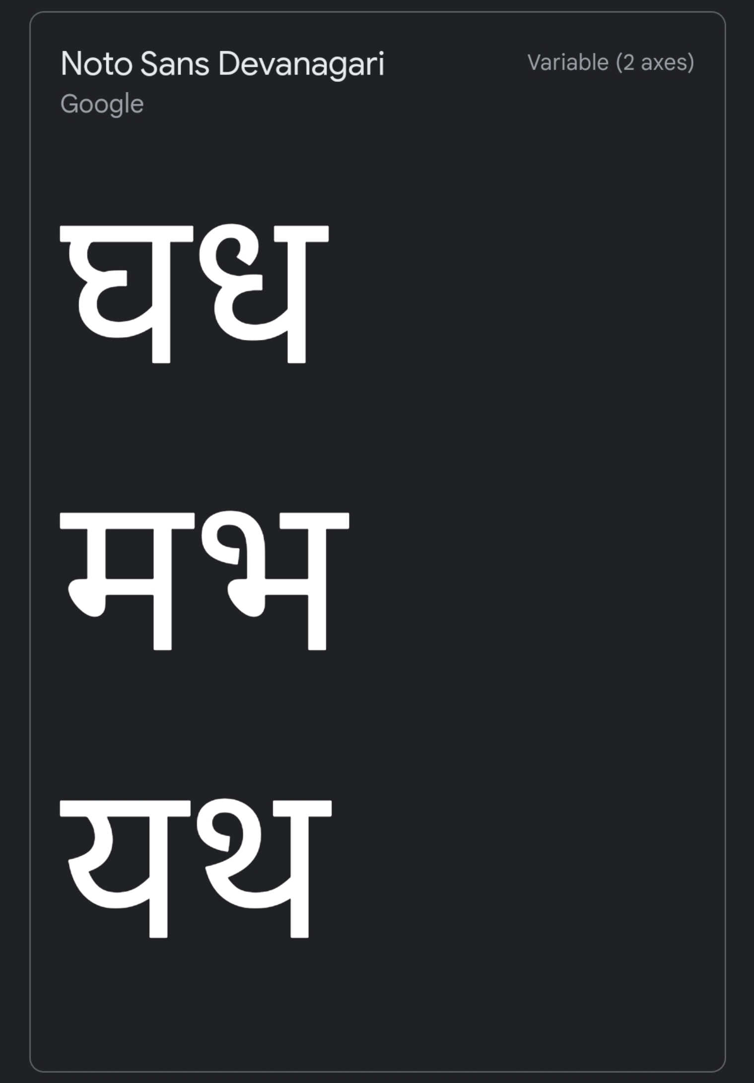
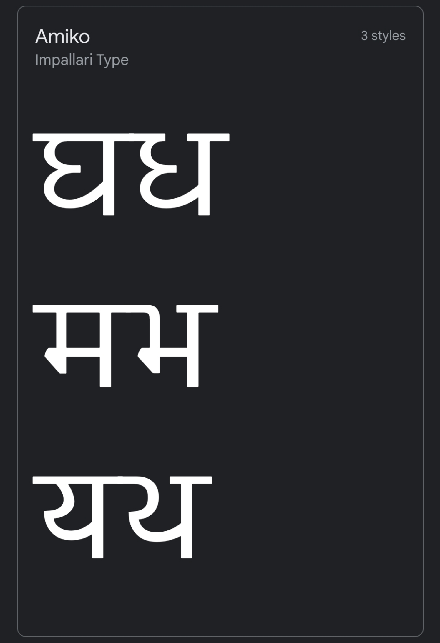
In my opinion, either all should have a rounded head (Noto Sans Devanagari) or none (Amiko). I would prefer the Noto Sans Devanagari way. It will also match with other characters without shirorekha like क्ष, श, श्र,...
Although I can't argue in your direction as the commonly used fonts such as Hind and Anek Devanagari do the same way, too.
Lastly, add support for all the Devanagari Unicode characters, including Vedic characters. Apart from Hindi, Marathi, and Nepali, Devanagari is also used to write over a ton of languages including Sanskrit, Kashmiri, Sindhi, and Limbu, which uses a whole different set of characters. Also, while transliterating other writing systems into Devanagari (esp. rich South Indian Scripts), different set of characters are used.
That is why I mentioned this requires a redesign.
Regards
Dangg i put so many efforts writing this & they closed it w/o a reply..!! Never gonna use any IBM service anymore.