Misaligned Histogram Output with CoreGraphics
Closed this issue · 7 comments
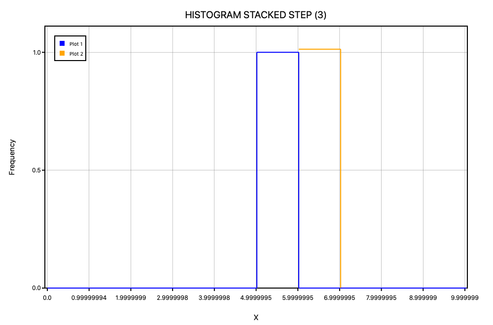
I was doing some testing with histograms and found out that for some reason the CoreGraphics renderer has a weird y- and x-offset bug, compare:
I just created a histogram with 10 bins with one series with the element 5 and another series with the element 6 in it. Do we know why this is?
Can you post the exact code you used?
I essentially just copied the code from histogram-stacked-step.swift and changed the data and bins:
func testHistogramStackedStepLineJoins() throws {
      let fileName = "_24_histogram_stacked_step_line_joins"

      let histogram = Histogram<Float>(isNormalized: false, enableGrid: true)
      histogram.addSeries(data: [5], bins: 10, label: "Plot 1", color: .blue, histogramType: .step)
      histogram.addStackSeries(data: [6], label: "Plot 2", color: .orange)
      histogram.plotTitle = PlotTitle("HISTOGRAM STACKED STEP")
      histogram.plotLabel = PlotLabel(xLabel: "X", yLabel: "Frequency")


      let svg_renderer = SVGRenderer()
      try histogram.drawGraphAndOutput(fileName: self.svgOutputDirectory+fileName,
                                       renderer: svg_renderer)
      #if canImport(AGGRenderer)
      let agg_renderer = AGGRenderer()
      try histogram.drawGraphAndOutput(fileName: self.aggOutputDirectory+fileName,
                                       renderer: agg_renderer)
      #endif
      #if canImport(QuartzRenderer)
      let quartz_renderer = QuartzRenderer()
      try histogram.drawGraphAndOutput(fileName: self.coreGraphicsOutputDirectory+fileName,
                                       renderer: quartz_renderer)
      #endif
}Fixed in the linked PR. The errors also affect AGG - the only reason SVG looked correct is because it happened to be the first one we rendered with.
This is a good example of why to prefer value types; it's easier to manage your state.
I checked your PR and I see that it fixed the issue. I don't know if I'm being picky or if it due to floating point errors or something like that, but is it possible that there is still some offset between the different renderers?
For example, in AGG the lines seem to be slightly before the supposed place, while in CG it seems to be slightly after and in SVG while it seems like it is properly aligned, a closer look at the tick marks shows that the histogram lines are slightly before the tick marks.
No, you're not being picky - the charts absolutely should be accurate. It seems like we have a bug there, but it may not be a trivial fix. There's a lot of investigating to do, for example:
- Does this affect any other charts? For example, is the line graph pixel-accurate? If the other charts are fine, it indicates something wrong with how we are drawing the histogram.
- What about different line thicknesses? Are all the charts getting that right, too?
- We should be drawing a polyline (or equivalent) rather than individual line-segments. That will require pretty-much rewriting the histogram's drawing code. It's not difficult, but we need to pay attention to accuracy, and we don't have a comprehensive test suite yet. Maybe just using polyline will fix the issue... 🤷♂
- Assuming polyline doesn't fix it: who is right? Is the chart correct (and the gridlines incorrect), or vice versa?
- Given that SVG appears to get it right - why is it getting it right? And perhaps more intriguingly...
- Why do AGG and CG each get it wrong in a different way? Is every renderer getting the same instructions? It might help to build a simple text renderer which outputs a list of instructions, and compare them. Perhaps we're leaking state again.
As to the last point: given that we just found a state-leaking bug, I commented out the other renderers and only rendered with AGG/CG, but couldn't notice any difference.
One thing we do really need is more comprehensive test coverage. The reference images we have are all very similar, and we'd really benefit from examples with more than 2 datasets, more varied datasets (e.g. variations in scale, maybe some negative numbers, variations in value concentration, ...etc), line thicknesses, gridline thicknesses, text sizes, and anything else you can think of. It would be a lot easier to find and fix bugs if that was the case.
I'm currently working on the third point you mention, changing histogram to use polyline and improving the algorithm to work on (hopefully) all edge cases, that's also why I noticed this issue.
Oh that's cool - I'm looking forward to it. It would be nice to have some tests with more than 1 stacked dataset, too.

