Thanks for checking out this front-end coding challenge.
To do this challenge, you need a basic understanding of HTML and CSS.
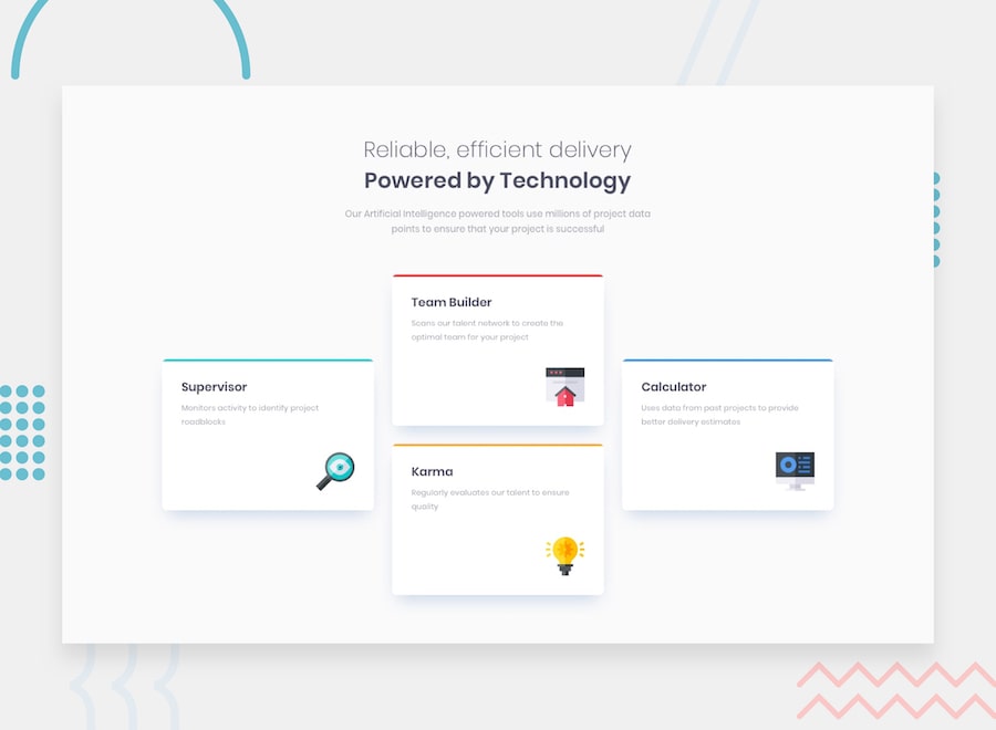
Your challenge is to build out this feature section and get it looking as close to the design as possible.
You can use any tools you like to help you complete the challenge. So if you've got something you'd like to practice, feel free to give it a go.
Your users should:
- View the optimal layout for the site depending on their device's screen size
Your task is to build out the project to the designs inside the /design folder. You will find both a mobile and a desktop version of the design to work to.
The designs are in JPG static format. This will mean that you'll need to use your best judgment for styles such as font-size, padding and margin. This should help train your eye to perceive differences in spacings and sizes.
If you would like the Sketch file in order to inspect the design in more detail it is available to purchase here.
You will find all the required assets in the /images folder. The assets are already optimized.
There is also a style-guide.md file, which contains the information you'll need, such as color palette and fonts.
Feel free to use any workflow that you feel comfortable with. Below is a suggested process, but do not feel like you need to follow these steps:
- Initialize your project as a public repository on GitHub. This will make it easier to share your code with the community if you need some help. If you're not sure how to do this, have a read through of this Try Git resource.
- Configure your repository to publish your code to a URL. This will also be useful if you need some help during a challenge as you can share the URL for your project with your repo URL. There are a number of ways to do this, but we recommend using ZEIT Now. We've got more information about deploying your project with ZEIT below.
- Look through the designs to start planning out how you'll tackle the project. This step is crucial to help you think ahead for CSS classes that you could create to make reusable styles.
- Before adding any styles, structure your content with HTML. Writing your HTML first can help focus your attention on creating well-structured content.
- Write out the base styles for your project, including general content styles, such as
font-familyandfont-size. - Start adding styles to the top of the page and work down. Only move on to the next section once you're happy you've completed the area you're working on.
- If you'd like to try making your project fully responsive, we'd recommend checking out Sizzy. It's a great browser that makes it easy to view your site across multiple devices.
