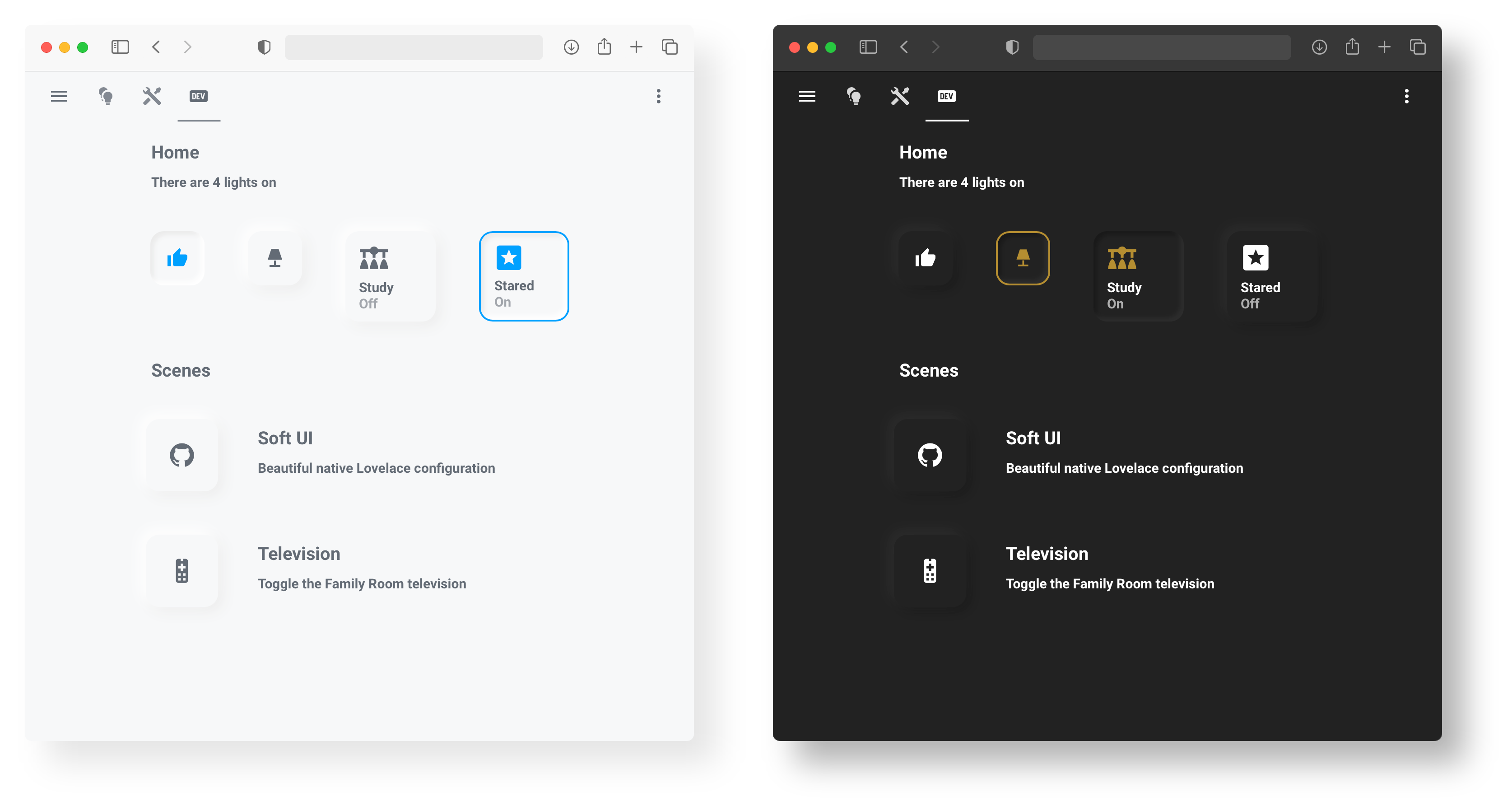
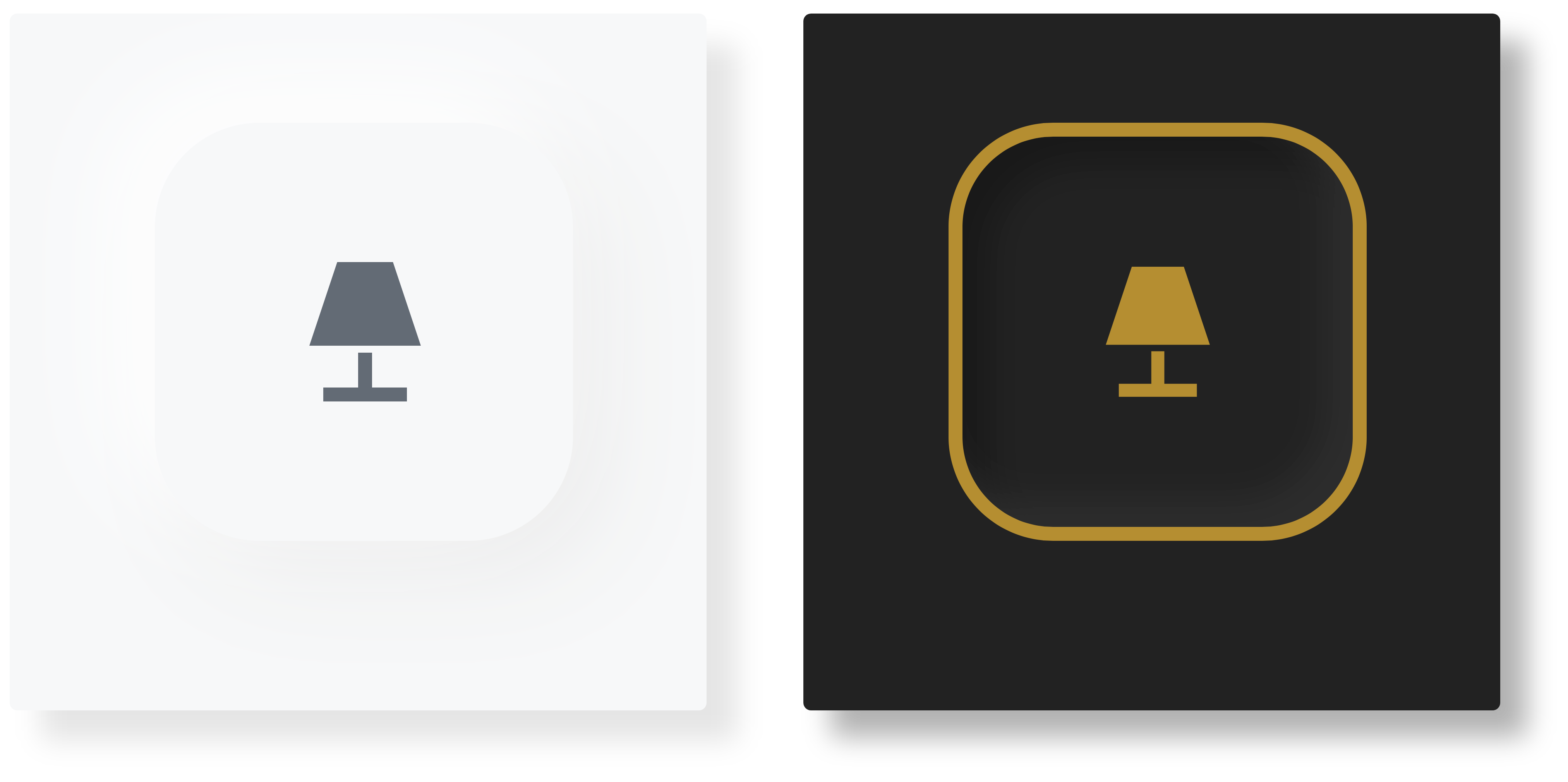
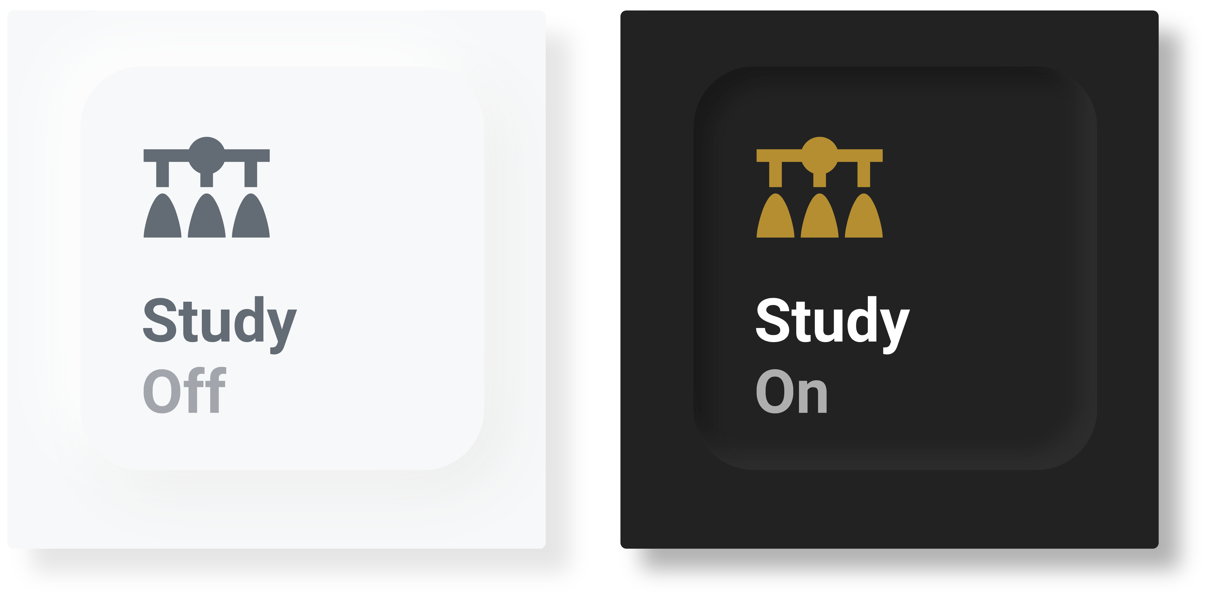
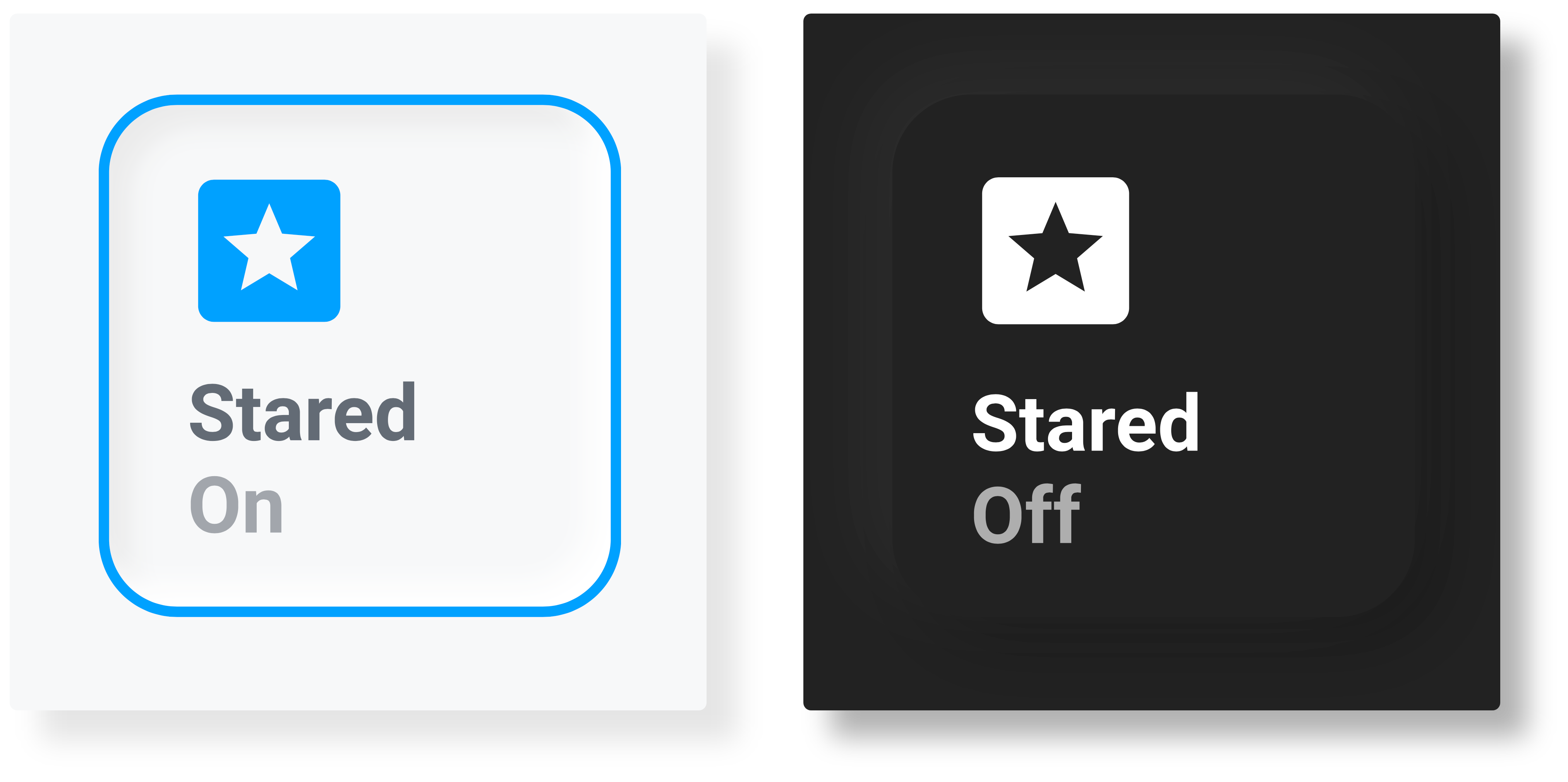
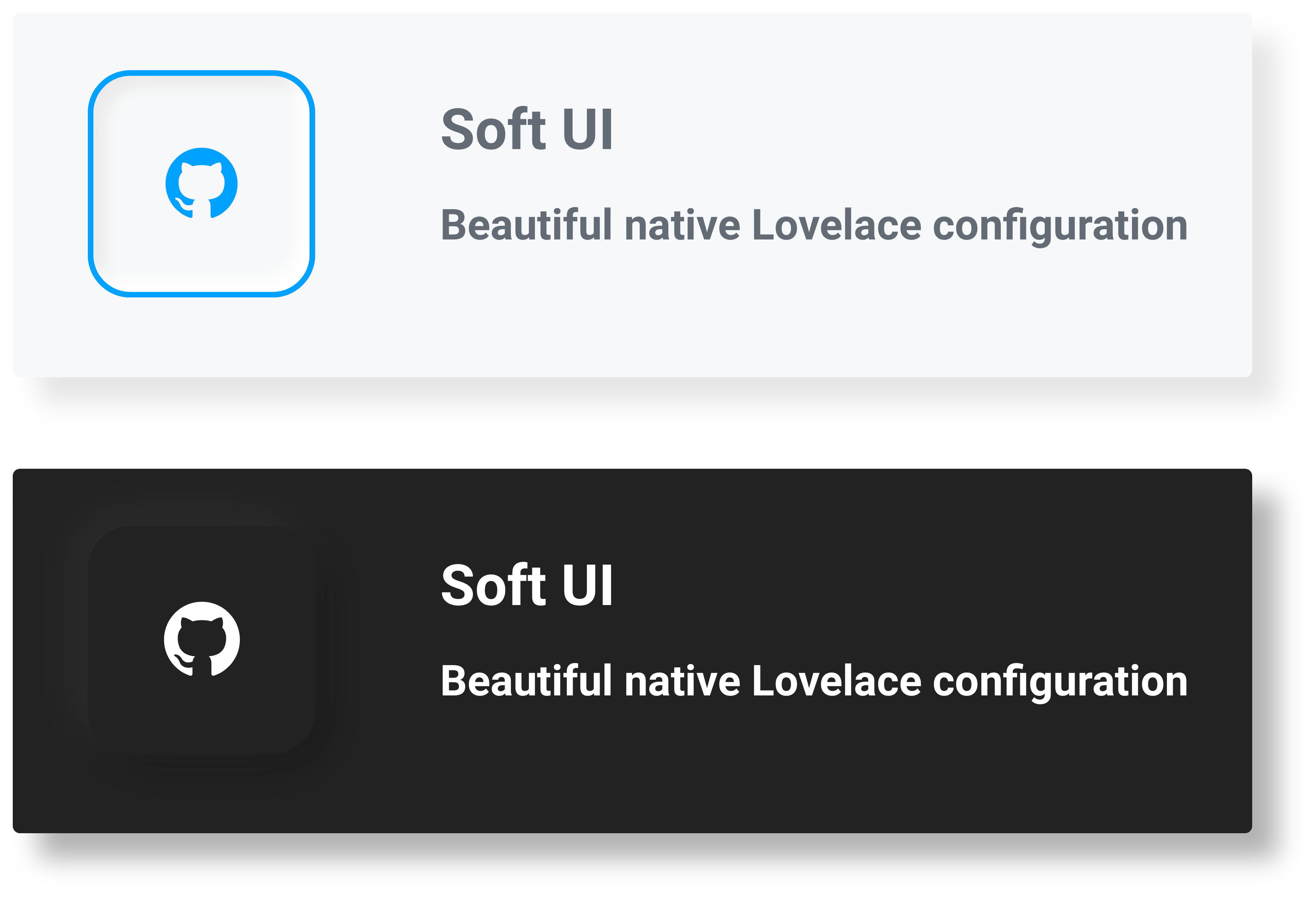
This project originally stemmed from just me redoing my UI. However, it has evolved into something much bigger. Today, in this repo, you will find detailed instructions on applying this style to your cards and a collection of custom-configured cards that match best with this style.
This would have not been possible without the support of the Home Assistant community. If you need help, please consult the community forums or the issues tab. New contributions are most welcomed. Thank you, and please check out other great alternatives:
First, we will need card-mod to style our cards. The easiest way to install card-mod is via HACS.
Second, we will need to apply our card-mod style through themes.
We first need to install custom themes (can also be found via HACS),
then we will add our card-mod style to the theme YAML files, typically found at:
config/themes/{theme_name}/{theme_name}.yaml
There are two ways to style our cards: the Universal method, which styles all cards, and the Individual method, which only styles specific cards.
To universally style all cards, add the following to your theme YAML file:
Show code
Light version:
# Example light_theme.yaml entry
theme_name:
  card-mod-theme: theme_name # Change to your theme name
  card-mod-card: |
    ha-card {
      margin: 20px;
      border-radius: 15px;
      background-color: var(--primary-background-color);
      box-shadow: -5px -5px 15px #ffffff, 5px 5px 15px #ebebeb;
    }
  # This is needed for the "pressed" buttons
  soft-ui-pressed: 'inset -4px -4px 5px #ffffff, inset 4px 4px 5px #ebebeb'
Dark version:
# Example dark_theme.yaml entry
theme_name:
  card-mod-theme: theme_name # Change to your theme name
  card-mod-card: |
    ha-card {
      margin: 20px;
      border-radius: 15px;
      background-color: var(--primary-background-color);
      box-shadow: -5px -5px 15px #2c2c2c, 5px 5px 15px #191919;
    }
  # This is needed for the "pressed" buttons
soft-ui-pressed: 'inset -4px -4px 5px #2c2c2c, inset 4px 4px 5px #191919'To individually style cards, first, we will create a styling class in our theme YAML:
Show code
Light version:
# Example light_theme.yaml entry
theme_name:
  card-mod-theme: theme_name # Change to your theme name
  card-mod-card: |
    ha-card.soft-ui {
      margin: 20px;
      border-radius: 15px;
      background-color: var(--primary-background-color);
      box-shadow: -5px -5px 15px #ffffff, 5px 5px 15px #ebebeb;
    }
  # This is needed for the "pressed" buttons
  soft-ui-pressed: 'inset -4px -4px 5px #ffffff, inset 4px 4px 5px #ebebeb'
Dark version:
# Example dark_theme.yaml entry
theme_name:
  card-mod-theme: theme_name # Change to your theme name
  card-mod-card: |
    ha-card.soft-ui {
      margin: 20px;
      border-radius: 15px;
      background-color: var(--primary-background-color);
      box-shadow: -5px -5px 15px #2c2c2c, 5px 5px 15px #191919;
    }
  # This is needed for the "pressed" buttons
  soft-ui-pressed: 'inset -4px -4px 5px #2c2c2c, inset 4px 4px 5px #191919'
Then to use the style, simply reference the soft-ui class in any card
by adding the following to the YAML card configuration:
# Example card configuration entry
card_mod:
class: soft-uiAll cards below have been made to work with both the Universal styling method and the Individual styling method. However, Button cards require the additional installation of the custom button-card. Add cards via the Manual card option in the Lovelace UI.
Get card here
Get card here
Get card here
Get card here
Get card here
Get card here
Get card here
