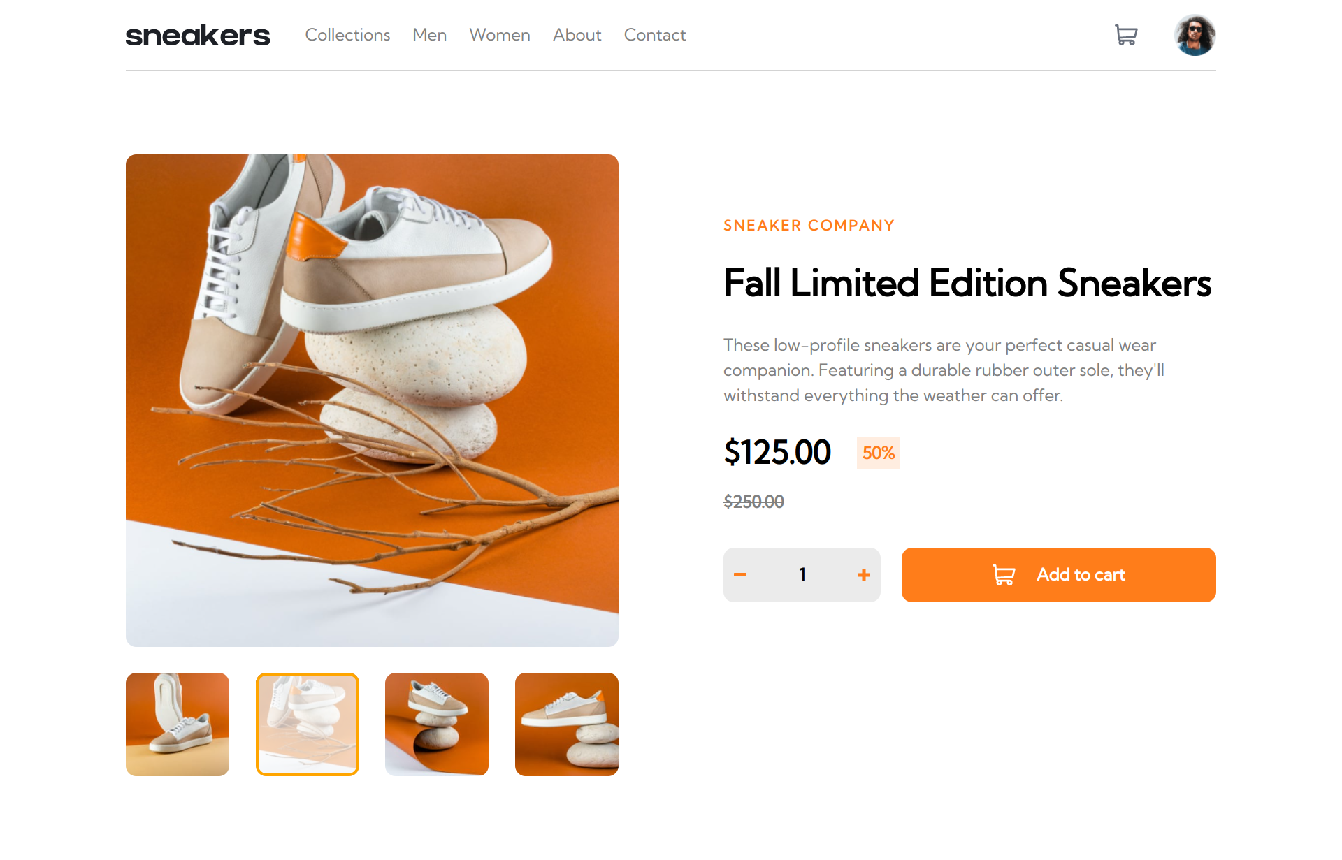
This is a solution to the E-commerce product page challenge on Frontend Mentor.
Users should be able to:
- View the optimal layout for the site depending on their device's screen size
- See hover states for all interactive elements on the page
- Open a lightbox gallery by clicking on the large product image
- Switch the large product image by clicking on the small thumbnail images
- Add items to the cart
- View the cart and remove items from it
- I had been using flex more often than grid in my last projects, but for this one I ended up using grid more often because it’s more useful for making elements the same size.
- I also learned how to pass a whole component (ImageSlider) as prop to another component (Lightbox).
I'm still not sure what's the best way to style React applications. At the start of this project I thought I would be using CSS modules but then I decided that plain Sass would be a cleaner and less tedious solution. I might try styled components in the future.
- Simple Image Lightbox Tutorial - Helped me with the lightbox.
