Solution for a challenge from Devchallenges.io.
This application/site was created as a submission to a DevChallenges challenge. The challenge was to build an application to complete the given user stories.
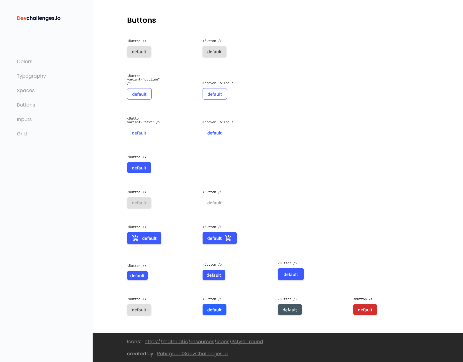
- Users can see different button types: default, outline and text
- Users can choose to disable box-shadow
- Users can choose to disable the button
- Users can choose to have an icon on the left or right (Use Google Icon and at least 5 variants)
- Users can have different button sizes
- Users can have different colors
- When Users hover or focus, Users can see visual indicators
- Users can still access all button attributes
To clone and run this application, you'll need Git and Node.js (which comes with npm) installed on your computer. From your command line:
# Clone this repository
$ git clone https://github.com/your-user-name/your-project-name

# Install dependencies
$ npm install

# Run the app
$ npm start- Website your-website.com
- GitHub @Rohitgour03
- Twitter @Rohitgour03
