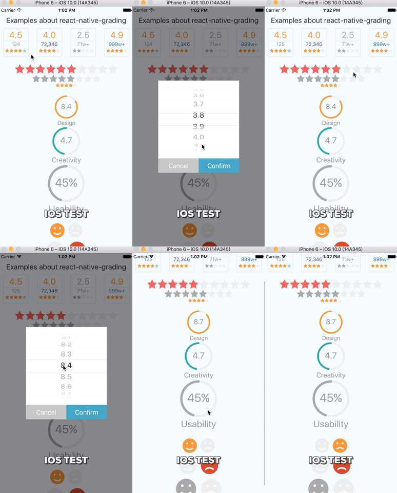
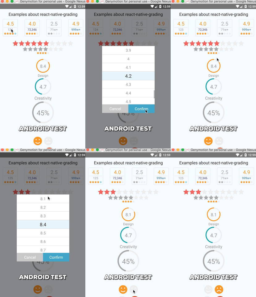
react-native-grading is a RN component for users to grade scores. Four modes are supplied by the component, arcs/simles/stars/board.
There are at least 3 examples for each mode in order to show component in different status. In every test group, the first grading component is enabled, the second one is read only, the third one is disabled.
Using this component directly in your project may encounter the following error:
No component found for view with name "ARTSurfaceView"
First find ART.xcdoeproj from your-project/node_modules/react-native/Libraies/ART/ART.xcdoeproj and drag it into Xcode your-project/Libraries.
Then turn to the project's General Settings and add libART.a into the Linked Frameworks and Libraries list.
Finally, press cmd + B to rebuild project.
install from npm
npm install --save react-native-gradingimport in project (Insure libART.a is linked)
import Grading from 'react-native-grading';board mode (Default)
<Grading score={4.0} num={72346} fontColor="#552da6" readOnly={true}/>stars mode
<Grading
  mode="stars"
  scale={2.4}
  score={this.state.stars.score}
  scoreBase={10}
  activeColor={customActiveColor}
  defaultColor={customDefaultColor}
  onGrading={this.changeStarScore}
/>
arcs mode
<Grading
  mode="arcs"
  score={this.state.arcs.score}
  scoreBase={10}
  activeColor="#2bb8aa"
  scale={1.2}
  onGrading={this.changeArcScore}
  name="Creativity"
  enable={true}
/>
smiles mode
<Grading mode="smiles" scale={1.2} activeColor="#d23f2b" isLike={this.state.simles.isLike} readOnly={true}/>| Property | Default | Type | Description |
|---|---|---|---|
| mode | ‘board' | string | Grading mode, oneOf[‘board’, ‘arcs’, ’stars’, ’smiles'] |
| enable | true | bool | whether the grading component is interactive |
| readOnly | false | bool | whether the component is read only |
| score | 0 | number | current score. In board mode, it’s current average score; In arcs mode, score can be a percentage when isPercentage is set true (eg. 45 stands for 45%); for smiles mode, it’s meaningless. |
| scoreBase | 5 | number | In arcs mode, it’s set 100 automatically when isPercentage=true; In board mode, scoreBase is always 5. |
| onGrading | - | function | Callback function of grading component, the first argument is the score graded by user. In smile mode, the argument is bool type. |
| num | 0 | number | The times of grading, board mode only. |
| name | '' | string | The title of arc, arcs mode only. |
| isPercentage | false | bool | Whether component displays percentage, arcs mode only. |
| activeColor | ACTIVE_COLOR | string | The main color used in the component, ACTIVE_COLOR is defined in Constants file. |
| defaultColor | DEFAULT_COLOR | string | The default color used in the component, DEFAULT_COLOR is defined in Constants file. |
| fontColor | FONT_COLOR | string | The font color used in the component. FONT_COLOR is defined in Constants file. |
| cancelText | ‘Cancel' | string | The text of grading modal’s cancel button. Enable in arcs or board mode both. |
| confirmText | ‘Confirm' | string | The text of grading modal’s confirm button. Enable in arcs or board mode both. |
| cancelTextStyle | {} | object | Custom style for cancel button text of modal. Enable in arcs or board mode both. |
| confirmTextStyle | {} | object | Custom style for confirm button text of modal. Enable in arcs or board mode both. |
| cancelButtonStyle | {} | object | Custom style for cancel button of modal. Enable in arcs or board mode both. |
| confirmButtonStyle | {} | object | Custom style for confirm button text of modal. Enable in arcs or board mode both. |
Please use refs to invoke the following instance methods.
| Method | Params | Description |
|---|---|---|
| openGradingModal | - | Manually open the grading modal. Enabled in arcs mode and board mode both |

