V0.11 21st Feb 2017
Provides a simple touch driven event based GUI interface for the Pyboard when used with the official LCD160CR colour display. It is based on the official driver and uses uasyncio for scheduling.
It is targeted at hardware control and display applications. GUI objects are drawn using graphics primitives rather than by rendering bitmap images. This ensures that they are scalable. The API is via event driven callbacks.
The library can use the fonts internal to the device and also arbitrary fonts
converted from ttf or otf formats.
An extension for plotting simple graphs is described here.
Caveat The official driver lcd160cr.py should be dated 21st Feb 2017
or later: use firmware dated on or after 22nd Feb 2017 or build from source.
Issue #2879 is due to be resolved with a display firmware update; in the
meantime the detection of long button presses is unreliable.
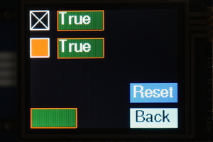
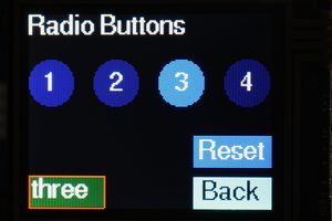
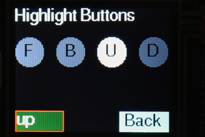
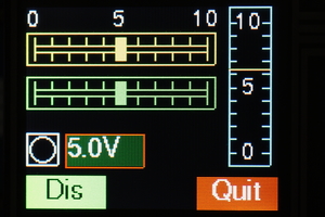
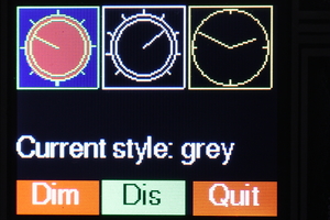
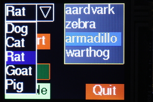
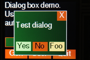
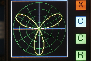
Images from the supplied test programs:
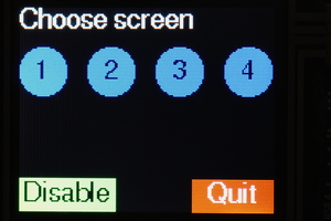
Screen selection buttons. Two styles of checkboxes.
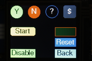
Assorted pushbutton styles. Radio buttons (1 of N selection).
Highlight buttons change color for a period after touching.
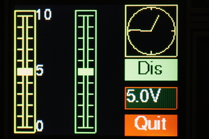
Slider controls allow control and display of float values. Also Meter, LED
and Dial displays.
Rotary controls and displays - lkt.py demonstrates the two styles of
"greying out" disabled controls.
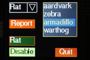
Listbox and dropdown list objects (image on right shows dropdown opened).
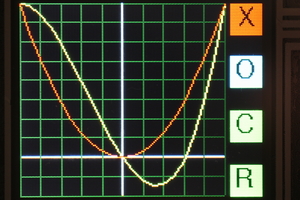
The Plot module: Cartesian and polar graphs.
1.1 Pre installation
1.3 Python files
2.1 Terminology
2.2 Coordinates
2.3 Colors
2.4 Callbacks
2.5 Screens
3.1 Initialisation
5.1 Class Label
5.2 Class Dial
5.3 Class LED
5.4 Class Meter
6.1 Class Slider
6.2 Class Knob
6.3 Class Checkbox
6.4 Class Button
6.5 Class ButtonList: emulate a button with multiple states
6.7 Class Listbox
6.8 Class Dropdown
7.1 Class Aperture
7.2 Class DialogBox
8.1 External fonts
8.2 Internal fonts: Class IFont
Before running the GUI the hardware should be tested by working through the tutorial.
Owing to the size of the library and depending on the size of your application it may be necessary to freeze modules as bytecode. Users should therefore be familiar with building Micropython from source, and installing Python modules as persistent bytecode. Instructions on doing this may be found here.
Familiarity with callbacks and event driven programming will assist in developing applications.
Documentation for the underlying libraries may be found at these sites.
lcd160cr driver
Installing the uasyncio library Run
the Unix build and issue upip install micropython-uasyncio. The library can then
be found at ~/.micropython/lib).
Other references:
Proposed standard font format
uasyncio libraries and notes
Library directory:
- The uasyncio library may be copied to the Pyboard or flashed as frozen
bytecode. To do this copy
lib\*containing the uasyncio installation to your frozen modules directory and build.
Core files:
asyn.pySynchronisation primitives.aswitch.pyProvides aDelay_msclass for retriggerable delays.lcd160_gui.pyThe micro GUI library.lcd_local.pyLocal hardware definition. This file should be edited to match your hardware.constants.pyConstants such as colors and shapes (import usingfrom constants import *).
Optional files used by test programs:
font6.pyFont file.font10.pyDitto.font14.pyDitto. These are generated from the free font FreeSans.ttf.
Test/demo programs:
lvst.pyA test program for vertical linear sliders. Also demos an asynchronous coroutine and linked sliders.lhst.pyTests horizontal slider controls, meter and LED. Demos asynchronous coroutine, linked sliders and dynamically changing object colors.lbt.pyPushbuttons, radio buttons, highlighting buttons and checkboxes. "Reset" buttons respond to short and long presses.lkt.pyRotary controls. Shows the two styles of "greying out" of disabled controls.ldd.pyDropdown list and Listbox controls.ldb.pyModal dialog boxes.ldb_if.pyAs above but using an internal font.
By the standards of the Pyboard this is a large library. The lcd160_gui.py
program is too large to be compiled on-board and must be cross-compiled. The
test programs have been run with a standard firmware build. If memory problems
are encountered Python code (including font files) may be implemented as frozen
bytecode.
It is also wise to issue ctrl-D to soft reset the Pyboard before importing a module which uses the library. The test programs require a ctrl-D before import.
GUI objects are created on a Screen instance which normally fills the
entire physical screen. Displayable GUI objects comprise control and
display instances. The former can respond to touch (e.g. Pushbutton
instances) while the latter cannot (LED or Dial instances).
In common with most displays, the top left hand corner of the display is (0, 0) with increasing values of x to the right, and increasing values of y downward. Display objects exist within a rectangular bounding box; in the case of touch sensitive controls this corresponds to the sensitive region. Locations are defined as a 2-tuple (x, y). The location of an object is defined as the location of the top left hand corner of the bounding box.
These are defined as a 3-tuple (r, g, b) with values of red, green and blue in range 0 to 255. The interface and this document uses the American spelling (color) throughout. This is for historical reasons.
The interface is event driven. Controls may have optional callbacks which will be executed when a given event occurs. A callback function receives positional arguments. The first is a reference to the object raising the callback. Subsequent arguments are user defined, and are specified as a tuple or list of items. Callbacks are optional, as are the argument lists - a default null function and empty list are provided. Callbacks are usually bound methods - see the Screens section for a reason why this is useful.
All controls and displays have a tft property which is the LCD160CR_G
instance. This enables callbacks to access drawing primitives.
GUI controls and displays are rendered on a Screen instance. A user program
may instantiate multiple screens, each with its own set of GUI objects. The
Screen class has class methods enabling runtime changes of the screen to be
rendered to the physical display. This enables nested screens. The feature is
demonstrated in lbt.py.
Applications should be designed with a Screen subclass for each of the
application's screens (even if the app uses only a single screen). This
faciitates sharing data between GUI objects on a screen, and simplifies the
handling of control callbacks. These will be methods bound to the user screen.
They can access the screen's bound variables via self and the control's
bound methods via the callback's first argument (which is a reference to the
control). Again lbt.py provides examples.
The Screen class has 3 null methods which may be implemented in subclasses:
on_open which runs when a screen is opened but prior to its display,
after_open which is called after display, and on_hide which runs when a
screen change is about to make the screen disappear. These may be used to
instantiate or control threads and to retrieve the results from a modal dialog
box.
The Screen class is configured in lcd_local.py.
The following illustrates the structure of a minimal program:
from lcd_local import setup
import font10
from constants import *
from lcd160_gui import Screen, Button
def quitbutton():
    def quit(button):
        Screen.shutdown()
    Button((109, 107), font = font10, callback = quit, fgcolor = RED,
           text = 'Quit', shape = RECTANGLE)

class BaseScreen(Screen):
    def __init__(self):
        super().__init__()
        quitbutton()
setup()
Screen.change(BaseScreen)
The last line causes the Screen class to instantiate your BaseScreen and to
start the scheduler using that screen object. Control then passes to the
scheduler: the code following this line will not run until the GUI is shut down
and the scheduler is stopped (Screen.shutdown()).
This is performed by lcd_local.py which instantiates an LCD160CR_G
display. This class is derived from the official driver's LCD160CR class:
the documentation for the latter may be viewed
here.
An additional optional constructor keyword argument bufsize is available.
See section 8 (Fonts) for its use.
The Screen class presents a full-screen canvas onto which displayable
objects are rendered. Before instantiating GUI objects a Screen instance
must be created. This will be current until another is instantiated. When a GUI
object is instantiated it is associated with the current screen.
The best way to use the GUI, even in single screen programs, is to create a
user screen by subclassing the Screen class. GUI objects are instantiated
in the constructor. This arrangement facilitates communication between objects
on the screen. The following presents an outline of this approach:
from lcd_local import setup
import font10
from constants import *
from lcd160_gui import Screen, Button, Label
def backbutton(x, y):
    def back(button):
        Screen.back()
    Button((x, y), font = font10, fontcolor = BLACK, callback = back,
           fgcolor = CYAN,  text = 'Back')

def fwdbutton(x, y, cls_screen, text='Next'):
    def fwd(button):
        Screen.change(cls_screen)
    Button((x, y), font = font10, callback = fwd, fgcolor = RED, text = text)

def quitbutton():
    def quit(button):
        Screen.shutdown()
    Button((109, 107), font = font10, callback = quit, fgcolor = RED, text = 'Quit')

class Screen_1(Screen):
    def __init__(self):
        super().__init__()
        Label((0, 0), font = font10, value = 'Test screen 1')
        backbutton(0, 100)

class Screen_0(Screen):
    def __init__(self):
        super().__init__()
        Label((0, 0), font = font10, value = 'Test screen 0')
        fwdbutton(0, 107, Screen_1)
        quitbutton()
setup()
Screen.change(Screen_0)
Note that the GUI is started by issuing Screen.change with the class as its
argument rather than an instance. This aims to minimise RAM usage.
In normal use the following methods only are required:
changeChange screen, refreshing the display. Mandatory positional argument: the new screen class name. This must be a class subclassed fromScreen. The class will be instantiated and displayed. Optional keyword arguments:args,kwargs. These enable passing positional and keyword arguments to the constructor of the new screen.backRestore previous screen.shutdownClear the screen and shut down the GUI.set_grey_styleSets the way in which disabled ('greyed-out') objects are displayed. The colors of disabled objects are dimmed by a factor and optionally desaturated (turned to shades of grey). Optional keyword arguments:desaturatedefaultTrueandfactordefault 2. AValueErrorwill result iffactoris <= 1. The default style is to desaturate and dim by a factor of 2.
Other method:
get_tftReturn theLCD160CRinstance. This allows direct drawing to the physical screen. Anything so drawn will be lost when the screen is changed. In normal use theTFTinstance is acquired via a GUI object'stftproperty.
See lbt.py and ldb.py for examples of multi-screen design.
This takes no arguments.
These do nothing, and may be defined in subclasses if required.
on_openCalled when a screen is instantiated but prior to display.after_openCalled after a screen has been displayed.on_hideCalled when a screen ceases to be current.
These classes provide ways to display data and are not touch sensitive.
Displays text in a fixed length field. The height of a label is determined by the metrics of the specified font.
Constructor mandatory positional argument:
location2-tuple defining position.
Keyword only arguments:
fontMandatory. Font object to use.widthThe width of the object in pixels. Default:None- width is determined from the dimensions of the initial text.borderBorder width in pixels - typically 2. If omitted, no border will be drawn.fgcolorColor of border. Defaults to system color.bgcolorBackground color of object. Defaults to system background.fontcolorText color. Defaults to system text color.valueInitial text. Default:None.
Method:
valueArgumentvalstring, defaultNone. If provided, refreshes the label with the passed text otherwise clears the text in the label.
Displays angles in a circular dial. Angles are in radians with zero represented by a vertical pointer. Positive angles appear as clockwise rotation of the pointer. The object can display multiple angles using pointers of differing lengths (like a clock face).
Constructor mandatory positional argument:
location2-tuple defining position.
Keyword only arguments (all optional):
heightDimension of the square bounding box. Default 50 pixels.fgcolorColor of border. Defaults to system color.bgcolorBackground color of object. Defaults to system background.borderBorder width in pixels - typically 2. If omitted, no border will be drawn.pointersTuple of floats in range 0 to 0.9. Defines the length of each pointer as a proportion of the dial diameter. Default (0.9,) i.e. one pointer of length 0.9.ticksDefines the number of graduations around the dial. Default 4.
Method:
valueArguments:angle(mandatory),pointer(optional) the pointer index. Displays an angle. AValueErrorwill be raised if the pointer index exceeds the number of pointers defined by the constructorpointersargument.
Displays a boolean state. Can display other information by varying the color.
Constructor mandatory positional argument:
location2-tuple defining position.
Keyword only arguments (all optional):
heightDimension of the square bounding box. Default 20 pixels.fgcolorColor of border. Defaults to system color.bgcolorBackground color of object. Defaults to system background.borderBorder width in pixels - default 2. IfNone, no border will be drawn.colorThe color of the LED. Default RED.
Methods:
valueArgumentvalboolean, defaultNone. If provided, lights or extinguishes the LED. Always returns its current state.colorArgumentcolor. Change the LED color without altering its state.
This displays a single value in range 0.0 to 1.0 on a vertical linear meter.
Constructor mandatory positional argument:
location2-tuple defining position.
Keyword only arguments:
heightDimension of the bounding box. Default 100 pixels.widthDimension of the bounding box. Default 26 pixels.fontFont to use in any legends. Default:NoneNo legends will be displayed.legendsA tuple of strings to display on the centreline of the meter. These should be short to physically fit. They will appear equidistant along the vertical scale, with string 0 at the bottom. DefaultNone: no legends will be shown.divisionsCount of graduations on the meter scale. Default 10.fgcolorColor of border. Defaults to system color.bgcolorBackground color of object. Defaults to system background.fontcolorText color. Defaults to system text color.pointercolorColor of meter pointer. Defaults tofgcolor.valueInitial value to display. Default 0.
Methods:
valueOptional argumentval. If provided, refreshes the meter display with a new value. Range 0.0 to 1.0: out of range values will be constrained to full scale or 0. Always returns its current value.
These classes provide touch-sensitive objects capable of both the display and entry of data. If the user moves the control, its value will change and an optional callback will be executed. If another control's callback or a coroutine alters a control's value, its appearance will change accordingly.
These emulate linear potentiometers. Vertical Slider and horizontal
HorizSlider variants are available. These are constructed and used
similarly. The short forms (v) or (h) are used below to identify these
variants. See the note above on callbacks.
Constructor mandatory positional argument:
location2-tuple defining position.
Optional keyword only arguments:
fontFont to use for any legends. DefaultNone: no legends will be drawn.heightDimension of the bounding box. Default 120 pixels (v), 20 (h).widthDimension of the bounding box. Default 20 pixels (v), 120 (h).divisionsNumber of graduations on the scale. Default 10.legendsA tuple of strings to display near the slider. TheseLabelinstances will be distributed evenly along its length, starting at the bottom (v) or left (h).fgcolorColor of foreground (the control itself). Defaults to system color.bgcolorBackground color of object. Defaults to system background.fontcolorText color. Defaults to system text color.slidecolorColor for the slider. Defaults to the foreground color.borderWidth of border. DefaultNone: no border will be drawn. If a value (typically 2) is provided, a border line will be drawn around the control.cb_endCallback function which will run when the user stops touching the control.cbe_argsA list/tuple of arguments for above callback. Default[].cb_moveCallback function which will run when the user moves the slider or the value is changed programmatically.cbm_argsA list/tuple of arguments for above callback. Default[].valueThe initial value. Default 0.0: slider will be at the bottom (v), left (h).
Methods:
greyed_outOptional boolean argumentvaldefaultNone. IfNonereturns the current 'greyed out' status of the control. Otherwise enables or disables it, showing it in its new state.valueOptional argumentsval(defaultNone). If supplied the slider moves to reflect the new value and thecb_movecallback is triggered. The method constrains the range to 0.0 to 1.0. Always returns the control's value.colorMandatory argcolorThe control is rendered in the selected color. This supports dynamic color changes
This emulates a rotary control capable of being rotated through a predefined arc.
Constructor mandatory positional argument:
location2-tuple defining position.
Optional keyword only arguments:
heightDimension of the square bounding box. Default 50 pixels.arcAmount of movement available. Default 2*PI radians (360 degrees).ticksNumber of graduations around the dial. Default 9.fgcolorColor of foreground (the control itself). Defaults to system color.bgcolorBackground color of object. Defaults to system background.colorFill color for the control knob. Default: no fill.borderWidth of border. DefaultNone: no border will be drawn. If a value (typically 2) is provided, a border line will be drawn around the control.cb_endCallback function which will run when the user stops touching the control.cbe_argsA list/tuple of arguments for above callback. Default[].cb_moveCallback function which will run when the user moves the knob or the value is changed.cbm_argsA list/tuple of arguments for above callback. Default[].valueInitial value. Default 0.0: knob will be at its most counter-clockwise position.
Methods:
greyed_outOptional boolean argumentvaldefaultNone. IfNonereturns the current 'greyed out' status of the control. Otherwise enables or disables it, showing it in its new state.valueOptional argumentval. If set, adjusts the pointer to correspond to the new value. The move callback will run. The method constrains the range to 0.0 to 1.0. Always returns the control's value.
This provides for boolean data entry and display. In the True state the
control can show an 'X' or a filled block of any color.
Constructor mandatory positional argument:
location2-tuple defining position.
Optional keyword only arguments:
heightDimension of the square bounding box. Default 20 pixels.fillcolorFill color of checkbox whenTrue. DefaultNone: an 'X' will be drawn.fgcolorColor of foreground (the control itself). Defaults to system color.bgcolorBackground color of object. Defaults to system background.borderWidth of border. DefaultNone: no border will be drawn. If a value (typically 2) is provided, a border line will be drawn around the control.callbackCallback function which will run when the value changes.argsA list/tuple of arguments for above callback. Default[].valueInitial value. DefaultFalse.
Methods:
greyed_outOptional boolean argumentvaldefaultNone. IfNonereturns the current 'greyed out' status of the control. Otherwise enables or disables it, showing it in its new state.valueOptional boolean argumentval. If the provided value does not correspond to the control's current value, updates it; the checkbox is re-drawn and the callback executed. Always returns the control's value.
This emulates a pushbutton, with a callback being executed each time the button
is pressed. Buttons may be any one of three shapes: CIRCLE, RECTANGLE
or CLIPPED_RECT.
Constructor mandatory positional argument:
location2-tuple defining position.
Mandatory keyword only argument:
fontFont for button text
Optional keyword only arguments:
shapeCIRCLE, RECTANGLE or CLIPPED_RECT. Default RECTANGLE.heightHeight of the bounding box. Default 20 pixels.widthWidth of the bounding box. Default 50 pixels.fillBoolean. IfTruethe button will be filled with the currentfgcolor.fgcolorColor of foreground (the control itself). Defaults to system color.bgcolorBackground color of object. Defaults to system background.fontcolorText color. Defaults to system text color.litcolorIf provided the button will display this color for one second after being pressed.textShown in centre of button. Default: an empty string.callbackCallback function which runs when button is pressed.argsA list/tuple of arguments for the above callback. Default[].onreleaseDefaultTrue. IfTruethe callback will occur when the button is released otherwise it will occur when pressed.lp_callbackCallback to be used if button is to respond to a long press. DefaultNone.lp_argsA list/tuple of arguments for above callback. Default[].
Method:
greyed_outOptional boolean argumentvaldefaultNone. IfNonereturns the current 'greyed out' status of the control. Otherwise enables or disables it, showing it in its new state.
Class variables:
lit_timePeriod in seconds thelitcoloris displayed. Default 1.long_press_timePress duration for a long press. Default 1 second.
A ButtonList groups a number of buttons together to implement a button
which changes state each time it is pressed. For example it might toggle
between a green Start button and a red Stop button. The buttons are defined and
added in turn to the ButtonList object. Typically they will be the same
size, shape and location but will differ in color and/or text. At any time just
one of the buttons will be visible, initially the first to be added to the
object.
Buttons in a ButtonList should not have callbacks. The ButtonList has
its own user supplied callback which will run each time the object is pressed.
However each button can have its own list of args. Callback arguments
comprise the currently visible button followed by its arguments.
Constructor argument:
callbackThe callback function. Default does nothing.
Methods:
add_buttonAdds a button to theButtonList. Arguments: as per theButtonconstructor. Returns the button object.greyed_outOptional boolean argumentvaldefaultNone. IfNonereturns the current 'greyed out' status of the control. Otherwise enables or disables it, showing it in its new state.valueOptional argument: a button in the set. If supplied and the button is not active the currency changes to the supplied button and its callback is run. Always returns the active button.
Typical usage is as follows:
def callback(button, arg):
    print(arg)

table = [
     {'fgcolor' : GREEN, 'shape' : CLIPPED_RECT, 'text' : 'Start', 'args' : ['Live']},
     {'fgcolor' : RED, 'shape' : CLIPPED_RECT, 'text' : 'Stop', 'args' : ['Die']},
]
bl = ButtonList(callback)
for t in table: # Buttons overlay each other at same location
bl.add_button((10, 10), font = font14, fontcolor = BLACK, **t)These comprise a set of buttons at different locations. When a button is pressed, it becomes highlighted and remains so until another button is pressed. A callback runs each time the current button is changed.
Constructor positional arguments:
highlightColor to use for the highlighted button. Mandatory.callbackCallback when a new button is pressed. Default does nothing.selectedIndex of initial button to be highlighted. Default 0.
Methods:
add_buttonAdds a button. Arguments: as per theButtonconstructor. Returns the Button instance.greyed_outOptional boolean argumentvaldefaultNone. IfNonereturns the current 'greyed out' status of the control. Otherwise enables or disables it, showing it in its new state.valueOptional argument: a button in the set. If supplied, and the button is not currently active, the currency changes to the supplied button and its callback is run. Always returns the currently active button.
Typical usage:
def callback(button, arg):
    print(arg)

table = [
    {'text' : '1', 'args' : ['1']},
    {'text' : '2', 'args' : ['2']},
    {'text' : '3', 'args' : ['3']},
    {'text' : '4', 'args' : ['4']},
]
x = 0
rb = RadioButtons(callback, BLUE) # color of selected button
for t in table:
    rb.add_button((x, 180), font = font14, fontcolor = WHITE,
                    fgcolor = LIGHTBLUE, height = 40, **t)
x += 60 # Horizontal row of buttonsThe height of a listbox is determined by the number of entries in it and the font in use. Scrolling is not supported.
Constructor mandatory positional argument:
location2-tuple defining position.
Mandatory keyword only arguments:
fontelementsA list or tuple of strings to display. Must have at least one entry.
Optional keyword only arguments:
widthControl width in pixels, default 80.valueIndex of currently selected list item. Default 0.borderSpace between border and contents. Default 2 pixels. IfNoneno border will be drawn.fgcolorColor of foreground (the control itself). Defaults to system color.bgcolorBackground color of object. Defaults to system background.fontcolorText color. Defaults to system text color.select_colorBackground color for selected item in list. DefaultLIGHTBLUE.callbackCallback function which runs when a list entry is picked.argsA list/tuple of arguments for above callback. Default[].
Methods:
valueArgumentvaldefaultNone. If the argument is provided which is a valid index into the list that entry becomes current and the callback is executed. Always returns the index of the currently active entry.textvalueArgumenttexta string defaultNone. If the argument is provided and is in the control's list, that item becomes current. Returns the current string, unless the arg was provided but did not correspond to any list item. In this event the control's state is not changed andNoneis returned.
The callback is triggered whenever a listbox item is pressed, even if that item is already currently selected.
A dropdown list. The list, when active, is drawn below the control. The height of the control is determined by the height of the font in use. The height of the list is determined by the number of entries in it and the font in use. Scrolling is not supported.
Constructor mandatory positional argument:
location2-tuple defining position.
Mandatory keyword only arguments:
fontelementsA list or tuple of strings to display. Must have at least one entry.
Optional keyword only arguments:
widthControl width in pixels, default 100.valueIndex of currently selected list item. Default 0.fgcolorColor of foreground (the control itself). Defaults to system color.bgcolorBackground color of object. Defaults to system background.fontcolorText color. Defaults to system text color.select_colorBackground color for selected item in list. DefaultLIGHTBLUE.callbackCallback function which runs when a list entry is picked.argsA list/tuple of arguments for above callback. Default[].
Methods:
valueArgumentvaldefaultNone. If the argument is provided which is a valid index into the list that entry becomes current and the callback is executed. Always returns the index of the currently active entry.textvalueArgumenttexta string defaultNone. If the argument is provided and is in the control's list, that item becomes current. Returns the current string, unless the arg was provided but did not correspond to any list item. In this event the control's state is not changed andNoneis returned.
The callback is triggered if an item on the dropdown list is touched and that item is not currently selected (i.e. when a change occurs).
In general Screen objects occupy the entire physical display. The principal
exception to this is modal dialog boxes which are rendered in a window which
accepts all touch events until it is closed. Dialog boxes are created by
instantiating an Aperture which is a Screen superclass. In effect this
is a window, but a 'micro' implementation lacking chrome beyond a simple border
and occupying a fixed location on the screen.
In use the user program creates a class subclassed from Aperture. This is
populated in the same way as per Screen subclasses. The class name can then
be passed to Screen.change to invoke the dialog box. The GUI provides a
simple way to build dialog boxes based on a small set of pushbuttons such as
'Yes/No/Cancel' in the form of the DialogBox class.
A convenience method locn is provided to assist in populating dialog boxes.
Given coordinates relative to the dialog box, it provides an absolute
location 2-tuple suitable as a constructor argument for control or
display classes. See ldb.py for example usage.
Provides a window for objects in a modal dialog box.
Constructor mandatory positional args:
location2-tuple defining the window position.heightDimensions in pixels.width
Optional keyword only args:
draw_borderBoolean, defaultTrue. If set a single pixel window border will be drawn.bgcolorBackground color of window. Defaults to system background.fgcolorColor of border. Defaults to system foreground.
Instance variables:
location2-tuple defining the window position.heightDimensions in pixels.width
Method:
locnArgs: x, y. Returns an absolute location 2-tuple given a pair of coordinates relative to the dialog box.
Class method:
valueOptional argvaldefaultNone. Provides a mechanism for returning the outcome of a dialog box which can be queried by the calling object. If the arg is provided, the value is set. The arg may be any Python object. Returns the value of theApertureclass. The callingScreencan query this by implementing anon_openmethod which callsAperture.value()(seeldb.py).
Eases building a dialog box subset based on a row of pushbuttons. Any button press will close the dialog. The caller can determine which button was pressed. The size of the buttons and the width of the dialog box are calculated from the strings assigned to the buttons. This ensures that buttons are evenly spaced and identically sized.
Constructor mandatory positional args:
fontThe font for buttons and label.
Optional keyword only args:
elementsA list or tuple of 2-tuples. Each defines the text and color of a pushbutton, e.g.(('Yes', RED), ('No', GREEN)).location2-tuple defining the dialog box location. Default (20, 20).labelText for an optional label displayed in the centre of the dialog box. DefaultNone.bgcolorBackground color of window. DefaultDARKGREEN.buttonwidthMinimum width of buttons. Default 25. In general button dimensions are calculated from the size of the strings inelements.closebuttonBoolean. If set, aclosebutton will be displayed at the top RH corner of the dialog box.
Pressing any button closes the dialog and sets the Aperture value to the
text of the button pressed or 'Close' in the case of the close button.
The LCD160CR contains internal fixed pitch fonts. These may be used as an
alternative to external fonts converted from ttf or otf files and are
likely to result in better text rendering at small sizes. External fonts enable
arbitrary fonts to be used including ones with variable pitch.
Fonts may be created using the font_to_py.py utility documented
here. The -x
argument should be employed. The resultant Python file may be imported and
the module passed to the constructor of GUI objects. These files may be
frozen as bytecode to radically reduce RAM usage.
The LCD160CR_G constructor has an optional constructor keyword argument
bufsize. This defines the size of an internal character buffer, required if
using external fonts. If an application's largest external font has dimensions
h*w pixels, the buffer must be at least h*w*2 bytes in size. The
default of 1058 bytes provides for external fonts up to 23 by 23 pixels.
A UguiException will be raised if an application attempts to use a font too
large for the buffer.
To use internal fonts an IFont is instantiated. The instance is then passed
to GUI constructors in the same way as for external fonts. See test program
ldb_if.py for an example.
Constructor mandatory positional arg:
family0 to 3. Determines the size of the font.
Optional args:
scalePixels are drawn as a square with side length equal to scale + 1. The value can be between 0 and 63 (default 0).bold_hControls the number of pixels to overdraw each character pixel in the horizontal direction making a bold effect. Value 0 to 3 (default 0).bold_vControls the number of pixels to overdraw each character pixel in the vertical direction making a bold effect. Value 0 to 3 (default 0).
