-
react-native-animated 3: >= 1.4.1
-
react-native-animated 2: <= 1.4.1
Animation is accelerated by react-native-reanimated and react-addons-update. Please install and setup react-native-reanimated.
npm install react-native-drag-sort-gridview --save
npm install react-addons-update --save
or
yarn add react-native-drag-sort-gridview react-addons-update
import React, { memo, useCallback, useState } from 'react'
import { StyleSheet, View } from 'react-native'
import DraggableGridView from 'react-native-drag-sort-gridview'

interface IItem {
  id: number
  color: string
}

const Item = memo(({ item }: { item: IItem }) => (
  <View style={[styles.item, { backgroundColor: item.color }]} />
))

const Example = () => {
  const [data, setData] = useState<Array<IItem>>([
    { id: 0, color: '#FF0000' },
    { id: 1, color: '#00FF00' },
    { id: 2, color: '#0000FF' },
    { id: 3, color: '#FFFF00' },
    { id: 4, color: '#00FFFF' },
    { id: 5, color: '#FF00FF' },
    { id: 6, color: '#FFFFFF' },
    { id: 7, color: '#888888' },
    { id: 8, color: '#555555' }
  ])

  const onOrderChanged = useCallback((orderedData: Array<IItem>) => setData(orderedData), [])

  const renderItem = ({ item }: { item: IItem }) => <Item item={item} />

  const keyExtractor = ({ id }: IItem) => `gridview-${id}`

  return (
    <DraggableGridView
      style={styles.bg}
      contentContainerStyle={styles.contentContainer}
      itemContainerStyle={styles.itemContainer}
      isEditing={true}
      numColumns={3}
      itemHeight={100}
      data={data}
      shouldAnimOnRelease={true}
      keyExtractor={keyExtractor}
      onOrderChanged={onOrderChanged}
      renderItem={renderItem}
    />
  )
}

const styles = StyleSheet.create({
  bg: {
    overflow: 'visible',
    backgroundColor: '#222222',
    paddingVertical: 80
  },
  contentContainer: {
    justifyContent: 'flex-start'
  },
  itemContainer: {
    padding: 10
  },
  item: {
    width: '100%',
    height: 80
  }
})

export default Example
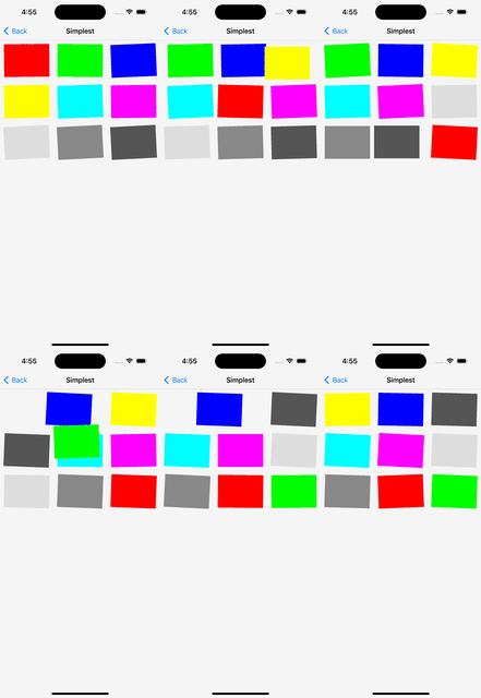
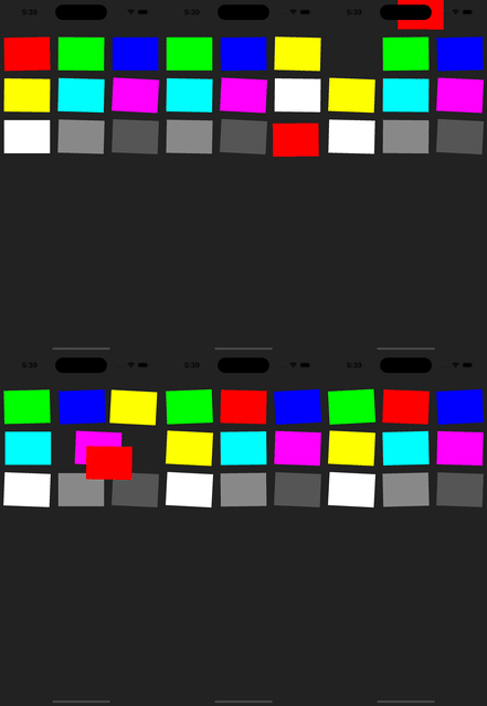
Version >= 1.3.0 & shouldAnimOnRelease={true}
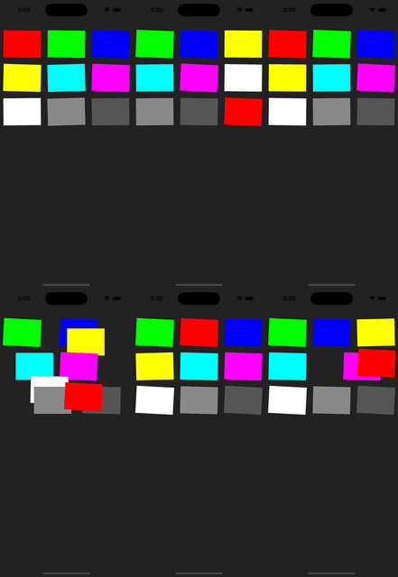
shouldAnimOnRelease={false}
Accept all props in ScrollView
| Name | Type | Required | Description |
|---|---|---|---|
| data | Array | ✓ | Same as FlatList data. |
| renderItem | function | ✓ | (info: { item: T, index: number}) => React.ReactElement. Simular to FlatList renderItem but this module does NOT accept JSX.Element. Currently not accept separator. Highly recommond to memo the render items to improve performance. |
| isEditing | boolean | ✓ | If isEditing is true, item can be sorted by drag & drop, but onPress/onLongPress within items would be blocked. |
| onOrderChanged | function | ✓ | Callback when touch end. (orderedData: Array<T>, from: number, to: number) would be returned. orderedData is an array of data with new order. from is the original position of the dragged item. to is the new position of the dragged item. |
| keyExtractor | function | ✓ | Same as FlatList keyExtractor. |
| isEditing | boolean | ✓ | If isEditing is true, item can be sorted by drag & drop, but onPress/onLongPress within items would be blocked. |
| numColumns | number | Default 1. Same as FlatList numColumns. If only 1 item is rendered in each row, you may use react-native-draggable-flatlist which has better performance. |
|
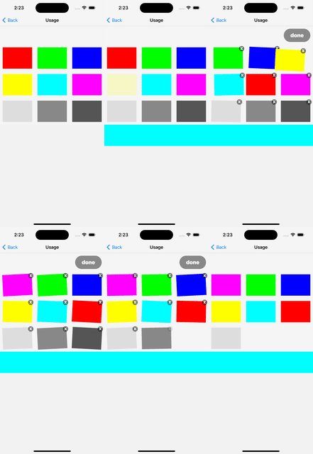
| renderOnEditOverlay | function | ({ index }: { index: number}) => React.ReactElement. Render overlay on top of renderItem while editing. Delete button can be added here. You may refer to Example Usage. This overlay will block the drag drop panResponder, therefore please keep it small in size. Highly recommond to memo the render items to improve performance. |
|
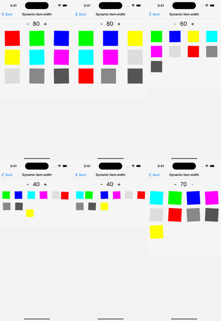
| listWidth | number | Default 100% of screen width. Width of the whole list, This value would be used to calcuate the width of item by listWidth / numColumns. |
|
| itemHeight | number | Default listWidth / numColumns. Height of items. |
|
| animMoveDuration | number | Default 500. The time taken (miliseconds) for non-dragged items to animate. |
|
| debounce | number | Default undefined. Debounce (miliseconds) of non-dragged items to start animation. If value is undefined, there would be no debounce. Implementing debounce can improve performance. If debounce is needed, value 300 is recommanded. |
|
| shouldVibrate | boolean | Default true. This determine should the items vibrate while editing. |
|
| shouldAnimOnRelease | boolean | Default false. This determine should the dragging item be animated after user released press. Touch would be blocked until all animations end. |
|
| onMovingStateChanged | function | This callback would be called only when shouldAnimOnRelease is true. (isMoving: boolean) would be returned. Since the touch of list would be blocked until all animations end, this can be used to indicate whether touch is blocked or not. |
|
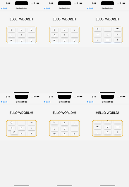
| scrollThreshold | number | Default undefined. If this value > 0, the actual threshold of scrolling would be height_of_list * scrollThreshold. If user is dragging and moving to a position < threshold or > height_of_list - threshold, the list will scroll upward and downward correspondingly. Value 0.2 is recommanded. You may refer to Example Defined Size. |
|
| itemContainerStyle | ViewStyle | Style of item wrapper. User may scroll the list on space created by padding during editing. E.g. itemContainerStyle={{ padding: 10 }} in usage example. |
