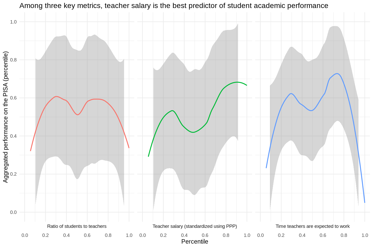
TL;DR: Students score better on an academic assessment where...
- Teachers are paid more
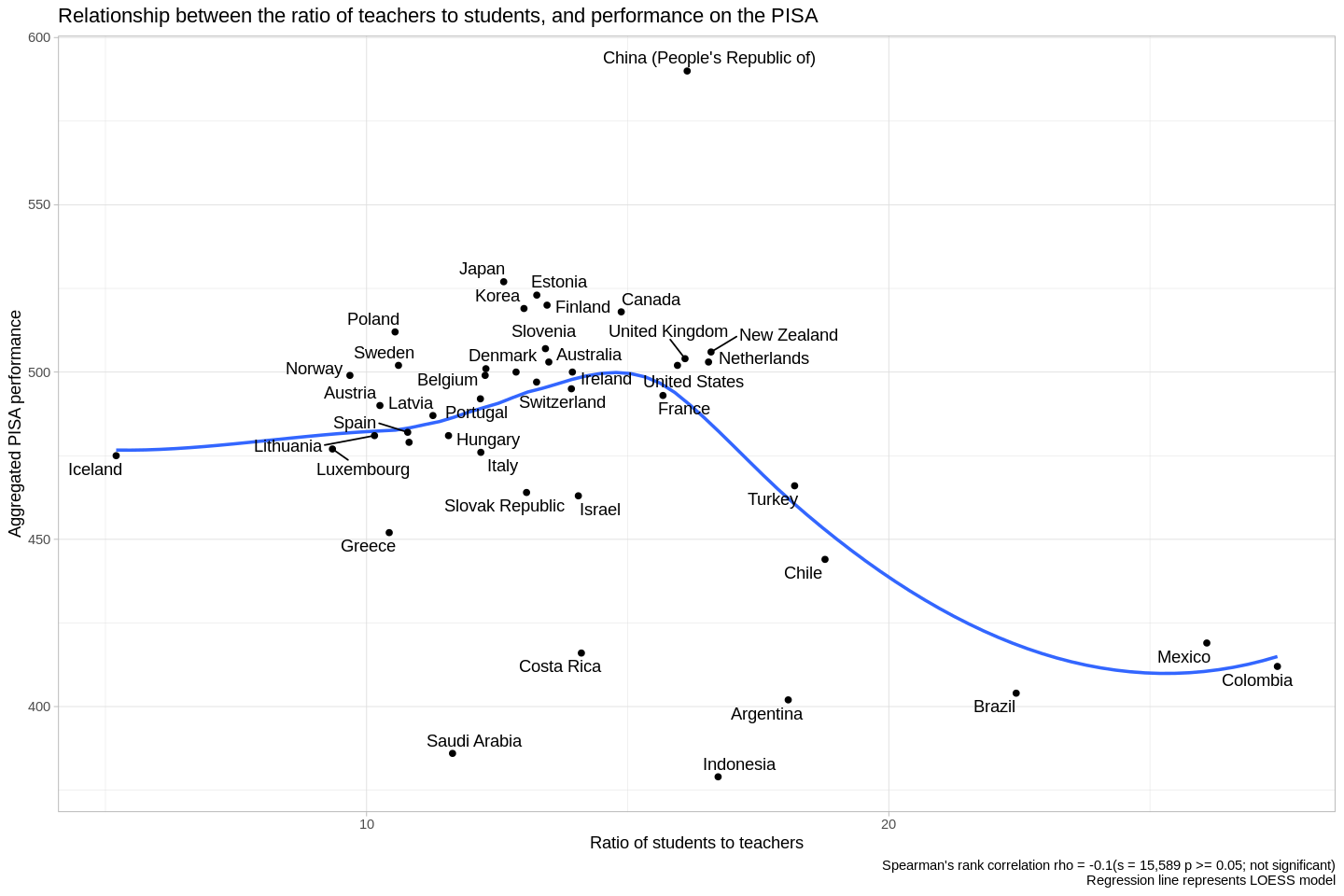
- There are 12 students for every teacher
Do the working conditions that public school teachers face end up impacting their students in quantifiable ways? Ideally, to find out, we'd conduct a randomized manipulation, wherein we'd improve some teachers' working conditions, and sabotage others'-- but this would likely be:
- unethical
- expensive
In lieu of this kind of controlled experiment, we can compare events that come about organically, and look for correlations between teachers' conditions, and students' educational outcomes. We'll use the following metrics, derived from data collected by the Organisation for Economic Cooperation and Development (OECD).
Metrics tracking teaching conditions:
- Salary
- Ratio of students to teachers
- How much time teachers spend working
Metrics tracking academic assessment:
- The Programme for International Student Assessment (PISA), a tool that measures 15 year-olds' skills in reading, math, and science
In the attached R notebook, you can see a more in-depth structural equation model that explores this dataset in a more holistic sense, but I expect that if you're interested in that kind of analysis, you'd rather see the original code, anyway-- so I won't include that here.
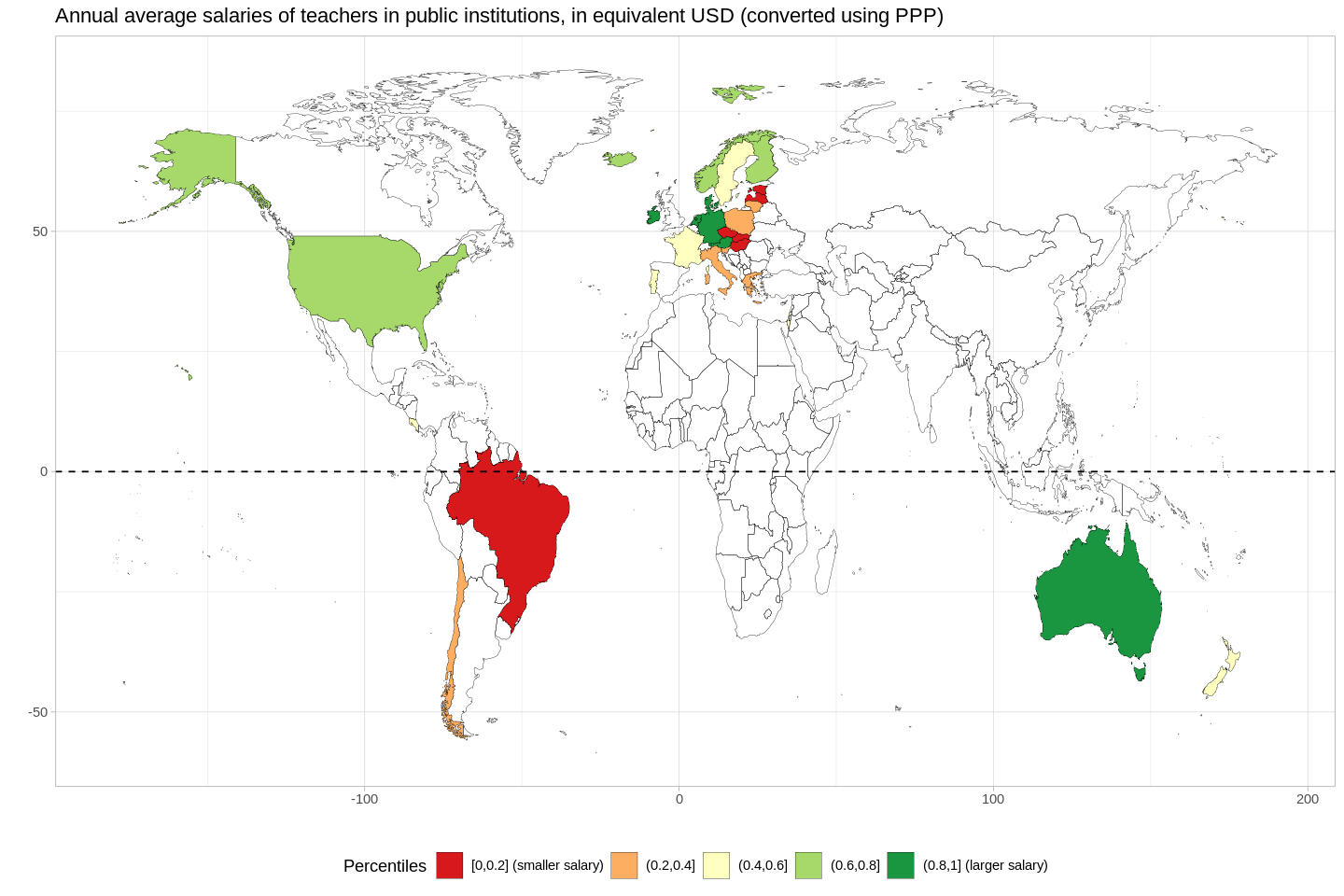
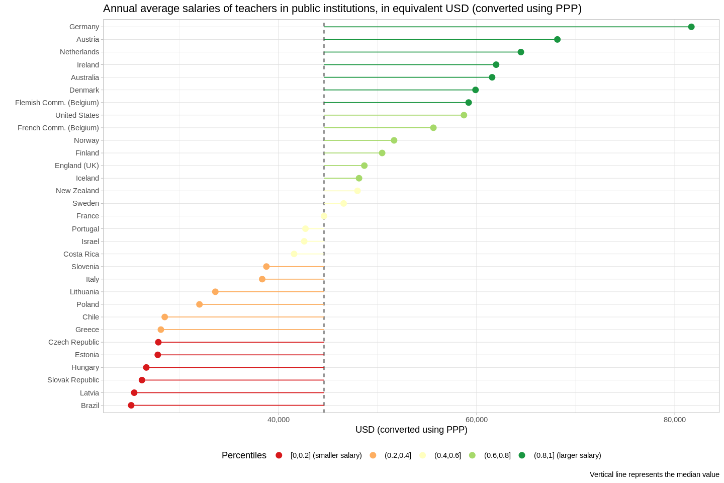
- "Annual average salaries (including bonuses and allowances) of teachers in public institutions, in equivalent USD converted using PPPs for private consumption" (OECD)
- Impressions:
- The average income for teachers in the USA is not as low, relatively-speaking, as we might guess.
- Eastern Europe and Latin America offer the smallest salaries.
- Teachers' salaries in Germany are much higher than in other countries.
- Germanic countries (Austria, Netherlands, etc.), by-and-large, offer higher salaries.
- If we consider the USSR to be an empire, then it's plausible that there is a correlation between nations that were colonies (rather than the seats of empire), and rather low teacher salaries.
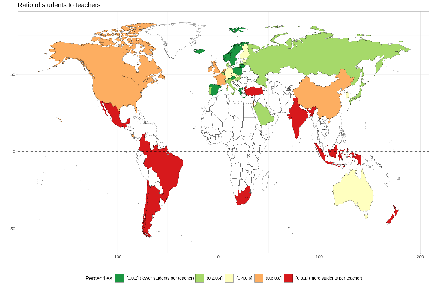
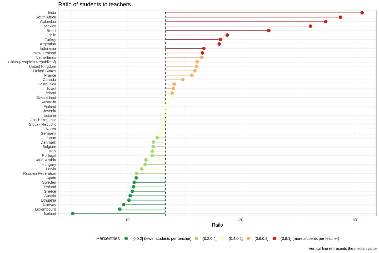
- "This dataset shows the ratio of full-time students to full-time teaching staff" (OECD)
- We'll look at these ratios at public schools only.
- There's a bias towards smaller ratios in Europe.
- The countries with the largest ratios (India, S. Africa, Colombia, and Mexico) are outliers-- note the large jumps from Brazil, to Mexico, to Colombia.
- Likewise, Iceland is a clear outlier on the other end of the spectrum.
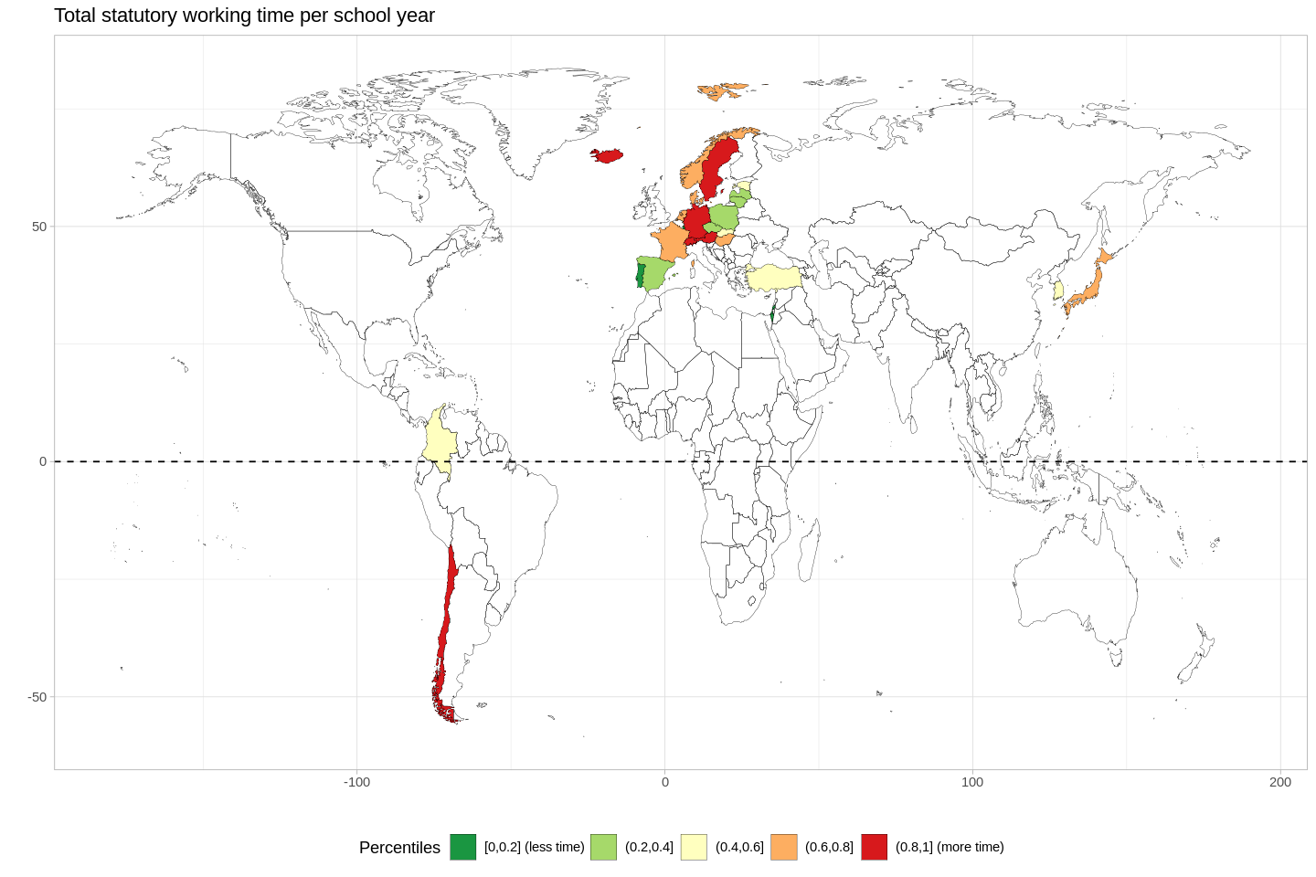
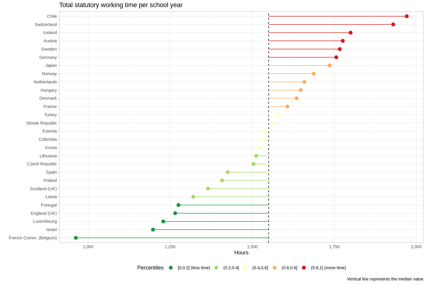
- "This dataset presents internationally comparable data on teaching and working time of (full-time) teachers in public institutions at pre-primary, primary and general (lower and upper) secondary education. Data refer to formal statutory requirements and also cover actual teaching time" (OECD)
- The Spearman's correlation coefficient between countries where teachers work more and earn more is 0.3-- this means that, in general, teachers who work more get paid more.
- The teachers who work the most (those in Chile and Switzerland) work a lot more than teachers in the next few nations.
- Teachers in French Belgium work fewer than 1,000 hours per year-- nearly half as much as do their peers in Chile.
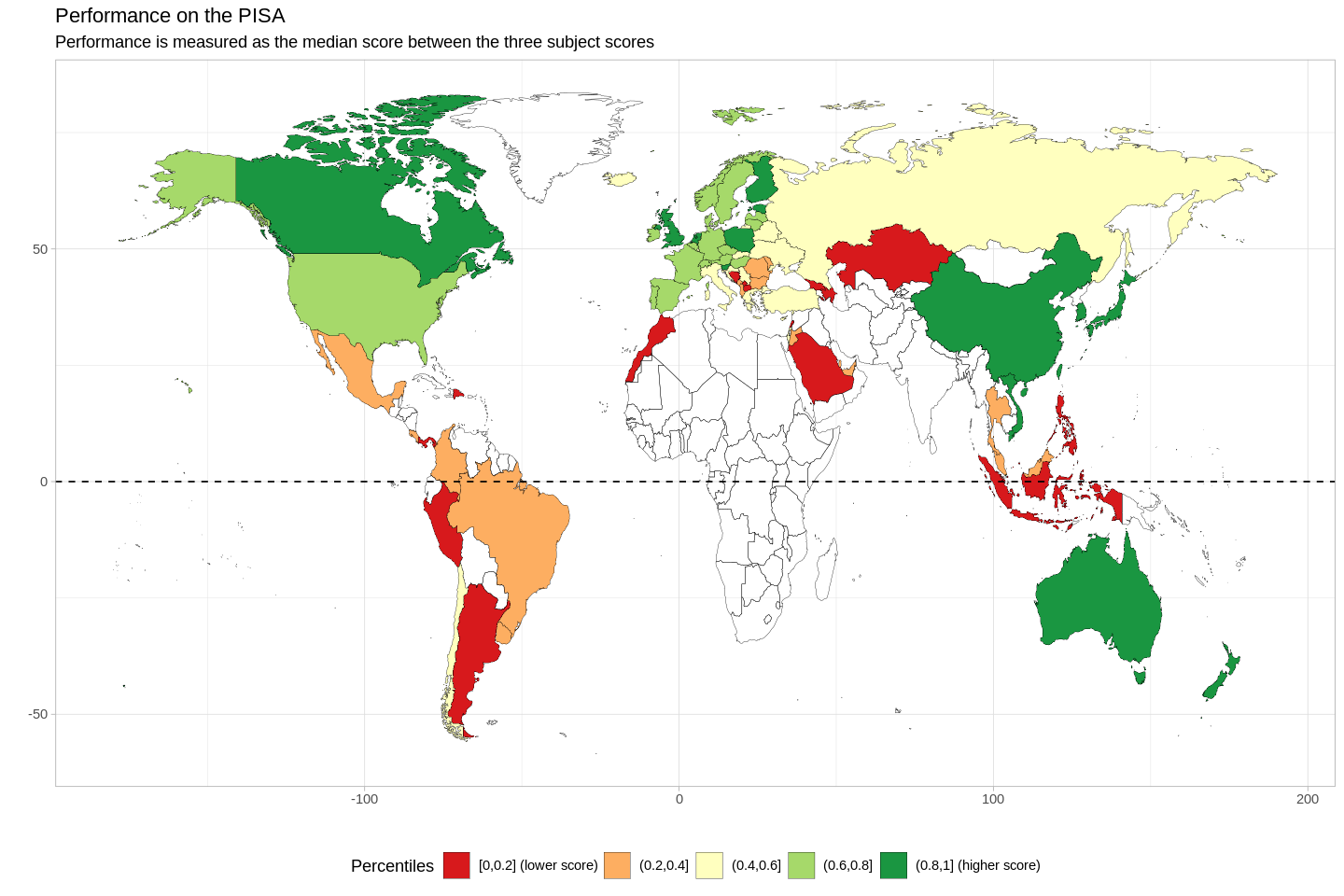
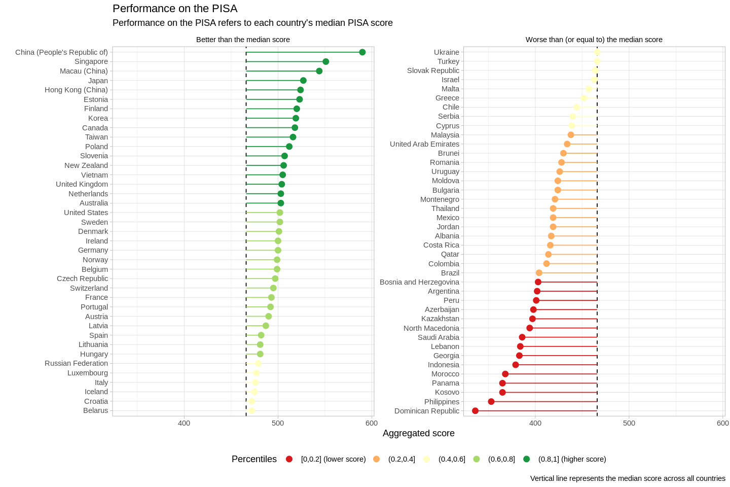
- "PISA is the OECD's Programme for International Student Assessment. PISA measures 15-year-olds' ability to use their reading, mathematics and science knowledge and skills to meet real-life challenges." (OECD)
- The correlations between these three subjects are pretty high (Spearman's correlation coefficients range from 0.99, which is very very very high, to 1, which is perfect correlation). This means that we can aggregate these three scores together, and simply look at each country's median PISA score.
- FWIW, the OECD indicates that the PISA has been validated against real-life social outcomes:
- "Four countries – Australia, Canada, Denmark and Switzerland – have conducted longitudinal studies that followed the cohort of students who sat the first PISA assessments in the early 2000s through their transition into adulthood. Across all of these countries, students who performed better in PISA at age 15 were more likely to attain higher levels of education by the age of 25. They were also less likely to be out of the labour market entirely, as measured by the percentage of students who were not in education, employment or training.
- Of course, there is a link between the socio-economic status of a student’s household – including material living conditions and parents’ educational attainment – and the student’s performance in PISA. However, even after accounting for these factors, students who perform better in PISA at age 15 have stronger education and employment outcomes at the age of 25. In addition, what students say about themselves in the PISA questionnaires also appears related to young people’s future life prospects."
- Overall, wealthier countries seem to have higher scores than poorer countries.
- While wealthier countries seem to have higher scores overall, there are some notable exceptions to this trend, e.g.:
- Estonia has the sixth-highest PISA scores, but Estonia is not the sixth-wealthiest nation in the world.
- On the other hand, Saudi Arabia is in the first quantile of PISA performance (1st to 25th percentiles), and S. Arabia has the 26th-highest GDP (PPP) per capita in the world.
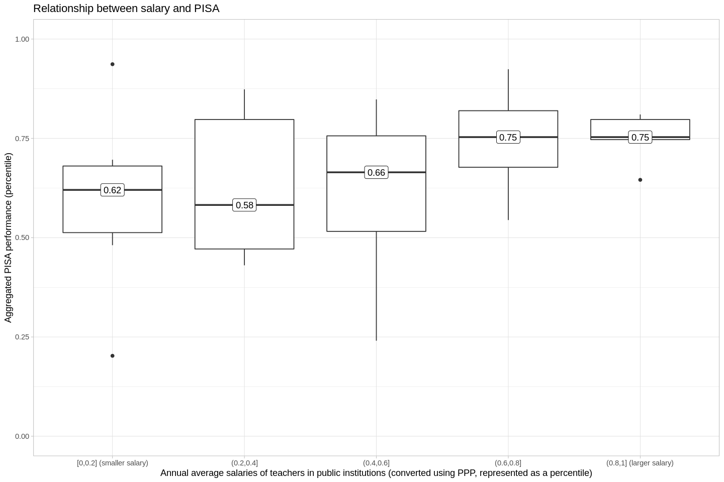
- There's a clear positive relationship between salary and PISA.
- ...but there's also a lot more variance in the first three quantiles than there is in the last two, which is something the next plot will better explain.
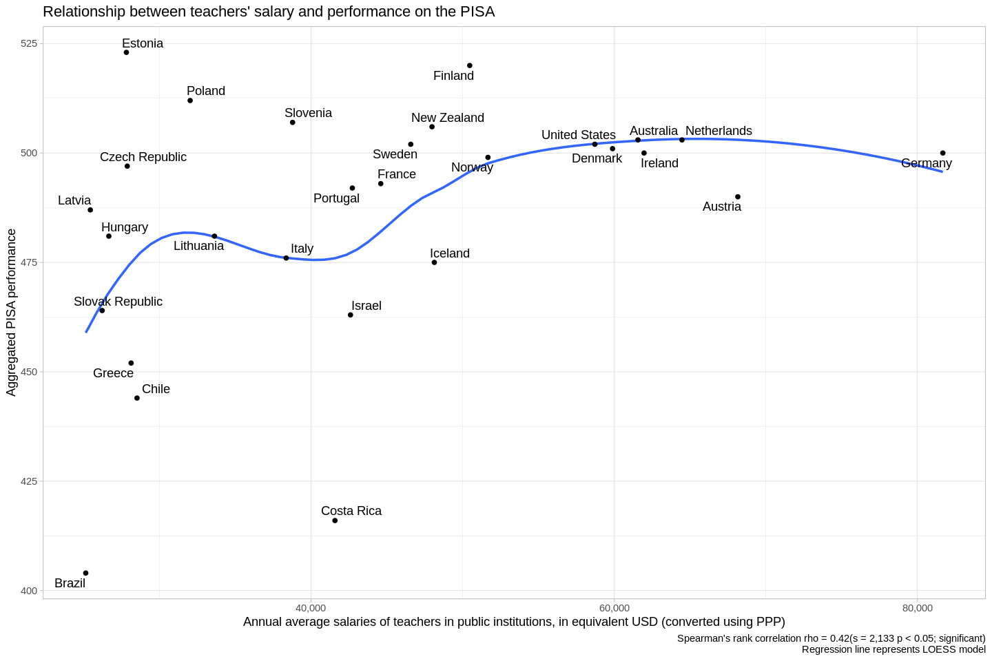
- Overall, the Spearman's correlation coefficient between salary and PISA scores is 0.4, which is pretty high. However, I'd argue that in fact there are two discrete things happening in this diagram.
- Interpretation:
- There's a lot of variance in the countries that pay their teachers less than about 50,000 USD (PPP). I refer here to everything to the left of, say, Norway. It's possible that this variance is really just noise, and there is no real correlation between salary and PISA when the salary is less than ~50k USD PPP.
- On the other hand, if we look at Norway (50k USD PPP per year) and every country where teachers earn more, we see another trend-- there is essentially a horizontal line, indicating that we can assume that students will get about 500 on the PISA-- not much higher, nor not much lower. These aren't the highest marks possible, but they're reliably pretty high.
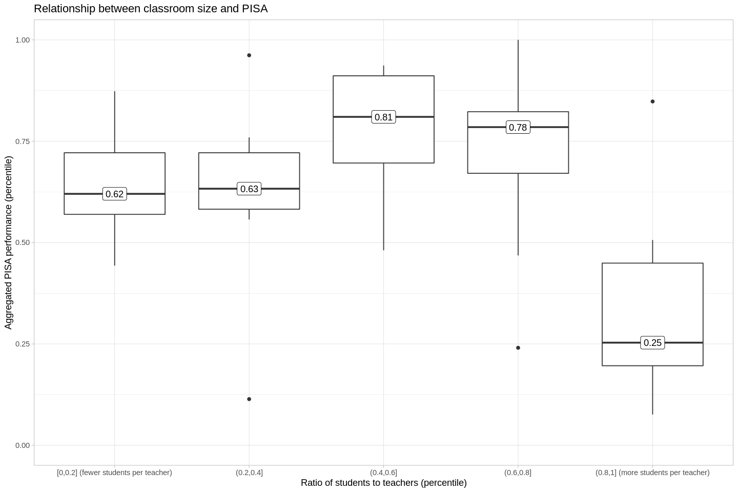
- Once again, we split our predictor variable (students/teacher) into quantiles.
- The countries in the first two quantiles (the countries with the smallest ratios of students/teachers) score at about the 60th percentile on the PISA.
- The next two larger quantiles of students:teacher ratios do better on the PISA, at about the 80th percentile.
- At the fifth quantile, students do much worse on the PISA.
- Strictly-speaking, there's not a linear correlation between the ratio of students to teachers, and PISA outcomes.
- But this doesn't mean there isn't a relationship.
- I wanted to test the possibility that there's a non-linear relationship between the ratio and PISA scores, but it's intellectually dishonest to retroactively fit a non-linear story onto data, when a linear story just doesn't work out. As a result, I tested four models using leave one out cross-validation. LOO CV is a pretty conservative strategy, so I think it helps to ensure that we're not just applying stories retroactively in a haphazard way. I tested four models: cubic polynomial, squared polynomial, linear, and intercept-only. The best-performing model was, in fact, the squared model; the peak is at 12 students per every one teacher.
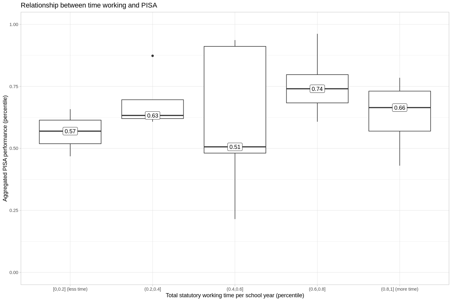
- It's tempting to say that there's another nonlinear relationship here that peaks at the third quantile, but there's a lot of variance in the third quantile.
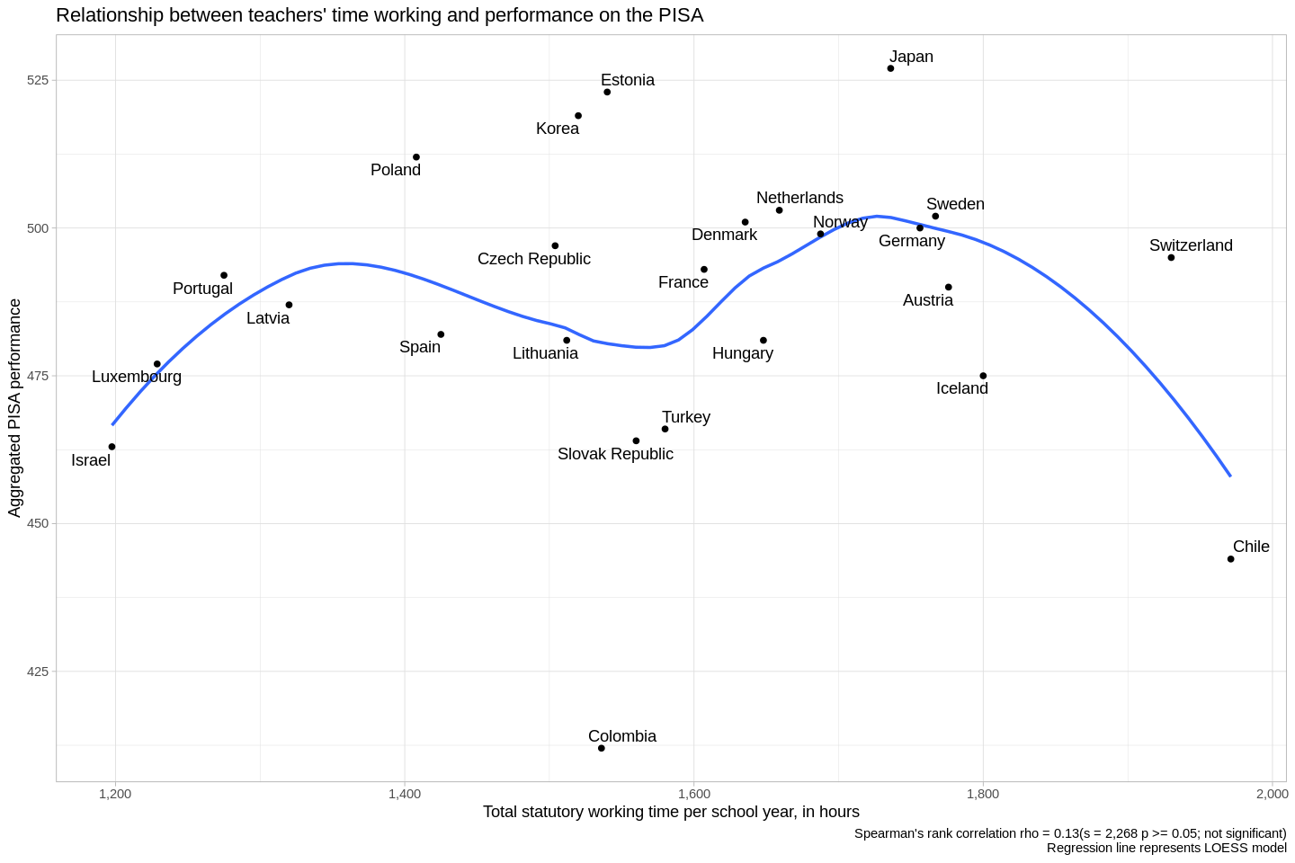
- To be my eye, this is just noise, with no linear correlation connecting teachers' time working and students outcomes.
