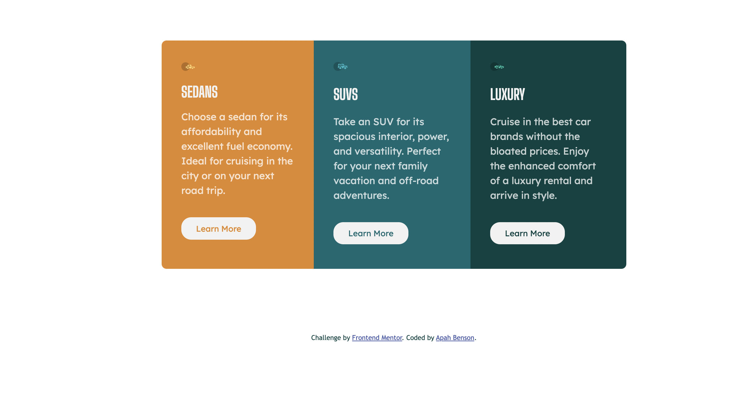
This is a solution to the 3-column preview card component challenge on Frontend Mentor.
Users should be able to:
- View the optimal layout depending on their device's screen size
- See hover states for interactive elements
- Solution URL: Add solution URL here
- Live Site URL: Add live site URL here
- Semantic HTML5 markup
- CSS custom properties
- Flexbox
- Mobile-first workflow
Use the mobile first design to avoid using many unnecessary media queries Used typography first in my css to make things much simplier Used min-width media query for my tablet and desktop screens used rems for a more responsive page
- Frontend Mentor - @apah-dev
- Twitter - @benson_apah
