Android Bootstrap is a library which provides several custom views styled according to the Twitter Bootstrap Specification. This allows you to spend more time on development rather than trying to get a consistent theme across your app, especially if you are already familiar with the Bootstrap Framework.
Add the following dependency to your build.gradle:
dependencies {
   compile 'com.beardedhen:androidbootstrap:2.0.1'
}
You should also override your application class with the following:
public class SampleApplication extends Application {
    @Override public void onCreate() {
        super.onCreate();
        TypefaceProvider.registerDefaultIconSets();
    }
}
You should then checkout the library and investigate the sample code, which covers most of the features. The sample app is also available on Google Play.
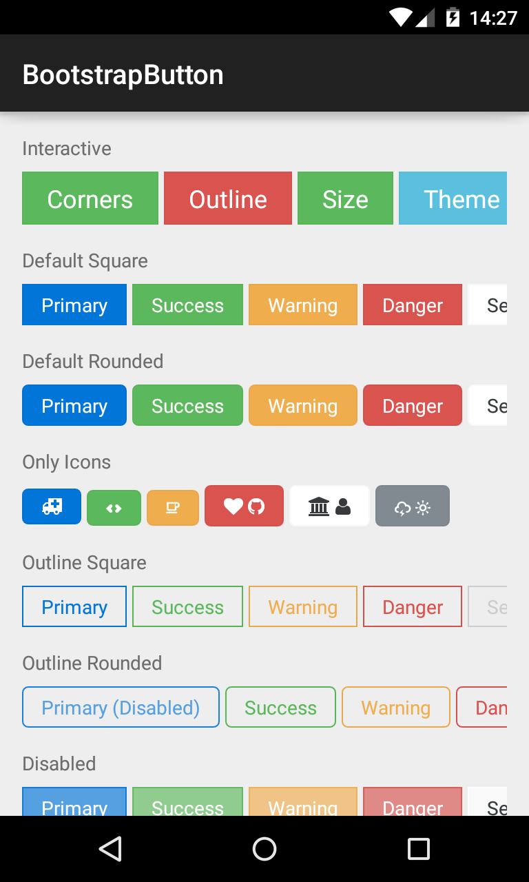
###BootstrapButton A button that supports Glyph icons, and is themeable using Bootstrap Brands.
<com.beardedhen.androidbootstrap.BootstrapButton
 android:layout_width="wrap_content"
 android:layout_height="wrap_content"
 android:text="BootstrapButton"
 app:bootstrapBrand="success"
 app:bootstrapSize="lg"
 app:buttonMode="regular"
 app:showOutline="false"
 app:roundedCorners="true"
 />
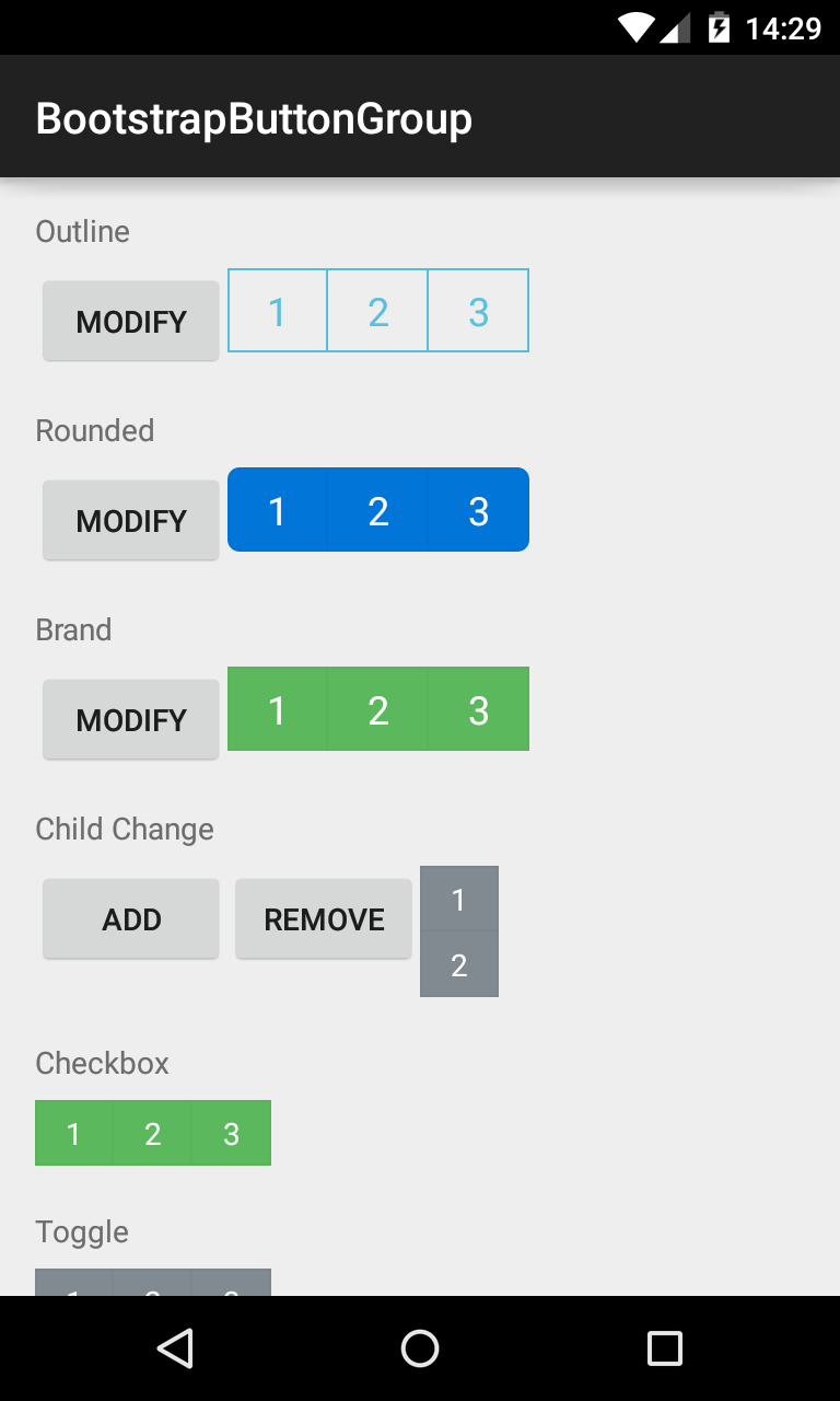
###BootstrapButtonGroup Allows BootstrapButtons to be grouped together and their attributes controlled en masse.
<com.beardedhen.androidbootstrap.BootstrapButtonGroup
 android:layout_width="wrap_content"
 android:layout_height="wrap_content"
 android:text="BootstrapButtonGroup"
 android:orientation="vertical"
 app:bootstrapBrand="success"
 app:bootstrapSize="lg"
 app:roundedCorners="true"
 >
 <com.beardedhen.androidbootstrap.BootstrapButton
    android:layout_width="wrap_content"
    android:layout_height="wrap_content"
    android:text="BootstrapButton 1"
    />
 <com.beardedhen.androidbootstrap.BootstrapButton
    android:layout_width="wrap_content"
    android:layout_height="wrap_content"
    android:text="BootstrapButton 2"
    />
</com.beardedhen.androidbootstrap.BootstrapButtonGroup>
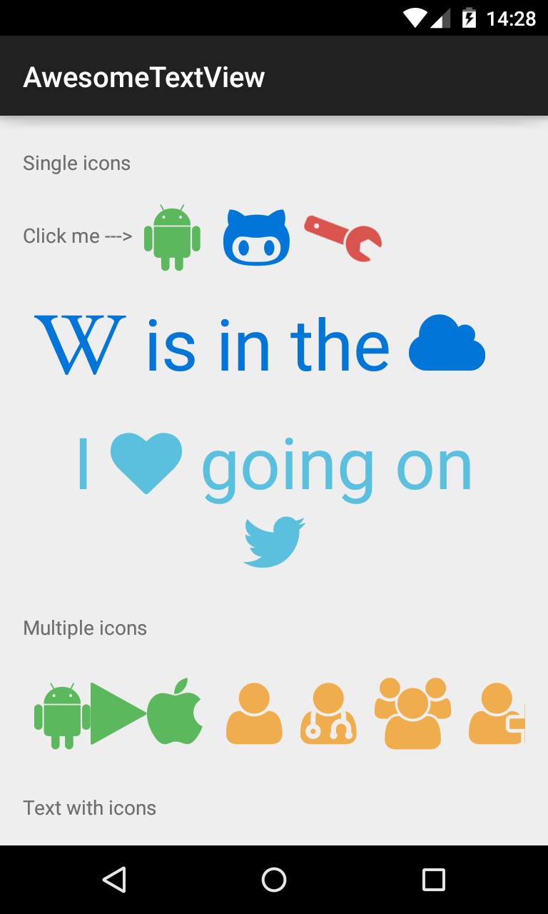
###AwesomeTextView A text widget that displays Glyph icons, and is themeable using Bootstrap Brands.
<com.beardedhen.androidbootstrap.AwesomeTextView
 android:layout_width="wrap_content"
 android:layout_height="wrap_content"
 app:bootstrapBrand="success"
 app:fontAwesomeIcon="fa_android"
 />
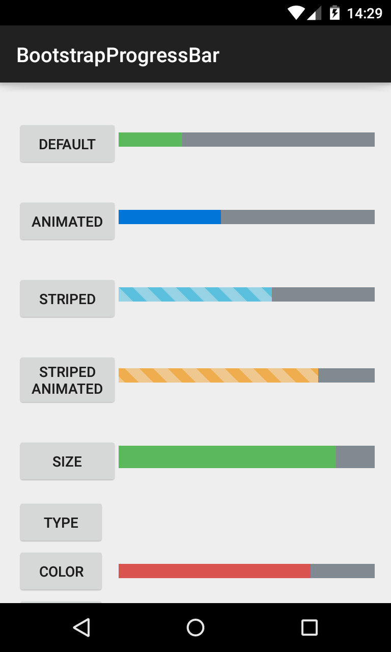
###BootstrapProgressBar Displays progress in a bar from 0-100, and animates updates to the current progress.
<com.beardedhen.androidbootstrap.BootstrapProgressBar
 android:layout_width="wrap_content"
 android:layout_height="wrap_content"
 app:animated="true"
 app:bootstrapBrand="warning"
 app:progress="78"
 app:striped="true"
 />
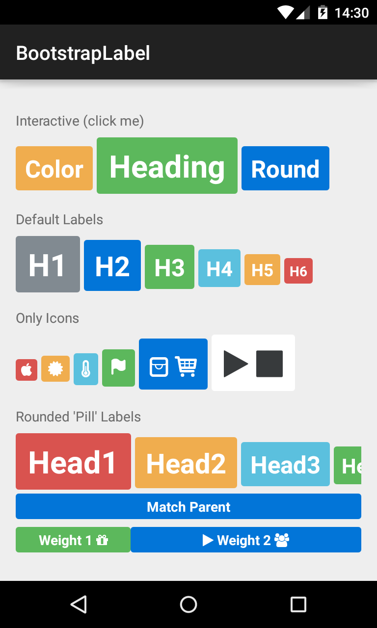
###BootstrapLabel Displays non-clickable text in a widget similar to the BootstrapButton, sizable using H1-H6 elements.
<com.beardedhen.androidbootstrap.BootstrapLabel
 android:layout_width="wrap_content"
 android:layout_height="wrap_content"
 app:bootstrapBrand="primary"
 app:bootstrapHeading="h3"
 app:roundedCorners="true"
 android:text="Bootstrap Label"
 />
###BootstrapEditText Allows editing of text in a widget themed using BootstrapBrand.
<com.beardedhen.androidbootstrap.BootstrapEditText
 android:layout_width="wrap_content"
 android:layout_height="wrap_content"
 app:bootstrapSize="md"
 app:bootstrapBrand="info"
 />
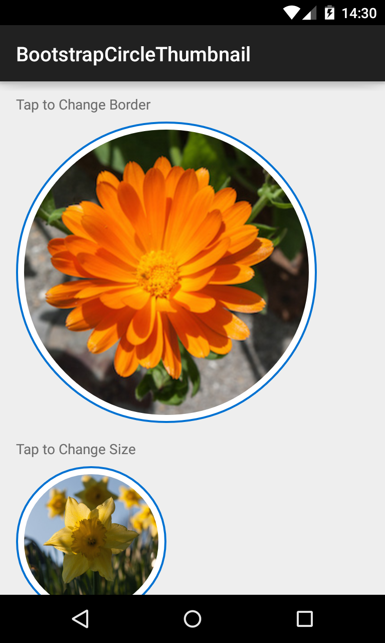
###BootstrapCircleThumbnail Displays images in a center-cropped Circular View, themed with BootstrapBrand.
<com.beardedhen.androidbootstrap.BootstrapCircleThumbnail
 android:layout_width="wrap_content"
 android:layout_height="wrap_content"
 android:src="@drawable/my_drawable"
 app:bootstrapBrand="danger"
 app:hasBorder="true"
 />
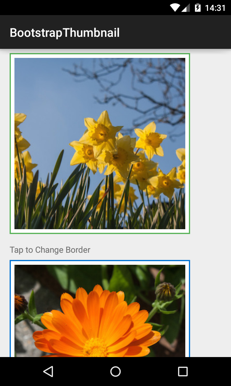
###BootstrapThumbnail Displays images in a rectangular View, themed with BootstrapBrand.
<com.beardedhen.androidbootstrap.BootstrapThumbnail
 android:layout_width="wrap_content"
 android:layout_height="wrap_content"
 android:src="@drawable/my_drawable"
 app:bootstrapBrand="info"
 app:hasBorder="true"
/> class CustomBootstrapStyle implements BootstrapBrand {
// specify desired colors here
}
BootstrapButton btn = new BootstrapButton(context);
btn.setBootstrapBrand(new CustomBootstrapStyle(this);Contributions are very welcome! There are 3 main ways you can help out:
- Add more Icon Typefaces, using the instructions here
- Help implement views which are present in the Twitter Bootstrap Specification but are not yet in this library.
- Raise an issue if you see a bug or are unsure on how something works, or even better - send a pull-request with a fix!
This project uses Semantic Versioning. There are several breaking changes in V2.X of the library, including:
- AwesomeTextView replaces FontAwesomeText
- Various altered method signatures/attributes for views
- Global BootstrapBrand/BootstrapSize attributes replace view-specific enums
Please consider what effect these changes might have on your app before upgrading!
If you have any questions, issues, or just want to let us know where you're using Android Bootstrap tweet us at @BeardedHen, email support@beardedhen.com, or head over to our website to see more of our creations.
