UI mockups
bleroy opened this issue · 3 comments
bleroy commented
UX people reading this, let's do some mockups for the features we want (see this for a list of proposed features).
bleroy commented
Commit list
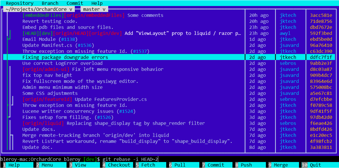
Things to note:
- The
devbranch is checked out, and appears in white. - The current lineage of the currently checked out branch appears green.
- On top of the list, there are two drop-downs: one for the project, and one for the branch (oops, that should say "dev" to be consistent with the rest).
- Referenced issues appear in blue and can be clicked to view those in a browser.
- UI is like Midnight Commander: menu on top, F keys on the bottom, integrated shell.
kenegozi commented
All local refs (branches included) are green, yet current branch lineage is green. Current branch HEAD's comment is in white, while non-current-branch lineage is white.
suggest to have same color for current branch's lineage and HEAD comment.
Also, perhaps make remote and local branches more similar? e.g. white for local and grey for remote?
bleroy commented
Point taken on consistency, thanks. Also, red is not readable on blue.