[译] [603] [#31] 自定义复选框
cssmagic opened this issue · 6 comments
本文是早期译版,未经校审。仅供参考。
Custom checkboxes
自定义复选框
The problem
难题
{原书注释!}
For readability, we will refer to “checkboxes” throughout this secret, but everything discussed applies to both checkboxes and radio buttons unless otherwise noted.
为易于理解,我们在本篇攻略中统一使用 “复选框” 这个词。但实际上,除非特别注明,本节讨论的所有内容是同时适用于复选框和单选框的。
Designers always wanted more control over every element in a web page. When a graphic designer with limited CSS experience is tasked to create a website mockup, they almost always produce one with customized form elements, making the developer tasked to convert it to CSS want to pull their hair out.
设计师对网页中各种元素的控制欲是永无止境的。当一个 CSS 经验不足的平面设计师接到一个网页设计设计任务时,他几乎一定会为各种表单元素设计一套自己的样式,然后接下来写 CSS 的工程师就精神崩溃了。
When CSS was first introduced, form styling was extremely limited and is still not clearly defined in any of the various CSS specifications. However, browsers got more and more permissive over the years about what CSS properties they allow on form controls, enabling us to style most of them quite extensively.
当 CSS 最初出现时,它对表单元素的样式控制力是极为有限的,而且现在仍然没有哪个 CSS 规范明确定义了这方面的行为。不过这些年来,浏览器们已经在逐步放开 CSS 属性对表单控件的作用范围,从而允许我们设置大多数表单控件的样式。
Unfortunately, checkboxes and radio buttons are not among those form controls. To this day, most browsers allow little to no styling when it comes to them. As a result, authors end up either coming to terms with their default look or employing awful, inaccessible hacks, such as recreating them with divs and JS.
然而不幸的是,复选框和单选框不在此列。直到今天,这两种控件在绝大多数浏览器中仍然是几乎或完全无法设置样式的。这最终导致网页开发者们要么接受默认样式,要么求助于一些糟糕透顶、可访问性极差的 hack 方案,比如用 div 和 JS 来模拟这两种控件。
Is there a way to get around these restrictions and customize the look of our checkboxes, without bloat and without giving up on semantics and accessibility?
有没有一种方法,既可以克服这些限制、自由定制复选框的外观,同时又可以摆脱臃肿的代码、保全结构层的语义和可访问性呢?
The solution
解决方案
Until a few years ago, this task was impossible without scripting. However, in Selectors Level 3, we got a new pseudo-class: :checked. This pseudo-class only matches when the checkbox is checked, whether that is done through user interaction, or through script.
在多年以前,这个任务还无法在脱离脚本的情况下完成。不过,在 选择符(第三版)中,我们得到了一个新的伪类 :checked。这个伪类只会在复选框被勾选时才会匹配,不论这个勾选状态是由用户交互所触发的,还是由脚本触发的。
{小提示}
Wondering what the difference is between
:checkedand the attribute selector[checked]? The latter doesn’t update based on user interaction, as user interaction doesn’t affect the HTML attribute.你是不是还在疑惑伪类选择符
:checked和属性选择符[checked]之间的区别?后者是不会根据用户的交互行为进行更新的,因为用户的交互并不会影响到 HTML 标签上的属性。
It’s not very useful when applied directly to checkboxes, as -- like we previously mentioned -- there aren’t many properties we can successfully apply to them. However, we can always use combinators to style other elements based on a checkbox state.
如果直接对复选框设置样式,那这个伪类并不实用,因为——前面已经交待过了——没有多少样式是能够对复选框起作用的。不过,我们倒是可以基于复选框的勾选状态借助组合选择符来给其他元素设置样式。
You might be wondering what other elements we may want to style based on whether a checkbox is checked or not. Well, there is one kind of element that has special behavior around checkboxes: <label>s. A <label> that is associated with a checkbox also acts as a toggle for it.
你可能还没搞清楚,我们要根据复选框的勾选状态来给哪个元素设置样式?嗯,其实有一个元素总是跟复选框形影不离、息息相关,它就是 <label>(标签元素)。当 <label> 元素跟复选框关联之后,也可以起到触发开关的作用。
Because labels--unlike checkboxes--are not replaced elements, [_] we can _add generated content to them and style that based on checkbox state*. Then, we could hide the real checkbox in a way that doesn’t remove it from the tabbing order, and have the generated content act as a styled checkbox instead!
由于 label 不是复选框那样的替换元素 [],我们可以__为它添加生成性内容(伪元素),并基于复选框的状态来为其设置样式__。然后,我们就可以__把真正的复选框隐藏起来__(但不能把它从 tab 键切换焦点的队列中完全删除掉),再把生成性内容美化一番,用它来__顶替原来的复选框*!
{原书脚注!}
[] From the CSS 2.1 specification: *“[A replaced element is] an element whose content is outside the scope of the CSS formatting model, such as an image, embedded document, or applet.” Replaced elements cannot have generated content applied to them, though some browsers allow it.
据 CSS 2.1 规范所述:“替换元素的特征在于,其内容超出了 CSS 格式化模型的范畴,比如图片、嵌入的文档或小应用程序等。” 原则上我们无法为替换元素添加生成性内容,尽管某些浏览器可能会允许这样做。
Let’s see this in action. We will start from the following simple markup:
让我们来亲手试一试。我们先从下面这段简单的结构代码开始:
<input type="checkbox" id="awesome" />
<label for="awesome">Awesome!</label>
{原书注释!}
Nesting the checkbox in the label would free us from using ids, but then we wouldn’t be able to target the label based on the checkbox status, because we do not yet have parent selectors.
把复选框嵌套进
label中同样可以把这两者建立关联,还可以省掉 ID 属性。但这样一来,我们就无法基于复选框的状态来设置label的样式了,因为现在还不存在父元素选择符。
The next step is to generate a pseudo-element that will be used as our styled checkbox, and apply some basic styling to it:
接下来我们需要生成一个伪元素,用它作为美化版的复选框。我们先给这个伪元素加上一些基本的样式:
input[type="checkbox"] + label::before {
                    /* non-break space */
    content: '\a0'; /* 不换行空格 */
    display: inline-block;
    vertical-align: .2em;
    width: .8em;
    height: .8em;
    margin-right: .2em;
    border-radius: .2em;
    background: silver;
    text-indent: .15em;
    line-height: .65;
}
{原书注释!}
The style we will apply to our checkboxes in these examples is pretty basic, but the possibilities are endless. You could even skip CSS styling altogether and use images for all different checkbox states!
在这些例子中,我们给复选框添加的样式是相当简单的,但实际的可能性是无穷无尽的。你甚至可以完全跳过 CSS 美化这一招,直接把复选框的各种状态显示为不同的图片!
图 6.9
Our rudimentary custom checkbox alongside the original checkbox
左边是原生复选框;而右边是我们经过初步自定义的复选框。(图中文字:帅呆了!)
You can see how our checkbox and label currently look in Figure XX.XX. The original checkbox is still visible, but we will hide it later. Now we need to apply a different style to our checkbox when it’s checked. This could be as simple as applying a different color and adding a checkmark as content:
你可以在 图 6.9 中看到复选框和 label 现在看起来是什么样的。原来的复选框仍然是可见的,但待会儿我们会把它隐藏掉。现在我们需要给复选框的勾选状态加点儿不一样的样式。我们就简单意思一下,比如换种颜色,再加个勾选标记进去:
input[type="checkbox"]:checked + label::before {
    content: '\2713';
    background: yellowgreen;
}
图 6.10
Styling our pseudo-element as a customized checked checkbox
在复选框的勾选状态下,伪元素也需要美化一番。
As you can see in Figure XX.XX, this is already functioning as a rudimentary styled checkbox. Now, we need to hide the original checkbox in an accessible way, which means we can’t use display: none, as that would remove it from the keyboard tabbing order entirely. Instead, we could use something like this:
你在 图 6.10 中可以看到,这个伪元素俨然已经是一个简单美化过的复选框了,而且功能完备。现在,我们需要把原来的复选框以一种不损失可访问性的方式给隐藏起来,这意味着我们不能使用 display: none,因为那样会把它从键盘 tab 键切换焦点的队列中完全删除掉。我们会改用另一种方法来达到目的:
input[type="checkbox"] {
    position: absolute;
    clip: rect(0,0,0,0);
}
{警告!!}
Be careful when using such permissive selectors. Using
input[type="checkbox"]will also hide checkboxes without a label after them (e.g., those nested in a label), essentially making them unusable.在使用宽松的选择符时一定要小心。对于那些没有
label跟在后面的复选框来说(比如它是被嵌套进一个label的),使用input[type="checkbox"]选择符也会把它们隐藏掉,从而损害可用性。
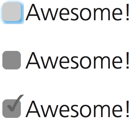
That’s it, we’ve made a very basic custom checkbox! We could of course improve it further--for example, by changing its style when it’s focused or disabled, which you can see in Figure XX.XX:
这就成了,我们已经得到了一个简单定制化的复选框!我们还可以进一步优化它——比如说,在它聚焦或禁用时改变它的样式(效果如 图 6.11 所示):
input[type="checkbox"]:focus + label::before {
    box-shadow: 0 0 .1em .1em #58a;
}

input[type="checkbox"]:disabled + label::before {
    background: gray;
    box-shadow: none;
    color: #555;
}
图 6.11
Top to bottom: customized focused checkbox, customized disabled checkbox, and checked checkbox
- 上图:自定义复选框的聚焦状态。
- 中图:自定义复选框被禁用的状态。
- 下图:自定义复选框被勾选且被禁用的状态。
You could even make these effects smoother by applying transitions or animations or go nuts and create things like skeuomorphic switches. The possibilities really are endless!
你甚至还可以用过渡或动画来让各个状态之间的切换更加平滑,或者脑子进水搞一个拟物化的开关出来也是可以的。这方面的可能性真的是无穷无尽的!
{原书注释!}
Although the possibilities are endless, avoid styling checkboxes as circles: most users associate round toggles with radio buttons. Same applies to square radio buttons.
尽管可能性是无穷无尽的,但仍然要避免把复选框设置为圆形:绝大多数用户会把圆形的开关理解为单选框。这个道理也适用于方形的单选框。
{致敬}
Hat tip to Ryan Seddon for coming up with the first version of this effect, now known as “the checkbox hack”. Ryan has since used this idea to implement all sorts of widgets that require state persistence, such as modal dialogs, dropdown menus, tabs, and carousels, though abusing checkboxes this much results in accessibility problems.
向 Ryan Seddon 脱帽致敬,感谢他最先提出这个效果——这个技巧现在已被大家称作 “复选框 hack” 了。Ryan 曾用这个创意 实现了各种需要保持状态的 UI 组件,比如模态对话框、下拉菜单、标签页、跑马灯等,不过像这样滥用复选框很容易导致可访问性上的问题。
Toggle buttons
开关式按钮
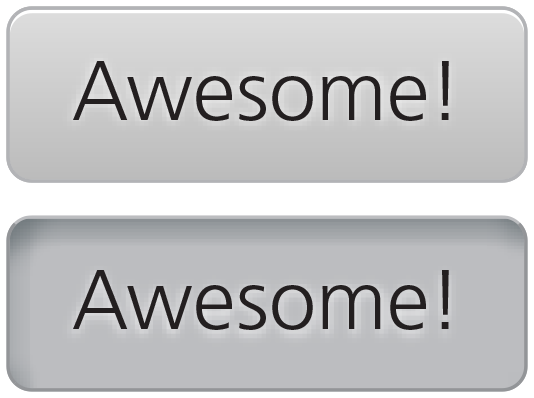
You could use a variation of “the checkbox hack” to emulate toggle buttons, as HTML does not provide a native way to create them. Toggle buttons are push buttons that act like checkboxes: they are used to toggle a setting on or off, and look pressed when checked and unpressed when unchecked. Semantically, there is no real difference between toggle buttons and checkboxes, so you can both use this trick and maintain semantic purity.
说到开关式按钮,HTML 并没有提供一种原生的方式来生成它,但我们可以利用这个 “复选框 hack” 的思路来把它模拟出来。开关式按钮是一种跟复选框的行为十分相似的按钮:它们可以用来切换某个选项的开关状态——当启用时,它是被按下的状态;而停用时,它就是浮起的状态。在语义上,开关式按钮和复选框并没有本质上的差别,因此,你可以放心地使用这个技巧,而不用担心语义上会有什么问题。
图 6.12
A toggle button in both its states
开关式按钮的两种状态。
To create toggle buttons with this trick, you would just style the labels as buttons, instead of using pseudo-elements. For example, to create the toggle buttons shown in Figure XX.XX, the code would look like this:
如果我们想用这个技巧来生成开关式按钮,其实只需要把 label 设置为按钮的样式即可,并不需要用到伪元素。具体来说,要生成 图 6.12 中的这个开关式按钮,代码可以这样写:
input[type="checkbox"] {
    position: absolute;
    clip: rect(0,0,0,0);
}

input[type="checkbox"] + label {
    display: inline-block;
    padding: .3em .5em;
    background: #ccc;
    background-image: linear-gradient(#ddd, #bbb);
    border: 1px solid rgba(0,0,0,.2);
    border-radius: .3em;
    box-shadow: 0 1px white inset;
    text-align: center;
    text-shadow: 0 1px 1px white;
}

input[type="checkbox"]:checked + label,
input[type="checkbox"]:active + label {
    box-shadow: .05em .1em .2em rgba(0,0,0,.6) inset;
    border-color: rgba(0,0,0,.3);
    background: #bbb;
}
However, be wary about using toggle buttons. In most cases, toggle buttons hinder usability as they can easily be confused with regular buttons that perform an action when pressed.
不过,在使用开关式按钮时还需慎重。在绝大多数场景下,开关式按钮对可用性有负面作用,因为它们很容易跟普通按钮混淆起来,让人误以为按下它会触发某个动作。
Related specs
相关规范
没想到css2还有一个clip属性。这个效果很nice。
这个用法太精妙了,比JS模拟不知道要高到哪里去
原汁原味,靠谱方便
太nice,学习了。
不过看Dash的CSS文档里写到:
Deprecated
This feature has been removed from the Web standards. Though some browsers may still support it, it is in the process of being dropped. Do not use it in old or new projects. Pages or Web apps using it may break at any time.
我想如果用 opacity: 0 来代替 clip �也可以吧?
可以的吧


