Matt Malishev | @darwinanddavis
D3 code and output
'app.js'
'index.html'
'scatter.js'
Website
'celonis.html'
Data
'songs.json'
Style
'css/styles.css'
If scatterplots don't render:
1️⃣ Open 'celonis.html' from dir in browser and navigate to Dashboard 2 tab
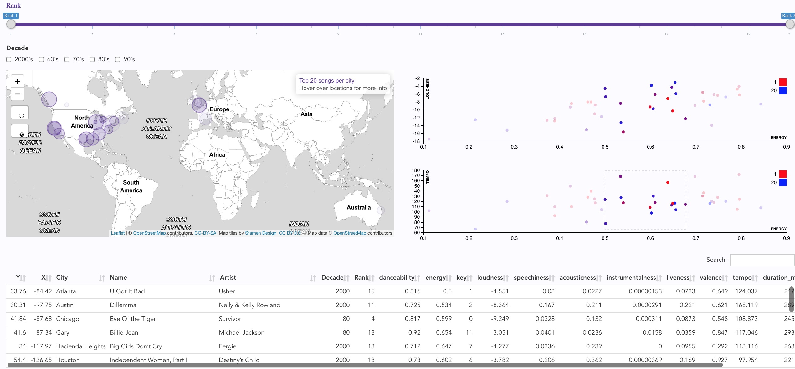
I extended the exploratory data elements of the dashboard (bar and scatter charts) to include an interactive map that incorporates more relatable and recognisable elements of the dataset. This allows users to connect the inherently abstract aspects of the data, such as energy, loudness, liveness, with a familiar UX component such as a map that people are familiar with. This design choice also maintains data integrity without the unnecessary step of compounding the data and creating more variables. For example, some metrics in the current dataset need further verification or supporting notes to explain their function and how they were measured. Verifying liveness, for example, may involve converting energy * loudness into a new metric, then correlating this with the current liveness index as a new variable in the dataset. Instead, by integrating the interactive map as an intuitive UX component of the dashboard, users can instantly recognise how the data are interconnected without the extra need for further notes or explanation for some of the more abstract metrics in the dataset.
With the map, users can still define their own data limits, such as Rank (slider), Decade (checkboxes), and brushing (scatterplots), using the respective interactive components, then pinpoint individual data points in a visual landscape that is instantly recognisable.
The added summary data at the bottom of the dashboard then allows users to further drill down into the data by interacting with the rows and search box in the table. Once an area of the scatterplots or map have been selected, users can then select single or multiple rows in the table by clicking on each row. This removes the guesswork of finding individual data points in the scatterplots after initially brushing a search window and surpasses more conventional alternatives i.e. using a tooltip in the scatterplot to display individual point info, which still requires randomly switching among individual points in the plots in order to glean the desired info on a specific data point. The summary table serves to present this detailed info in a quick visual format that updates with no further user action after selecting the initial data window.
The analysis part for building the map involved querying the city location string (City) in the dataset with available databases on world city locations that returned location data (longitude and latitude). These new location data were then appended to the original dataset and merged with the appropriate columns and rows to correctly link each city string with the corresponding XY for the real location in the map. The same dataset can then be connected to the scatterplots and summary table via the chosen variable (Rank). Note that some locations have been doubled and may appear in multiple countries (an easy fix with more time and fine tuning).
Possible extensions to dashboard and data viz
Dashboard 1
- Facet bar chart data by decade
- Highlight user-defined artist/song e.g. search bar input to highlight one artist as bar chart updates
Dashboard 2
- Group data into different bins (drop down menu)
- Update scatter charts with user-defined selection of data variables
- Enable regex and wildcard search string in search bar of table to allow users to search for a broader range of data more quickly
- Extend popup info from tooltip in map to display alternative info or charts/data viz within popups for each location e.g. hovering on data point in map displays tooltip info while clicking on data point displays a weblink to the artist homepage or a popup chart exploring a different variable in the dataset
I don't use Angular (yet), so I ignored the build procedure you provided and instead hosted the dashboard on a shareable website. This allowed me to instead focus on the data exploration and data viz components to showcase different dashboard elements.
Run live-server to view index.html (dashboard 1) or celonis.html (website)
npm install -g live-server
live-server # use CTRL + C to end current session
If live server fails to open browser, enter one of the following in normal web browser
- http://127.0.0.1:8080/
- localhost:8080/
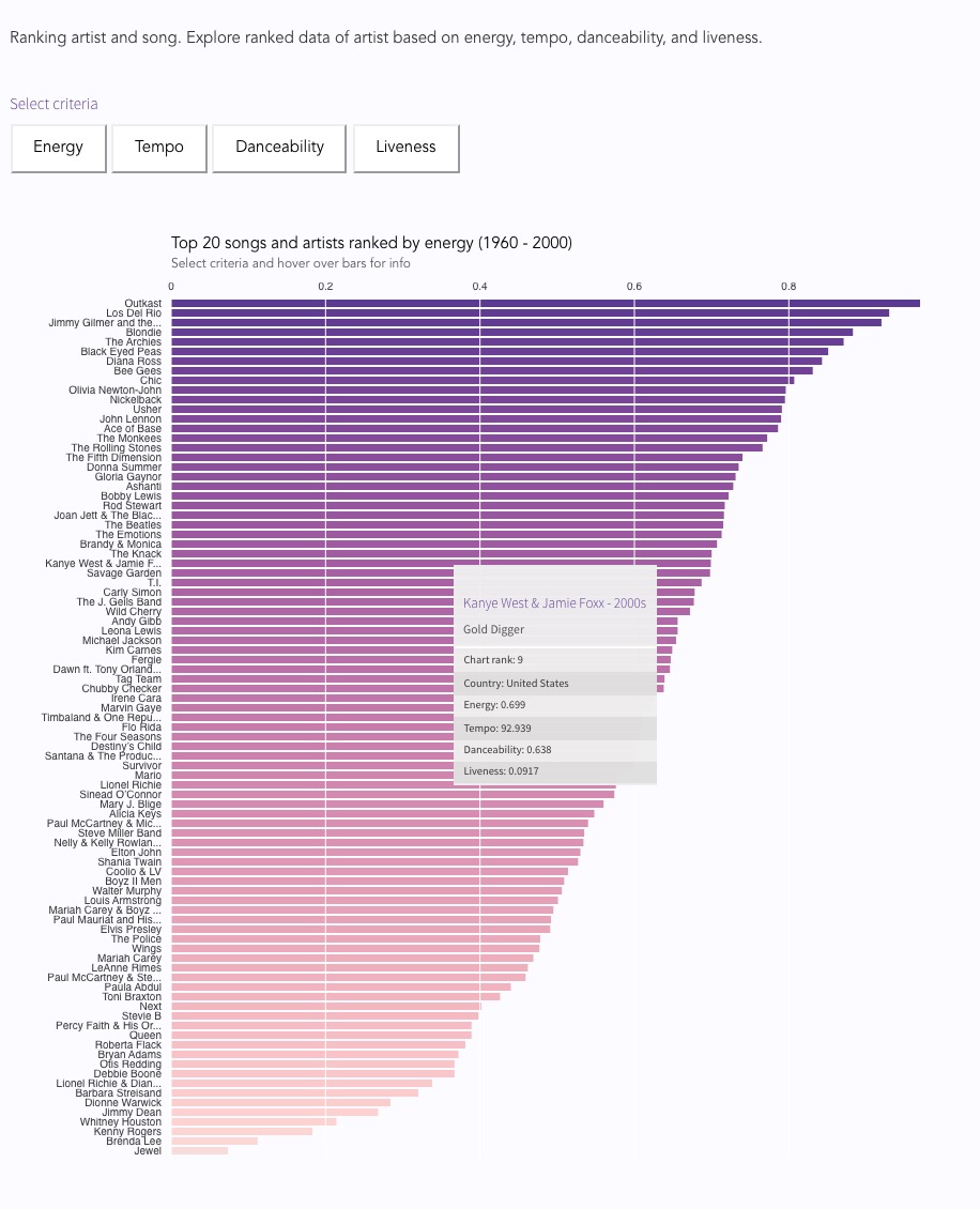
Live preview of Dashboard 1
Dashboard 1
If scatterplots don't render:
1️⃣ Open 'celonis.html' in browser and navigate to Dashboard 2 tab


