Workflow Arrival Date
The goal was to get an idea of the submission dates of workflows on Cloud or similar infrastructure over a day. Based on execution archives, the program draws a histogram graph of the amount of workflow submissions along a full day. Each value is an average of the number of submissions sent at a specific time every day during many years.
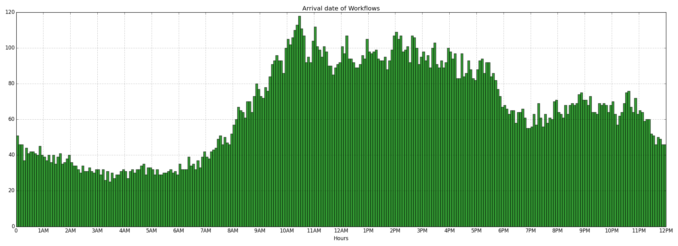
The histogram just above is the result you should obtain.
Getting the tools ready
Create a Python 2 virtualenv:
virtualenv2 env
Activate the environment:
source env/bin/activate
Check Python and pip version (should be 2.x):
python --version
pip --version
Install the required packages:
pip install numpy matplotlib
Input file
The input data can be found in the Parallel Workloads Archive website.
For my work, I downloaded the more recent archive on this page which is the ID 38: MetaCentrum2 (56MB version). This archive contains the logs of an experimentation started in January 2013 and finished in April 2015.
Uncompress this file in the git repository. The size should be around 548MB.
The program
The input file is way too big. The first step is to get from it only the interesting values: the arrival dates. The following command does this task and create an output file called arrival_time.txt. It is normal if the command takes about 10 seconds to execute.
python gen_compressed_data_file.py
Now that we have a smaller file (around 760KB), we can use it to generate the histogram.
For the graphic generation, we use Matplotlib. Run the next command to generate the histogram:
python gen_graph.py
If everything went well, you should have a graph.png file representing the histogram of the arrival time of the workflows.