Improve The Overall UX
austincondiff opened this issue · 96 comments
Problem
The UI lacks the polish and UX necessary to give developers more confidence that Netlify CMS is the right CMS for their project and is as robust as other similar CMS’s.
Motivation
In the time I have used Netlify CMS for my projects, I have identified several key areas the UI needs attention. If I am going to invest my time and future projects in this CMS, I’d like to share some of these areas of improvement.
Solution
From an outsiders perspective I have created a few mockups showing what I believe the Netlify CMS UI should look like in order to give users a much better experience. They highlight the following improvements
- Use of space
- Navigation
- Contextual awareness
- Icons
- Typography


Invision Prototype
https://invis.io/3ATIRBHKW9F#/380522637_Login_-_Custom_Logo
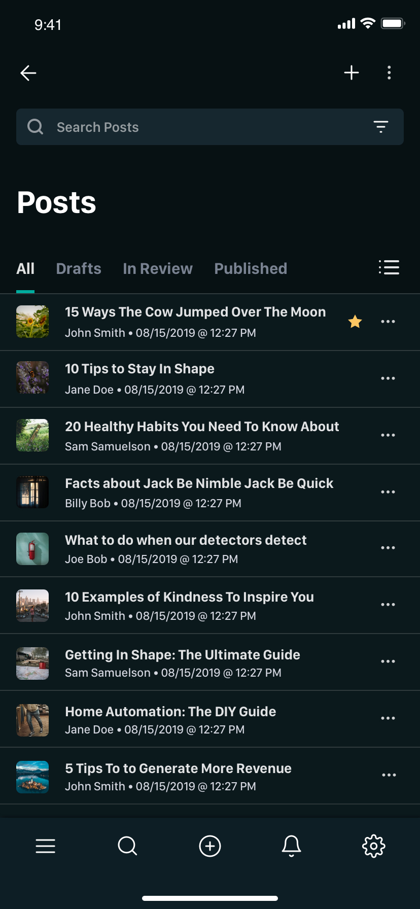
You'll see in these mockups that I've organized the navigation and combined it with collections moving the search bar at the top in the toolbar. We are now including additional columns which we would easily be configurable in config.yml. I also provided useful links in the navigation that pertain to the website you are working on. This makes it much easier to get around if need be. I've added icons to each collection that can be configurable as well. I am utilizing the full width of the viewport contrary to the pixel limit that we enforce in our layout today.
Moving on to the editor view, I also am taking full advantage of the browser width, fixing the editor to the left. I am conserving vertical space by keeping the inputs concise yet easily readable. In the toolbar I have included a language toggle so that we are better able to support translations in our websites content creation process.
You will also notice that I included the following additions which I am happy to create individual issues for these if need be
- Multi-language support
- Column configuration for each collection
- Edit
config.ymlright in Netlify CMS via Settings tab (we can already make markdown changes, why notconfig.ymlas well? - Specific site settings configurable in config.yml such as navigation, footer, social, etc that do not belong in it's own collection
- Breaking Media out of a dialog when browsing from main UI (not from a image or file widget)
Otherwise, we are keeping much the same. I just cleaned up the layout to support a cleaner, more intentional aesthetic that focuses on content.
I will update this issue as I create more screens. I figured I could at least get a dialog going to see if we might be able to make a concept like this a reality. Feedback is certainly welcome.
Edit
I have created a sandbox to illustrate this in action...
https://codesandbox.io/embed/netlify-cms-editor-design-j1cg3
I loved it!
How do you see mobile version?
Without first doing a mockup, I'd imagine something like this.

Just zoomed in but you get the idea. When I get a moment, I will do a mockup for mobile.
This is absolutely fantastic, awesome work @austincondiff!!
Thanks @erquhart! Let me know if I can help in any way if this is a direction you want to head in. Love what you guys are doing! 👍🏻
Because you can only see a limited number of widgets in these mockups, here is a comp showing how more widgets would look including the following:
- String / Text
- Date
- Image / File
- Markdown
- List
- Object
I think this saves a lot of space and makes things much easier to read. It adds much needed controls such as expand/collapse all for lists and moves the "add new" button to the bottom of the list so the user doesn't have to scroll to the top of the list every time they need to add new items.

Wow @austincondiff, these designs are fantastic. My only grip is that the expand / close state of the list & object widgets are too subtle, on a quick scan it's hard to tell which list item is being open & which was not.
It also would be nice to see how the image widget handles multiple images. I imagine the action buttons (remove image, replace image) would have to be placed somewhere else.
Thanks @d4rekanguok. I've updated my comment above to include a widget with multiple images.
Here are some different states for that multiple image widget just to give you an idea
Default

Hover

Drag

Action hover

Does anyone else feel the same way about the expanded/closed state of list items within the list widget being too subtle? Personally, I think it is pretty apparent, but I'd be interested to know if anyone else is of the same opinion.
@austincondiff I'm going to have to agree with @d4rekanguok. Lists with nested objects etc can get pretty crazy so I think we need to make it pretty explicit what's nested where.
@tomrutgers I've made a more complex example to demonstrate how it would nest.

This gives us more room to nest items. I think it is pretty clear while allowing more vertical screen real-estate for user content. We could get creative with sticky field labels to make it clear where you are if that helps.
@erquhart when you have the time, would it be possible to give a bit more in depth feedback on the design here?
I think the open/close state is still too subtle, but I love the overall improvements... @austincondiff are you working on a PR for this?
@austincondiff Here's a quick mockup of what I mean by a bit more explicit. Obviously it needs the same love and attention you've put into your designs, but hopefully this will help the discussion. (cc @d4rekanguok)

@tomrutgers I appreciate your mockup. Here is my feedback. I see that you have added each field into it's own containing box. While that might seem like it might make things more apparent, in my experience it tends to muddy up the design and can cause more confusion than clarity. The tendency is to put boxes within boxes to reinforce hierarchy of information, but that isn't always the best way to convey a sense of hierarchy. When we use boxes within boxes it increases the users cognitive load and also increases the amount of space required for the user to review to consume the same amount of information.
Check this out https://www.youtube.com/watch?v=5BbVixE0BSA
In this design, you would need to count twice as many lines to the left, for example, to identify how deep you are in the hierarchy, which can be confusing.
In my opinion informational hierarchy is pretty clear in my design. It makes more sense when looking at it in place rather than on GitHub. It also would make sense as the user is creating and interacting with their content especially with use of subtle animation cues. Context is everything. If we are trying to make things even more apparent we might take a look at other ways to do that other than nesting our inputs into boxes in my opinion.
I never illustrated this but what would you think about darkening or thickening the left line of the active item in my design? We could also play with hover states as well.
@austincondiff Right, I get what you're saying. I do agree that more boxes within boxes are not the answer to our challenge at hand. Consider my mockup as part of the discussion instead of what I think should be our final solution 😉.
With the mockup I am looking for a way to isolate parts of the content so the hierarchy is more apparent when a list item is expanded. I considered having some kind of background for the expanded item, but that might clutter things even more. A darkened or thickened line might help, though I do feel like making a bit more room (hence the extra margins) for the item you're working on can indeed help. I do love your minimal approach, but I feel like some extra help focussing is needed here and there.
Maybe something like this??

Further indention would also make things more apparent

I personally feel this disrupts the flow of the design perhaps in a negative way. I could be convinced otherwise though 😉
When I designed this, I played with the location of the line. It felt much better when the arrow indicating the list item is expanded pointed to the line as opposed to when the line lined up with the "Post" label like so...

Agreed. I like the thickened line. I get why there isn't a line between "post" and "related post" but somehow I think that an expanded item should feel more like a separated block. Definitely on the right track, and you pretty much nailed it with everything else so far!
@d4rekanguok I can work on a PR but I am not currently. I'd like to make a POC first to see how it feels. This can have a big impact into how subtle the expanded state is depending on how it is executed. I am thinking I am getting this feedback as a result of me not being able to demonstrate how I envision this behaving. Let me make a quick sandbox and we can play with a few things if it still doesn't feel like it does the job.
@tomrutgers Nothing is set in stone. I am happy to help get this to a point where we are all happy with it. I would like to get others unbiased feedback as well to validate this concern. Maybe once we have this POC done we can do a little testing.
@d4rekanguok @tomrutgers This isn't perfect by any means but it should give you an idea as to how this concept feels when interacting with it.
Here's the sandbox
https://codesandbox.io/embed/netlify-cms-editor-design-j1cg3
There is a lot here so take your time running through it. It also works great on mobile. I will continue working on this POC as I get time, but this should at least move the conversation forward.
@austincondiff I echo the other positive comments, this is super! Great UX.
I think it's correct with the vertical line and having it inline with the > arrow (not indented like the earlier example). I am undecided on whether it should be thick, but...
Perhaps the expanded item could use colour to help distinguish it further?
In the same way that when you edit a single field, the field is highlighted. So follows the same aesthetic? eg:

Thanks @rmcsharry. Love the thought. I considered this as a possibility. In this design color is used to indicate action. Because the line is colored, it decreases the prominence of the focused field. Also, what happens when there are multiple items expanded? In my opinion the repetition would lessen the value this effect has.
After doing this sandbox, I am pretty confident that this affordance is clear enough, especially after validating this with several people I’ve shown it to. I am happy to look further into it though if need be.
@austincondiff Good points both of which I agree with (prominence and multiple open expands). So probably not a good idea...or risk ending up down the Rabbit Hole! I think what you have is already a massive improvement so kudos :)
I believe I have found a way to make everyone happy and also make the interaction feel more natural. When hovering over the list header, I highlight the left border and make it a bit thicker. When you click on the list context menu and mousing over delete, I highlight the same border in red which tells the user exactly what will be deleted. Check it out for yourself in the sandbox here: https://codesandbox.io/embed/netlify-cms-editor-design-j1cg3
Thoughts?
@austincondiff Me likey. A lot! Such a creative use of hover makes me feel sorry for touch screen users. ;)
We're showing a lot of things at once, that's the core problem. We're trying to solve it by making boundaries and hierarchy clear yet subtle. What if we tried showing less things instead?
Using your sandbox as an example:
- The Features section shows a list of unopened features
- When a specific feature in the list is clicked:
- the name/title/identifier for that list item is added next to Features as a breadcrumb, eg. Features > Specific Feature
- the clicked feature expands to show its content
- the other features in the list are no longer visible
- some sort of back/close functionality closes the list item and goes back to the list
- if the feature itself contains a list, those list items would work the same, and a clicked item would be added to the breadcrumbs next to Featured
Thoughts?
@erquhart Thanks for the thoughts and feedback. I think it is pretty important to be able to see and edit multiple list items at once. In some use-cases it is important to reference data in other list items to create content for new list items. The idea you have presented, if I am understanding correctly in my opinion, is a little constrictive as far as what you can see at once.
How would this concept work when lists are within lists? I might assume you would add to the breadcrumb. This might be even more confusing because there is no positional context, it must be in reference to the breadcrumbs. Also, what if the list only contained booleans and images? How would the breadcrumbs work then? Just playing devils advocate and thinking about this from all angles.
I am personally pretty happy with how the sandbox turned out but I am open to looking at other ideas if you wanted to fork this.
@d4rekanguok @tomrutgers I am curious, what are your thoughts of the sandbox? Particularly the highlight of the line on hover of the header or delete actions to indicate the row in question. I know you have expressed this concern before but does this make hierarchy clear enough?
Hope this issue doesn't go silent. This would really make a huge difference in how people perceive Netlify CMS. As awesome as I think it is, most clients are still a bit iffy on the whole thing. It doesn't look as polished as the likes of WordPress, or Strapi, and that makes a big difference. I'd love to help out here if necessary. I can't design like you guys do, so I'm not even gonna try, but once you settle on a design you want to go with, I can help implement the HTML/CSS/React code.
@timmysmalls, I agree with you 100%. If there’s anyone that’s going to take on the likes of WordPress, it’s Netlify because they also drive the deployment process. But I’ll have to say as you had mentioned, with full respect to all those who have contributed towards this project, this CMS needs to be far more intuitive, in terms of the feature set it offers and in the UX. I really like the things they are doing over at tinacms.org. For example in-site editing. I love the site-builder experience while having the power of a CMS. I’ve brought this up before and I’ll bring it up again, in order for most enterprise customers to get on board, there needs to be user roles and permission or it all falls on it’s face. There also needs to be things like site-level settings, menus, etc that are abstracted away from the traditional collections model. There needs to be multilingual support. This project definitely has potential and I am willing as well to help out, but in order for me to invest any more of my time into this, I need to see that this can turn into something that can be adopted by both eager developers wanting to try the latest and greatest and by enterprise customers alike. Right now I have a hard time seeing that when user permissions is off the table just because GitHub doesn’t have support for them. Change my mind and I’m all in! 🙂
@austincondiff I like where you're going with this ;) I'd love to see Netlify CMS overtake WordPress! And as a developer the difference between Netlify CMS and WordPress is night and day. That's why I decided to start using it for clients (and no regrets there by the way!).
I think many of the features you're hoping to integrate are still a long way away. Personally, I use Netlify CMS for smaller clients. With the pricing over at Netlify right now being what it is, using Netlify CMS it's possible to get a free site up, CMS included, for 0 bucks a month. I think (and hope) that the features will grow. And I definitely think that should be possible.
Some of the things you mention, like site-level-settings, menu's, and even multi-lingual support are very doable. Right now everything is quite flexible, offering multiple ways to create read-only or singleton type entities. We could definitely create a 'default' that includes things like site-wide settings out of the box. Menu's are a matter of more options for customization. It's really purely presentational. I'm not even sure of everything that's offered at this point. Lastly, translations. Really, same thing. This could be just a matter of setting up the correct query. If you have www.mysite.com, and you wanted a spanish and an english section, you could automatically prefix the english versions of posts with /en, and /es for spanish. Set the correct language in the React Helmet element using information from your GraphQL query.
I know you can use Netlify CMS without Gatsby btw, so I'm sorry if I'm giving some people the feeling of being left out. I'm sure all these things would also be available in other static site/pwa frameworks, I just haven't worked with those, so I can easily see how I would do something in Gatsby ;)
I hope to take this one step at a time. I'm also working on some other things I'm hoping to open source soon enough (also mostly Gatsby... once, again, apology to Hugy and Jekyll developers out there ;) ). So improving the UI/UX would be really, really awesome at this point.
The sandbox blew me away. It looks awesome. One thing I'd like to change is the fact that the boolean toggle is all the way at the right. I think It'd be more intuitive to place it underneath the label. I also like the fact that you kept the labels around instead of using the typical 'placeholder turns into label trick', which given the consequences for accessibility wouldn't be a good choice in my opinion, especially for a CMS. For the dropdown, there are several approaches you can take. You could either hardcode the values into the dropdown. That would be alright for a first version. You could also set up a query that queries all the entries of a certain type, and add the field you want to query. For example if your config.yml contains this with a new 'relation' widget:
- { label: "Category", name: "category", widget: "relation", type: "postCategory", field: "name" }
we could automatically turn that into a query that fetches the 'name' field on all markdown instances with type 'postCategory' at build-time to create the dropdown list:
query {
  pages: allMarkdownRemark ( filter: {frontmatter: { type: { eq: "postCategory" } } } ) {
    edges {
      node {
        fields {
          name
        }
      }
    }
  }
}
The postCategory could in turn be its own collection type.
Possibilities are endless. But for now it's best to take it one step at a tie, and focus on making everything look more professional (like the designs you showed - holy ****, that would be awesome!). I'm not sure if this would then be the default layout for Netlify CMS, or something like a theme. Where we keep the core functionality of Netlify CMS that connects to GitHub, and AWS lambda as an abstraction layer, and build the UI on top of it as a theme. I'm not sure how much work would be involved in making that work. It depends on how @erquhart would feel about these changes. Then perhaps we can split this issue into a bunch of smaller issues that can be tackled one at a time.
@timmysmalls I could team up with you to do the UI development. Let's talk about it in detail if any decisions are made.
First of all, the redesign by @austincondiff is an amazing improvement. Thank you ⚡️
To build on top of your idea, I think general UI & UX improvements can be more powerful if a consistent visual brand direction for the NetlifyCMS was maintained. Right now it is based on the previous version, not a new vision. To overcome the confidence issue you mentioned, I think it can be valuable to create consistent NetlifyCMS's brand guides. This can also be used in their marketing websites. A consistent example is non-OSS headless CMS Sanitiy.io and here a great article of how to create brand guidelines.
Does anyone know if there is a publicly available brand strategy? The most ideal situation in my eyes would be a component-based Design System in Storybook which is maintained by the community. Is there a way to contribute on this level?
@danoszz I'm all for it! I'd love to work on it. But first I hope that we can come to some consensus as to what exactly we want, and what how the maintainers of the project see this fitting into Netlify CMS as it is. I'd love for this to become the new default design of the CMS. If we can't agree on one design, perhaps enabling different themes would be a less polarizing route to take. Definitely not my preferred option, because that would entail creating a stand-alone theme that needs to be updated and maintained separately from the main project.
As far as @austincondiff staying true to the original style of Netlify CMS (same logo, same colors, same fonts), I think that's really awesome as it is. I personally don't think it would be necessary to change any of these things. Just a makeover to give it a little bit extra 'awesome-sauce' would do. It seems the parts they were getting stuck on were some of the finer UX decisions, like if some of the nested forms were clear enough. I think the big question here is whether or not the core maintainers would be interested in using Austin's deign to replace the existing design as the default Netlify CMS skin (provided we can implement it, and hand it off to them in a PR, of course). I'd love to hear @tomrutgers and @erquhart opionions on this.
As far as the finer design stuff, such as Storybook, it looks really awesome, and I'm all for it, but I'll leave the design decisions to the people who know what they're talking about, and unfortunately I'm not one of those people ;) I'd be offering my JavaScript/React code-monkey services, and leave the design to you guys! Maybe I'll learn something along the way!
I think many of the features you're hoping to integrate are still a long way away.
@timmysmalls I'd agree. I think this is going to be one step at a time. We need to see a north star then we need to come to an agreement and create a roadmap around this so we know where to go and how to get there.
One thing I'd like to change is the fact that the boolean toggle is all the way at the right. I think It'd be more intuitive to place it underneath the label.
@danoszz The reason why I put it on the right of the label was to conserve vertical screen real estate (may not be much but it quickly adds up especially on mobile). Just as you see toggles on the right in your mobile devices settings, I thought it was best to follow that same paradigm.
I think general UI & UX improvements can be more powerful if a consistent visual brand direction for the NetlifyCMS was maintained. Right now it is based on the previous version, not a new vision.
My design was primarily based on Netlify's branding, not the original version of NetlifyCMS. I took from the fonts, colors, button styles, cards, etc, from their own website and used them in my designs to maintain a consistent look. Would you mind letting me know what you see that is not consistent with their brand that I may have missed?
If we can't agree on one design, perhaps enabling different themes would be a less polarizing route to take. Definitely not my preferred option, because that would entail creating a stand-alone theme that needs to be updated and maintained separately from the main project.
We need to agree on a design. I wouldn't imagine being able have set themes for NetlifyCMS, but I could see allowing developers to customize it. Something I often considered when designing this was the ability to easily set a primary color or even a custom stylesheet via config.yml.
My design was primarily based on Netlify's branding, not the original version of NetlifyCMS. I took from the fonts, colors, button styles, cards, etc, from their own website and used them in my designs to maintain a consistent look. Would you mind letting me know what you see that is not consistent with their brand that I may have missed?
There are no inconsistencies in your design. It is very well done actually (big ups). But what I mean is that NetlifyCMS doesn't have its own brand (guidelines). Currently, the look and feel of NetlifyCMS is based on Netlify's identity. I think it is important that NetlifyCMS should have different branding since it is a separate product. To become a standalone product, backed by Netlify, is also needed to tackle the confidence issues.
We need to agree on a design. I wouldn't imagine being able have set themes for NetlifyCMS, but I could see allowing developers to customize it. (..)
Yes I agree. But agreeing on such a subjective topic through Github is hard. Rebranding is a strategic process where all stakeholders need to be involved. It will take a couple of days working with a designer, the core team and Netlify to identify the right direction.
But again, I am not aware of the roadmap of NetlifyCMS. So I might be addressing a complete unnecessary improvement. Does anyone know who is aware of the NetlifyCMS roadmap? I would love to collaborate with someone to strengthen NetlifyCMS on a UX and brand perspective.
(...) Something I often considered when designing this was the ability to easily set a primary color or even a custom stylesheet via config.yml.
This is possible! You can import a custom stylesheet at src/cms/cms.js with import './yourstylesheet.scss'
As far as the styleguide is concerned I don't mind it borrowing from (or being taken straight from) Netlify itself. It looks very clean. But I wouldn't mind if Netlify CMS would go a different route alltogether. For me getting the bulk of austin's work as the main UI for Netlify CMS is my main objective with this issue. I think it would really help adoption of the CMS, and furthermore, it would make clients happier. Right now when I show them their new Netlify CMS backend they consider it "functional", and they're happy that it's free, but it lacks the "wow" factor. And while I get all excited from the Git backend, non-tech people could usually care less about what kind of storage it uses. Their initial response, and how they will feel about the product in general, is largely determined by the aesthetics of the whole thing.
But first, we need some sort of consensus from - among others - the maintainers, like I called for in my previous post.
they consider it "functional", and they're happy that it's free, but it lacks the "wow" factor.
I'd second this, though I'm finding users actually struggle with things like objects/lists... when things get complicated the UI can lean towards looking broken.
The sandbox that @austincondiff has shared is a massive improvement in UX... particularly in those more complicated areas.
I have yet to use Netlify CMS, I'm just passing through evaluating several different solutions.
In terms of functionality this project appears to align the closest with my requirements, but lacks the visual polish of some of the others. Ultimately the functionality should win out over the aesthetics, though it often helps when trying to convince other stakeholders who care less about the technology side of things.
I'm really impressed with the mock-ups and proof of concepts that @austincondiff has developed so far, it looks as though a good amount of consideration has been put into them, it would be a shame if the momentum were to tail off.
Personally, I prefer the original proposal over the changes that followed. I think a focus on minutiae has started to creep in; the concept as a whole is a definite improvement and might benefit from actually being implemented, getting feedback from the wider community, and then iterating on the finer points.
Great stuff guys, now to put together a Netlify CMS test project…
@kriswillis Yeah, I'm afraid it's a little too late for that ;) I'm surprised no one closed this issue yet. I'd love to see it happen, but it's been open for months, and despite the community support, and people volunteering to help put it into action it doesn't look like there are any real plans to put this together.
@kriswillis @timmysmalls I'd really like to put this in place but there was too much push back and conflicting opinions to justify building it out and pushing a PR in hopes it would be merged. There would be too much time involved for me to go at it alone. If someone wants to help me do it I would consider it but my schedule is already pretty busy how it is. I actually applied to Netlify and interviewed with @erquhart at one point so I could dedicate 100% of my time on things like this but in the end I never got hired (missed opportunity?)
In any event I am happy to work on this if I could get some assurance that there was a possibility that a PR would get merged and if I could get some help doing this.
@austincondiff That's exactly where I'm at at this point. I would love to invest my time in building this, even though I'm busy, but I'd need some assurances that there's a path towards it being integrated into the actual project. To know that I'm not just wasting my time on a PR that never gets merged, or stays in limbo as it collects new merge conflicts every week.
But that would require a response from the maintainers, and I think we've tried hard enough to get their attention, but they seem to have abandoned this issue late September. Without some assurances I don't think it's a good idea to get started on this, given how much time it would cost.
@timmysmalls Exactly.
@erquhart @tomrutgers Thoughts? Of course you aren't going to say, sure, we'll merge in this black box. But I'd like to work with one of you guys to get it to a point both we as a community, and you guys as maintainers are comfortable merging it in.
Also if we could get detailed feedback/concerns around these mockups and prototype we could work towards resolutions and start development when we are all happy. The problem here in this issue is generally speaking it seemed like I got a lot of "Thats really cool but..." responses. Let's work out the kinks. Instead of just talking about it. I tried doing some of that earlier but it all just fizzled out. Is this even a direction y'all want to consider? It seems like the community is really getting behind it.
Hey all 👋 - looks like we're overdue for a response here :)
While all of this conversation was going on back in October, I was pretty heads down landing a new full time maintainer. We ended up bringing in @erezrokah (🙌) , you may have seen him around if you follow the repo. Since then we've been focused on knocking out the most requested features, and the top three are now closed - Editorial workflow support for all backends already has a WIP PR that will be merged soon. After that is Multilingual support.
@austincondiff you're dead right about UI improvements bolstering confidence, and that's exactly why I've chosen not to be bullish on this until now - without critical functionality like multilingual, and basic integration requirements like page bundling for Gatsby/Hugo, an awesome UI could make folks overconfident in what this CMS can do for them. My point in the last paragraph, though, is that this is changing rapidly 🚀
From where we stand currently, I'm definitely ready to work with everyone here to improve our veritable cornucopia of UI issues. A lot of great points have been made in the conversation so far - here's what I'm thinking:
- I agree with the sentiment voiced a few times above that Austin's original mockups are pretty darn good, and piddling with details too much can easily take the wind out of our sails
- Nested content in the editor (lists/objects) is a monumental UI problem unto itself - for this initial effort, the goal should be to simply not make it worse.
- We need a breakdown of dedicated issues, such that every PR can close one specific issue rather than multiple PR's chipping away at this one umbrella.
@austincondiff let me know how active you want to be on this effort. This issue has been a great vehicle for conversation, but we need a proper, somewhat concise epic describing scope and linking to feature requests. Also note the prior art in #490, a lot of the conversation and feedback there coincides with our discussion above.
@timmysmalls, @danoszz, same for you on the question of how involved you're able to be.
Thanks to all of you for your patience on this issue, and willingness to bring solutions. We're definitely taking it seriously, and couldn't agree more on the implications of a solid user experience for Netlify CMS and its users. Let's get it 💪
@erquhart That is great to hear. I am excited for the future of Netlify CMS. I am currently pretty busy for the next few weeks but I am happy to take on a task or two at a time.
What is the target? My prototype? We need a north star. I am going to lean on you on how we want to divvy up work.
Obviously my code sandbox is a prototype but I used several things that are not currently dependencies of the actual project. What do you want to do there?
How do you want to handle svg icons? In the code sandbox I created individual components from each icon. Check it out and tell me if you can think of a better way to handle this.
Let's first start with those questions and that will hopefully get the ball rolling.
@erquhart Sounds great! As far as involvement is concerned, I'd love to take an active role in the process. I have to balance it with work, but I'm all for contributing to this project. Looks to me like the scope is quite large, so creating a good gameplan should be a major priority. A style guide and a basic pattern library should probably be the first step. It looks like @austincondiff already has quite a few bases covered there with his and his sandbox.
For me a good place to start would also be to take a look at the existing codebase, to get acquinted with the coding conventions already in place, and to get an idea of the architecture. State management, CSS conventions, that sort of thing. And then tackling smaller issues one by one in a feature branch.
@austincondiff Couldn't we turn the SVG's into a spritesheet? I have to admit I've created components for icons myself in the past, but I've decided that I should really start using sprite sheets for my next project (new year's resolution) ;). I don't usually style SVGs in the XML itself, like you did in the sandbox.
As far as the North Star is concerned, I'd say giving the CMS as it is today a make-over would probably be a good goal to set. So sticking to the interface. Many great ideas have been floated in this discussion, but most of them are entirely separate from the UI, so we should avoid losing ourselves in those suggestions at this point.
@erquhart I am down to take an active role in this process together w/ @austincondiff and @timmysmalls
Maybe, we can set up a meeting to syncronize about our plans and how we can proceed?

Sounds like we're all in!
A few responses:
- Agreed w/ @austincondiff that defining objectives (north star) is our first priority - the mocks above are solid, but a fair amount of out-of-scope new feature work would come with implementing the design as a whole.
- Agreed w/ @timmysmalls that familiarity with existing architecture is critical - we may need to start by storybooking the current UI, then bringing in new components from there.
- SVG's were mentioned a few times so I'll say that we currently have custom ones being built as React components, easy enough to expand/replace (totally open to svg sprites too): https://github.com/netlify/netlify-cms/tree/master/packages/netlify-cms-ui-default/src/Icon
Also agreed w/ @danoszz that a call would probably be a good next step. @alexbuiltit (working on mobile UI) and @tomrutgers (ux maintainer) may be interested to join as well. Would Tuesday or Thursday of next week be possible for all interested?
@erquhart Tuesday or Thursday both work for me depending on the time. I'd imagine evenings would work best for most people. Tuesday at 4pm or 5pm work for everybody? 🕓
It would also be helpful to communicate via something like Slack for smaller things and throughout the dev process for all working on this UI design effort. 📣
Regarding our north star ✨, as I was designing this I already new several things were out of scope such as the language picker. I think they are part of the design so I included them in the prototype. I see this as being iterative so I don't expect everything to make it in this first pass, just as long as it is an eventual goal. More of this can be discussed in detail on our call. ✅
Regarding the icons, it sounds like you were heading the same direction I went in. Check out /src/components/icons in the sandbox here https://codesandbox.io/s/netlify-cms-editor-design-j1cg3 👀
@alexbuiltit @tomrutgers Of course this design needs to be fully responsive. I had a few ideas how this design might break down on smaller devices if you ate interested. We can discuss this on the call as well. 📲
Thanks everybody. Things like this are refreshing to see in the open source community! I am pretty certain we all have busy schedules, but together we can make this happen! 💪
I'm afraid tuesday probably won't work for me, however, thursday should be fine! If someone else can't make it thursday, you can shedule tuesday. It may be difficult to schedule something that works for everyone, so if not everyone can be present at a meeting, I think that's something we're going to have to get used to.
What timezone are we using by the way ;) ? I live in the Netherlands. I believe the same goes for @danoszz! I'm a freelancer, so I'm quite flexible when it comes to time, so long as it's not in the middle of the night. The time difference is 7 hours (it's 7 hours later in the Netherlands than it is in Texas), which makes things a bit harder, since evening in the Netherlands will be the middle of the day in Texas. I'm also fine with talking on the weekends.
I fully agree with regards to the slack channel. I don't really have a preference for Slack/Skype/Hive/Chanty/...., so it's your pick!
And lastly, @austincondiff yes, it is great to see this sort of thing take off! It's what I like about open source. Using awesome tooling made by others for free, and contributing to that tooling, for others to use for free. Netlify CMS is a very unique concept, which is why I started using it in the first place. It has the potential of making the lives of many webdevelopers a lot easier. And I'd love help out with that effort!
I believe @tomrutgers is in the Netherlands, and @erezrokah is in Israel, same timezone. We'll do it earlier in the day.
We can reference UTC time so we're all on the same page.
I have a bit less availability than I thought for Thursday - I can do 5pm UTC at the earliest. I'm pretty wide open on Friday, available 2pm UTC through end of day.
Once we agree on a time I'll send an invite out with a Zoom link for the call 👍
Great to see things working out this fast! Are you working on Fridays due to Shabbat @erezrokah? I am used to working on Sundays instead of Fridays if that works better for you.
My availability syncs with @erquhart.
- Thursday 5 PM UTC
- Friday 2 - 6 PM UTC
- Sunday 10 - 6 PM UTC
@timmysmalls and @tomrutgers are you located in Amsterdam? If you'd like, you are welcome to join us in our office for the call and to meet up.
I'm not working Fridays, but can make an exception (though not this Friday). Thursday 5PM UTC works for me.
Invite has been sent for Thursday, Jan 16 (tomorrow) at 5pm UTC, with a Zoom link attached. Looking forward to it!
I'm in! And thanks @danoszz, friday would have been fine for me to come to Amsterdam, but tomorrow I'll have to be here (in Leiden) all day. Looking forward to talking to you guys tomorrow!
Hey!
Thank you so much for including me in the conversation and I would love to be involved in improving the overall UI. Unfortunately, I am unable to make tomorrows meeting but still do want to be involved.
Hopefully, there will be a way I can catch up afterwards?
Cheers
I think it might be a good idea to post meeting notes here for all those that cannot attend. We will make a point to do that.
@austincondiff along with everyone else in the thread, thank you for putting in the time and brain power to work on improving Netlify CMS.
I would like to support the work in developing Netlify CMS. I'm still working my way through reading the entire thread, but I wanted to be sure to take action on the inspiration I'm feeling by sending this message.
Reading through the thread (so far) I have found the concerns of Netlify CMS requiring a brand identity and the development of the UX/UI to be an area that I am confident in providing support. I'm a designer by trade and a novice developer. I've fallen' in love with the JAMSTACK methodology so I have been teaching myself code and understand today's modern web languages.
Some of my work can be found here, keep in mind it is 2 years old, and yes, I am working on updating everything.
@CyrusDwayne feel free to join our slack channel https://netlifycms.slack.com/archives/CSCTG14DQ
I realized I never considered how validation would work in our forms. Thoughts on this approach?

Dark mode anyone? 🌙😈

Mobile support + darkmode = 💯. It would be great if the CMS' design theme or components are exported so third party plugins can easily use them as well!
@austincondiff and others: Thanks for your work here. Will be following it in earnest.
The question that occurs to me as I read through the thread is whether Netlify is providing any compensation for this work which will have tremendous value to them as a business. Seems worth hiring Austin or sponsoring his work here, unless his current employer is already doing that.
My sincerest apologies if I’ve misread or misunderstood something!
@adamavenir - really glad you’re appreciating the work here!
To give some context, Netlify CMS is a completely free-to-use JavaScript app, and was intentionally built to work anywhere, with no requirement of being run on the Netlify platform. Netlify has invested significantly in this open source project by committing hours from paid team members to work on it, in hopes that it will be valuable for businesses, agencies, or anyone else wanting a free, open source, Git-based CMS for the JAMstack.
While the vast majority of work on Netlify CMS over the last four years was contributed through this time investment, community members like @austincondiff and so many others add to that investment tremendously, and we hope that everyone who uses Netlify CMS is as appreciative as we are.
Much of the benefit of open source contribution is inherent to the model: resulting work is free for anyone to use, anyone can collaborate and contribute to the success of the project, and community members can build the features they want without waiting for someone else to prioritize them. Community contributions improve the project for everyone.
Lastly, there’s a guide from GitHub on navigating OSS funding - I’ve only scanned it myself, but you may find relevant and useful: https://opensource.guide/getting-paid/
@erquhart I appreciate it. I’m reasonably familiar with the business/open source/funding tightrope, having run a company for 12 years that has made a number of meaningful open source contributions. I have also seen a lot of businesses benefit significantly and individual contributors burn out, and the generosity and joy of those contributions melt into less fun feelings.
I was expressing my personal opinion based on the observation of Austin saying he’d applied to work at Netlify and push this forward and that didn’t go through, but noted that he’s continuing to push it forward regardless and that made me feel a little uncomfortable.
There’s a whole host of context that is obviously outside my purview and, as a result, expressing my opinion may be fully unnecessary here, but I had a twinge of discomfort in reading through the thread and felt a need to at least raise the concern.
As I've worked on this design, I've realized that my initial mocks of the collection view do not consider some features that Netlify CMS currently offers. I have made several modifications to accommodate these features. I'd love to get some feedback.


And here are some mobile designs...


Just a quick update, here are my latest designs that align a bit closer with the mobile screens above.


My plan moving forward is to update our stories in storybook to reflect these design changes. Then I plan on replacing the existing components in the current UI with these newer components.
I'd really appreciate any help I can get. Currently I am the only one working on this design effort. Let me know if anyone is interested in contributing. Thanks!
For anyone that wants to contribute to the design, I am converting all my designs to live in Framer web. Send me your email address via Slack and I can invite you to the project.
Hey @austincondiff how can I contribute implementing those to the CMS? Awesome job by the way! I love it!
Similar to @thinklinux I would also like to contribute to implementing these awesome designs 💪 it seems I can't join Slack however? 🤔
@jochemkeller Hey. What's the problem with slack that you are having? I didn't have any issues joining in. We will even have a discussion today with @austincondiff 🥳
@jochemkeller Just sent you a message via your website.
Awesome, thanks @austincondiff! Let's do this 💪
thanks everyone, this is great work! Have you guys thought about adding an entrypoint to customize the list item summary as well? I know that you can use the field values but this hardly works for more complex transformations, images and data linked via relation fields.
@joernroeder that has crossed my mind and that is an excellent idea. Do you have anything in particular in mind? Also, feel free to create a separate issue and refer to this one.
@erezrokah I was working on the UI for the new Editor component. Could you tell me how the configurations are loaded currently from the config.yml file ? Please point me to all the relevant files.
Could you tell me how the configurations are loaded currently from the
config.ymlfile ? Please point me to all the relevant files
The config.yml is loaded an validated here:
https://github.com/netlify/netlify-cms/blob/04ccb56e668ce24372675b8e937c773215a6d2d6/packages/netlify-cms-core/src/actions/config.js#L261
The current editor here:
https://github.com/netlify/netlify-cms/blob/04ccb56e668ce24372675b8e937c773215a6d2d6/packages/netlify-cms-core/src/components/Editor/Editor.js#L1
I have a few issues with the form fields in terms of usability.
This is the prototype i have base this on: https://codesandbox.io/s/netlify-cms-editor-design-j1cg3
- The lack of defined field borders make it difficult to know the clickable area.
- The lack of borders makes one think that the horisontal dividers are the form line. This is not the case, and clicking them does nothing. The result are effectively invisible form fields.
- The horizontal borders make the form look busy and incoherent.
- The list widget has borders on halv the field groups (not the fields). This could be very confusing when using nested lists or similar.
- The drop downs have a sligt delay. This makes the interface feel unresponsive. I would have "animate-in" be much shorter or removed entirely. The centered animation scale should be right aligned, since the menu is coming from the clicked chevron.
I think field borders are a must-have. And to minimize clutter, better use of background color i favor of borders for field groups would go a long way to make the editing experience better.
I would like to take a stab at a revised version if this is not to late.
@austincondiff I just want to say how much I appreciate your work here as the UI is the single biggest barrier of Netlify CMS to use it for all use cases (especially outside English speaking and technical audiences).
That said, if you need help, be it with design, front-end or accessibility, I'm glad to help. Accessibility is especially important to me, so I would really like to help test with screen readers and fix potential issues.
The UX Project for v3 that tracks integration of Awesome UI suggested by @austincondiff was last updated a few months back.
We would like to know
- When are we launching?
- Where are we now?
- How can we help?
Thanks a ton!
@mrdotkg the status hasn't really changed. The UI rewrite effort was spearheaded by @austincondiff, initially aided by a few others. Austin completed an enormous amount of product, design, and implementation work (plus UI docs in storybook), but the task is bigger still. There's no roadmap for all of this, he sort of brought the vision. Anyone looking to take it further is welcome, but will need similar skills and tenacity as this will continue to be a community led effort as things currently stand.
@bachmannn you're not wrong - theming would be the ideal approach. That said, while I haven't built the v3-ui-redesign branch, the packages directory compared to the main branch are roughly equal weight, so I'm not certain these changes being implemented as the new core would actually hurt.
Any intentions of implement design any time soon? I would love to be one of the contributors.
Hi @AbdallahAbis, not much had changed since @erquhart last comment. If you'd like to have a look at the code it's in https://github.com/netlify/netlify-cms/tree/v3-ui-redesign
Has this UX effort been abandoned or just too many other issues/features to address first.
Hi @timbomckay, this UX effort not currently being work on.
Other contributors have a take a more incremental approach, see #5729 as an example.
@martinjagodic Please put this on your radar ❤️
@airtonix It definitely is. Austin already joined the Decap discord and discussions are being held there
how can i apply this to my site
@pxrpl you can't because this feature is still in development.
This proposal is amazing and it's a pity it has been ignored for 4 years :-/
@DannieBGoode I agree, but it's a complex situation. Are you willing to contribute to moving this forward? If yes, please join the #ux channel on our Discord server.
PS: Working on it
https://github.com/Daniel-Mendes/decap-cms/tree/next


PS: Working on it https://github.com/Daniel-Mendes/decap-cms/tree/next

that looks amazing!

Working on porting all stories !!

Working on Header AppBar
How can I contribute to the development of this ux? it's really fantastic :)
Any news regarding that? Would be amazing...
Any news regarding that? Would be amazing...
You can follow the progress in the ux discord channel