Increase Visibility of Data Usage Text on "Active/Leftover Data" Pages
lightonflux opened this issue · 1 comments
Currently, the text label for used data on the "active data" page/view is small and it's a bit "hard" to skim the list quickly.
After all, the most important information is the amount of space that is used on disk, but currently is it's rather small and below the application name. It should have the same visual hierarchy as the name.
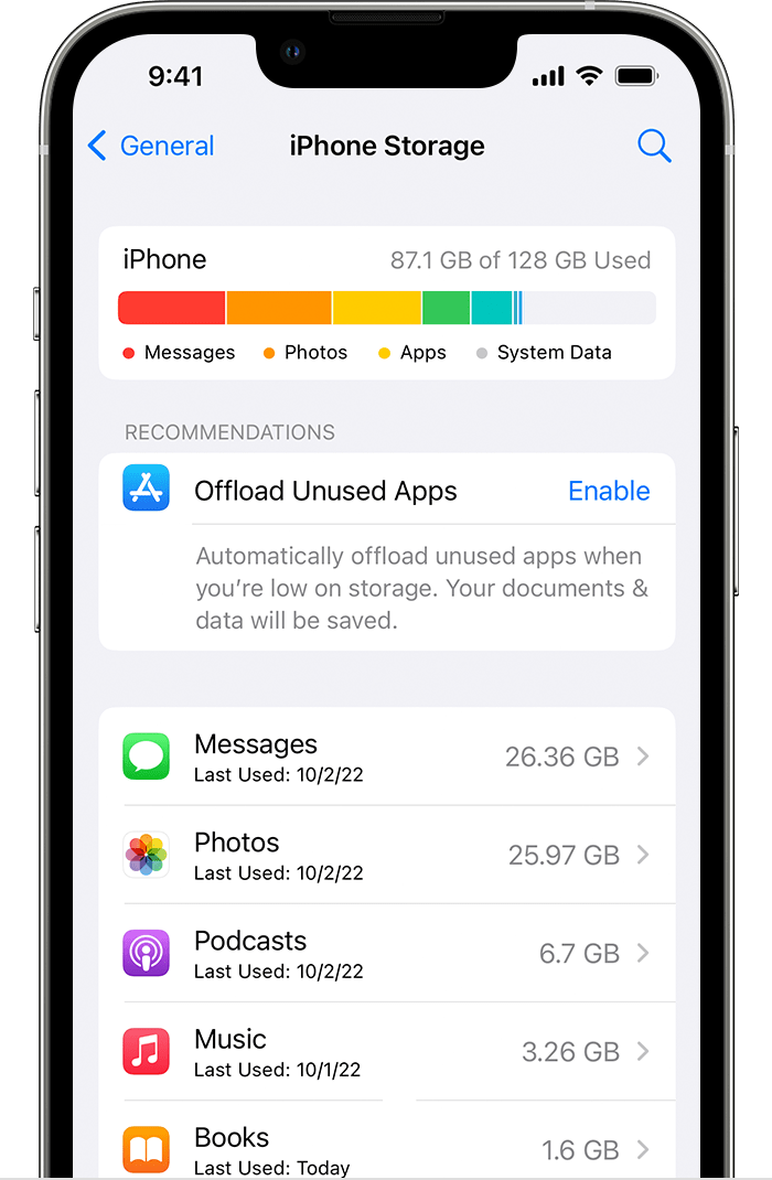
In most tools and tables about data use, the name and size (or number) is usually on the right, with a sum at the top or bottom of the table.
Gnome Disks
iOS Settings
Warehouse
Suggestion on the right.
Moving the text to the right and enlarging it would reduce the empty space and make it more prominent and move it into the vertical line with the sum on top.

The space could be used even more efficient if the three buttons did not have their own row, but it did not come up with a satisfactory solution so far that does not involve overlay buttons.
The suggestion has some issues when the application window is narrow:
The sum is moved below the title and to the left, which is not needed with the English Translation, but it could be necessary in languages where the string "Active Data" is longer. Moving the sum from right to left, messes up the vertical alignment.


