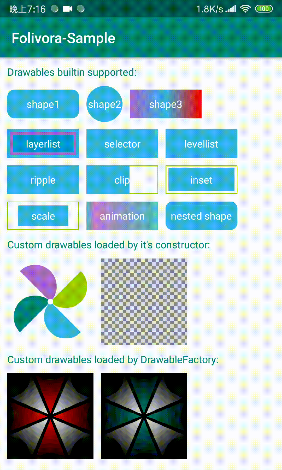
对于android开发者来说,在layout文件中引用drawable来设置View的背景或者ImageView的src是很常见的事情,需要我们在drawable文件夹下写好xml文件就可以应用了,但是有许多drawable文件可能只被使用了一次,也有可能我们只是为了实现一个简单的圆角背景的功能。越来越多的drawable文件导致开发和维护成本的增加,有没有什么方法可以直接在layout文件中去创建drawable呢,Folivora为你提供了这样的功能。
Folivora可以为你的View设置一个背景或者ImageView的src,当前支持的drawable类型有
- shape (GradientDrawable)
- selector (StateListDrawable)
- ripple (RippleDrawable)
- layerlist (LayerListDrawable)
- levellist (LevelListDrawable)
- inset (InsetDrawable)
- clip (ClipDrawable)
- scale (ScaleDrawable)
- animation (AnimationDrawable)
- 自定义的Drawable (新增)
- STEP1 : 添加Gradle依赖,在项目的build.gradle中加入
  dependencies {
    implementation 'cn.cricin:folivora:0.0.5'
}- STEP2 : 在layout.xml中加入自定义的属性, 告诉Folivora如何创建drawable,Folivora提供的内置drawable属性前缀如下
- shape -> shape
- selectror -> selector
- layer-list -> layer
- level-list -> level
- clip -> clip
- scale -> scale
- inset -> inset
- ripple -> ripple
- animation -> anim
例如所有的shape属性设置的前缀都是shape, 如shapeSolidColor, shapeCornerRadius等, 在设置了drawableType
之后,敲出指定的前缀,IDE会自动的给出所有该drawableType可用的属性
shape

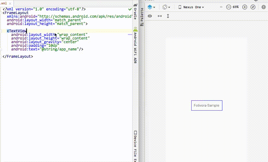
我们来试着在xml中书写Folivora为我们提供的属性来实现上图中第一个的圆角shape效果
<TextView
  android:layout_width="100dp"
  android:layout_height="40dp"
  android:text="shape1"
  android:gravity="center"
  android:textColor="@android:color/white"
  app:drawableType="shape"
  app:shapeCornerRadius="6dp"
  app:shapeSolidColor="@color/blue_light"/>
layerlist

<TextView
  android:layout_width="100dp"
  android:layout_height="40dp"
  android:text="layerlist"
  android:gravity="center"
  android:textColor="@android:color/white"
  app:drawableType="layer_list"
  app:layerItem0Drawable="@color/blue_light"
  app:layerItem1Drawable="@color/blue_dark"
  app:layerItem1Insets="4dp"
  app:layerItem2Drawable="@color/blue_bright"
  app:layerItem2Insets="8dp"/>
levellist

<!-- this level-list level is 95, levelItem1 matches -->
<TextView
  android:layout_width="100dp"
  android:layout_height="40dp"
  android:gravity="center"
  android:text="levellist"
  android:textColor="@android:color/white"
  app:drawableType="level_list"
  app:levelCurrentLevel="95"
  app:levelItem0Drawable="@color/green_dark"
  app:levelItem1Drawable="@color/blue_light"
  app:levelItem1MaxLevel="100"
  app:levelItem1MinLevel="90"/>
selector

<TextView
  android:layout_width="100dp"
  android:layout_height="40dp"
  android:textColor="@android:color/white"
  android:gravity="center"
  android:text="selector"
  app:drawableType="selector"
  app:selectorStateNormal="@color/blue_light"
  app:selectorStatePressed="@color/blue_dark"/>
ripple

<TextView
  android:layout_width="100dp"
  android:layout_height="40dp"
  android:textColor="@android:color/white"
  android:gravity="center"
  android:text="ripple"
  app:drawableType="ripple"
  app:rippleColor="@android:color/white"
app:rippleContent="@color/blue_light"/>使用ripple的确是酷炫多了,但是ripple效果是5.0之后引入的,那5.0之前的设备怎么办呢,Folivora为你提供了RippleFallback接口,用来创建一个替换RippleDrawable的Drawable实例,让我们试着用一个selector来代替ripple:
Folivora.setRippleFallback(new Folivora.RippleFallback()){
  @Override
  public Drawable onFallback(ColorStateList ripple, Drawable content, Drawable mask, Context ctx){
    StateListDrawable sld = new StateListDrawable();
    sld.addState(new int[]{android.R.attr.state_pressed}, new ColorDrawable(ripple.getDefaultColor()));
    sld.addState(new int[0], content);
    return sld;
  }
}
clip

<TextView
  android:layout_width="100dp"
  android:layout_height="40dp"
  android:gravity="center"
  android:text="clip"
  android:textColor="@android:color/white"
  app:clipDrawable="@color/blue_light"
  app:clipLevel="6000"
  app:drawableType="clip"/>
inset

<TextView
  android:layout_width="100dp"
  android:layout_height="40dp"
  android:gravity="center"
  android:text="inset"
  android:textColor="@android:color/white"
  app:drawableType="inset"
  app:insetAll="4dp"
  app:insetDrawable="@color/blue_light"/>
scale

<TextView
  android:layout_width="100dp"
  android:layout_height="40dp"
  android:gravity="center"
  android:text="scale"
  android:textColor="@android:color/white"
  app:drawableType="scale"
  app:scaleDrawable="@color/blue_light"
  app:scaleGravity="center"
  app:scaleHeight="0.3"
  app:scaleWidth="0.3"/>
animation

<TextView
  android:id="@+id/animation"
  android:layout_width="100dp"
  android:layout_height="40dp"
  android:gravity="center"
  android:text="animation"
  android:textColor="@android:color/white"
  app:animAutoPlay="true"
  app:animDuration="300"
  app:animFrame0="@drawable/animation0"
  app:animFrame1="@drawable/animation1"
  app:animFrame2="@drawable/animation2"
  app:animFrame3="@drawable/animation3"
  app:animFrame4="@drawable/animation4"
  app:animFrame5="@drawable/animation5"
  app:animFrame6="@drawable/animation6"
  app:animFrame7="@drawable/animation7"
  app:animFrame8="@drawable/animation8"
  app:animFrame9="@drawable/animation9"
app:drawableType="animation"/>Folivora现在支持在drawable中嵌套shape了,除了animation以外,所有的drawable的子drawable除了可以使用@drawable/xxx和颜色之外,新增了shape/shape1/shape2/shape3/shape4这5个值,参考定义shape的例子,替换相应的前缀即可, 我们来定义嵌套了shape的selector试一试
<TextView
  android:layout_width="100dp"
  android:layout_height="40dp"
  android:gravity="center"
  android:text="selector"
  android:textColor="@android:color/white"
  app:drawableType="selector"
  app:selectorStateNormal="shape"
  app:shapeSolidColor="@color/blue_light"
  app:shapeCornerRadius="10dp"
  app:selectorStatePressed="shape1"
  app:shape1SolidColor="@color/blue_dark"
  app:shape1CornerRadius="10dp"/>
效果是这样的

从0.0.4版本开始,Folivora除了支持自带的drawable以外,还支持使用自定的drawable类型了,让你使用自定义drawable就和使用自定义view一样轻松。这里我们以自定义一个绘制纸风车的WindmillDrawable为例,来让Folivora为我们提供支持:
- 首先我们和自定义
View一样,为WindmillDrawable提供自定义的属性:
<!-- 和自定义view相同,这里declare-styleable的name最好和自定义drawable的名字一样 -->
<declare-styleable name="WindmillDrawable">
    <attr name="wdSize" format="dimension"/> <!-- 纸风车的默认大小 -->
    <attr name="wdColor0" format="color"/> <!-- 纸风车第一个叶子的颜色 -->
    <attr name="wdColor1" format="color"/> <!-- 纸风车第二个叶子的颜色 -->
    <attr name="wdColor2" format="color"/> <!-- 纸风车第三个叶子的颜色 -->
    <attr name="wdColor3" format="color"/> <!-- 纸风车第四个叶子的颜色 -->
    <attr name="wdCenterDotRadius" format="dimension"/> <!-- 中心圆的半径 -->
    <attr name="wdCenterDotColor" format="color"/> <!-- 中心圆的填充色 -->
    <attr name="wdRotateDegrees" format="integer"/> <!-- 纸风车旋转角度 -->
</declare-styleable>可以看到,自定义属性这部分和普通的View自定义属性是一样的。name和自定义drawable的类名相同就行了,Folivora就可以在layout文件中为这些drawable的自定义属性提供属性的自动提示了
- 创建自定义的
WindmillDrawable,继承自Drawable, 提供一个public WindmillDrawable(Context ctx, AttributeSet attrs)的构造方法,在这个构造方法里就可以获取自定义的属性, 代码如下:
public WindmillDrawable(Context ctx, AttributeSet attrs) {
  TypedArray a = ctx.obtainStyledAttributes(attrs, R.styleable.WindmillDrawable);
  int count = a.getIndexCount();
  for (int i = 0; i < count; i++) {
    int index = a.getIndex(i);
    switch (index) {
      case R.styleable.WindmillDrawable_wdSize:
        mSize = a.getDimensionPixelSize(index, mSize);
        break;
      case R.styleable.WindmillDrawable_wdColor0:
        mColors[0] = a.getColor(index, mColors[0]);
        break;
      case R.styleable.WindmillDrawable_wdColor1:
        mColors[1] = a.getColor(index, mColors[1]);
        break;
      ...
      default://no-op unexpected attr index
        break;
    }
  }
  a.recycle();
}这部分代码其实和自定义View的属性获取没有什么区别,主要就是给drawable添加一个构造方法,具体绘制代码就不贴了,如果想要查看具体细节,可以点击这里查看源码
- 在layout文件中使用自定义drawable,Folivora提供了
drawableName属性,使用该属性指定需要使用的drawable:
<View
  andorid:layout_width="120dp"
  android:layout_height="120dp"
  app:drawableName="cn.cricin.folivora.sample.drawable.WindmillDrawable"
  app:wdColor0="@color/blue_light"
  app:wdColor1="@color/green_dark"
  app:wdColor2="@color/green_light"
  app:wdColor3="@color/purple"
  app:wdRotateDegrees="45"/>
运行之后的效果:

到这里,Folivora就会为该View设置我们指定的drawable了,有人可能就会问了,drawable名字这么长,写起来会不会太复杂了,不用担心,当你敲出drawableName的时候,Folivora会为你自动提示可用的drawable名字的,并且该drawable的自定义属性也会有自动提示。
如果我的自定义drawable没有上面指定的构造方法,并且我没办法直接修改该drawable的源码来添加这个构造方法该怎么办呢?
Folivora考虑到了这一点,有些drawable的源码我们没法修改,但是它总会有向外提供设置属性的方法吧?所以,我们提供了一个DrawableFactory接口,假设WindmillDrawable只有一个无参的构造方法,但是提供了设置各种属性的方法,我们需要让Folivora支持WindmillDrawable,可以这样做:
Folivora.addDrawableFactory(new Folivora.DrawableFactory() {
  @Override
  public Drawable newDrawable(Context context, AttributeSet attrs) {
    TypedArray a = context.obtainStyledAttributes(attrs, R.styleable.WindmillDrawable);
    WindmillDrawable d = new WindmillDrawable();
    d.setColor0(a.getColor(R.styleable.WindmillDrawable_wdColor0, Color.BLACK));
    d.setRotateDegrees(a.getInt(R.styleable.WindmillDrawable_wdRotateDegrees, 0));
    ...
    a.recycle();
    return d;
  }

  @Override
  public Class<? extends Drawable> drawableClass() {
    return WindmillDrawable.class;
  }
});
自定义Drawable请注意,如果你的drawable需要获取其他drawable,建议使用
Folivora.getDrawable(Context ctx, TypedArray a, AttributeSet attrs, int attrIndex)方法获取,这样可以支持获取内嵌的shape,当然如果你不需要支持内嵌的shape,可以不用这样做。
Folivora现在对预览工具的支持已经停止,因为hook了IDE中的组件,工具本身并不是很稳定,兼容问题也比较大。在新版本中,不建议再使用该工具。
对于在IDE中编辑时的预览效果,建议使用Folivora自带支持预览的插桩View,这些插桩View在运行时会被指定的View替换掉,不会对原来的view树结构产生任何影响,例如,如果你想要支持TextView的实时预览,你可以使用cn.cricin.folivora.view.TextView代替原来的TextView, 代码如下:
<!-- this becomes android.widget.TextView at runtime -->
<cn.cricin.folivora.view.TextView
  android:layout_width="100dp"
  android:layout_height="40dp"
  android:gravity="center"
  android:text="Stubbed TextView"
  android:textColor="@color/white"
  app:drawableType="shape"
  app:shapeCornerRadius="10dp"
app:shapeSolidColor="@color/blue_light"/>Folivora对系统常用的控件的预览提供了支持,如Button,TextView,ImageView等,使用这些控件即可实时预览。
对于你自己或者第三方的控件,如何提供预览支持呢?
Folivora也是支持的,例如RecyclerView在预览时是不支持Folivora的,让它支持预览可以这样做:
public class StubRecyclerView extends RecyclerView {
  public StubRecyclerView(Context ctx, AttributeSet attrs){
    super(ctx, attrs);
    if (!isInEditMode()) {
      throw new IllegalStateException("this view only available at design time");
    }
    Folivora.applyDrawableToView(this, attrs);
  }
}
在xml代码中就可以使用了:
<your.package.name.StubRecyclerView
  android:layout_width="120dp"
  android:layout_height="120dp"
  app:replacedBy="android.support.v7.widget.RecyclerView"
  app:drawableType="shape"
  app:shapeSolidColor="@color/black"
app:shapeCornerRadius="10dp"/>可以看到,我们指定了replacedBy属性, 告诉Folivora需要把这个StubRecyclerView替换成RecyclerView,replacedBy也是支持自动提示的,注意如果没有该属性,在运行时StubRecyclerView不会被替换,导致直接抛出异常。如果不想每次都写replacedBy,可以使用ReplacedBySuper这个接口, Folivora会自动的用父类替换它. 让我们修改一下我们的StubRecyclerView:
public class StubRecyclerView extends RecyclerView implements ReplacedBySuper {
...Folivora使用lint原本是为了内嵌的xml代码自动提示引入的,之后就顺便做了几个检查规则,为使用者做代码检查,主要检查以下几个问题点
- 如果当前
Activity是AppCompatActivity的子类,会检查Folivora.installViewFactory()是不是在super.onCreate()之后调用的(AppCompatActivity会为LayoutInflater设置创建AppCompat系列View的Factory2) - 检查
Folivora.applyDrawableToView()调用是否在XXView(Context ctx, AttributeSet attrs)构造方法中 - 检查Folivora的属性是否被设置在了不支持在IDE中预览的
View上,如果是的话,使用alt+enter会提供替换为支持预览的插桩View的快捷修复(需要IDE支持)
Folivora在0.0.4版本之后,把xml属性自动提示的代码移入到了lint中,如果当前lint运行在IDE中,Folivora会尝试为IDE安装xml属性自动提示的功能
注: 如果你坚持在layout文件中使用系统控件,如View和TextView等,除了不支持预览以外,在运行时是OK的,但是许多 IDE (Android Studio, IntelliJ) 会把这些Folivora提供的属性标注为错误,但是实际上是正确的。可以在这个View或者根ViewGroup上加上tools:ignore="MissingPrefix"来避免报错。为了使用 ignore属性,可以加上xmlns:tools=" http://schemas.android.com/tools"。关于这个问题,可以查看: https://code.google.com/p/android/issues/detail?id=65176.
- STEP3 : 在Activity中注入Folivora, Folivora可以通过两种方法注入:
public class MainActivity extends AppCompatActivity {
  @Override
  protected void attachBaseContext(Context newBase) {
    super.attachBaseContext(Folivora.wrap(newBase));
  }
}
或者
public class MainActivity extends AppCompatActivity {
  @Override
  protected void onCreate(Bundle savedInstanceState) {
    super.onCreate(savedInstanceState);
    Folivora.installViewFactory(this);
    setContentView(R.layout.your_layout_xml_name);
  }
}在Android Studio中提供了实时预览编辑layout文件,但是IDE不识别自定义的属性,预览窗口渲染不出自定义的View背景,也无法使用属性提示
为了解决这个问题,Folivora提供了支持工具,按下面的方式使用:
- 下载jar包 点击下载。
- 拷贝下载的文件到Android Studio安装目录下的plugins/android/lib/下
- 重启IDE,如果你的项目依赖中有Folivora,打开layout文件即可实时预览
注: 支持工具依赖java的classloader加载类的顺序,所以下载的jar包请不要重命名,直接拷贝即可
预览效果
| 属性 | 取值 | 描述 |
|---|---|---|
| app:setAs | background(default) | src | foreground | 设置view背景或者ImageView的src或者view前景 |
| app:drawableType | shape | layer_list | selector | ripple | drawable类型 |
| app:drawableName | string | 自定义drawable的class全名 |
| app:replacedBy | string | 需要替换当前view的view class全名 |
| 属性 | 取值 | 描述 |
|---|---|---|
| app:shapeType | rectangle(default)|oval|line|ring | 形状 |
| app:shapeSolidSize | dimension | 宽高 |
| app:shapeSolidWidth | dimension | 宽 |
| app:shapeSolidHeight | dimension | 高 |
| app:shapeSolidColor | color | 填充色 |
| app:shapeSolidColor | color | 边框填充色 |
| app:shapeStokeWidth | dimension | 边框厚度 |
| app:shapeStokeDashWidth | dimension | 边框线宽 |
| app:shapeStokeDashGap | dimension | 边框线间距 |
| app:shapeCornerRadius | dimension | 角半径 |
| app:shapeCornerRadiusTopLeft | dimension | 左上角半径 |
| app:shapeCornerRadiusTopRight | dimension | 右上角半径 |
| app:shapeCornerRadiusBottomLeft | dimension | 坐下角半径 |
| app:shapeCornerRadiusBottomRight | dimension | 右下角半径 |
| app:shapeGradientType | linear | radial | sweep | 渐变类型 |
| app:shapeGradientAngle | tb | tr_bl | rl | br_tl | bt | bl_tr | lr | tl_br | 渐变角度 |
| app:shapeGradientStartColor | color | 渐变起始颜色 |
| app:shapeGradientCenterColor | color | 渐变中间颜色 |
| app:shapeGradientEndColor | color | 渐变结束颜色 |
| app:shapeGradientRadius | dimension | 渐变半径 |
| app:shapeGradientCenterX | dimension | 渐变中点x轴位置 |
| app:shapeGradientCenterY | dimension | 渐变中点y轴位置 |
| 属性 | 取值 | 描述 |
|---|---|---|
| app:selectorStateFirst | reference | color | selector状态:第一个 |
| app:selectorStateMiddle | reference | color | selector状态:中间 |
| app:selectorStateLast | reference | color | selector状态:最后一个 |
| app:selectorStateActive | reference | color | selector状态:活动 |
| app:selectorStateActivated | reference | color | selector状态:激活的 |
| app:selectorStateAccelerate | reference | color | selector状态:加速的 |
| app:selectorStateChecked | reference | color | selector状态:勾选的 |
| app:selectorStateCheckable | reference | color | selector状态:可勾选的 |
| app:selectorStateEnabled | reference | color | selector状态:启用的 |
| app:selectorStateFocused | reference | color | selector状态:获得焦点 |
| app:selectorStatePressed | reference | color | selector状态:点击 |
| app:selectorStateNormal | reference | color | selector状态:正常状态 |
| 属性 | 取值 | 描述 |
|---|---|---|
| app:layerItem0Drawable | reference | color | 最底层的drawable |
| app:layerItem0Insets | dimension | 该drawable的margin |
| app:layerItem0Left | dimension | 该drawable的左margin |
| app:layerItem0Right | dimension | 该drawable的右margin |
| app:layerItem0Top | dimension | 该drawable的上margin |
| app:layerItem0Bottom | dimension | 该drawable的下margin |
...
layerlist支持最多5个drawable,替换相应的数字即可
| 属性 | 取值 | 描述 |
|---|---|---|
| app:rippleColor | color | ripple点击时的涟漪色 |
| app:rippleMask | reference | color | ripple涟漪色的遮罩 |
| app:rippleContent | reference | color | ripple的内容背景 |
如果设备不支持Ripple效果(<Api21),可以给Folivora设置一个RippleFallback, 用来创建替代RippleDrawable的Drawable
| 属性 | 取值 | 描述 |
|---|---|---|
| app:levelCurrentLevel | integer | 当前的level |
| app:levelItem0Drawable | reference | color | 第一个item的drawable |
| app:levelItem1MinLevel | integer | 该drawable的最小level |
| app:levelItem1MaxLevel | integer | 该drawable的最大level |
...
levellist支持最多5个drawable,替换相应的数字即可
| 属性 | 取值 | 描述 |
|---|---|---|
| app:clipDrawable | reference | color | 需要裁剪的drawable |
| app:clipGravity | 同View的layout_gravity | 裁剪位置 |
| app:clipOrientation | vertical | horizontal | 裁剪的方向 |
| app:clipLevel | integer | 当前level |
| 属性 | 取值 | 描述 |
|---|---|---|
| app:scaleDrawable | reference | color | 需要缩放的drawable |
| app:scaleGravity | 同View的layout_gravity | 缩放位置 |
| app:scaleWidth | float[0,1] or -1() | 宽度缩放比例 |
| app:scaleHeight | float[0,1] or -1() | 高度缩放比例 |
| app:scaleLevel | integer[0,10000] | 当前的level |
| 属性 | 取值 | 描述 |
|---|---|---|
| app:insetDrawable | reference | color | 需要插入边距的drawable |
| app:insetAll | dimension | 所有方向的边距 |
| app:insetLeft | dimension | 左边距 |
| app:insetTop | dimension | 上边距 |
| app:insetRight | dimension | 右边距 |
| app:insetBottom | dimension | 下边距 |
| 属性 | 取值 | 描述 |
|---|---|---|
| app:animAutoPlay | boolean | 是否自动开始动画 |
| app:animDuration | int(millisecond) | 每一帧的持续时间 |
| app:animOneShot | boolean | 是否只播放一次 |
| app:animFrame0 | reference | color | 第0帧 |
| app:animDuration0 | int(millisecond) | 第0帧持续时间 |
animation支持最多10帧,替换相应的数字即可
Copyright 2019 Cricin
Licensed under the Apache License, Version 2.0 (the "License"); you may not use this file except in compliance with the License. You may obtain a copy of the License at
http://www.apache.org/licenses/LICENSE-2.0
Unless required by applicable law or agreed to in writing, software distributed under the License is distributed on an "AS IS" BASIS, WITHOUT WARRANTIES OR CONDITIONS OF ANY KIND, either express or implied. See the License for the specific language governing permissions and limitations under the License.