


A customizable application menu bar with submenus for your Flutter Desktop apps.
The menu bar is rendered inside your Flutter app (i.e. not as a native menu bar like in macOS). Native menu bars (at least for macOS) are currently in development by Flutter, see #23600. In the future, a native option in this plugin could get added.
- Application menu bar for Flutter Desktop
- Nested submenus support
- Dividers to structure submenus
- Icon in submenu buttons (optional)
- Shortcut text in submenu buttons (optional)
- Open menus and submenus on hover or on click
- Fully customizable
- Easy to implement
- Rich widget documentation
First, download and import the package:
import 'package:menu_bar/menu_bar.dart';Secondly, hide the MenuBar and MenuStyle widgets from the material package:
import 'package:flutter/material.dart' hide MenuBar hide MenuStyle;Wrap your application around the MenuBar widget and add an empty list to barButtons so that you have assigned the 2 necessary fields. The child is your application under the menu bar:
MenuBar(
barButtons: [],
child: Scaffold(...),
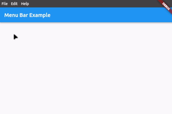
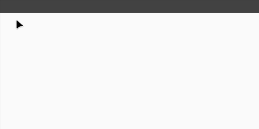
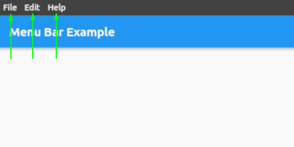
),You should now see an empty menu bar above your application (see picture below). To add buttons with menus, proceed to step 2.
To add buttons with menus, use the following widget structure:
MenuBar
    BarButton
        SubMenu
            MenuButton
            MenuButton
            ...
    BarButton
        SubMenu
            MenuButton
            MenuButton
            ...
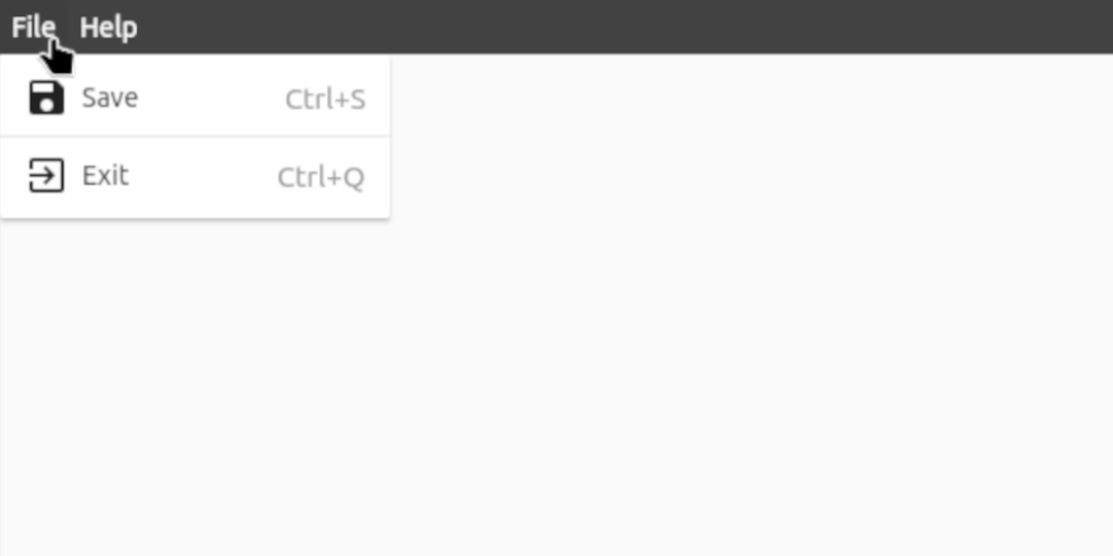
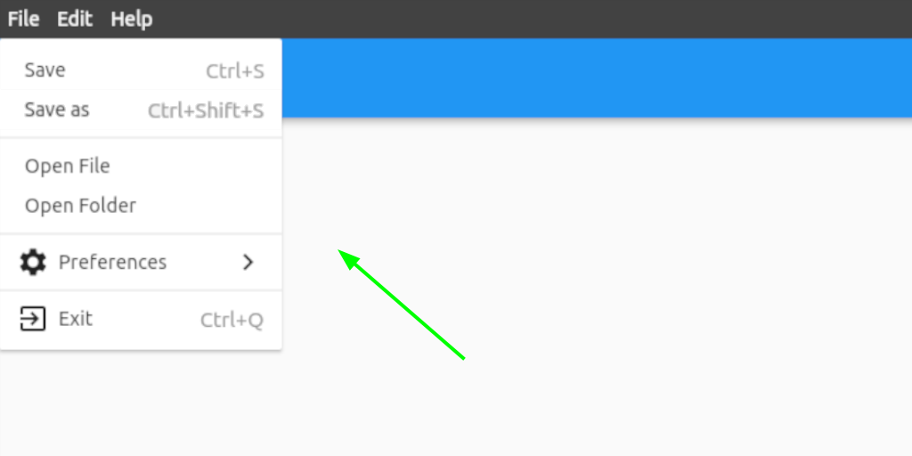
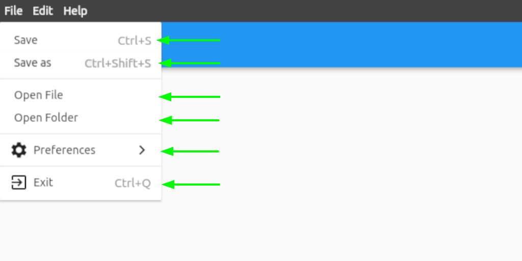
In this example, we will add the following menu bar:
MenuBar(
    // The buttons in this List are displayed as the buttons on the bar itself
    barButtons: [
        BarButton(
            text: const Text('File', style: TextStyle(color: Colors.white)),
            submenu: SubMenu(
                menuItems: [
                    MenuButton(
                        text: const Text('Save'),
                        onTap: () {},
                        icon: const Icon(Icons.save),
                        shortcutText: 'Ctrl+S',
                    ),
                    const MenuDivider(),
                    MenuButton(
                        text: const Text('Exit'),
                        onTap: () {},
                        icon: const Icon(Icons.exit_to_app),
                        shortcutText: 'Ctrl+Q',
                    ),
                ],
            ),
        ),
        BarButton(
            text: const Text('Help', style: TextStyle(color: Colors.white)),
            submenu: SubMenu(
                menuItems: [
                    MenuButton(
                      text: const Text('View License'),
                      onTap: () {},
                    ),
                    MenuButton(
                      text: const Text('About'),
                      onTap: () {},
                      icon: const Icon(Icons.info),
                    ),
                ],
            ),
        ),
    ],

    // Set the child, i.e. the application under the menu bar
    child: Scaffold(...),
),For customization options, see #Customization below or hover over the widgets for all the options in your preferred IDE when integrating the menu bar.
For a complete example, check out example.dart
| Property | Type | Default | Description |
|---|---|---|---|
| height | double | 28.0 | Height of the menu bar |
| mainAxisAlignment | MainAxisAlignment | MainAxisAlignment.start | Horizontal alignment of the bar buttons |
| backgroundColor | Color | Color(0xFF424242) | Background color of the bar |
| gap | double | 0.0 | Gap between the bar buttons |
| padding | EdgeInsets | EdgeInsets.symmetric(horizontal: 0.0) | Padding inside the bar row |
| closeMenuOnHoverLeave | bool | true | Close the all menus on hover leave |
| openMenuOnHover | bool | false | Open the bar button menus on hover |
| closeMenuOnHoverDelay | Duration | Duration(milliseconds: 400) | Close duration on hover leave |
| Property | Type | Default | Description |
|---|---|---|---|
| backgroundColor | Color | Colors.transparent | Bar button background color |
| padding | EdgeInsets | EdgeInsets.symmetric(horizontal: 6.0) | Padding inside the bar buttons |
| Property | Type | Default | Description |
|---|---|---|---|
| width | double | 200.0 | Width of the menus and submenus |
| openSubmenusOnHover | bool | true | Open the submenus on hover |
| backgroundColor | Color | Colors.white | Background color of the menus and submenus |
| padding | EdgeInsets | EdgeInsets.symmetric(vertical: 8.0) | Padding inside the menus and submenus |
| Property | Type | Default | Description |
|---|---|---|---|
| closeMenuOnClick | bool | true | Close the all menus on a menu button click |
| backgroundColor | Color | Colors.white | Background color of the submenu buttons |
| height | double | 28.0 | Height of the submenu buttons |
| padding | EdgeInsets | EdgeInsets.symmetric(horizontal: 12.0) | Padding inside the submenu buttons |
| shortcutTextStyle | TextStyle | TextStyle(fontSize: 15.0, color: Colors.grey) | Shortcut text style |
| showSubmenuIcon | bool | true | Show a submenu icon if a submenu is assigned |
| submenuIcon | Widget | Icon(Icons.keyboard_arrow_right) | Set the submenu icon if showSubmenuIcon is true and a submenu is assigned |
If you want to report a bug, request a feature or improve something, feel free to file an issue in the GitHub repository.