Card
Closed this issue · 9 comments
@owenm6 at the Home Office is also working on this.
We should standardise language, cards are probably a more accurate way to describe them.
Just spoken to @Fenwick17 and agreed we should call these cards.
PTA Card - Submission to HMRC Design System
What is the user need?
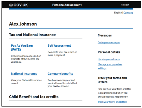
Caption: Old PTA home page
- The previous home page navigation system provided a single link into a service.
- The problem is that there are useful things that users wanted to do within the tenant services but it wasn’t obvious that those services contained those features.
- At different business events the content and the links needed to change so the user could do a task that was related to a business event.
- The organisation and names of those services hadn’t undergone any information architecture or UR.
- UR showed that quite a few users would click on the text thinking that was the link.
Current Pattern
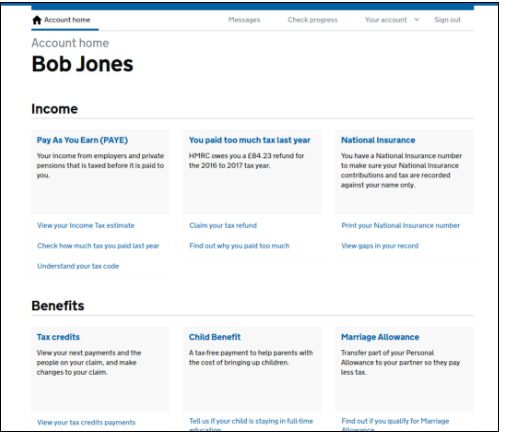
Caption: Current PTA home page
- Current pattern addresses the issues above.
- Undergone multiple rounds of tree testing, card sorting and first click tests, as well as UR sessions.
- The content and links have all been provided by the individual services based on their best understanding of their users’ needs.
- The links can change to meet key business events or any other demonstrable user or business need while the main link into the service remains constant.
- Font size - Header 19px, default font size 16px. The cards are a navigational tool and the font size makes the page less cluttered at the smaller size, making it easier for users to identify key information.
Known limitations
1. For other services to use this pattern we need to provide some more flexible use cases for the card. It needs to support when there is only 1 link into a service
We also need to decide absolutely whether or not we want to link to content outside of PTA (eg guidance content, or calculators), because this may impact the number of links services are able to offer. We currently don’t offer external links.
2. We need more ways to display different kinds of information in the main section of the card
It seemed to me, from watching the recent UR videos, that users were interacting with the blue in-card banner (eg SA ambig “You can’t access this service” or whatever it says) in the same way that they do with green buttons - by viewing it to the exclusion of everything nearby and taking primary direction from what it tells them to do (in this case, to look elsewhere for the task they need to perform). I think this design needs to be reviewed and possibly flagged for further UR.
3. We need a way to not have the main section clickable, but still have links
4. There are some general interaction issues with it
Current tile versions in prototype have borders that aren’t fully responsive. Not sure if this is the same in live.
5. There’s a strong belief that all the links should have a visible underline
Disputed point.
Sheldon’s understanding is that lists of items with links set within sentences should be underlined, but lists where the whole sentence is a link should be underlined.
My understanding matches but only to a point. Experts agree that underlines should be retained if accessibility is a priority (which is the case for us) and in addition our text / link colours don’t have a good enough contrast (2.93:1) to meet accessibility requirements. The purple of visited links is even worse (1.94:1).
6. The consistent height of the cards is set by minimum height
7. The content on the main card link is contained in an anchor tag and all of it is read out by a screenreader
Looks like Gov.UK are using something along the lines of the original PTA implementation
https://www.gov.uk/education
I would think that there is the possibility of the amount of space between the copy and the section links below could cause issues with screen magnifier users as it breaks the association between the two.
Cards have been raised in the GOV.UK design system backlog alphagov/govuk-design-system-backlog#113
@roblav In the Submission description, under 'Known Limitations' in point 5, end of second sentence "...but lists where the whole sentence is a link should be underlined" I guess it means to say "...should not be underlined".
On the GOV.UK Design System backlog - ours is different, should it be?
Even if ours are different, there is no reason why we could not add more of our findings to that issue.

