Negative border radius made easy
Nebo.css is a pure CSS solution that allows you to add a “convex” or “concave” puzzle angle to elements without SVG and JavaScript. Everything is controlled via custom CSS variables.
- ⚡ CSS only — no images or scripts;
- 🎛 Flexible customization via variables:
--nb-r- radius of main rounding;--nb-w- width of protrusion/cutout;--nb-h- height of protrusion/cutout;--nb-cor1-rw,--nb-cor1-rh- first corner radius (width/height);--nb-cor2-rw,--nb-cor2-rh- second corner radius (width/height);--nb-curve-rw,--nb-curve-rh- curve radius (width/height);
- 🧩 4 modifiers for angle positioning:
.nebo--tl,.nebo--tr,.nebo--bl,.nebo--br;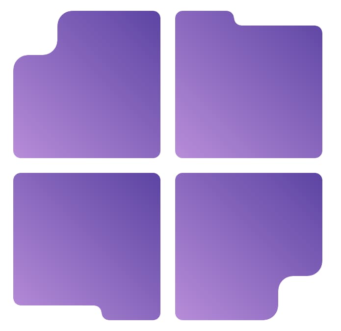
- 🖼 Supports any backgrounds (solid colors, gradients, images);
- 🔧 SCSS mixin for advanced customization:
@include apply-nebo-corner().

<div class="card nebo nebo--br">
  Card Content
</div>.card {
--nb-r: 24px; /* radius of curvature */
--nb-w: 28px; /* protrusion width */
--nb-h: 28px; /* protrusion height */
background: linear-gradient(135deg, #b98bff, #6244d6);
padding: 2rem;
color: #fff;
font: 16px/1.4 "Inter", sans-serif;
}Combine modifiers to get a four-piece puzzle:
<div class="grid">
  <div class="nebo nebo--tl"></div>
  <div class="nebo nebo--tr"></div>
  <div class="nebo nebo--bl"></div>
  <div class="nebo nebo--br"></div>
</div>For more precise control, use the SCSS mixin:
.custom-puzzle {
  @include apply-nebo-corner(
    $radius: 24px,        // Set all radiuses to 24px
    $width: 32px,         // Set protrusion width
    $height: 28px,        // Set protrusion height
    $corner: "br"         // Position at bottom-right
  );
}

.asymmetric-puzzle {
  @include apply-nebo-corner(
    $cor1-rw: 20px,       // First corner width radius
    $cor1-rh: 16px,       // First corner height radius
    $cor2-rw: 24px,       // Second corner width radius
    $cor2-rh: 20px,       // Second corner height radius
    $curve-rw: 18px,      // Curve width radius
    $curve-rh: 14px,      // Curve height radius
    $width: 30px,
    $height: 25px,
    $corner: "tl"
  );
}| Browser | Version |
|---|---|
| Chrome | 60+ |
| Edge | 79+ |
| Firefox | 53+ |
| Safari | 14+ |