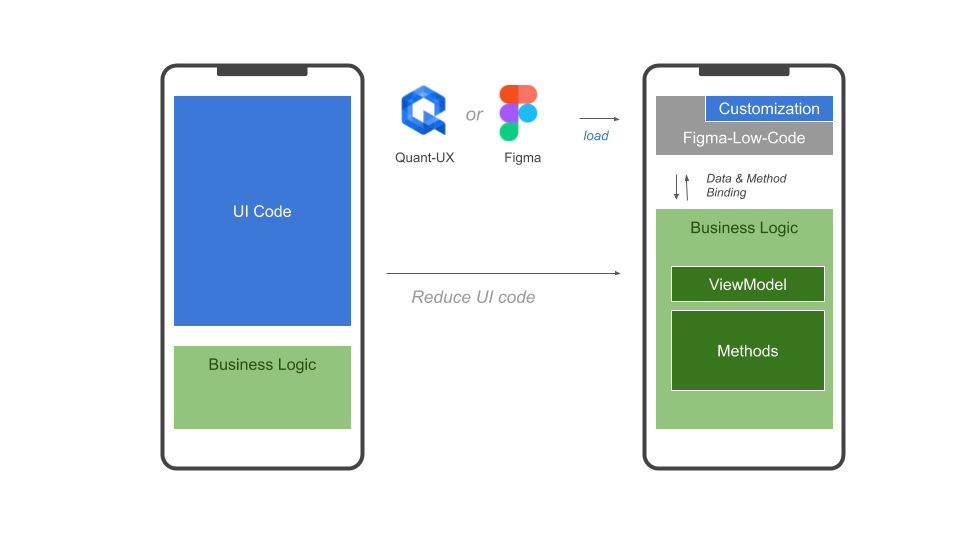
Vue-Low-Code is an open-source project that turns Figma and Quant-UX designs into fully functional VUE applications. By ensuring that the design stays the single source of truth, Vue-Low-Code reduces the need for design hand-offs and front-end code significantly.
A constant pain point during the development of an application is the hand-off between the design and the development team. Often this process is not frictionless. The design team creates a set of graphics and prototypes, which serve as the source of truth and specification for the development team. The development team implements the visual design in the desired technology, which includes the translation of the design into front-end code and business logic, as well as the wiring between the two. As the development evolves, the implementation becomes a second source of truth, and keeping the design and the code base in sync can be a painful exercise.
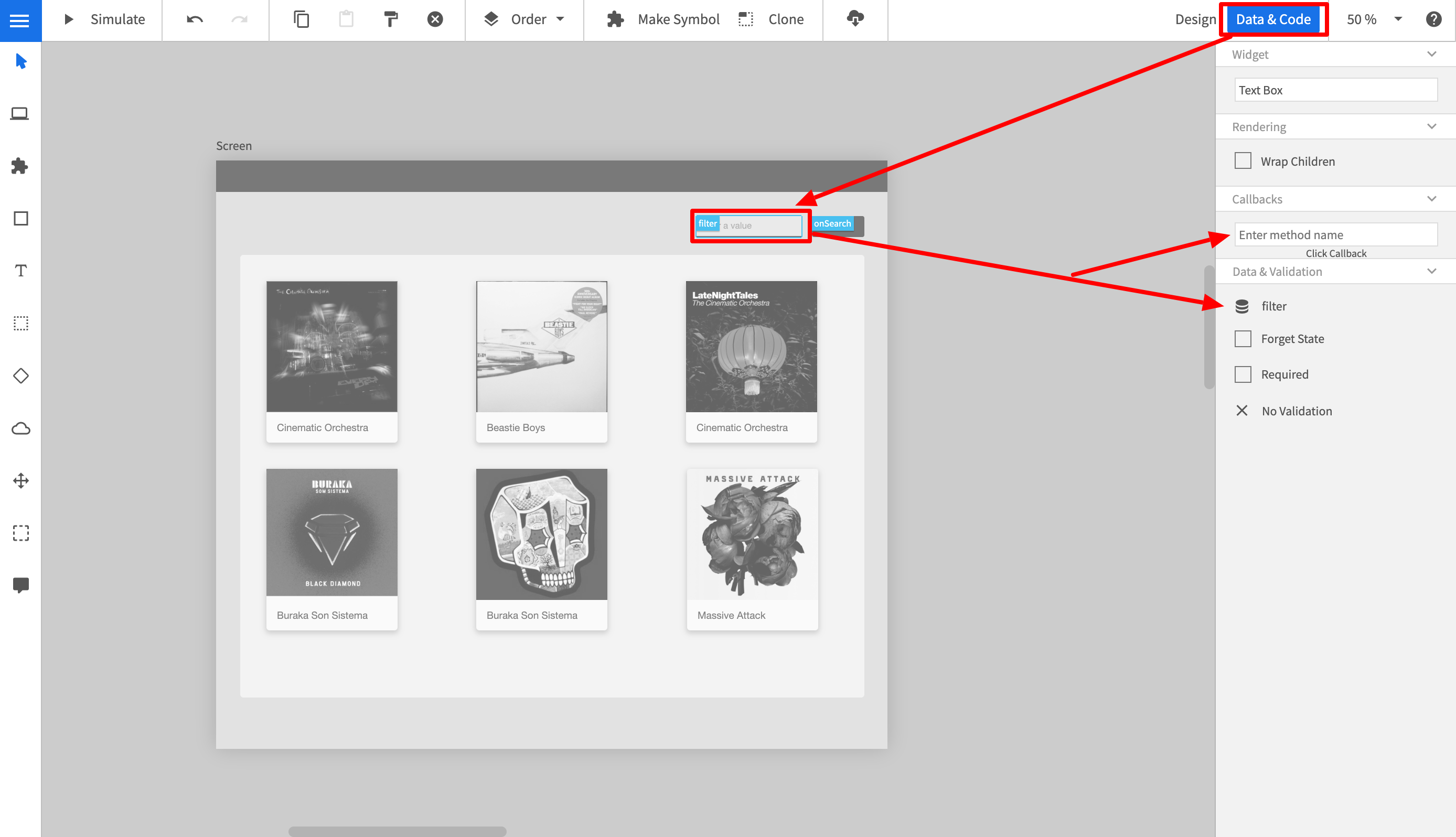
The core of the solution is the Vue-Low-Code component which reads the visual design and creates the front-end automatically on the fly. As a result, changes in the design are immediately updated in the application. The wiring between the front-end component and the business logic is achieved through method and data binding, which is defined in a Figma plugin or a dedicated view in Quant-UX.
As a result, Developers can focus on business logic and backend connectivity, while the design team can iterate fast through different ideas, without impacting the development team.
In summary, the Vue-Low-Code project provides the following benfefits:
- Zero Code rendering of visual design and animations
- Clear separation of UI and business logic
- Developers can focus on code
- Developers can use the tools and frameworks of their choice.
- Designers can use the powerful visual design tool
- Easy extension with custom callback functions
- Full support of VUE data binding.
- Extension with custom components
- Extension with custom CSS
- Rich library of stylable components.
More information can be found here
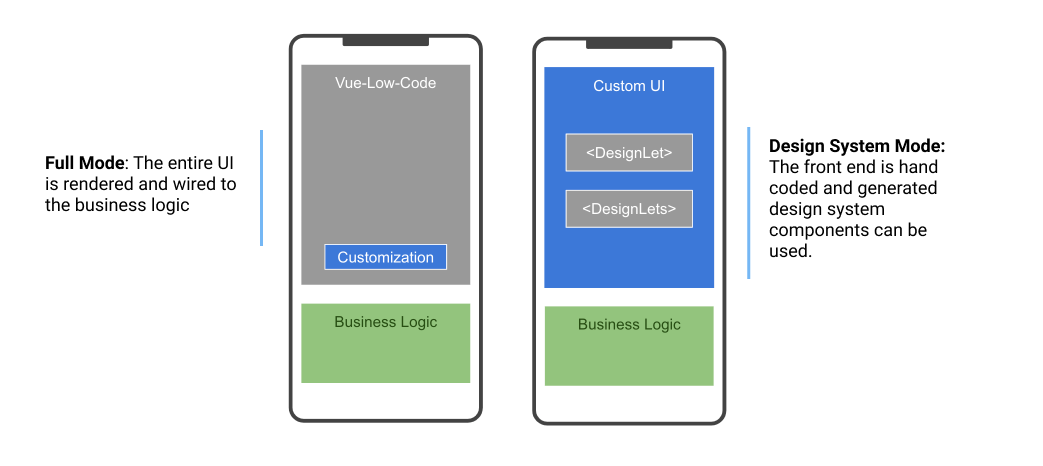
Vue-Low-Code provides two modes of operation.
- The first mode is the 'Full' low code mode. The Figma or Quant-UX design is entirely rendered and wired to the business logic. The front-end developers will usually do little UI customization and focus on backend connectivity and business logic.
- The second mode is the so called 'Design System' mode, which turns your design system into Vue components. The developers can simply use these as any other VUE component within their projects.
The full mode will in general result to a faster development experience, however the developers have less control over the front end. The 'Design System' mode speeds up development and helps to implement design systems. Please note, that both approaches will maintain the design as the single source of truth. Design channges will be instantly visible in the application.
Table of contents
- Installation
- Full Mode
- Design System Mode
- Defintion of Bindings in Quant-UX
- Responsive Rendering
- Low Code Workflow
- Example & Links
- Development Setup
- Contact & Support
First, you have to install the QUX-LowCode package via NPM
npm i vue-low-codeIn the full mode the or component are used to render the entire front end. The first step is top register these components in Vue. The following section will use Quant-UX design as an example. For Figma, please check the Figma-Low-Code repo.
import Vue from "vue";
import QUX from 'vue-low-code'
Vue.use(QUX);Now you can start including the component, for instance in your home components. You have to pass your Quant-UX prototype to the component, so it knows what to render. You can either pass a javascrit object or a share key
<QUX :app="app"/>You can optain the share key from the http://quant-ux.com website by clicking share in the canvas menu. In general the share key is best for development. Updates in Quant-UX will be immediatly visible after a page reload. However, for production you should pass an app object. You can download the app json with the quant-ux command line interface:
npm install -g quant-ux-cliNow you can call quant-ux on the command line. Please pass the share key and select download. The json file will be loaded and all images will be stored in the public folder
quant-uxPlease note that home component should be wrapped by a router-view, otherwise navigation will not work. If you use VUE-CLI to bootrap the project, everything will be configured out of the box.
 <div id="app">
    <router-view/>
</div>Last, you have to update your router to delegate all routes to home.
const routes = [
  {
    path: '/',
    name: 'home',
    component: () => import(/* webpackChunkName: "about" */ '../views/Home.vue')
  },
  {
    path: '/:screenName.html',
    name: 'qux',
    component: () => import(/* webpackChunkName: "about" */ '../views/Home.vue')
  }
]
The default paramter QUX will look for is 'screenName'.
You can configure certain parameters, e.g. the routing rules. To do so, pass a config object to the qux component.
<QUX :app="app":config="config"/>The config object can have the following properties and hsould be defined in the data section of the home component.
    config: {
        css: {
          grid: true, // Use CSS grid to align objects. False will use CSS-Flex.
          justifyContentInWrapper: true // In justifz or left align content in wrapped elements
        },
        router: {
          key: 'id', // alternative routing parameter
          prefix: 'qux' // path prefix that will be used when rendering links
        }
}QUX-LowCode supports VUE data binding. You have to pass a v-model to the QUX component. The databindings for the widgets must be defined in the Quant-UX canvas.
<QUX :app="app" v-model="view-model"/>In the Quant-UX canvas you can define javascript callbacks for the widgets. Place the methods in the parent compoent of QUX. The method will have the following signature:
myMethod (value, element, e) {
 ...
}
If a method returns a string, matching a screen name, the QUX will navigate to this screen.
myMethod (value, element, e) {
 ...
 // navigate to screen 2
 return 'Screen2'
}Sometimes you want to render a certain part of the UI by your self, or replace existing widgets with custom implementations. These components will be used at the specified screen location instead of the default QUX component. This approach allows you to fully manage certain parts of the UI. Data is passed as a value property and follows default VUE practices.
<QUX :app="app" :config="config"/>
...

import MyWidget from 'src/myWidget'

...

config = {
    components: {
      'myCustomComponent': MyWidget
    }
}
You can set the name of the custom component in the data view in Quant-UX.
Sometimes you might not want to render the entire prototype, but just a small subsection, e.g. a dialog. You can do this by using the 'selected' property. Enter the name of the component to show. Please make sure, that the name is unique. You can also use several instances if the QUX component in your template.
    <QUX
      :app="app"
      :config="config"
      v-model="viewModel"
      selected="LoginBox"
      />


    <QUX
      :app="app"
      :config="config"
      v-model="viewModel"
      selected="SignupBox"
/>If you are using the Quant-UX icons components, you have to install the mdi-font package.
npm install @mdi/font
Afterwards import the icons in the App.vue
import '@mdi/font/css/materialdesignicons.css'
The Design System mode allows to turn your design system into Vue components that can be used as normal components. The first step is
to globally register the design system before any template is parsed. The easiest way is to register the design system in the main.jsfile:
import Vue from 'vue'
import App from './App.vue'
import './registerServiceWorker'
import router from './router'
import * as VueLowCode from 'vue-low-code'
import figmaDesign from './views/figma-design-system.json'
import quxDesign from './views/qux-design-system.json'

Vue.config.productionTip = false

/*
 * Make sure the design is registered before the App is mounted
 */
async function init () {
    // for live debuging use Figma.createFigmaDesignSystem(<FileID>, <AccessKey>)
  await VueLowCode.createFigmaDesignSystem(figmaDesign)
  // for live debuging use Figma.createQUXDesignSystem(<quxSharekey>)
  await VueLowCode.createQUXDesignSystem(quxDesign)

  new Vue({
    router,
    render: h => h(App)
  }).$mount('#app')
}

init()
The Vue-Low-Code package provides a method for Figma (createFigmaDesignSystem) and for Quant-UX (createQUXDesignSystem). For Figma design systems,
you use your API token and fileID, or you can download the Figma design using the download.js script
node download.js <api token> <file id>For Quant-UX you can use share key or download the file with the QuantUX-CLI:
npm install -g quant-ux-cli
quant-uxOnce the design system is registered, they can be used within any template in the application. Suppose there is primary button defined in the design system. This can be invoked be simple using a tag with the corresponding name. Please make sure that the design system names do not clash with standard HTML elements, or other components in your code base.
<PrimaryButton/>For simple elements like boxes, rectangles or labels one can use the wrapped notion to replace the inner elements. An alternative is to use the label property
<PrimaryButton>Hello World</PrimaryButton>
<PrimaryButton label="Hello World"/>
For input elements, also the v-model element works. In addtion a placeholder and options element is supported
<PrimaryField v-model="user.name" placeholder="Enter a name"/>
<PrimaryDropDown v-model="user.job" :options="job" />
...
jobs = [
  {label: 'Developer', value:'deverloper'},
  {label: 'Designer', value:'designer'},
]
Low Code Design Systems are not limited to simple components like buttons or text, but can also be compplex components like forms, dialogs and so on.
Usually one has to use data and method binding (Details) in this situations to populate the elements with data.
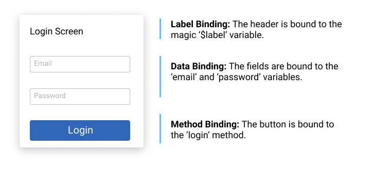
The relevant (child) elements have to be wired to the right data and the right actions have to be defined. For instance in a login dialog, the email field needs to be
wired to the email variable and the password field to the password variable. The button needs to get a method binding for the login method. When the
user clicks in the button, and 'login' event will be fired, which can be used using the standard '@' notation. Please note, that when a component consist out of more than one shapes, it is not possible infer where the label text should be shown. One has to specify a magic data binding ($label). The wiring of the login dialog would look like
The code would be
<LoginDialog v-model="loginData" label="Enter your credentials" @login="myLoginMethod">

...
loginData = {
  email: '',
  password: ''
}

....

myLoginMethod () {
  // your code
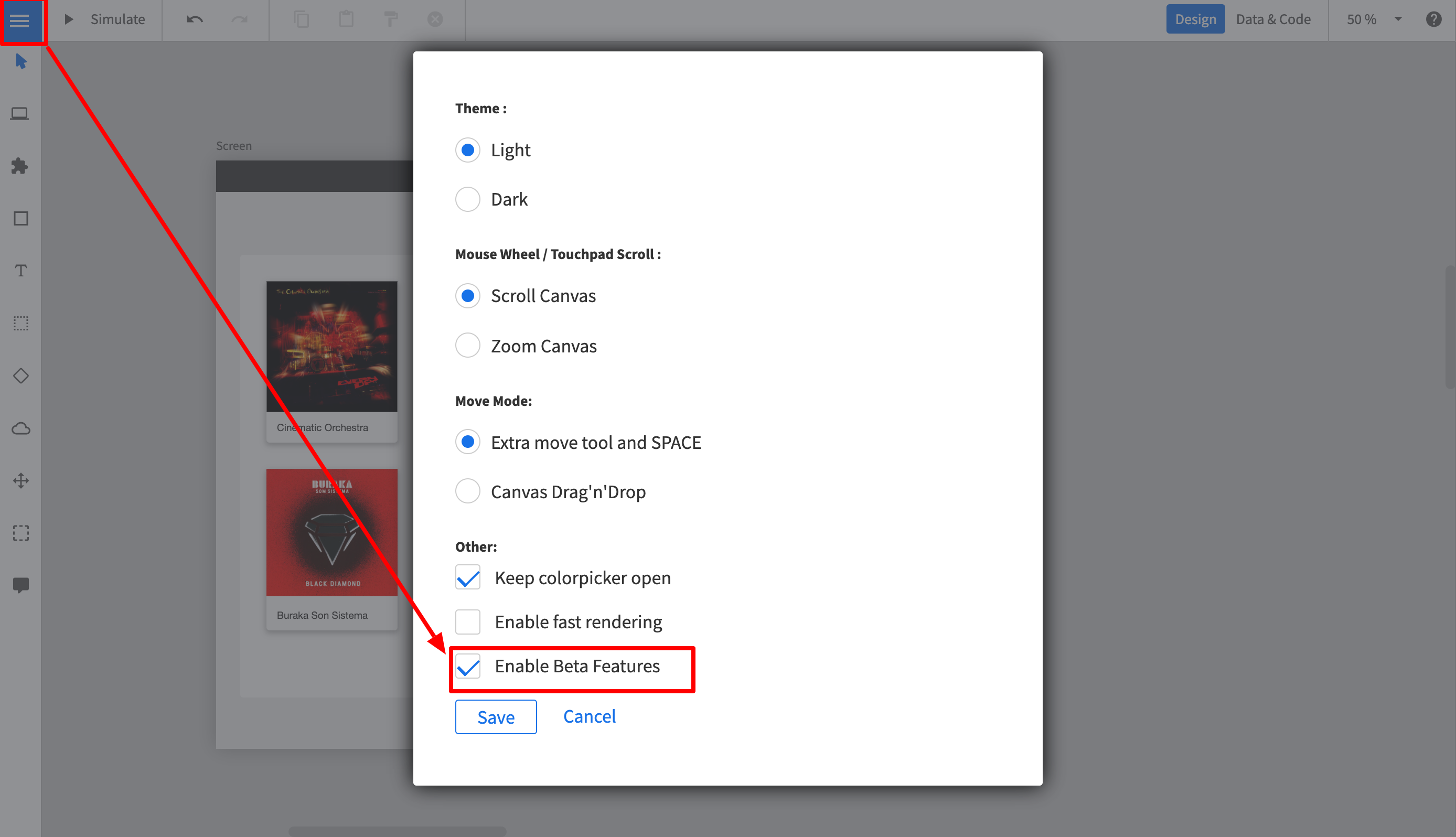
}You can define the data binding and the callbacks in the normal Quant-UX designer. Before you start, you have to enable the Beta features. To do so:
- Login at http://www.quant-ux.com
- Open the prototype
- Click on the menu and select "Settings"
- Select "Enable Beta Features"
- In the upper right corner you can now toggle between "Design" and "Data & Code" view
To set the code properties perform the following steps:
- Click on "Data & Code" in the upper right corner
- The canvas will turn gray now.
- Select a widget.
- In the properties panel you can now define method name to be called.
- If the widet supports data binding, you can also configure the data binding variable here. Please note, that Quant-UX supports JSON Path, so a variable name can be "person.name"
Vue-Low-Code apps are to some degree responsive, depending on the constraints that affre defined in Quant-UX or Figma. In addtion you can define min and max widths, and determine the flow of child components (Grid vs Flex).
However, sometimes this is not enough and one needs different UIs for different devices. Vue-Low-Code allows you to specify for each device type a different app. By doing this, you have to complete freedom to design for each device type, without worrying too much about the responsive behavior. Also, this approahc allows you to provide completly different navigation patters, e.g. a hamburger menu on mobile and a central navbar on desktop.
To enable the responsive behavior do:
<QUX :app="apps"/>

...
let apps = {
    mobile: <key or object>,
    tablet: <key or object>
    desktop: <key or object>
}
You can pass weather the share key or the downloaded app json. Again, the share key is great for development, but for production you should download the artifacts.
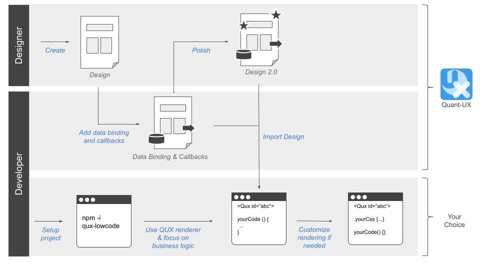
We envision the following workflow to enable painless collaboration between designers and developers:
- The designer creates an initial design in Quant-UX or Figma
- The developer adds data binding and method callbacks in Quant-UX using a dedicated view or the Figma Plugin
- The developer sets up a new project (Vue.js for now) and includes the QUX (or Figma) component
- The developer loads the design from Quant-UX and creates the required methods and fills them with business logic.
- The QUX component renders the design and invokes the callbacks in clicks.
- Changes in the design are transparent to the developer, he just reloads the design from Quant-UX.
- Quant-UX
- Low Code Example
- Figma Plugin
- Figma-Low-Code
- Figma-Low-Code Design System Example
- Some motivation for the project
For fixes and improvements please clone the repository and submit pull requests.
npm install
Build:
npx bili --bundle-node-modules
If you want to reach out please use the Contact page or Spectrum Chat
