Jinxin Ma - jma33@usfca.edu Will Young - wjyoung@usfca.edu
We gathered the data set from worldbank.org. It includes several economic, health, natural resource, and social indicators in each country in the world beginning in 1960. Much of the data is missing for many indicators in many countries, and using all of the indicators would be cumbersome. We thus decided to use a subset of the variables with more complete data and relevance.
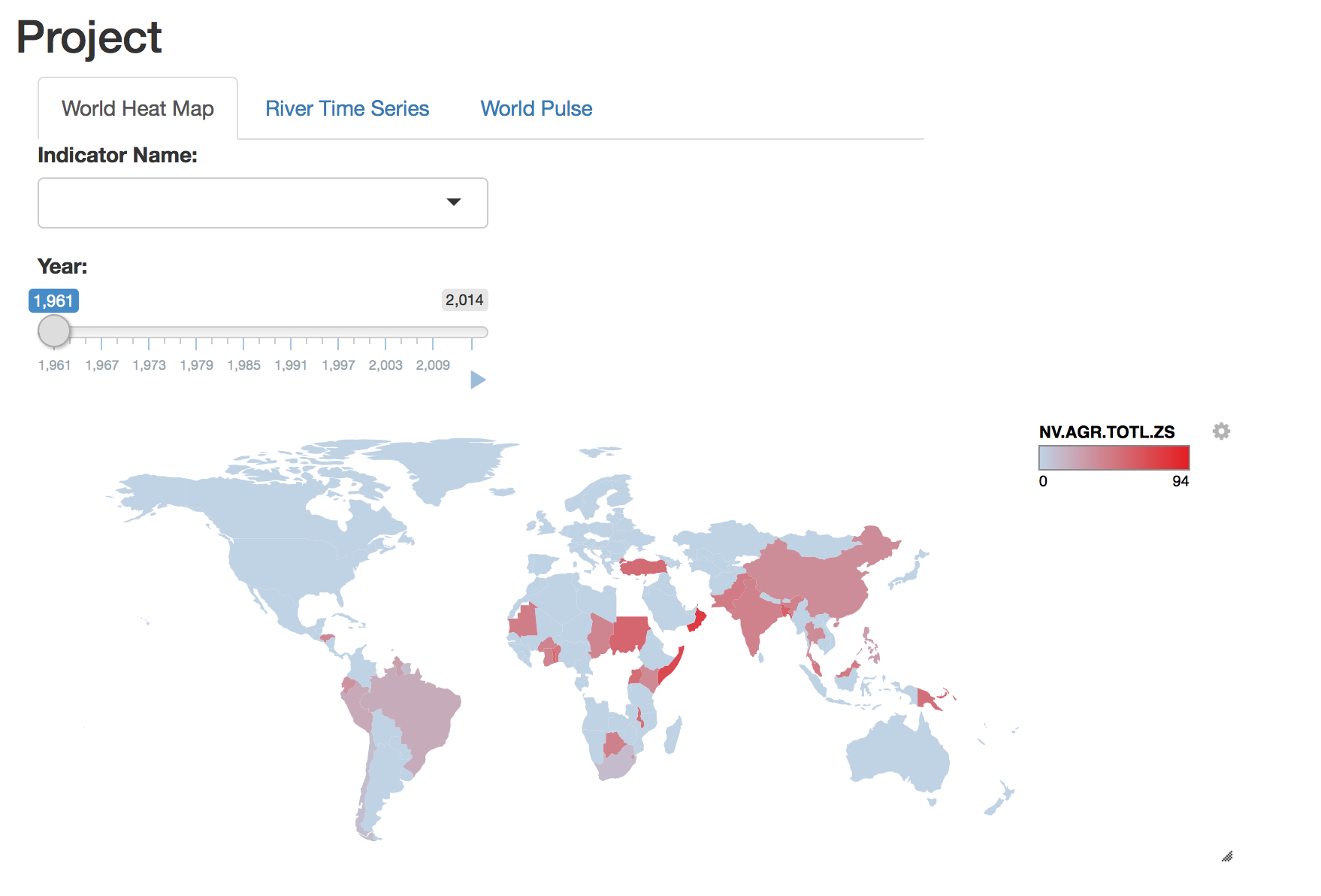
In the prototype we present three plots, a heatmap on a world map, a "ribbon time series", and "world pulse plot". The world-heat map displays countries in different shades or colors depending on the value of the selected variable. In the final plot, we hope to make this interactive so a user could brush select sevral countries and the map update to zoom to those countries.
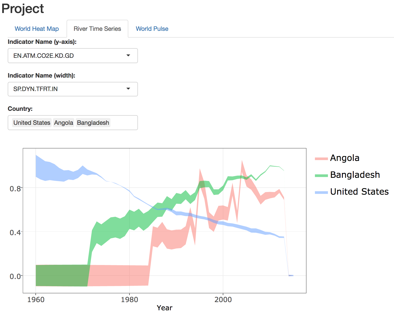
The ribbon time series is an attempt to show two variables simultaneously changing over time in a single line. The height on the y-axis of of the line indicates the value of one variable at time
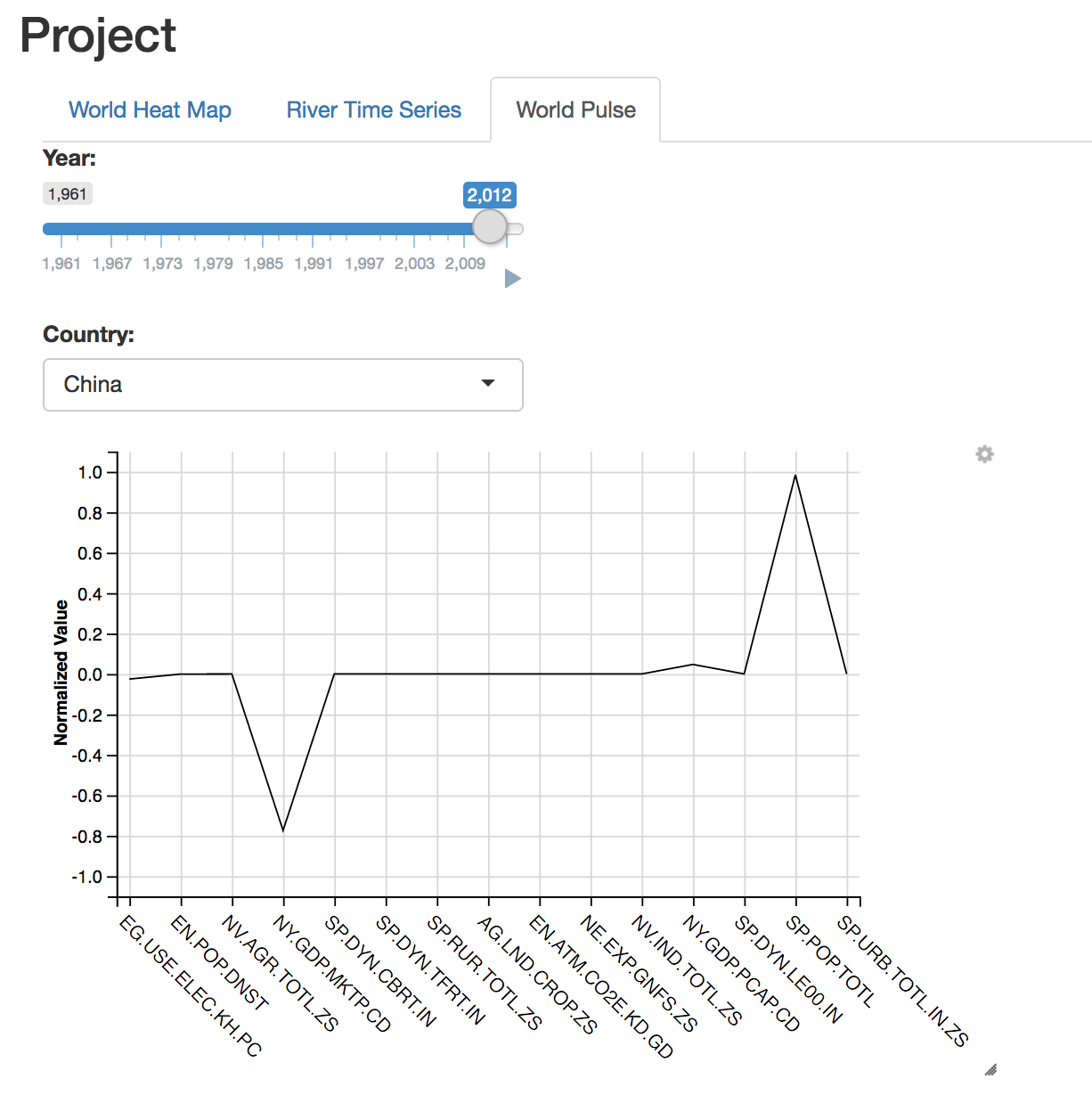
The world pulse plot may or may not work, but we're going to try it. The idea is to plot several variables, for one country at a time, in a modified parallel coordiate plot and animate the plot through time. The primary modification is the variables alternate between moving between zero and positive one and zero and negative one. The sign of the variable is not relevant, only the magnitude. We will group similar variables next to each other on the plot. So economic inidcators are on the left, health indicators in the middle, and environmental indicators are on the right (for example). Hopefully as the animation loops we will see different varaibles pulse in some sort of pattern. Our early observations are that this may only work for particular varaibles, and will only look neat when those variables are cyclical.
Each plot will be displayed in its own tab each tab having its own set of interactions. The heat map will allow the user to select the variable that controls the color. The river time series will allow the user to select countries ot display and two variables to compare. The pulse plot will allow the user to select the country.


