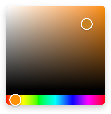
- Small: Just 1,5 KB (minified and gzipped). Size Limit controls the size.
- Fast: Built with hooks and functional components only.
- Simple: The interface is straight forward and easy to use.
- Mobile-friendly: Works well on mobile devices and touch screens.
- No dependencies
npm install react-colorful --save
import ColorPicker from "react-colorful";
import "react-colorful/dist/index.css";

const YourComponent = () => {
  const [color, setColor] = useState("#aabbcc");
  return <ColorPicker color={color} onChange={setColor} />;
};The default react-colorful's input/output format is a HEX string (like #ffffff). In case if you need another color model, we provide 5 additional color picker bundles.
How to use another color model
| Import path | Value example | Size (gzipped) |
|---|---|---|
"react-colorful/rgb" |
{ r: 255, g: 255, b: 255 } |
~1,4 KB |
"react-colorful/rgbString" |
"rgb(255, 255, 255)" |
~1,5 KB |
"react-colorful/hsl" |
{ h: 0, s: 0, l: 100 } |
~1,2 KB |
"react-colorful/hslString" |
"hsl(0, 0%, 100%)" |
~1,3 KB |
"react-colorful/hsv" |
{ h: 0, s: 0, v: 100 } |
~1,2 KB |
import RgbColorPicker from "react-colorful/rgb";
import "react-colorful/dist/index.css";

const YourComponent = () => {
  const [color, setColor] = useState({ r: 50, g: 100, b: 150 });
  return <RgbColorPicker color={color} onChange={setColor} />;
};The easiest way to tweak react-colorful is to create another stylesheet to override the default styles.
.react-colorful {
  height: 250px;
}
.react-colorful__saturation {
  bottom: 30px;
  border-radius: 3px 3px 0 0;
}
.react-colorful__hue {
  height: 30px;
  border-radius: 0 0 3px 3px;
}
.react-colorful__saturation-pointer {
  border-radius: 5px;
}
.react-colorful__hue-pointer {
  border-radius: 2px;
  width: 15px;
  height: inherit;
}As you probably noticed the color picker itself doesn't include an input field, but don't worry if you need one. react-colorful is a modular library that allows you to build any picker you need. Since v2.1 we provide an additional component that works perfectly in pair with our color picker.
How to use HexInput
import ColorPicker from "react-colorful";
+import HexInput from "react-colorful/HexInput";
import "react-colorful/dist/index.css";

const YourComponent = () => {
  const [color, setColor] = useState("#aabbcc");
  return (
    <div>
      <ColorPicker color={color} onChange={setColor} />
+     <HexInput color={color} onChange={setColor} />
    </div>
  );
};HexInput doesn't have any default styles, but accepts all properties that a regular input tag does (such as className, placeholder and autoFocus). That means you can place and modify this component as you like. Also, that allows you to combine the color picker and input in different ways.
By the way, HexInput is also minimalist-friendly — only 400 bytes gzipped.
Today each dependency drags more dependencies and increases your project’s bundle size uncontrollably. But size is very important for everything that intends to work in a browser.
react-colorful is a simple color picker for those who care about their bundle size and client-side performance. It's fast and lightweight because:
- has no dependencies (no risks in terms of vulnerabilities, no unexpected bundle size changes);
- built with hooks and functional components only (no classes and polyfills for them);
- ships only a minimal amount of manually optimized color conversion algorithms (while most of the popular pickers import entire color manipulation libraries that increase the bundle size by more than 10 KB and make your app slower).
To show you the problem that react-colorful is trying to solve, we have performed a simple benchmark (using bundlephobia.com) against popular React color picker libraries:
| Name | Size (minified) | Size (gzipped) | Dependencies |
|---|---|---|---|
| react-colorful | 0 | ||
| react-color | 6 | ||
| react-input-color | 7 | ||
| rc-color-picker | 5 |
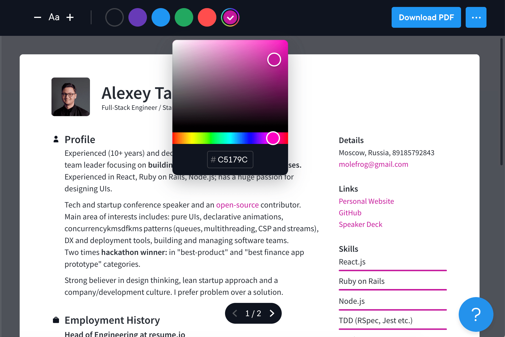
Resume.io — online resume builder with over 7,800,000 users worldwide

- Additional modules to support different RGB, HSL and HSV color models
- HEX input component
- TypeScript support
- Alpha channel support (RGBA and HSLA color models)
- Preact support


