Component generalization of Janic Duplessis' solution to animate the toolbar off-screen while scrolling, a common material design pattern
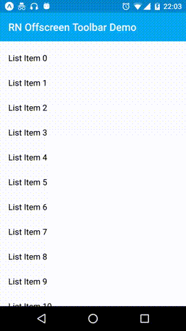

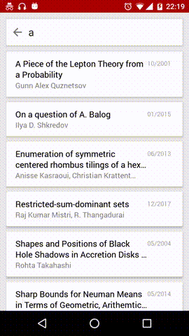
Library usage in both the example bundled with the library and in the search screen of a to be released application
$ npm install react-native-offscreen-toolbar --save
import OffscreenToolbar from 'react-native-offscreen-toolbar';

export default class YourComponent extends React.Component {
    render() {
        const toolbar = () => (<ToolbarAndroid title={'Title'} />);
        const listItem = ({item}) => <Text>{item.key}</Text>;
        const scrollable = () => (<FlatList data={DUMMY_DATA} renderItem={listItem}/>);
        return (
            <View style={styles.container}>
                <OffscreenToolbar
                    toolbar={toolbar}
                    scrollable={scrollable} />
            </View>
        );
    }
}| Prop | Description | Default |
|---|---|---|
toolbar |
Component for the toolbar/navbar. | None |
scrollable |
Component for the scrollable, a FlatList or ScrollView for example. |
None |
scrollableOverlay |
Optional component for the scrollable overlay. | None |
toolbarHeight |
Toolbar height used when calculating the animations. | 56 |
scrollablePaddingTop |
Since the scrollable is placed behind the toolbar, this padding is typically used to make the scrollable content appear below the toolbar. | 64 |