Introduction to Predictive Modeling
maximilian.eber@quantco.com, fabian.fraenz@quantco.com 28/11/2017
In this workshop, we will introduce you to some of the most important concepts in predictive modeling. We will use a dataset from the insurance company Porto Seguro (via kaggle.com). The dataset contains driver characteristics and an indicator for whether the driver had an accident in a given year or not. The goal is to identify safe drivers by modeling accidents. We will first conduct an exploratory data analysis, then build a basic linear model, and finally use a boosted trees algorithm to improve the accuracy of our model. Along the way, we will think about feature engineering, different metrics for model evaluation, overfitting, hyperparameter tuning, and cross-validation.
Setup
Load libraries
rm(list = ls())
library(readr)
library(dplyr)
library(xgboost)
library(ggplot2)
library(tidyr)
library(pROC)
library(forcats)
Load data
# Load data and recode
if (!file.exists("train.csv")) {
  message("Data not found. Please download and unzip from https://www.kaggle.com/c/porto-seguro-safe-driver-prediction/download/train.7z")
}
data <- read_csv("train.csv") %>%
  mutate_at(vars(ends_with("_cat")),   funs(factor(., exclude = -1))) %>%
  mutate_at(vars(ends_with("_bin")),   funs(if_else(. == -1, as.integer(NA), as.integer(.)))) %>%
  mutate_at(vars(matches("_[0-9]+$")), funs(if_else(. == -1, as.numeric(NA), as.numeric(.)))) %>%
  select(-id)
Summary statistics
Histograms
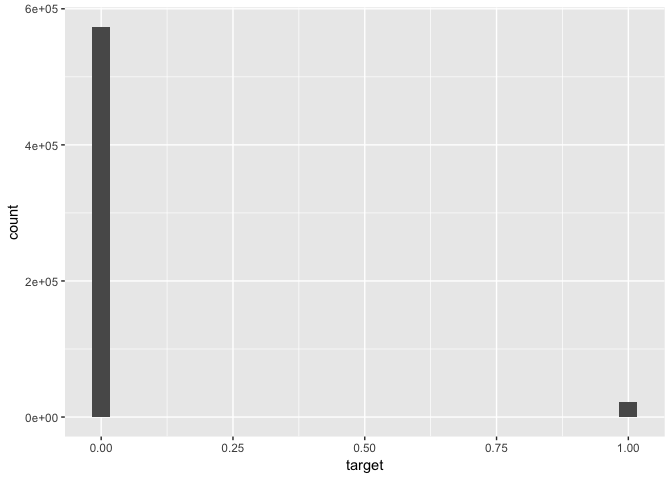
# Histogram of outcome variable
data %>% ggplot(aes(x = target)) + geom_histogram()
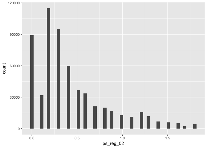
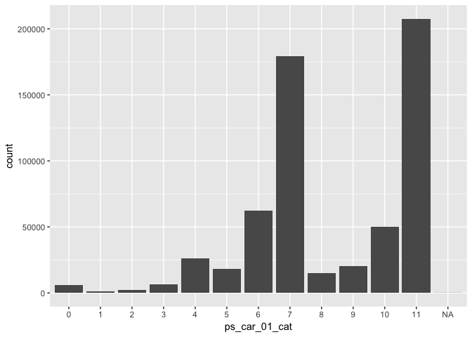
# Histograms of selected predictors
# - Example (continuous variable)
data %>% ggplot(aes(x = ps_reg_02)) + geom_histogram(bins = 50)# - Example (categorical variable):
data %>% ggplot(aes(x = ps_car_01_cat)) + geom_bar()TODO: Select a few important variables and plot their distribution.
Correlation of predictors and outcome
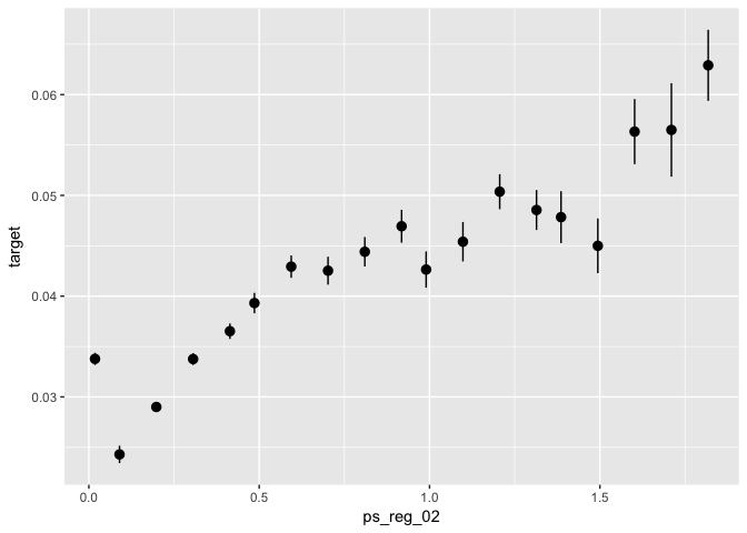
# Correlation of selected predictors with outcome variables

# - Example (continuous variable)
data %>%
  ggplot(aes(x = ps_reg_02, y = target)) +
  stat_summary_bin(fun.data = "mean_se", bins = 50)
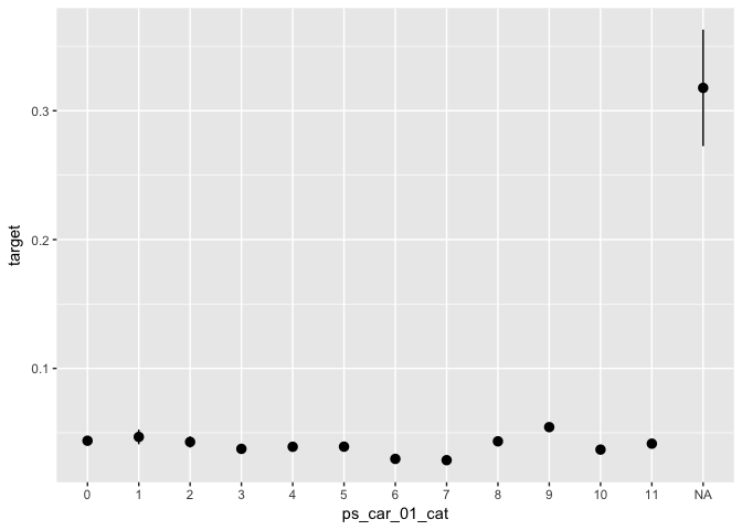
# - Example (categorical variable):
data %>%
ggplot(aes(x = ps_car_01_cat, y = target)) +
stat_summary(fun.data = "mean_se")TODO: Select a few important variables and plot their correlation with the outcome variable.
Basic linear model
Train model
# Problem: How to deal with missing values?
data %>% count(is.na(ps_car_01_cat))
## # A tibble: 2 x 2
## `is.na(ps_car_01_cat)` n
## <lgl> <int>
## 1 FALSE 595105
## 2 TRUE 107
# Solution: Code explicitly
data_glm <- data %>%
  select(target, ps_reg_02, ps_car_01_cat) %>%
  mutate(
    # ps_car_01_cat (categorical)
    ps_car_01_cat = forcats::fct_explicit_na(ps_car_01_cat),
    # ps_reg_02 (continuous)
    ps_reg_02_missing = if_else(is.na(ps_reg_02), 1, 0),
    ps_reg_02 = if_else(is.na(ps_reg_02), 0, ps_reg_02)
  )
# Here, we build a simple linear model based on a few features
glm0 <- glm(data = data_glm, formula = target ~ ps_reg_02 + ps_car_01_cat, family = "binomial") # ignore missing indicator
# glm0 <- glm(data = data_glm, formula = target ~ ps_reg_02 + ps_reg_02_missing + ps_car_01_cat, family = "binomial") # including missing indicator
summary(glm0)
##
## Call:
## glm(formula = target ~ ps_reg_02 + ps_car_01_cat, family = "binomial",
## data = data_glm)
##
## Deviance Residuals:
## Min 1Q Median 3Q Max
## -1.0319 -0.2861 -0.2668 -0.2412 2.7026
##
## Coefficients:
## Estimate Std. Error z value Pr(>|z|)
## (Intercept) -3.256688 0.064181 -50.742 < 2e-16 ***
## ps_reg_02 0.344703 0.016483 20.912 < 2e-16 ***
## ps_car_01_cat1 0.029441 0.143029 0.206 0.83692
## ps_car_01_cat2 -0.052820 0.124147 -0.425 0.67050
## ps_car_01_cat3 -0.193630 0.090575 -2.138 0.03254 *
## ps_car_01_cat4 -0.067387 0.071163 -0.947 0.34367
## ps_car_01_cat5 -0.040520 0.074289 -0.545 0.58546
## ps_car_01_cat6 -0.362637 0.067830 -5.346 8.98e-08 ***
## ps_car_01_cat7 -0.369121 0.065219 -5.660 1.52e-08 ***
## ps_car_01_cat8 0.006987 0.075099 0.093 0.92588
## ps_car_01_cat9 0.220464 0.070705 3.118 0.00182 **
## ps_car_01_cat10 -0.198649 0.067854 -2.928 0.00342 **
## ps_car_01_cat11 -0.090880 0.064545 -1.408 0.15913
## ps_car_01_cat(Missing) 2.456132 0.217447 11.295 < 2e-16 ***
## ---
## Signif. codes: 0 '***' 0.001 '**' 0.01 '*' 0.05 '.' 0.1 ' ' 1
##
## (Dispersion parameter for binomial family taken to be 1)
##
## Null deviance: 186283 on 595211 degrees of freedom
## Residual deviance: 185001 on 595198 degrees of freedom
## AIC: 185029
##
## Number of Fisher Scoring iterations: 6
Evaluate performance
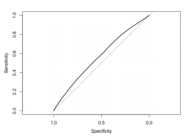
# Evaluate in-sample accuracy (metric: AUC)
predicted <- predict(object = glm0, newdata = data_glm, type = "response")
actual <- data_glm %>% pull(target)
auc(actual, predicted)
## Area under the curve: 0.5688
roc(actual, predicted, plot = TRUE, grid = TRUE)##
## Call:
## roc.default(response = actual, predictor = predicted, plot = TRUE, grid = TRUE)
##
## Data: predicted in 573518 controls (actual 0) < 21694 cases (actual 1).
## Area under the curve: 0.5688
TODO: Explain intuitively what this metric does. Why is better than using, say, accuracy?
Plot model fit along covariates
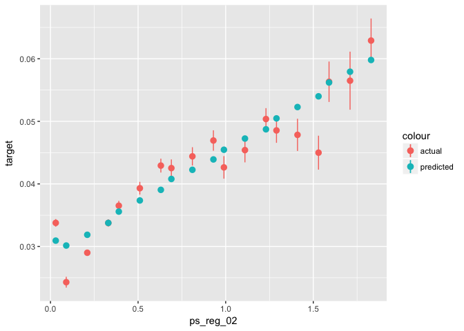
# Plot predicted vs. actual along a few variables

# Example:
data_glm %>%
  mutate(predicted = predict(object = glm0, newdata = ., type = "response")) %>%
  ggplot(aes(x = ps_reg_02)) +
  stat_summary_bin(aes(y = target, color = "actual"), fun.data = "mean_se") +
stat_summary_bin(aes(y = predicted, color = "predicted"), fun.data = "mean_se")TODO: Evaluate the fit of your model along a few more variables. What does this imply for feature engineering? Hint: The numnber of missing values per row is known to be predictive.
TODO: Avoid overfitting:
- Split the sample in train (50%) and test (50%). Remember to set a seed for reproducability
- Build the model on the training data only
- What is the AUC on the training data? What is the AUC on the test data? Why do they differ
TODO: Add a few variables to your model. Does the training AUC improve as you add variables? How about the testing AUC?
Boosted Trees
Prepare data
# Prepare data for XGBOOST
# - This is necessary to comply with the inner workings of the packages (not native R, optimized for performance)
options(na.action = "na.pass") # keep NAs

# create model matrix, vector with labels, vector with sample (train, test)

dat_x <- model.matrix(data = data, object = target ~ ps_reg_02 + ps_car_01_cat)
dat_y <- data %>% pull(target)

# This creates a "one-hot encoded" matrix:
head(dat_x)
## (Intercept) ps_reg_02 ps_car_01_cat1 ps_car_01_cat2 ps_car_01_cat3
## 1 1 0.2 0 0 0
## 2 1 0.4 0 0 0
## 3 1 0.0 0 0 0
## 4 1 0.2 0 0 0
## 5 1 0.6 0 0 0
## 6 1 1.8 0 0 0
## ps_car_01_cat4 ps_car_01_cat5 ps_car_01_cat6 ps_car_01_cat7
## 1 0 0 0 0
## 2 0 0 0 0
## 3 0 0 0 1
## 4 0 0 0 1
## 5 0 0 0 0
## 6 0 0 0 0
## ps_car_01_cat8 ps_car_01_cat9 ps_car_01_cat10 ps_car_01_cat11
## 1 0 0 1 0
## 2 0 0 0 1
## 3 0 0 0 0
## 4 0 0 0 0
## 5 0 0 0 1
## 6 0 0 1 0
# Create indicators for train-test split
set.seed(281701)
select_train = sample(c(TRUE, FALSE), prob = c(0.5, 0.5), replace = TRUE, size = nrow(dat_x))
select_valid = !select_train

# create data sets for training and validation
train_xgb <- xgb.DMatrix(data = dat_x[select_train,], label = dat_y[select_train])
valid_xgb <- xgb.DMatrix(data = dat_x[select_valid,], label = dat_y[select_valid])
Train model
xgb0 <- xgb.train(
  data            = train_xgb,
  watchlist       = list(train = train_xgb, validation = valid_xgb),
  objective       = "binary:logistic",
  eval_metric     = "auc",
  nrounds         = 100,
  print_every_n   = 25,
  verbose         = 1,
  eta             = 0.1,
  gamma           = 0,
  nthread         = parallel::detectCores(),
  seed            = 182064,
  grow_policy     = "lossguide")
## [1] train-auc:0.564797 validation-auc:0.562611
## [26] train-auc:0.573547 validation-auc:0.568837
## [51] train-auc:0.577292 validation-auc:0.568816
## [76] train-auc:0.578426 validation-auc:0.567924
## [100] train-auc:0.578877 validation-auc:0.567208
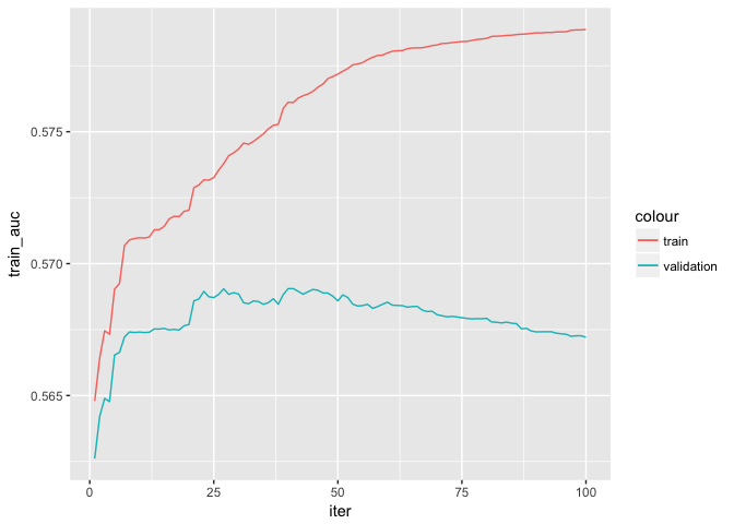
# Print evaluation log
xgb0$evaluation_log %>%
  ggplot(aes(x = iter)) +
  geom_line(aes(y = train_auc, color = "train")) +
geom_line(aes(y = validation_auc, color = "validation"))TODO: Estimate the model for various other hyperparameters (e.g. eta, nrounds, gamma, max_depth).
- How does the evaluation log change?
- What are good parameters for eta and nrounds?
Feature importance
# Print feature importance
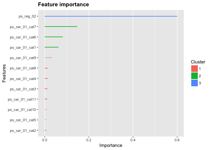
xgb0 %>%
  xgb.importance(feature_names = colnames(dat_x)) %>%
  xgb.ggplot.importance()
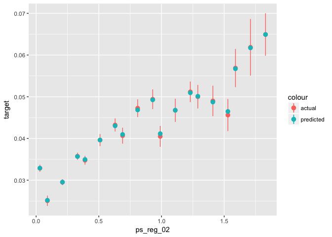
# Training:
data_glm[select_train, ] %>% # select training part only
mutate(predicted = predict(object = xgb0, newdata = train_xgb, type = "response")) %>%
ggplot(aes(x = ps_reg_02)) +
stat_summary_bin(aes(y = target, color = "actual"), fun.data = "mean_se") +
stat_summary_bin(aes(y = predicted, color = "predicted"), fun.data = "mean_se")# Testing:
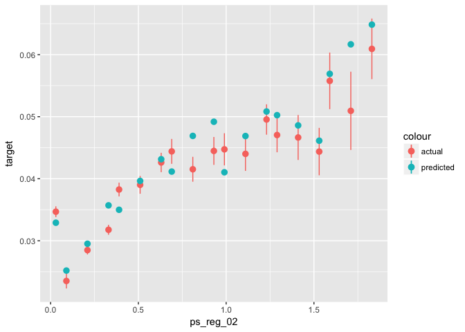
data_glm[select_valid, ] %>% # select training part only
mutate(predicted = predict(object = xgb0, newdata = valid_xgb, type = "response")) %>%
ggplot(aes(x = ps_reg_02)) +
stat_summary_bin(aes(y = target, color = "actual"), fun.data = "mean_se") +
stat_summary_bin(aes(y = predicted, color = "predicted"), fun.data = "mean_se")TODO: Choose a high value (e.g. 5) for gamma and see how these plots change. Why?
TODO: Add new feature (e.g. number of NAs per row) - Does it improve accuracy? - Where does it show up in feature importance?
Feature engineering
TODO: Feature Engineering - Build new features* - Evaluate distribution and correlation with outcome variable - Add it to your boosted tree - Where does it show up in feature importance? - Does accuracy improve?
Hint: try adding the number of NAs per row in addition to the two variables above:
dat_x <- data %>%
  mutate(number_nas = rowSums(is.na(as_data_frame(.) %>% select(-target)))) %>%
  model.matrix(object = target ~ ps_reg_02 + ps_car_01_cat + number_nas)
Additional Tasks
TODO: Build a model with all features.
TODO: Cross-validate results.
TODO: Evaluate partial dependency for some variables.
