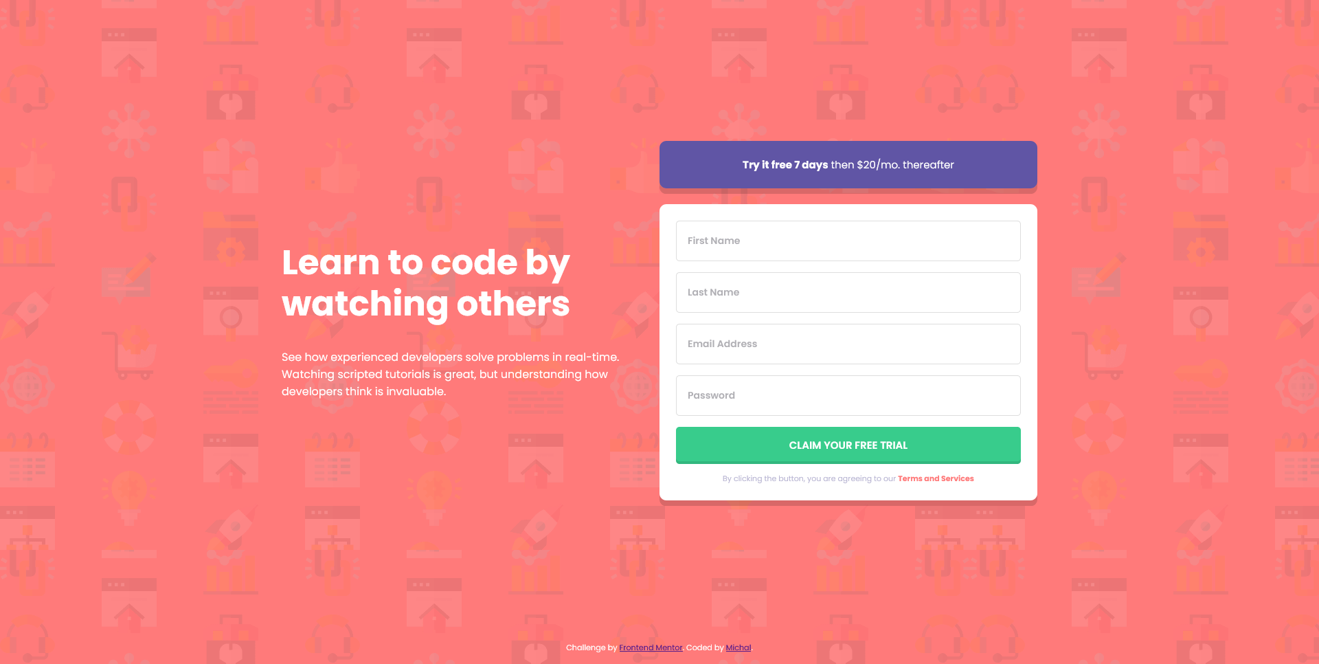
This is a solution to the Intro component with sign up form challenge on Frontend Mentor. Frontend Mentor challenges help you improve your coding skills by building realistic projects.
Users should be able to:
- View the optimal layout for the site depending on their device's screen size
- See hover states for all interactive elements on the page
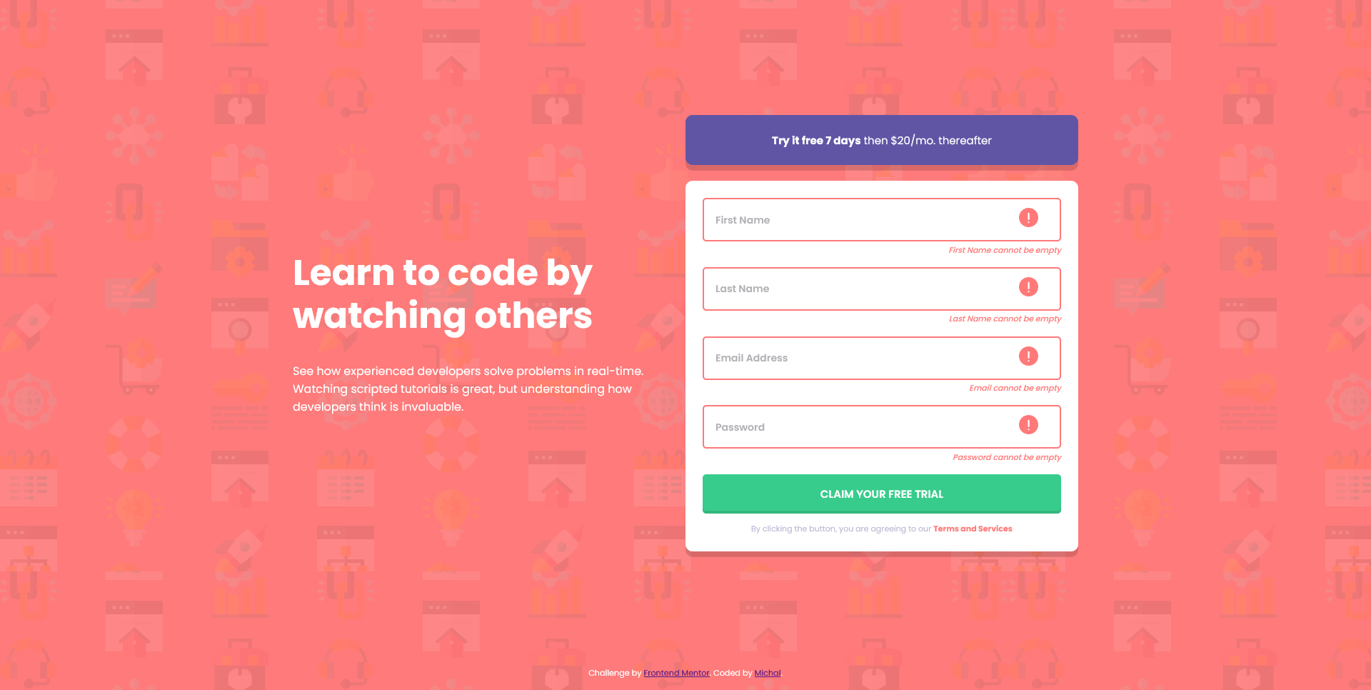
- Receive an error message when the
formis submitted if:- Any
inputfield is empty. The message for this error should say "[Field Name] cannot be empty" - The email address is not formatted correctly (i.e. a correct email address should have this structure:
name@host.tld). The message for this error should say "Looks like this is not an email"
- Any
- Semantic HTML5 markup
- React
- React Hook Form
- Styled Components
- Mobile-first workflow
Although this project seems small, I learned a lot!
For the first time I used styled components and I liked it so much that I think I will be using it in my all React projects from now. Not having to come up with CSS class names is a blessing.
To validate the form I used react-hook-form library and once you get a gist of it, it's pretty straight-forward.
The most important thing I learned is form accessibility. It was tricky to get screen readers to read out validation errors, but thanks to suggestions from mentors I got it to work correctly, once I connected error message to input field. This fragment is probably the best and I'm really proud of it. FormField component can be used for different types of input (text, email, password) and will always display/announce correct message.
const FormField = React.forwardRef((props, ref) => {
  const isError = () => (props['errors'] ? 'isError' : '')
  return (
    <InputWrapper className={isError()}>
      <StyledInput
        {...props}
        ref={ref}
        className={isError()}
        aria-describedby={props['name']}
      />
      {props['errors'] && (
        <p id={props['name']} className="errorMessage" aria-live="polite">
          {props['errors']['message']}
        </p>
      )}
    </InputWrapper>
  )
})I'd like to learn more about accessibility.
- React Hook Form - Really good documentation.
To run this project, install it locally using npm:
npm install && npm start
- Frontend Mentor - @mbart13

