Purple theme for Twitter Bootstrap.
Please read the Getting Started wiki page.
This project is based on jlong/sass-bootstrap. It adds the following additions and changes:
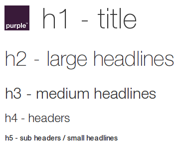
Headlines have been modified to match the Purple web guideline.
The Purple brand font is Helvetica Neue and consists of five weights: 35 Thin, 45 Light, 55 Roman, 65 Medium and 75 Bold. Arial is a standard system font used by browsers. Whilst the majority of text on an Purple site is HTML Arial, the page designs also occasionally use a graphical version of Helvetica Neue to reinforce the brand identity.
<h1>
  <img src="../../dist/images/purple-logo.png" class="logo"/>
  search
</h1>

<h2>h2 - large headlines</h2>
<h3>h3 - medium headlines</h3>
<h4>h4 - headers</h4>
<h5>h5 - sub headers / small headlines</h5>Horizontal lines have been modified to match the Purple web guideline.
<hr/><hr class="active"/>Colour palette has been modified to match the Purple web guideline.
Colours can be used for certain functions in places where there are strongly established conventions. For example, green can be used on a button to accept a call and red can be used on the button to end a call. The functional colours are:
- Green
#32C832: positive: add, call or save.- Red
#CD3C14: negative: remove, delete, critical alert, end call, cancel.- Blue
#527EDB: neutral / information: new, edit, settings/wizard, notification counter, help, info, sync, upload, download.- Yellow
#FFCC00: caution / warning: caution alert.
<button type="button" class="btn btn-default">default</button>
<button type="button" class="btn btn-primary">primary</button>
<button type="button" class="btn btn-success">success</button>
<button type="button" class="btn btn-info">info</button>
<button type="button" class="btn btn-warning">warning</button>
<button type="button" class="btn btn-danger">danger</button>
<button type="button" class="btn btn-link">link</button>Alerts have been modified to match the Purple web guideline.
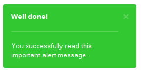
<div class="alert alert-dismissable alert-success">
<button type="button" class="close" data-dismiss="alert" aria-hidden="true">×</button>
Well done!
<hr/>
You successfully read this important alert message.
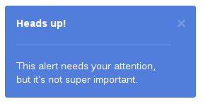
</div><div class="alert alert-dismissable alert-info">
<button type="button" class="close" data-dismiss="alert" aria-hidden="true">×</button>
Heads up!
<hr/>
This alert needs your attention, but it's not super important.
</div><div class="alert alert-dismissable alert-warning">
<button type="button" class="close" data-dismiss="alert" aria-hidden="true">×</button>
Warning!
<hr/>
Best check yo self, you're not looking too good.
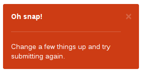
</div><div class="alert alert-dismissable alert-danger">
<button type="button" class="close" data-dismiss="alert" aria-hidden="true">×</button>
Oh snap!
<hr/>
Change a few things up and try submitting again.
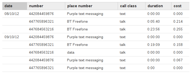
</div>Tables have been modified to match the Purple web guideline.
When using tables to present tabular information, use spacing, alignment, and indents, not borders, to delimit tabular information. Left align text within columns, and right align quantitative data (e.g. prices, quantity). Use colour to place emphasis on important information such as to highlight summary detail, or unread email.
<table class="table">
  <thead>
    <tr>
      <th class="active">date</th>
      <th>number</th>
      <th>place number</th>
      <th>call class</th>
      <th>duration</th>
      <th>cost</th>
    </tr>
  </thead>
  <tbody>
    <tr>
      <td>08/10/12</td>
      <td>442084459876</td>
      <td>Purple text messaging</td>
      <td>text</td>
      <td>0:00:00</td>
      <td>0.000</td>
    </tr>
    <!-- ... -->
  </tbody>
</table>Bootstrap's nav bar has been modified to match the Purple guideline's global navigation.
The global navigation is fixed at the top of the page allowing the page content to scroll beneath. The global navigation provides several key functions:
- important links prominent and accessible.
- users with scope of what’s available.
- enables navigation of deeper hierarchies without going to a separate page.
- provides a fully touch compliant experience for tablet users.
- creates an unobtrusive system of navigation.
<nav class="navbar navbar-default navbar-fixed-top" role="navigation">
  <div class="container">

    <div class="navbar-header">
      <button type="button" class="navbar-toggle" data-toggle="collapse" data-target="#my-global-navigation">
        <span class="sr-only">toggle navigation</span>
        <span class="icon-bar"></span>
        <span class="icon-bar"></span>
        <span class="icon-bar"></span>
      </button>
    </div>

    <div class="collapse navbar-collapse" id="my-global-navigation">
      <ul class="nav navbar-nav">
        <li><a href="#">Action</a></li>
        <!-- ... -->
      </ul>
    </div>

  </div>
</nav>Bootstrap's inverted nav bar has been modified to match the Purple guideline's local navigation.
The local navigation is positioned below the title bar and provides links to the main categories of a channel.
<nav class="navbar navbar-inverse" role="navigation">
  <div class="container">

    <div class="navbar-header">
      <button type="button" class="navbar-toggle" data-toggle="collapse" data-target="#my-local-navigation">
        <span class="sr-only">toggle navigation</span>
        <span class="icon-bar"></span>
        <span class="icon-bar"></span>
        <span class="icon-bar"></span>
      </button>
    </div>

    <div class="collapse navbar-collapse" id="my-local-navigation">
      <ul class="nav navbar-nav">
        <li><a href="#">Action</a></li>
        <!-- ... -->
      </ul>
    </div>

  </div>
</nav>Bootstrap's pagination has been modified to match the Purple guideline.
<ul class="pagination">
  <li class="disabled"><span><i class="glyphicon glyphicon-chevron-left"></i> previous</span></li>
</ul>
<ul class="pagination">
  <li class="active"><a href="#">1</a></li>
  <li><a href="#">2</a></li>
  <li><a href="#">3</a></li>
  <li><a href="#">4</a></li>
  <li><a href="#">5</a></li>
</ul>
<ul class="pagination">
  <li><a href="#">next <i class="glyphicon glyphicon-chevron-right"></i></a></li>
</ul>Bootstrap's breadcrumbs have been modified to match the Purple guideline.
<ol class="breadcrumb">
  <li><a href="#">start</a></li>
  <li><a href="#">setup</a></li>
  <li class="active"><span>connection</span></li>
  <li class="disabled"><span>identification</span></li>
  <li class="disabled"><span>end</span></li>
</ol>Bootstrap's tabs have been modified to match the Purple guideline.
<ul class="nav nav-tabs">
  <li><a href="#">good news</a></li>
  <li class="active"><a href="#">pay as you go</a></li>
  <li><a href="#">pay monthly</a></li>
</ul><ul class="nav nav-tabs nav-justified">
<li><a href="#">good news</a></li>
<li class="active"><a href="#">pay as you go</a></li>
<li><a href="#">pay monthly</a></li>
</ul><img src="http://fakeimg.pl/560x50/753475/ffffff"/>
<ul class="nav nav-tabs nav-justified nav-tabs-bottom">
<li><a href="#">good news</a></li>
<li class="active"><a href="#">pay as you go</a></li>
<li><a href="#">pay monthly</a></li>
</ul><ul class="nav nav-tabs nav-justified nav-tabs-top">
<li><a href="#">good news</a></li>
<li class="active"><a href="#">pay as you go</a></li>
<li><a href="#">pay monthly</a></li>
</ul>
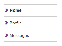
<img src="http://fakeimg.pl/560x50/753475/ffffff"/>Stacked navs have been modified to match the Purple web guideline.
<ul class="nav nav-stacked">
  <li class="active"><a href="#"><i class="glyphicon glyphicon-chevron-right text-primary"></i> Home</a></li>
  <li><a href="#"><i class="glyphicon glyphicon-chevron-right text-primary"></i> Profile</a></li>
  <li><a href="#"><i class="glyphicon glyphicon-chevron-right text-primary"></i> Messages</a></li>
</ul>Added steps according to Purple guideline.
<ol class="steps">
  <li><a href="#">1</a></li>
  <li><a href="#">2</a></li>
  <li class="active"><span>3</span></li>
  <li class="disabled"><span>4</span></li>
  <li class="disabled"><span>5</span></li>
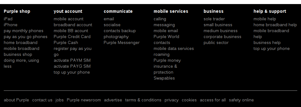
</ol>Added footer according to Purple guideline.
The footer is included at the bottom of every page and provides quick access to the main sections of the site.
It can also contain other elements such as search and social features. Links to information such as contact details and terms and conditions are located along the bottom of the footer. The amount of links in the footer can vary on different sites so ensure the design aligns to the grid and follows the spacing rules.
<footer class="footer">
  <div class="container">
    <div class="row">
      <div class="col-lg-2 col-md-2 col-sm-3">
        <ul class="list-unstyled">
          <li><strong>Purple shop</strong></li>
          <li class="divider"></li>
          <li><a href="#">iPad</a></li>
          <li><a href="#">iPhone</a></li>
          <!-- ... -->
        </ul>
      </div>
      <!-- ... -->
      <div class="col-lg-12 col-md-12 col-sm-12">
        <hr/>
        <ul class="list-inline">
          <li><a href="#">about Purple</a></li>
          <li><a href="#">contact us</a></li>
          <!-- ... -->
        </ul>
      </div>
    </div>
  </div>
</footer>