English | 日本語
Chrome extension to make Workplace a bit easier to read. It provides about 10 features for now.
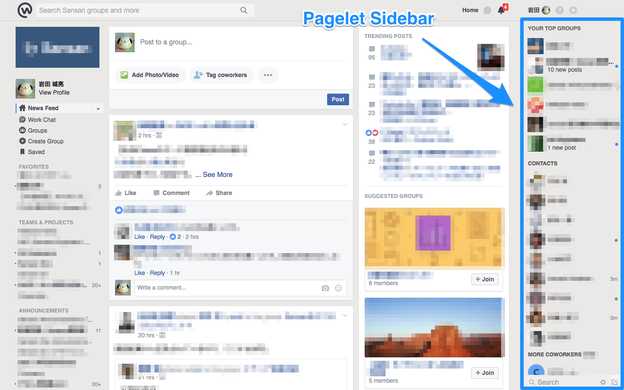
- Hide "Pagelet Sidebar" at the right end of the page
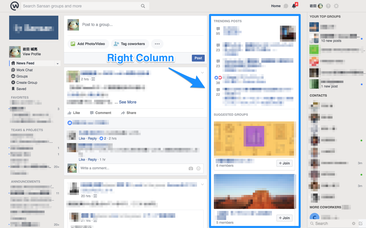
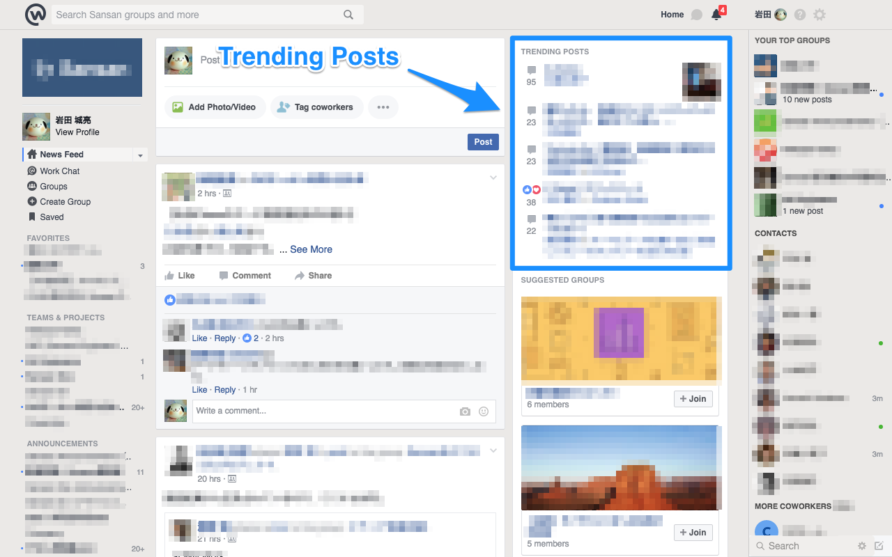
- Hide "Right Column" next to the content area
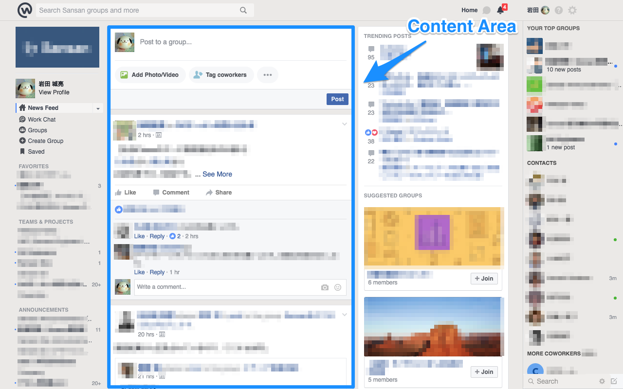
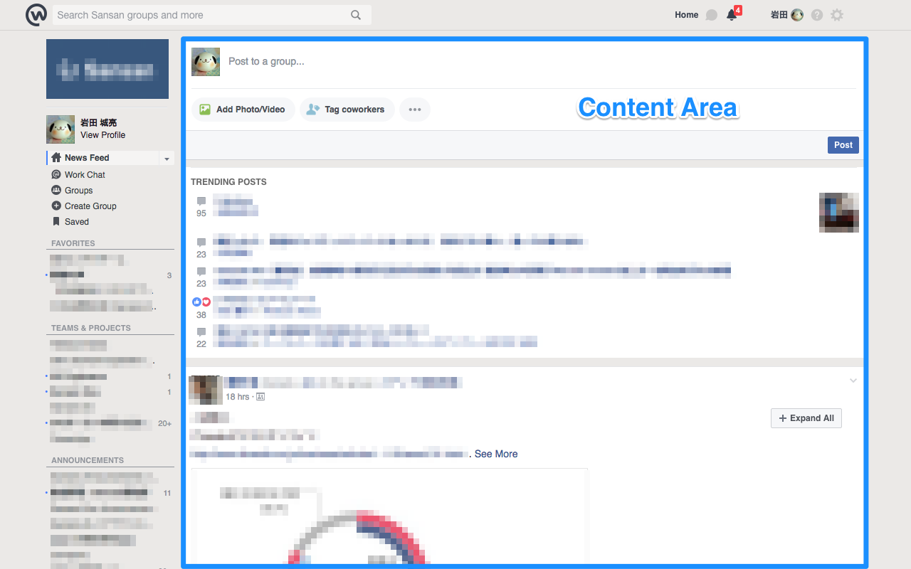
- Make posts easier to read by expanding the content width
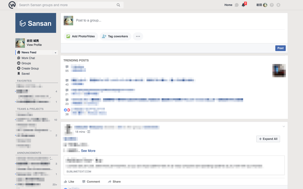
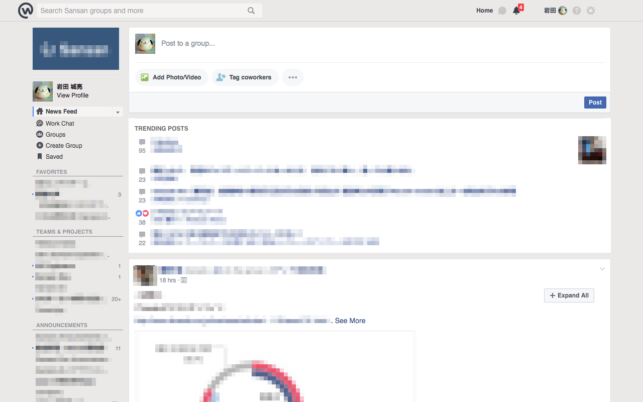
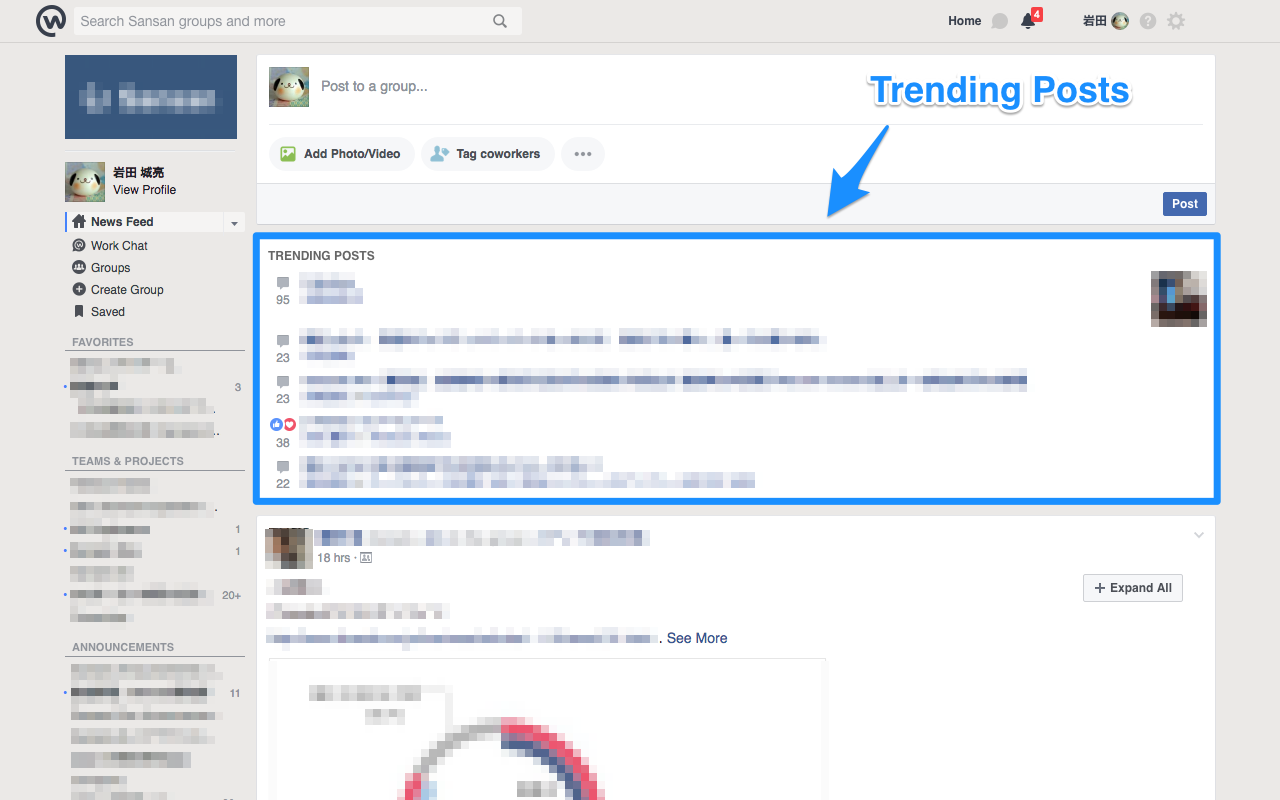
- Move "Trending Posts" from "Right Column" to the content area
- Place "Expand All" in each user content
- Place "Scroll to Top" button at the bottom right of the page
- Highlight mentions to me a little
- Highlight "Recent Activity" and "Older" headings a little
- Highlight subheadings a little in "Left Column"
Hide fixed "Pagelet Sidebar" at the right end of the page. Recommended for those who do not need the following features in the sidebar.
- YOUR TOP GROUPS
- CONTACTS
- MORE COWORKERS
- Search
If you are using "YOUR TOP GROUPS", you can use "FAVORITES" instead in the left sidebar.
Hide "Right Column" next to the content area. Recommended for those who do not need the following features in the sidebar.
- Home
- TRENDING POSTS
- SUGGESTED GROUPS
- Give Feedback
- Select Your Language
- Group
- ADD MEMBERS
- MEMBERS
- DESCRIPTION
- GROUP TYPE
- INVITE A MAILING LIST
- GROUP CHATS
- CREATE NEW GROUPS
- RECENT GROUP PHOTOS
- SUGGESTED GROUPS
- Select Your Language
- ADD MEMBERS
Make posts easier to read by expanding the width of content area. You can focus on post contents which is the main contents of Workplace.
Also, by applying liquid design, the width of the content area will be resized according to the window width.
Since "Right Column" will be hidden, move "Trending Posts" from "Right Column" to the content area. As a secondary effect, since "Trending Posts" area expands, post contents will not be ommitted.
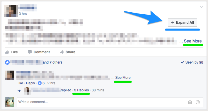
For each post, place a "Expand All" button to expand the collapsed post.
In Workplace, contents with long sentences and more than a certain number of comments are appropriately omitted. In order to display omitted content, you need to click on the following link one by one. It's too much hassle.
- See More
- View previous comments
- View x more comments
- x Replies
Clicking on "Expand All" button, the collapsed post expands automatically and you can check all the omitted contents.
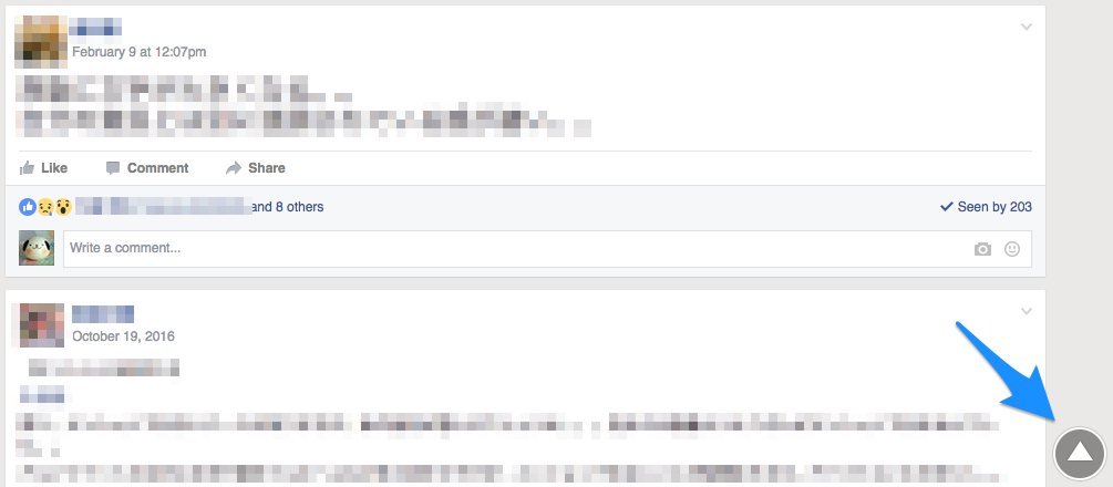
Place "Scroll to Top" button at the bottom right of the page (the content area in a strict sense).
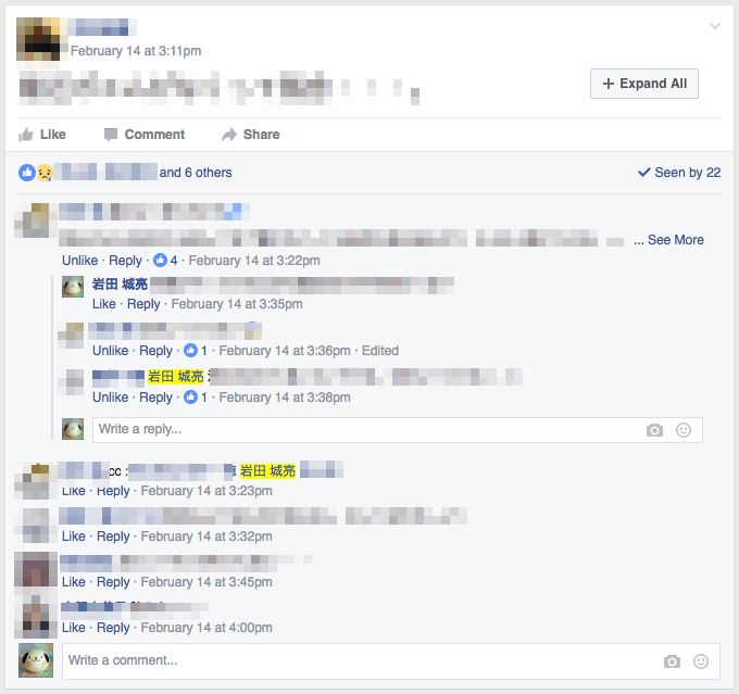
Highlight mentions to me a little. It becomes easy to notice a bit for mentions to me that tends to overlook.
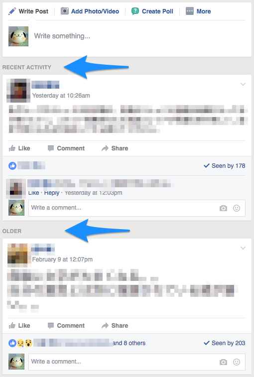
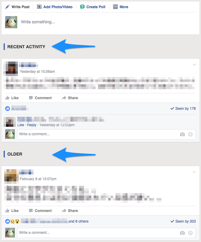
With highlighting "RECENT ACTIVITY / OLDER (POST) / PINNED POST" headings a little, you can avoid the situation that "I intended to browse only the latest posts, but I was reading past ones without even noticing".
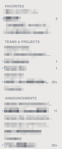
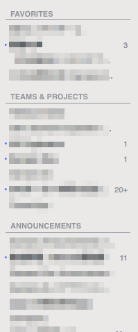
Highlight subheadings a little in "Left Column" by putting a separator line. That's all.
Copyright © 2017 Josuke Iwata (@rockwillj)
Copyright © 2016 Atsushi Kambara (@atsukanrock, in Expand All feature)
This software is released under the MIT License, see LICENSE.
