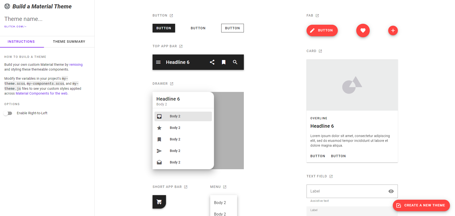
To begin customizing your theme, you’ll modify the variables in your project’s my-theme.scss file. By default, each theme starts off with Material’s baseline values. We’ve added these values in the theme so you can easily swap them out.
To change your theme’s typography, we recommend using Google Fonts and choosing a font-family that best reflects your style. Copy the font’s @import url and set the global font-family.
@import url('https://fonts.googleapis.com/css?family=Roboto:300,400,500');
$mdc-typography-font-family: unquote("Roboto, sans-serif");
To systematically apply shape throughout your app, it helps to understand that components are grouped by size into categories of small, medium, and large. Each component size group can be themed by overriding the default values. We recommend using our shape customization tool to help you pick your radius values.
$mdc-shape-small-component-radius: 4px;
$mdc-shape-medium-component-radius: 4px;
$mdc-shape-large-component-radius: 0px;
To change your theme's color scheme, replace the default HEX color values with custom HEX color values. Use our color palette generator to help come up with pairings and check your color contrast.
Primary colors $mdc-theme-primary map to components and elements, while secondary colors $mdc-theme-secondary are used as accents on components.
$mdc-theme-primary: #6200ee;
$mdc-theme-secondary: #018786;
Theme background $mdc-theme-background appears behind scrollable content. Surface color $mdc-theme-surface is mapped to the surface of components such as cards, sheets, and menus. Error color $mdc-theme-error is used to indicate an error state for components such as text fields.
$mdc-theme-surface: #ffffff;
$mdc-theme-background: #ffffff;
$mdc-theme-error: #b00020;
"On" colors define how text, icons, and strokes are colored in relation to the surface on which they appear.
$mdc-theme-on-primary: #ffffff;
$mdc-theme-on-secondary: #ffffff;
$mdc-theme-on-error: #ffffff;
$mdc-theme-on-surface: #000000;
Modifying these variables in your project's my-theme.scss file creates your custom Material theme.
- From the root directory, run:
npm install
npm run-script build
Note: This will update
bundle.jsandbundle.cssin thedist/folder.
- Open
index.htmlin your browser
Congrats!, your theme is ready to be used.
Check out the Material Components for the Web documentation to add more components and styling. Read the full Getting Started guide and learn about Material Theming.
