Mobile adjustments
Opened this issue · 2 comments
I love this template, the only thing I'm missing is something for mobile. It looks okay on mobile and handles the resize well, but I think it would look so much nicer if the navbar on the left was hidden and able to be toggled. That would make it easier to see the content on the right, allowing it to be larger and more legible. I viewed the demo on my phone, and everything was shown it was just incredibly small.
Yeah, It would be nice but I can't do it right now, I'll take asap.
Thanks :)
Maybe even just some more mobile friendly CSS. Like taking the navbar, removing the collapsing elements, and just keeping the navbar above the content for mobile.
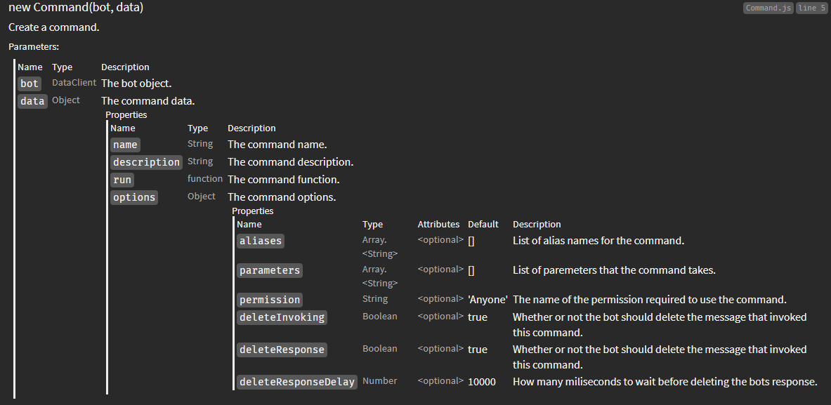
Also the tables could use some work as well, having a couple nested objects with optional values makes it very very wide.

It might be worthwhile to rework these as well. Maybe instead of breaking out objects into sub tables the properties could be listed directly below, but prefixed with the object name? Example from image would work maybe like:
- data
- data.name
- data.description
- data.options
- data.options.aliases
- etc
Limiting the number of columns would make it easier to style.