nord-iterm2 slightly dimmer than nord-alacritty
bdeak4 opened this issue · 2 comments
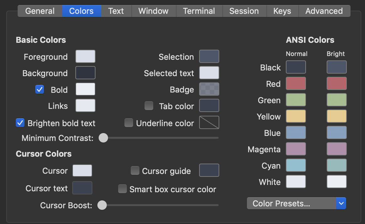
Hey, I've noticed that Nord colors in iterm2 are slightly dimmer than same in Alacritty terminal.
Left - iterm2
Right - Alacritty

iterm2 settings:

Alacritty settings:
colors:
   primary:
     background: '0x2E3440'
     foreground: '0xD8DEE9'
   cursor:
     text: '0x2E3440'
     cursor: '0xD8DEE9'
   normal:
     black: '0x3B4252'
     red: '0xBF616A'
     green: '0xA3BE8C'
     yellow: '0xEBCB8B'
     blue: '0x81A1C1'
     magenta: '0xB48EAD'
     cyan: '0x88C0D0'
     white: '0xE5E9F0'
   bright:
     black: '0x4C566A'
     red: '0xBF616A'
     green: '0xA3BE8C'
     yellow: '0xEBCB8B'
     blue: '0x81A1C1'
     magenta: '0xB48EAD'
     cyan: '0x8FBCBB'
     white: '0xECEFF4'
I am not sure if this is bug with one of those terminal emulators or is one theme outdated?
Hi @Bartol 👋, thanks for your contribution 👍
That's a topic one could write multiple scientific books about color theory 😄
Every application might use a different color space, starting from the simple RGB color model to sRGB or the CMYK color model to the comparison of natural color to other color systems.
And then there are many other factors like the color management on your system, e.g. the ICC profile and color calibration of your monitor as well as the type of your display device, e.g. LCD or LED. More factors are your environment, e.g. the effect and brightness of the sun light/rays on the adaption of the retina of your eye to various levels of light.
I guess we need to deal with the fact that there will always small (but most of the time hardly visible ) color differences.
@arcticicestudio Thanks for great explanation!