docs - maps have wrong default color pallete
danton267 opened this issue · 5 comments
They have a turquoise default color palette, instead of grey.
https://github.com/plotly/plotly.matlab-docs/blob/main/matlab/2021-08-04-scatter-plots-on-maps.md
https://github.com/plotly/plotly.matlab-docs/blob/main/matlab/2021-08-04-lines-on-maps.md
here only first 2 plots: https://github.com/plotly/plotly.matlab-docs/blob/main/matlab/2021-08-04-bubble-maps.md
This issues was fixed by PR #434
Bellow share results for one example of each geo chart case
geoscatter function

geoplot function

geobubble function

REMARK
It is important to note that for geo charts there is an optional parameter called 'geoRenderType'. This parameter can be set to 'geo' or 'mapbox'. Geo charts by default use 'geo'.
Below I share examples using 'mapbox'
geoscatter function
lon = (-170:10:170);
lat = 50 * cosd(3*lon);
A = 101 + 100*(sind(2*lon));
C = cosd(4*lon);
geoscatter(lat,lon,A,C,'^')

fig2plotly(gcf, 'geoRenderType', 'mapbox');

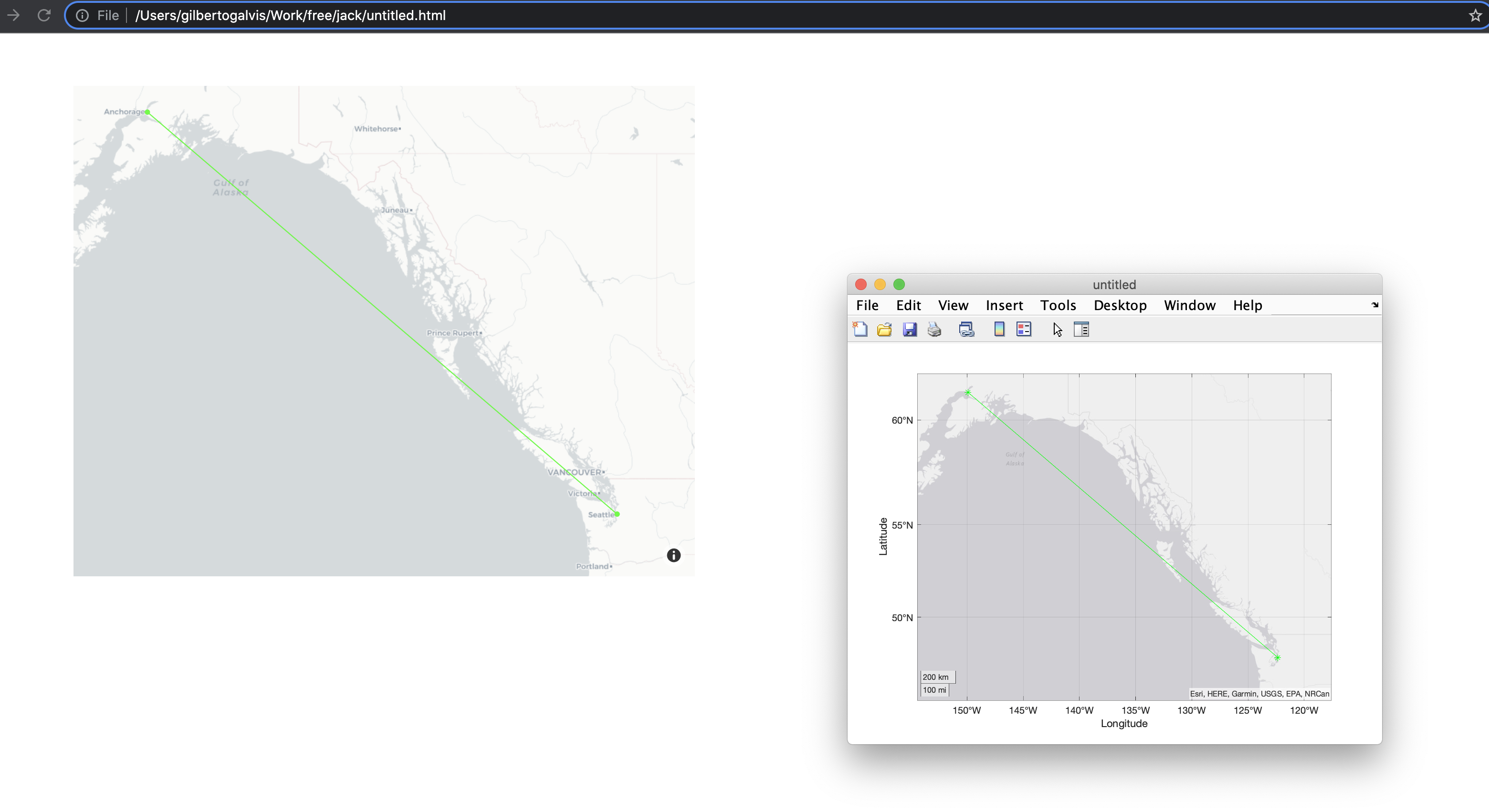
geoplot function
latSeattle = 47.62;
lonSeattle = -122.33;
latAnchorage = 61.20;
lonAnchorage = -149.9;

geoplot([latSeattle latAnchorage],[lonSeattle lonAnchorage],'g-*')
geolimits([45 62],[-149 -123])

fig2plotly(gcf, 'geoRenderType', 'mapbox');
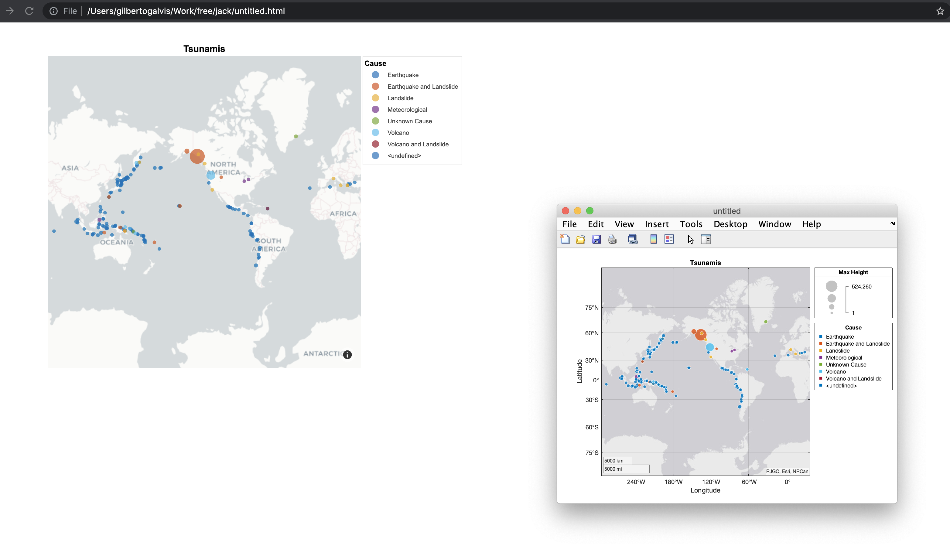
geobubble function
tsunamis = readtable('tsunamis.xlsx');

tsunamis.Cause = categorical(tsunamis.Cause);

geobubble(tsunamis,'Latitude','Longitude', ...
    'SizeVariable','MaxHeight','ColorVariable','Cause');

fig2plotly(gcf, 'geoRenderType', 'mapbox');
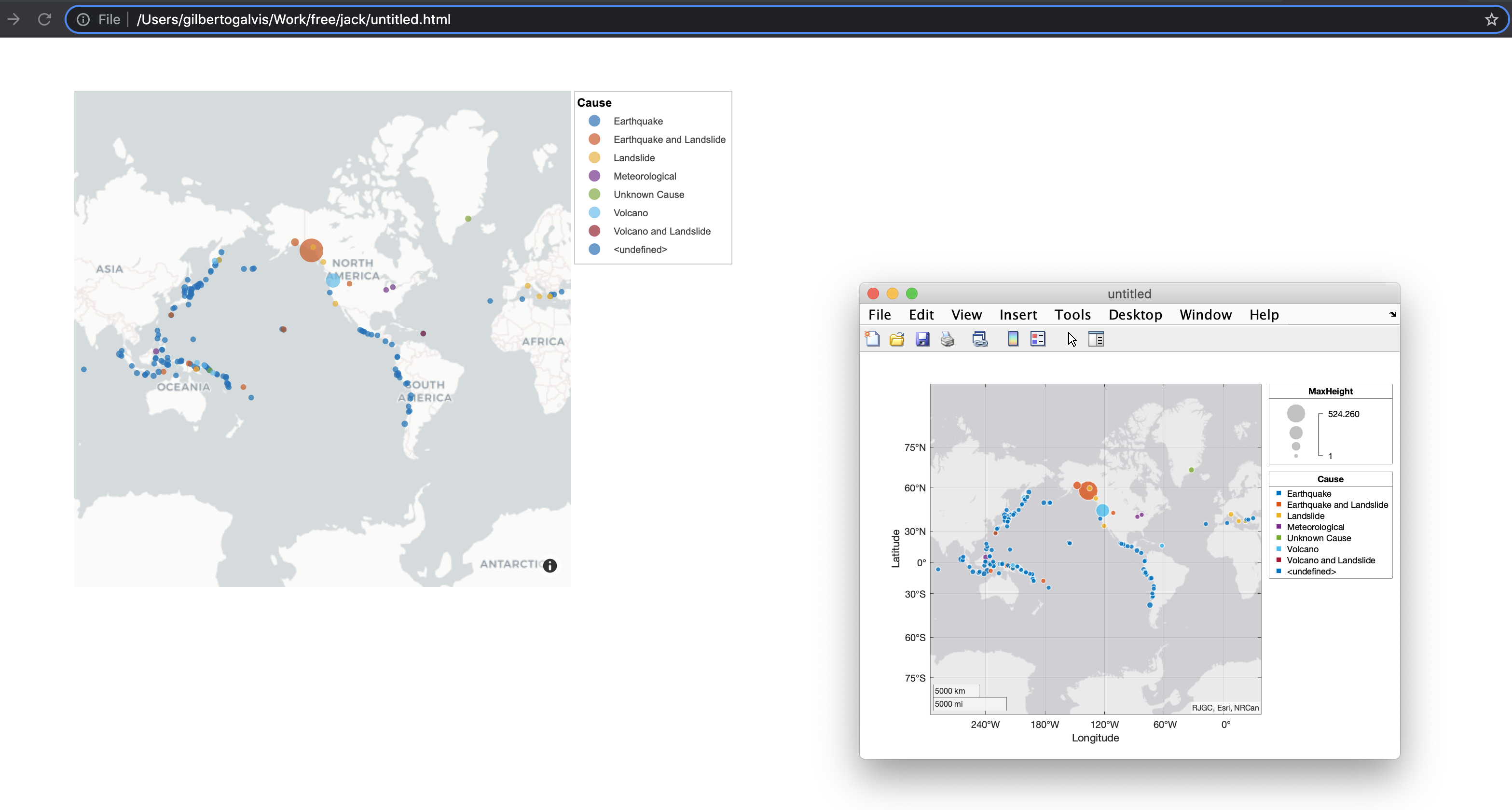
NOTE:
The mapbox option makes geo charts more elegant, but has limitations regarding markers (they can only be circles)
Noting down here that none of the axes are captured with fig2plotly().
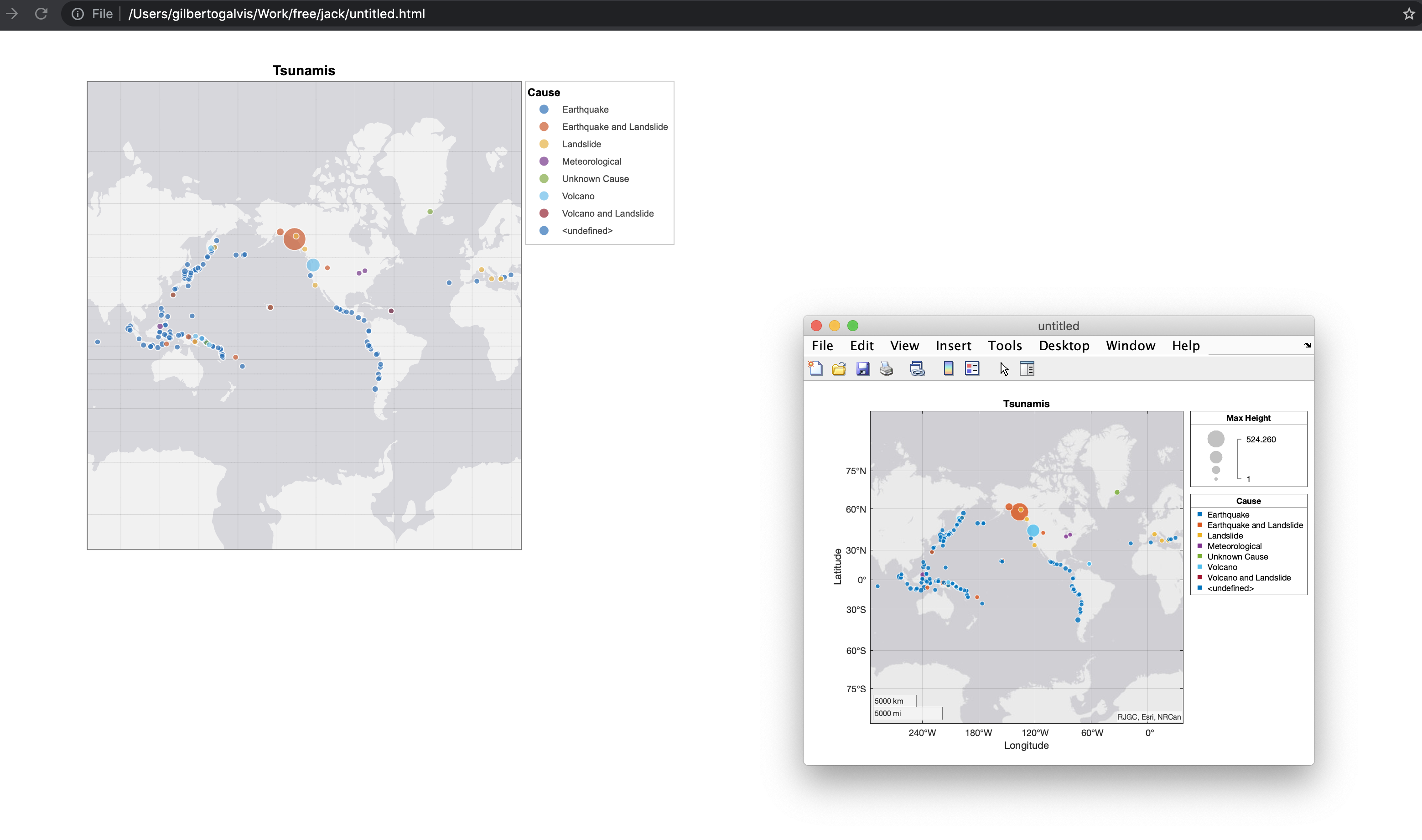
tsunamis = readtable('tsunamis.xlsx');

colordata = categorical(tsunamis.Cause);

gb = geobubble(tsunamis.Latitude,tsunamis.Longitude,tsunamis.MaxHeight,colordata,'Title','Tsunamis');

gb.SizeLegendTitle = 'Max Height';
gb.ColorLegendTitle = 'Cause';

fig2plotly(gcf);
not captured properly
Noting down here that none of the axes are captured with fig2plotly().
Yes. When I updated this functionality I wrote it down as an observation. The plotly functionalities used to create the geo charts do not allow to configure the tick labels and some other axes features
tsunamis = readtable('tsunamis.xlsx');

colordata = categorical(tsunamis.Cause);

gb = geobubble(tsunamis.Latitude,tsunamis.Longitude,tsunamis.MaxHeight,colordata,'Title','Tsunamis');

gb.SizeLegendTitle = 'Max Height';
gb.ColorLegendTitle = 'Cause';

fig2plotly(gcf);
not captured properly
This issue was fixed by PR #462
Result using 'geo' as 'geoRenderType'
Result using 'mapbox' as 'geoRenderType'