Website visual change proposals
cyanxiao opened this issue · 3 comments
cyanxiao commented
What’s the problem
- Font weight of side menu is too heavy, which always attracts users’ attention to side menu instead of doc right in the center of the page.
- Table lacks of contrast when it compares to other content of the doc.
- Many different font sizes lead to distraction (
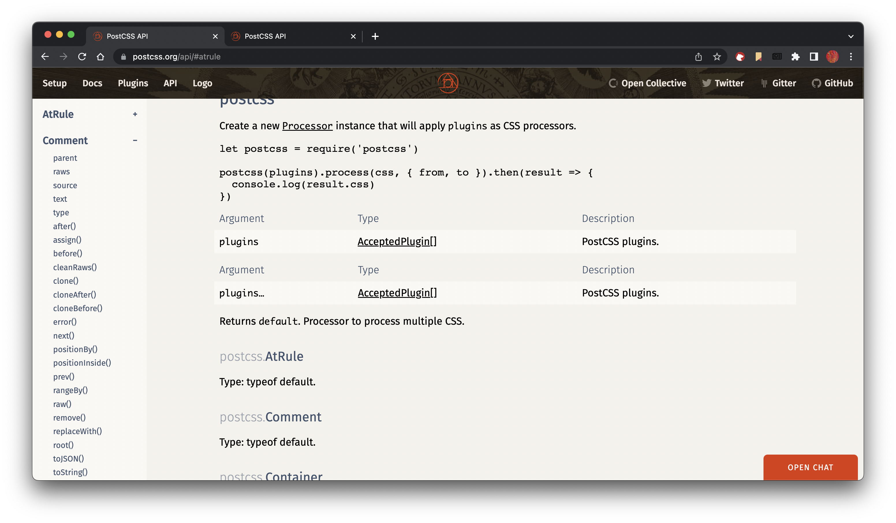
navlink,sidemenu_section,sidemenu_child,doc_title,doc,doc_subtitleall have different sizes). - Inconsistency between homepage & API page. The navigation bar of the API page sticks to the top when scrolling down while homepage doesn’t.
Possible Solutions
- Reduce side menu font weight.
- Polish the style of table.
- Use color & font weight to indicate hierarchy instead of font sizes.
- Stick navigation bar to the top always.
Comparison of My Draft
API Page Before
API Page After

Homepage Before
Homepage After

These are just my personal opinion. Don't know whether it is good enough to tweak the design.
ai commented
I like the changes.
A question:
- What sidemenu links will be highlighted in red like
Commentin your example?
A few changes:
- No transparent background since it reduce readability
- Can we make table header in API less aggressive? Users should look at table content, not table header.
cyanxiao commented
- What sidemenu links will be highlighted in red like
Commentin your example?
When the section is expanded.
- No transparent background since it reduce readability
Yes pure color would be better. I noticed that mobile size has adopted pure color.
2. Can we make table header in API less aggressive? Users should look at table content, not table header.
I will try to use a light blue seperation line instead.
ai commented
When the section is expanded.
Let’s try 👍
I will try to use a light blue seperation line instead.
We can try. Show how it will look like.