Client/server autocompletion designed for Meteor's collections and reactivity.
Check out a demo app at http://autocomplete.meteor.com or the source.
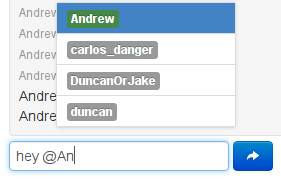
Auto-completes typing in text inputs or textareas from different local or remote Meteor collections when triggered by certain symbols. You've probably seen this when referring to users or issues in a GitHub conversation. For example, you may want to ping a user:
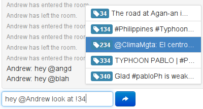
...and ask them to look at a certain item:
Features:
- Multiple collection matching with different trigger tokens and fields
- Fully live and reactive Meteor template rendering of drop-down list items
- Drop-down can be positioned above or below the text
- Mouse or keyboard interaction with autocomplete menu
- Simple token-less autocompletion in an
<input>element, just like Bootstrap typeahead
Meteor's client-side data availability makes this dynamic, full-fledged autocomplete widget possible. Use it in chat rooms, comments, other messaging systems, or wherever strikes your fancy.
Use Meteorite to install the package:
mrt add autocomplete
Add a text input or textarea to a template in one of the following ways, as a Spacebars template or block helper. Pass in any HTML parameters as other arguments to the template:
<template name="foo">
    ... stuff
    {{> inputAutocomplete settings=settings id="msg" class="input-xlarge" placeholder="Chat..."}}
    ... more stuff
</template>

<template name="bar">
    ... stuff
    {{#textareaAutocomplete settings=settings id="msg"}}
        {{myStartingText}}
    {{/textareaAutocomplete}}
    ... more stuff
</template>
Define a helper for the first argument, like the following example:
Template.foo.settings = function() {
  return {
   position: "top",
   limit: 5,
   rules: [
     {
       token: '@',
       collection: Meteor.users,
       field: "username",
       template: Template.userPill
     },
     {
       token: '!',
       collection: Dataset,
       field: "_id",
       options: '',
       matchAll: true,
       filter: { type: "autocomplete" },
       template: Template.dataPiece
     }
   ]
  }
};position(=toporbottom) specifies if the autocomplete menu should render above or below the cursor. Select based on the placement of yourinput/textarearelative to other elements on the page.limit: Controls how big the autocomplete menu should get.rules: An array of matching rules for the autocomplete widget, which will be checked in order.
-
token: (optional) What character should trigger this rule. Leave blank for whole-field behavior (see below). -
collection: What collection should be used to match for this rule. Must be aMeteor.Collectionfor client-side collections, or a string for remote collections (available inglobalon the server.) -
subscription: A custom subscription for server-side search; see below. -
template: The template that should be used to render each list item. -
filter: (optional) An object that will be merged with the autocomplete selector to limit the results to more specific documents in the collection. -
noMatchTemplate: (optional) A template to display when nothing matches. This template can use the reactive functions on the AutoComplete object to display a specific message, or be assigned mouse/keyboard events for user interaction. -
callback: (optional) A function which is called when an item is selected with arguments(doc, element), corresponding to the document of the selected item and the active input field. -
nomatch: (optional) A function which is called when the autocompleter does not find a match and the user attempts to use the text written in the box. Default matcher arguments: the default behavior is to create a regex against the field to be matched, which will be constructed using the arguments below. -
field: The field of the collection that the rule will match against. Can be nested, i.e.'profile.foo'. -
options:'i'(default) to specify the regex matching options. -
matchAll:false(default) to match only fields starting with the matched string. (see below)
Custom matcher: if this is specified, the default matcher arguments will be ignored.
selector: a one argumentfunction(match)that takes the currently matched token suffix and returns the selector that should be added to the argument tocollection.findto filter the autocomplete results. (NOTE: if you are using$where, the selector cannot be serialized to the server).
Note that regular expression searches can only use an index efficiently when the regular expression has an anchor for the beginning (i.e. ^) of a string and is a case-sensitive match. Hence, when using case-sensitive matches and string start anchors (i.e. matchAll: false) searches can take advantage of server indices in Mongo.
This behavior is demonstrated in the example app.
If you only need to autocomplete over a single collection and want to match the entire field, specify a rules array with a single object and omit the token argument. The behavior for this is a little different than with tokens; see the demo.
Mixing tokens with tokenless autocompletion is unsupported and will probably result in unexpected behavior.
For security purposes, a default implementation of server-side autocomplete is only provided for insecure collections, to be used while prototyping. In all other applications, write your own publish function with the same arguments as in the autocomplete-recordset publication and secure it properly, given that clients can subscribe to this function in ways other than your client code intends. Make sure to push documents to the AutoCompleteRecords client-side collection.
Use of a custom publish function also allows you to:
- use full-text search services outside of Meteor, such as ElasticSearch
- use preferential matching for record fields that start with the autocomplete text, rather than contain it anywhere
An autocomplete template is just a normal Meteor template that is passed in the matched document. The template will be passed the entire matched document as a data context, so render list items as fancily as you would like. For example, it's usually helpful to see metadata for matches as in the pictures above.
Records that match the filter text typed after the token render a list of the template sorted in ascending order by field. For example, if you were matching on Meteor.users and you just wanted to display the username, you can do something very simple, and display the same field:
<template name="userPill">
    <span class="label">{{username}}</span>
</template>
However, you might want to do something a little more fancy and show not only the user, but whether they are online or not (with something like the user-status package. In that case you could do something like the following:
<template name="userPill">
    <span class="label {{labelClass}}">{{username}}</span>
</template>
and accompanying code:
Template.userPill.labelClass = function() {
  if this._id === Meteor.userId()
    return "label-warning"
  else if this.profile.online === true
    return "label-success"
  else
    return ""
}
This (using normal Bootstrap classes) will cause the user to show up in orange for him/herself, in green for other users that are online, and in grey otherwise. See CrowdMapper's templates for other interesting things you may want to do.
For example settings see one of the following:
- Multi-field example (from the app above)
- Single-field example (also from the app above)
- Autocompleting chatroom example
- To reduce latency, we could additionally support using
Meteor.methodsto return an array of documents, instead of a subscription, if the client's cache of the collection is assumed to be read-only or if changes don't matter. - The widget can keep track of a list of ordered document ids for matched items instead of just spitting out the fields (which currently should be unique)
- Could potentially support rendering DOM elements instead of just text. However, this can currently be managed in post-processing code for chat/post functions (like how GitHub does it).
- If you are not using Meteor, you may want to check out jquery sew, from which this was heavily modified.
- If you need tag autocompletion only (from one collection, and no text), try either the x-editable smart package with Select2 or jquery-tokenInput. Those support rendering DOM elements in the input field.

