Petal Components
Petal is a set of HEEX components that makes it easy for Phoenix developers to start building beautiful web apps.

About
Petal stands for:
- Phoenix
- Elixir
- Tailwind CSS
- Alpine JS (optional)
- Live View (HEEX)
Some components like Dropdowns require Javascript to work. We default to Alpine JS (17kb) but you can choose to use Phoenix.LiveView.JS as an alternative (though this will only work in live environments like live views or live components).
Documentation
For full documentation, visit petal.build.
Try it out
We have a fresh Phoenix boilerplate template with Petal Components ready to go if you would like to get your hands dirty.
Roadmap
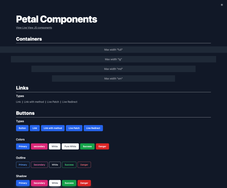
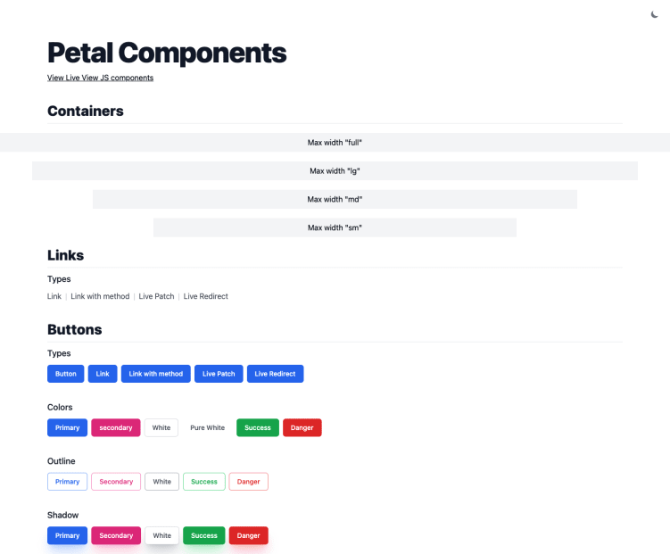
Layout
- container
Form components
- text input
- select dropdown
- textarea
- checkbox
- radios
- errors
- labels
- file upload
- text variants (email, password, tel)
- color input
- range input
- time, datetime, & date input
- multiple select (see checkbox group)
- switch
- input help text
- input prefix and postfix
Buttons
- basic button
- change size
- change color
- loading state (with spinner)
- filled vs outline
- button group
Misc
- menu dropdown
- tooltips
- avatar
- alerts
- tables
- cards
- breadcrumbs
- modal
- slide over
- spinners
- accordian
- pagination
- badges
- progress
- links
Contributing
Feel free to open a Github issue in this project.
If you'd like to help out we've got a Phoenix umbrella app that allows you to easily contribute to Petal Components (which is installed as a git submodule).