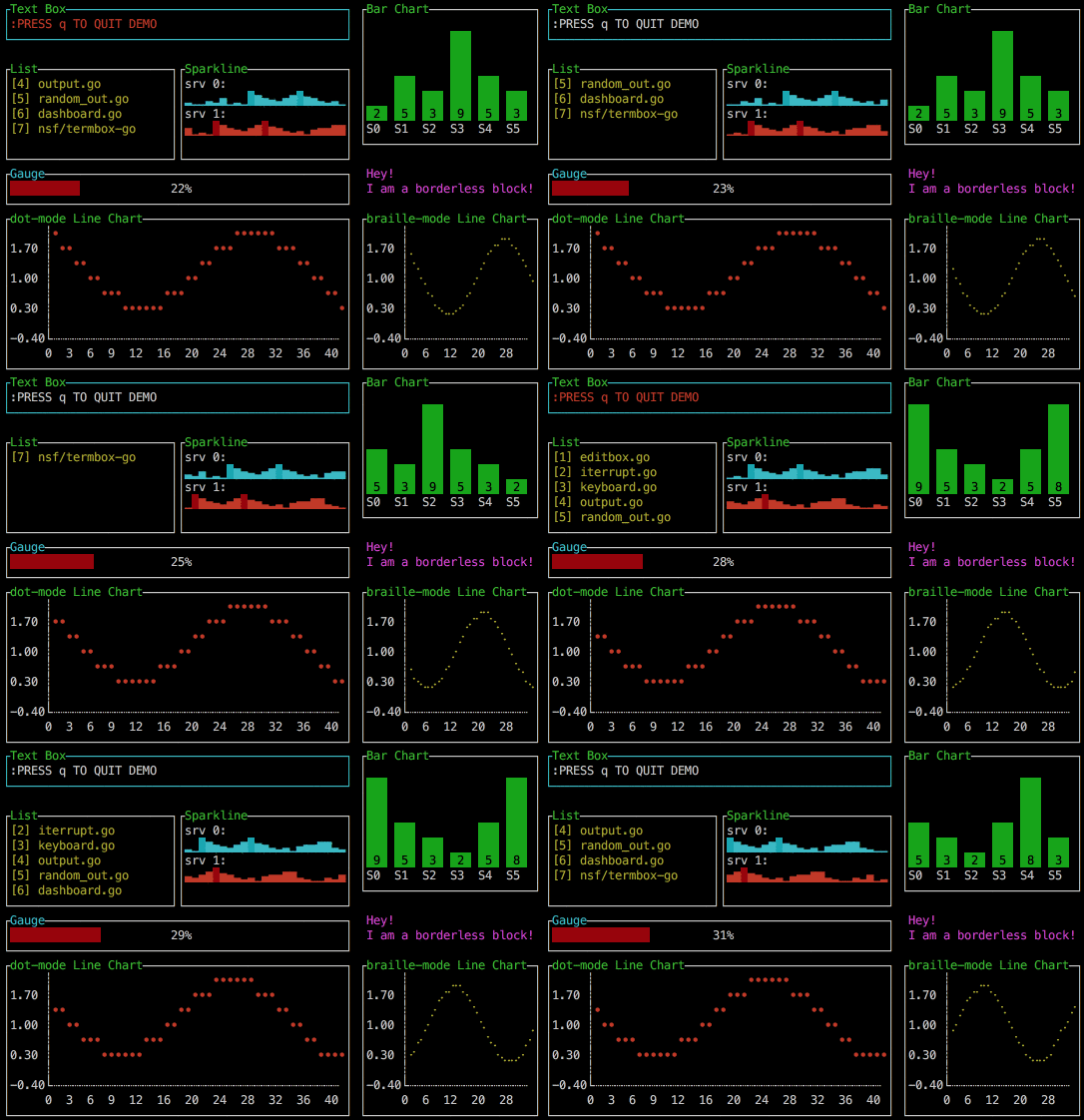
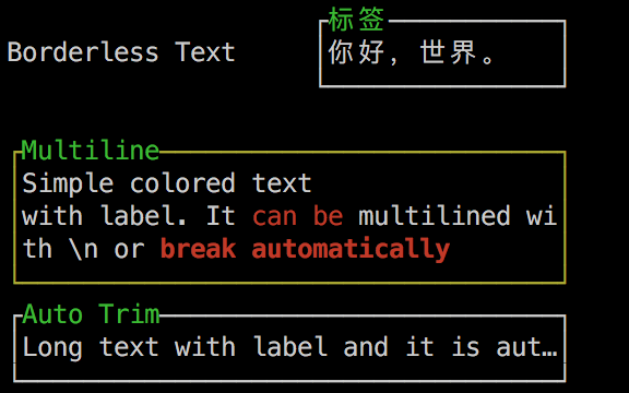
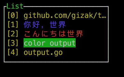
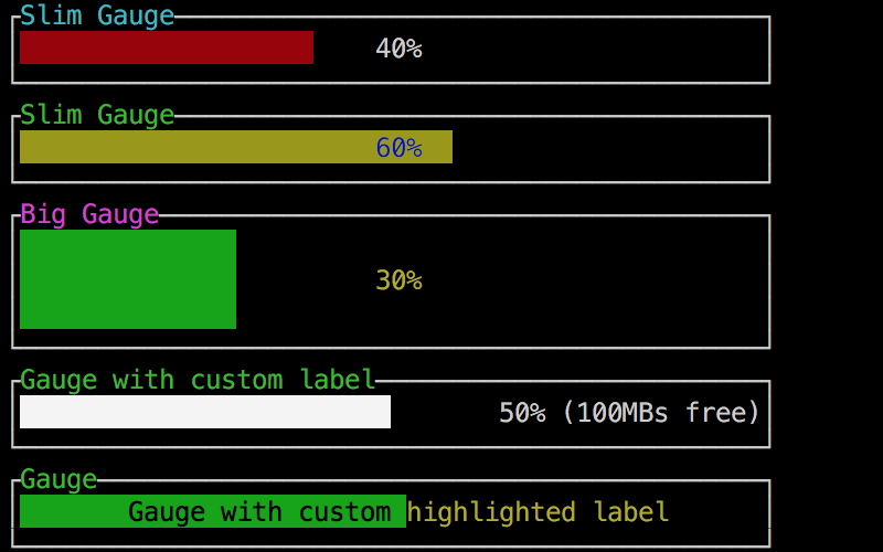
termui is a cross-platform, easy-to-compile, and fully-customizable terminal dashboard. It is inspired by blessed-contrib, but purely in Go.
Now version v2 has arrived! It brings new event system, new theme system, new Buffer interface and specific colour text rendering. (some docs are missing, but it will be completed soon!)
master mirrors v2 branch, to install:
go get -u github.com/gizak/termui
It is recommanded to use locked deps by using glide: move to termui src directory then run glide up.
For the compatible reason, you can choose to install the legacy version of termui:
go get gopkg.in/gizak/termui.v1
To use termui, the very first thing you may want to know is how to manage layout. termui offers two ways of doing this, known as absolute layout and grid layout.
Absolute layout
Each widget has an underlying block structure which basically is a box model. It has border, label and padding properties. A border of a widget can be chosen to hide or display (with its border label), you can pick a different front/back colour for the border as well. To display such a widget at a specific location in terminal window, you need to assign .X, .Y, .Height, .Width values for each widget before sending it to .Render. Let's demonstrate these by a code snippet:
	import ui "github.com/gizak/termui" // <- ui shortcut, optional

	func main() {
		err := ui.Init()
		if err != nil {
			panic(err)
		}
		defer ui.Close()

		p := ui.NewPar(":PRESS q TO QUIT DEMO")
		p.Height = 3
		p.Width = 50
		p.TextFgColor = ui.ColorWhite
		p.BorderLabel = "Text Box"
		p.BorderFg = ui.ColorCyan

		g := ui.NewGauge()
		g.Percent = 50
		g.Width = 50
		g.Height = 3
		g.Y = 11
		g.BorderLabel = "Gauge"
		g.BarColor = ui.ColorRed
		g.BorderFg = ui.ColorWhite
		g.BorderLabelFg = ui.ColorCyan

		ui.Render(p, g) // feel free to call Render, it's async and non-block

		// event handler...
	}
Note that components can be overlapped (I'd rather call this a feature...), Render(rs ...Renderer) renders its args from left to right (i.e. each component's weight is arising from left to right).
Grid layout:
Grid layout uses 12 columns grid system with expressive syntax. To use Grid, all we need to do is build a widget tree consisting of Rows and Cols (Actually a Col is also a Row but with a widget endpoint attached).
	import ui "github.com/gizak/termui"
	// init and create widgets...

	// build
	ui.Body.AddRows(
		ui.NewRow(
			ui.NewCol(6, 0, widget0),
			ui.NewCol(6, 0, widget1)),
		ui.NewRow(
			ui.NewCol(3, 0, widget2),
			ui.NewCol(3, 0, widget30, widget31, widget32),
			ui.NewCol(6, 0, widget4)))

	// calculate layout
	ui.Body.Align()

ui.Render(ui.Body)termui ships with a http-like event mux handling system. All events are channeled up from different sources (typing, click, windows resize, custom event) and then encoded as universal Event object. Event.Path indicates the event type and Event.Data stores the event data struct. Add a handler to a certain event is easy as below:
	// handle key q pressing
	ui.Handle("/sys/kbd/q", func(ui.Event) {
		// press q to quit
		ui.StopLoop()
	})

	ui.Handle("/sys/kbd/C-x", func(ui.Event) {
		// handle Ctrl + x combination
	})

	ui.Handle("/sys/kbd", func(ui.Event) {
		// handle all other key pressing
	})

	// handle a 1s timer
	ui.Handle("/timer/1s", func(e ui.Event) {
		t := e.Data.(ui.EvtTimer)
		// t is a EvtTimer
		if t.Count%2 ==0 {
			// do something
		}
	})

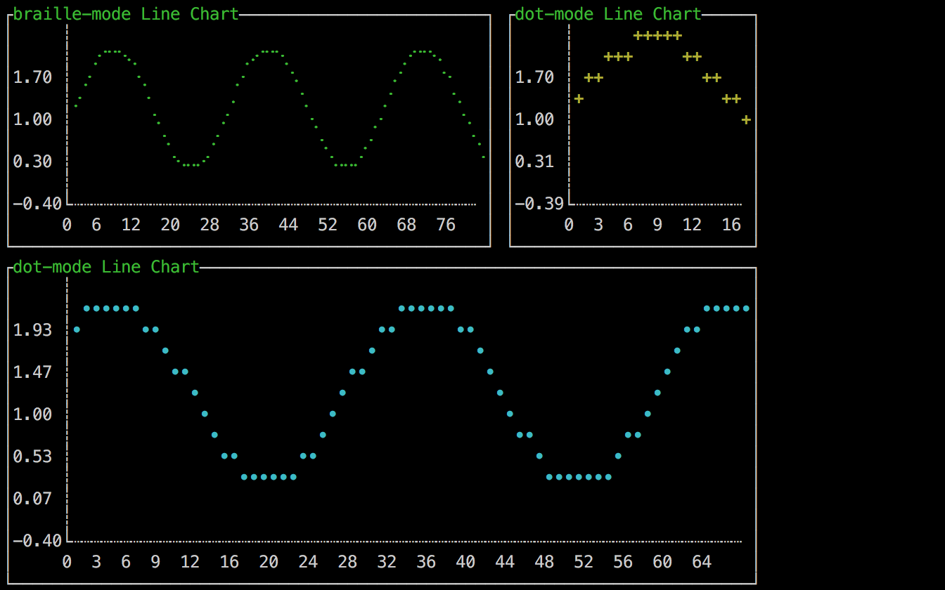
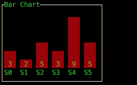
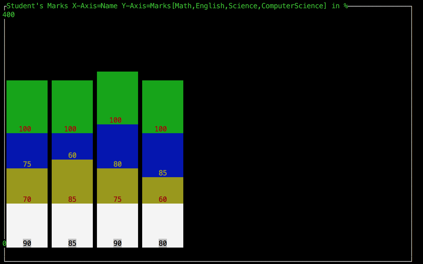
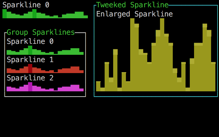
ui.Loop() // block until StopLoop is calledClick image to see the corresponding demo codes.
- Grid layout
- Event system
- Canvas widget
- Refine APIs
- Focusable widgets
This library is under the MIT License

