Select nice-looking static colors for reports
Closed this issue · 4 comments
sbine commented
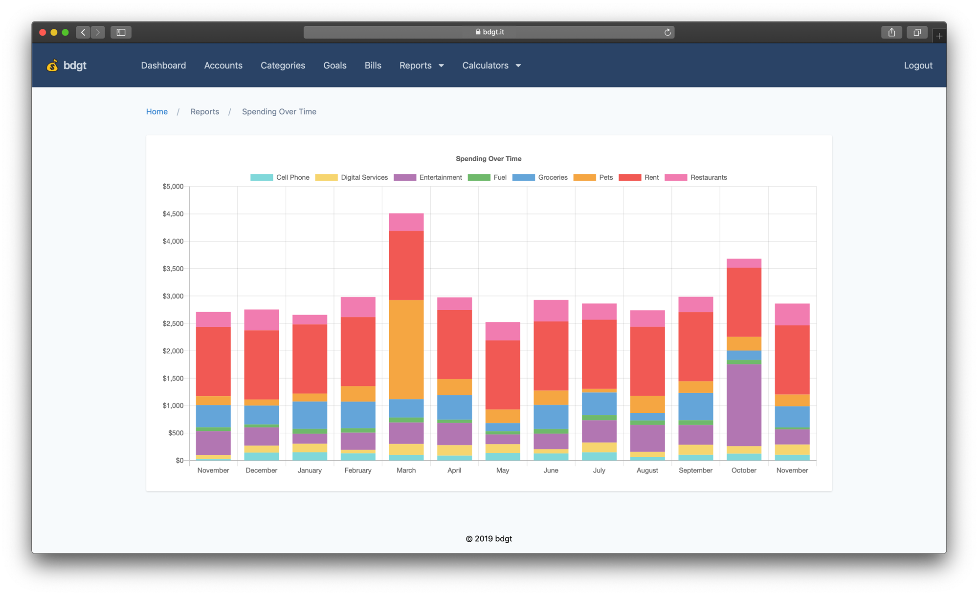
bdgt's reports are currently generated using random colors that change every time you refresh the page. It was a fun gimmick, but long-term it would be preferable to have some complementary colors that look good and aren't constantly changing.
This issue covers:
- Selecting a new set of colors that look nice together but are easy to differentiate
- Updating both reports so categories generally keep appearing in the same color through page refreshes (but it's OK if they change when the list of categories changes)
As a starting point, I like the colors shown in the bar chart in the README (screenshot below)–but I'm not a designer, so here's a designer's advice on selecting colors for data visualization.
- Pie chart is in SpendingByCategory.vue
- Bar chart is in SpendingOverTime.vue
- To work on this task you'll need to know how to build the frontend assets
Please include a screenshot in your PR :)
ActuallyConnor commented
