#Responsive CSS
This workshop is important because:
Certain best practices in CSS help us build web applications and sites that looks nice well on a multitude of devices.
After this workshop, developers will be able to:
- Write semantic CSS class names
- Articulate the benefits of "mobile-first" design
- Write media queries to adjust styles for different sized viewports
- Organize content on a website using a grid system
- Articulate the benefits of a CSS framework
Before this workshop, developers should already be able to:
- Write custom HTML & CSS
- Include external stylesheets
##Semantic CSS Classes
Discussion, challenge, then demonstration
Create modular classes that encapsulate a certain behavior and name them semantically.
How would you style CSS for these elements?
.shout— uppercase the text inside the element.shadow— add a drop-text to text inside the element.invert— flip an element upside-down
Example solution
.shout {
	text-transform: uppercase;
}

.shadow {
	text-shadow: 1px 1px 2px black;
}

.invert {
	transform: rotate(180deg);
}Consider what the experience will be on a small screen first. It will be much easier to have the same content fit a larger screen than it would be to have it fit a smaller one. Here's a set of sites to illustrate the point.
- Relative Units
- Media queries
- Grid system
###ems & rems
While the em unit is relative to the font-size of the parent, which can cause the "compounding issue" if the style is applied to nested elements—children getting smaller and smaller or bigger and bigger as they always refer to the size of their direct parent. Rem stands for "root-em", is relative to the <html> element, aka the root.
html { font-size: 62.5%; }
body { font-size: 1.4rem; } /* =14px */
h1   { font-size: 2.4rem; } /* =24px */
Note: Defining a base font-size of 62.5% allows font sizes to be 1/10 of their pixel equivalent.
###vw & vh
Sometimes we want certain elements to entirely fit within the viewport. Previously, developers would delegate this task to a JavaScript. As of CSS3, vw and vh size elements relatively to the viewport. 1 unit is 1 percent of the viewport size.
One way to adjust the styles depending on the device's size is by using media queries:
<!-- not great to style the body -->
body {
  background: papayawhip;
}

<!-- applied up to 400px wide  -->
@media (max-width: 400px){
  body {
    background: tomato;
  }
}
Using media queries, we can group our css rules according to the size of our expected viewing devises. This media query says, if our viewport is less than 400px, use the following css rules.
Possible values include:
- min-width
- max-width
- min-height
- max-height
Note: The
viewportmeta tag lets developers scale the viewport on mobile devices to be equal to the width of the device’s screen.
- Grids are a simple way to apply layout to a webpage. A better layout improves the user experience.
- Grids help avoid stressful CSS debugging by starting out on the right foot.
- Grids make the layout process easier because of reusable, semantically-named "utility classes" (i.e., a library of CSS class selectors).
- Grids aren't limited to a particular project. We can apply them to pretty much everything we do.
- Grids are highly customizable. You can really make them your own.
Even if you don't use a grid system, these concepts will translate across other layout problems.
- Separates content horizontally
- Contains columns
- Separates content vertically
- Is contained by a row
- Optional
- Spacing between columns
Most grid systems divide each row into 12 columns. Why 12? Well, 12 is the best number as it is divisible by 2, 3, 4, and 6 (meaning we can have columns that are: half-width, third-width, quarter-width, and sixth-width aka 50%, ~33.3%, 25%, and ~16.7%):
12/2  = 6
12/3  = 4
12/4  = 3
12/6  = 2
12/12 = 1

6 + 6                                           = 12
4 + 4 + 4                                       = 12
3 + 3 + 3 + 3                                   = 12
2 + 2 + 2 + 2 + 2 + 2                           = 12
1 + 1 + 1 + 1 + 1 + 1 + 1 + 1 + 1 + 1 + 1 + 1   = 12
##CSS Frameworks
- Teaches good practices
- Semantic class names
- Solid starter code
- Aids cross-browser compatibility
- Built-in grids!
- Well documented for teams
##Jigsaw Groups: Learn Skeleton
-
Create a simple index.html and include Skeleton in it.
-
Divide up into four groups. Each use Skeleton to accomplish one of the objectives. We will then mix up the groups and have a representative from each teach the others how their group accomplished their task.
-
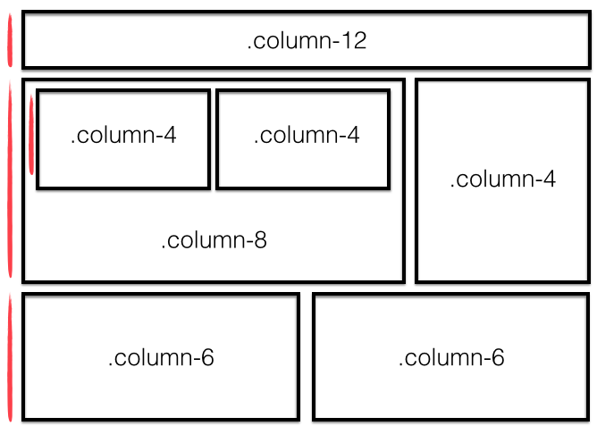
Implement the Skeleton grid system to create this:
-
Display JavaScript code on a webpage using the
codeandpretag. -
Create the front-end interface for a login form.
-
Create a table that displays 5 countries' population count, GDP, and Internet TLD
-
- What are three important components of responsive web design?
- How would you build your own grid system?
- Why use a CSS framework?
- The beginning of responsive web design
- Flexbox
- BEM
- Responsive images