This repository provides a python code to generate figures (e.g., curves and barcharts) that can be used in the paper to show the results.
Dependencies: Python 3.+, numpy, and matplotlib.
- Preliminary
- Examples for Plotting Curves
- Examples for Plot Functions
- Examples for Plotting Barchart
- Create Colorbar
- Crop Patches for Zoom-in Comparison
The following shows a simple but complete diagram.
It contains the following common components. When creating a new diagram, we will modify these components to present our data:
- Title
- X-Label, xtick, and, xticklabel
- Y-Label, ytick, and, yticklabel
- Line, Marker, Legend
- Grid
In this code, we define the appearance of the diagram with a configuration file. Then, we can plot the diagram by simply running:
python plot_diagram.py examples/demo/simple_plot.confThe configuration file for the above simple plot is shown below with comments.
# CONFIGURATION FILE

# Comments start with '#';
# Parameters start with '!';
# If a parameter contains space, please replace the space with '&' for correct parsing
# For bool type, 1 is True else False

# Plot type: ploty|plotxy|plottwins
# ploty: The input data only contains Y values, the X values are generated as [0, ..., len(Y)]
# plotxy: The input data contains both X and Y values
# plottwins: The input data only contains Y values. Plot figure with two different Y-axis
! plot_type plotxy

# Figure format: pdf|jpg|png
! format pdf

# Canvas setting, fig size in inches
# https://matplotlib.org/devdocs/gallery/subplots_axes_and_figures/figure_size_units.html
! width 7
! height 3
! dpi 220

# Line and marker setting, different lines have different colors and marker shapes
# https://matplotlib.org/stable/api/_as_gen/matplotlib.pyplot.plot.html
# Example colors: 'r', 'k', 'b', 'g', 'y', 'm', 'c', 'tab:blue', 'tab:orange'
# Example markers: 'd', 'v', '1', '8', 'o', '^', '<', '>', 's', '*', 'p'
! linewidth 1.5
! line_style -
! color tab:blue tab:orange tab:green
! markersize 4
! marker d v *

# Title and label setting
# None indicates ignore; '&' is a placeholder for space;
# Eample font sizes: 'x-small', 'small', 'medium', 'large', 'x-large', 'xx-large', 'larger', 'smaller'
! title Simple&Plot
! title_font x-large
! xlabel x-Label
! xlabel_font x-large
! ylabel y-Label
! ylabel_font x-large

# Legend setting
# https://matplotlib.org/stable/api/_as_gen/matplotlib.pyplot.legend.html
# Example legend loc: 'best', 'upper left', 'upper right', 'lower left', 'lower right'
! legend Linear Quadratic Cubic
! legend_loc upper&left
! legend_font x-large
! legend_ncol 1

# Set grid on or off, 1 for on, 0 for off
! grid_on 1

# Data configuration
# Store the data values of a curve in a file, e.g., data.txt
# If have multiple curves, just list the file names one by one
! datafile data/linear.txt data/quadratic.txt data/cubic.txt

# Specify the maximum number of points,
! max_point_num 1000

# set whether sort the data (None|ascend|descend), all x values should be the same for different curves
! sort_data NoneThe main difference between the following three configuration files is the number of curves.
# Figure at the below left
python plot_diagram.py examples/curve_simple_example/ploty_single_curve.conf

# Figure at the below middle
python plot_diagram.py examples/curve_simple_example/ploty_two_curves.conf

# Figure at the below right
python plot_diagram.py examples/curve_simple_example/ploty_multi_curves.confBy adding "! draw_dot 1" in the .conf, we can plot dots instead of lines.
python plot_diagram.py examples/curve_simple_example/ploty_multi_dots.confWe can manually set the xticklabel in the configuration file. e.g., adding "! xticklabel 2 4 9 18 30 36 45 60 90 180 $\infty$".
python plot_diagram.py examples/curve_custom_xtick/ploty_set_xtick.confWe can also load the xticklabel from a file by setting the path, e.g., adding "! xtick_path data/merl_name.txt". We can rotate the xticklabel if they are too long by adding "! xtick_rot 90".
python plot_diagram.py examples/curve_custom_xtick/ploty_set_rotate_xtick.conf
# Remember that we can plot dots by setting draw_dot to 1 in the configuration fileBy setting the plot_type to plottwins, we can draw the figure with two different Y-axes. But remember that this current implementation only supports two curves, one for each Y-axis.
python plot_diagram.py examples/curve_twin_y_axis/plottwins_yaxis.confNote that this example is a hardcode for this specific legend pattern (i.e., two curves share the same legend).
python plot_diagram.py examples/curve_custom_legend/ploty_custom_legend.confTODO.
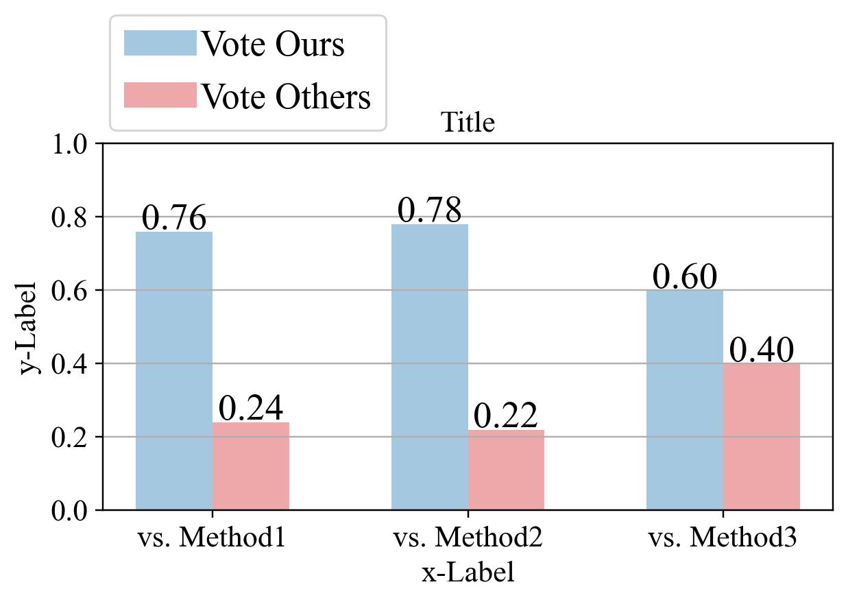
The following shows a simple barchart.
It contains the following common components. When creating a new barchart, we will modify these components to present our data:
- Title
- X-Label, xtick, and, xticklabel
- Y-Label, ytick, and, yticklabel
- Bar, Text, Legend
- Grid
The above barchart can be generated by running:
python plot_diagram.py examples/barchart_example1/simple_barchart.confConfiguration file for the above barchart
# CONFIGURATION FILE

# Comments start with '#';
# Parameters start with '!';
# If a parameter contains space, please replace the space with '&' for correct parsing
# For bool type, 1 is True else False

# Plot type: ploty|plotxy|plottwins
# ploty: The input data only contains Y values, the X values are generated as [0, ..., len(Y)]
# plotxy: The input data contains both X and Y values
# plottwins: The input data only contains Y values. Plot figure with two different Y-axis
    ! plot_type plotbar

# Figure format: pdf|jpg|png
    ! format pdf

# Canvas setting, fig size in inches
# https://matplotlib.org/devdocs/gallery/subplots_axes_and_figures/figure_size_units.html
    ! width 5.5
    ! height 3
    ! dpi 220

# Data configuration
# Store the data values of the barchart in a single file, e.g., data.txt
# Each column corresponds to a group
# The number of row equals to the number of bars in a group
    ! datafile data/bar_data_3group.txt

# IMPORTANT: Please remember to update the color, legend, xticklabel to match the input

# Bar setting
# Opacity sets the transparency of the bar, 0 indicates solid color
# Number of color and Opacity should equal to the bar numbers
    ! bar_width 0.3
    ! color tab:blue tab:red
    ! opacity 0.4 0.4
    ! y_min 0
    ! y_max 1

# xtick and ytick setting
    ! xticklabel vs.&Method1 vs.&Method2 vs.&Method3
# ! ytick 0 0.2 0.4 0.6 0.8 1.0
# ! yticklabel 0 20% 40% 60% 80% 100%

# Text setting
    ! put_text 1
    ! text_font 18
    ! percentage 0

# Title and label setting
# None indicates ignore; '&' is a placeholder for space;
# Eample font sizes: 'x-small', 'small', 'medium', 'large', 'x-large', 'xx-large', 'larger', 'smaller'
    ! title Title
    ! title_font x-large
    ! xlabel x-Label
    ! xlabel_font x-large
    ! ylabel y-Label
    ! ylabel_font x-large

# Legend setting
# https://matplotlib.org/stable/api/_as_gen/matplotlib.pyplot.legend.html
# Example legend loc: 'best', 'upper left', 'upper right', 'lower left', 'lower right'
    ! legend Vote&Ours Vote&Others
    ! legend_loc upper&left
    ! legend_font xx-large
    ! legend_ncol 1
# You might need to tune the following bbox_to_anchor parameters to manually place the legends
    ! bbox_to_anchor -0.015 1.40

# Set grid on or off, 1 for on, 0 for off
! grid_on 1python plot_diagram.py examples/barchart_example1/simple_barchart_custom_ytick.confWe set yticklabel in percentage, legend column number to 2, and show text in percentage, by adding the following to the config file.
! ytick 0 0.2 0.4 0.6 0.8 1.0
! yticklabel 0 20% 40% 60% 80% 100%
! legend_ncol 2
! percentage 1
python plot_diagram.py examples/barchart_example2/barchart_color.confWe also provide a simple script to generate colorbar.
python img_tools/color_bar.py --colormap jet
python img_tools/color_bar.py --colormap jet --horizontal
python img_tools/color_bar.py --colormap viridis
python img_tools/color_bar.py --colormap viridis --horizontalAs it is very common to show zoom-in comparison between different methods in the paper, we provide a small image cropping scripts for this task.
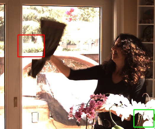
By specifying the directory storing images, the desired box locations, and the colors, the following command can crop and highlight the boxes in the original images. However, you have to determine the locations of the boxes [left top bottom right] using other softwares.
python img_tools/image_cropper.py --in_dir examples/image_cropper_example/ -k '*.jpg' \
    --save_dir ROI --save_ext .jpg \
    --boxes 118 60 193 150 --boxes 371 452 431 521 --colors r g
# bash scripts/image_cropping.sh
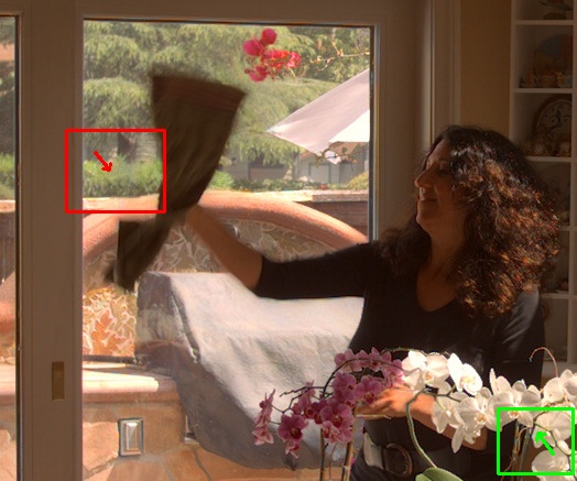
We can also add arrows onto the images to further highlight the differences.
python img_tools/image_cropper.py --in_dir examples/image_cropper_example/ --key '*.jpg' \
    --save_dir ROI_arrow --save_ext .jpg \
    --boxes 118 60 193 150 --boxes 371 452 431 521 --colors r g \
    --arrows 86 138 99 154 --arrows 502 412 488 393 --arrow_color r g
TODO: support selecting boxes in an interactive manner.


