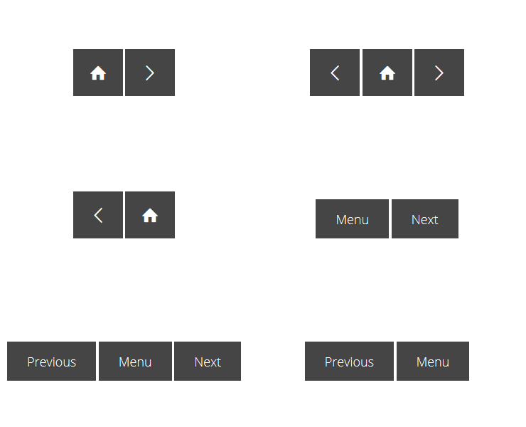
adapt-pageNav
PageNav is a presentation component that adds basic navigation controls to a page
When to use
Use PageNav as a replacement for the Quicknav component AND extension for both the Framework and the Authoring Tool going forwards.
Settings Overview
The attributes listed below are used in components.json to configure PageNav, and are properly formatted as JSON in example.json.
Navigation bar component which can contain some or all of the following buttons:
- _returnToPreviousLocation (takes you back to the previous location - not back in history, just the last routed location)
- _home (takes you back to top level menu)
- _up (takes you to the menu the next level up in the hierarchy)
- _previous (navigates directly to the previous page, if exists, without having to navigate via the menu)
- _next (navigates directly to the next page, if exists, without having to navigate via the menu)
- _sibling (1,2,3,4 etc buttons representing each sibling page)
- _close (closes the course window - only possible if the course was launched in a popup window)
The pageNav buttons will respect any locking that has been configured in Adapt. In cases not covered by Adapt's locking system - such as a start page that appears immediately before the main menu - the setting _lockUntilPageComplete can be used to disable the button until the current page has been completed.
Attributes
core model attributes: These are inherited by every Adapt component. Read more.
_component (string): This value must be: pageNav. (One word.)
_classes (string): CSS class name to be applied to PageNav’s containing div. The class must be predefined in one of the Less files. Separate multiple classes with a space.
_layout (string): This defines the horizontal position of the component in the block. Acceptable values are full, left or right.
instruction (string): This optional text appears above the component. It is frequently used to guide the learner’s interaction with the component.
_loopStyle (string): Acceptable values are allPages, siblings, and none. allPages = loop sequentially through all pages in course. siblings = loop sequentially through all pages in current parent object. none = disable previous and next buttons at start and end of the pages in the current parent object.
_shouldSkipOptionalPages (boolean): Skip pages that are set to "_isOptional": true. Default is false.
_buttons (object): The following attributes configure the defaults for the Quickanv buttons. These attributes are available on all of the following buttons _returnToPreviousLocation, _previous, _root, _up, _next, _sibling, and _close.
Global button configurations
_isEnabled (boolean): Turns the button on and off. Acceptable values are
trueandfalse.
_lockUntilPageComplete (boolean): For use when the standard Adapt locking system doesn't apply, such as in a start page before the main menu. Acceptable values are
trueandfalse.
_order (number): Defines the display order of the button. Numerical order with 0 rendering first.
_classes (string): CSS class name to be applied to the
button. The class must be predefined in one of the Less files. Separate multiple classes with a space.
_iconClass (string): CSS class name to be applied to the
buttonicon. The class must be predefined in one of the Less files with the corresponding icon be added as part of a font. Suggested icons for each button detailed in the example.json. List of all available vanilla icons to choose from.
_alignIconright (boolean): Defines whether the icon is aligned to the left or right of the text. Default is
falsewhich aligns the icon to the left of the text.
text (string): Defines the text that renders in the
button.
ariaLabel (string): This text is associated with the button. It renders as part of the aria label to give screen readers more information.
_showTooltip (boolean): Defines whether the tooltip renders on hover. Default is
false.
tooltip (string): Defines the text that renders in the tooltip.
_previous / _root / _up / _next / _sibling
_customRouteId (string): Overrides the route ID. For use when non standard route navigation is required.
Version number: 2.0.3
Framework versions: 5.2+
Vanilla versions: 5.1.1+
Author / maintainer: Kineo
Accessibility support: WAI AA
RTL support: Yes
Cross-platform coverage: Chrome, Chrome for Android, Firefox (ESR + latest version), Edge, IE11, Safari 12+13 for macOS/iOS/iPadOS, Opera
