

🎨 Jetpack Compose canvas library that helps you draw paths and images on canvas with color pickers and palettes. Sketchbook also provides useful components and functions that can easily interact with canvas.


Sketchbook is maintained by Stream. If you’re interested in adding powerful In-App Messaging to your app, check out the Stream Chat Tutorial for Jetpack Compose! Also, anyone can contribute to improving code, docs, or something following our Contributing Guideline.

Add the dependency below to your module's build.gradle file:
dependencies {
    implementation "io.getstream:sketchbook:1.0.1"
}See how to import the snapshot
Snapshots of the current development version of Sketchbook are available, which track the latest versions.
To import snapshot versions on your project, add the code snippet below on your gradle file.
repositories {
   maven { url 'https://oss.sonatype.org/content/repositories/snapshots/' }
}
Next, add the below dependency to your module's build.gradle file.
dependencies {
    implementation "io.getstream:sketchbook:1.0.2-SNAPSHOT"
}First, you should initialize SketchbookController, which allows you to control the Sketchbook and all components.
private val sketchbookController = rememberSketchbookController()Next, you can implement your drawing canvas with the Sketchbook composable function:
Sketchbook(
    modifier = Modifier.fillMaxSize(),
    controller = sketchbookController,
    backgroundColor = Color.White
)
Sketchbook implements canvas, which allows you to draw paths with custom properties. It interacts with SketchbookController to control other components.
You can use the Sketchbook as the following example:
Sketchbook(
    modifier = Modifier.fillMaxSize(),
    controller = sketchbookController,
    backgroundColor = Color.White,
    onEventListener = { x, y -> .. },
    onRevisedListener = { canUndo, canRedo -> .. }
)
SketchbookController interacts with Sketchbook and it allows you to control the canvas and all of the components with it.
SketchbookController supports undo and redo to cancel or reverse drawn paths and recover the previous canvas state.
You can implement it with the following functions below:
sketchbookController.undo() // undo the drawn path if possible.
sketchbookController.redo() // redo the drawn path if possible.
By enabling Erase Mode, you can erase the colored paths following the transparent path. You can set the mode with the function below:
sketchbookController.setEraseMode(true)Also, you can toggle the erase mode with the following function below:
sketchbookController.toggleEraseMode()You can get the State of the erase mode with the following function below:
val isEraseMode = sketchbookController.isEraseMode.valueNote: If you use the erase mode, make sure you set the
backgroundColoron theSketchbookproperly.
You can changes the radius size of the erase circle:
sketchbookController.setEraseRadius(50f)
You can custom the paint to support various drawing options as the following:
.setPaintColor(color)
.setPaintAlpha(alpha)
.setPaintStrokeWidth(stroke)
.setPaintShader(shader)
.setLinearShader(colorList)
.setPaintingStyle(paintStyle)
.setPathEffect(pathEffect)
Also, you can set your own paint with the setPaint method:
sketchbookController.setPaint(paint)You can set the rainbow shader to the paint with the setRainbowShader method:
sketchbookController.setRainbowShader()
Sketchbook supports to set an ImageBitmp on the canvas and draw paths over the bitmap. You can set an initial ImageBitmap on the Sketchbook composable as the following:
Sketchbook(
    imageBitmap = ImageBitmap.imageResource(R.drawable.poster),
    ..
)
Also, you can set an ImageBitmap dynamically with the SketchbookController as the following:
sketchbookController.setImageBitmap(imageBitmap)You can clear the image bitmap on canvas with the clearImageBitmap method:
sketchbookController.clearImageBitmap()Note: This demo project demonstrates an image picker with ModernStorage's Photo Picker.
You can get the final ImageBitmap of the current canvas of the Sketchbook with the following:
val imageBitmap = sketchbookController.getSketchbookBitmap()If you'd like to get the Android's bitmap, you can get it as the following:
val bitmap = sketchbookController.getSketchbookBitmap().asAndroidBitmap()You can clear all the drawn paths and paths and the image bitmap as the following:
sketchbookController.clear()Also, you can clear only the drawn paths and redo paths as the following:
sketchbookController.clearPaths()
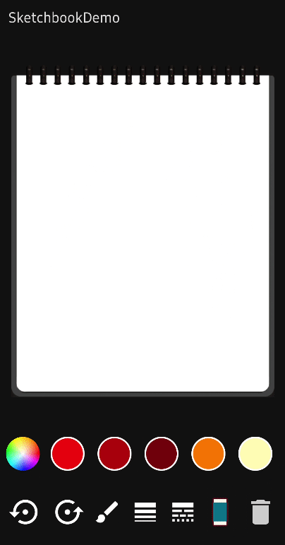
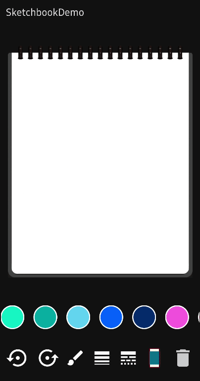
PaintColorPalette provides a color palette to let users choose desired colors from a provided color list. It provides default color palettes and shapes, which are fully customizable. You can simply implement this as the following example:
PaintColorPalette(
    controller = sketchbookController,
    borderColor = MaterialTheme.colors.onPrimary
)
You can customize UI themes with PaintColorPaletteTheme as the following example:
PaintColorPalette(
    theme = PaintColorPaletteTheme(
        shape = CircleShape,
        itemSize = 48.dp,
        selectedItemSize = 58.dp,
        borderColor = Color.White,
        borderWidth = 2.dp,
        borderColor = MaterialTheme.colors.onPrimary
    ),
Also, you can set an index for selecting a color initially with the initialSelectedIndex parameter:
initialSelectedIndex = 2You can track the selected color's index and color value with the onColorSelected listener:
PaintColorPalette(
    onColorSelected = { index, color -> .. },
)You can add your own composable on the very first of the palette or on the end as the following example:
PaintColorPalette(
    header = { Text("Header") },
    footer = { Text("Footer") }
)You can customize the entire content with your own composable as the following example:
PaintColorPalette(
    content = { index, color ->
        Box(modifier = Modifier
            .size(60.dp)
            .background(color)
            .clickable { .. }
        )
    }
)
Note: Make sure if you use the custom content, you should implement all interactions and listeners by yourself.

Sketchbook supports ColorPickerDialog, which lets you choose your desired color from an HSV color palette.
You can implement ColorPickerDialog with the following codes:
val expandColorPickerDialog = remember { mutableStateOf(false) }
Image(
    modifier =
        Modifier.clickable { expandColorPickerDialog.value = true },
    bitmap = ImageBitmap.imageResource(R.drawable.palette),
    contentDescription = null
)

ColorPickerDialog(
    controller = sketchbookController,
    expanded = expandColorPickerDialog,
    initialColor = controller.currentPaintColor.value,
    onColorSelected = { color ->
        controller.setPaintShader(null)
        controller.setSelectedColorIndex(-1)
    }
)
ColorPickerPaletteIcon implements the example code above internally, so you can use like an icon, which shows up a color picker dialog as the following example:
ColorPickerPaletteIcon(
     modifier = Modifier
        .size(60.dp)
        .padding(6.dp),
    controller = sketchbookController,
    bitmap = ImageBitmap.imageResource(R.drawable.palette)
)
You can use the ColorPickerPaletteIcon with hearder or footer custom composable for the PaintColorPalette.
PaintColorPalette(
    header = {
        ColorPickerPaletteIcon(
            ..
        )
    }
)
Support it by joining stargazers for this repository. ⭐
Also, follow Stream on Twitter for our next creations!
Copyright 2022 Stream.IO, Inc. All Rights Reserved.

Licensed under the Apache License, Version 2.0 (the "License");
you may not use this file except in compliance with the License.
You may obtain a copy of the License at

   http://www.apache.org/licenses/LICENSE-2.0

Unless required by applicable law or agreed to in writing, software
distributed under the License is distributed on an "AS IS" BASIS,
WITHOUT WARRANTIES OR CONDITIONS OF ANY KIND, either express or implied.
See the License for the specific language governing permissions and
limitations under the License.