📦 Overview
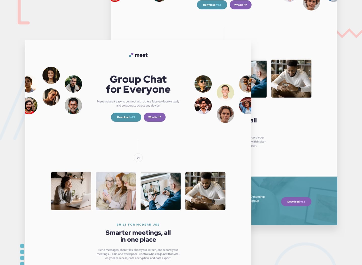
The Meet Landing Page project is a responsive landing page designed to promote a video conferencing application. It features a hero section, details section, and a footer, all styled using CSS Grid and Flexbox. The design is fully responsive, ensuring a smooth user experience across various screen sizes.
✅ The Challenge
Create a visually appealing and functional landing page for a video conferencing application.
Implement a responsive navigation menu with a mobile toggle and social media icons.
Develop a layout that includes a hero section, a features section, and a call-to-action footer.
Ensure consistent styling using CSS variables for colors, fonts, and spacing.
📸 Screenshot
✅ My Process
File Structure and Organization:
Organized the project using modular CSS, splitting styles into sections such as navbar, hero, details, and footer. Applied a consistent BEM naming convention to maintain clarity and modularity.
HTML Structure:
Implemented semantic HTML using <nav>, <header>, <section>, and <footer> elements for logical structure and accessibility.
Incorporated a navigation bar with mobile toggle functionality for smaller screens.
CSS Styling:
Utilized CSS Grid and Flexbox to align and structure the layout. Applied CSS variables for colors, font sizes, and spacing to maintain design consistency. Implemented hover effects for buttons and navigation links for better user interaction feedback.
Responsive Design:
Included media queries to adjust the layout for desktop, tablet, and mobile screens. Adjusted the hero section’s layout to accommodate image reordering on smaller screens.
JavaScript:
Added a simple mobile menu toggle to handle the display of the main navigation links on smaller screens. Implemented a scroll effect to change the navbar’s background color when scrolling.
🛠️ Built With
Semantic HTML5 CSS Grid and Flexbox CSS Variables Font Awesome for icons JavaScript (for menu toggle and scroll effect) Responsive Design Techniques
🚀 What I Learned
How to implement a mobile-first design using media queries to handle various screen sizes. Applying CSS Grid and Flexbox together for flexible, dynamic layouts. Managing CSS variables to maintain a consistent design and simplify future updates. Creating a mobile navigation menu toggle using JavaScript. Implementing scroll-based navbar styling to provide visual feedback during user interaction.
🔄 Continued Development
Implement a dark mode toggle for improved user experience in different lighting conditions. Enhance the scroll animations for a smoother visual transition between sections. Add more interactivity to the buttons, such as hover effects and subtle animations. Optimize images for faster loading and better performance. Improve accessibility by adding aria-labels and ensuring screen reader compatibility.
