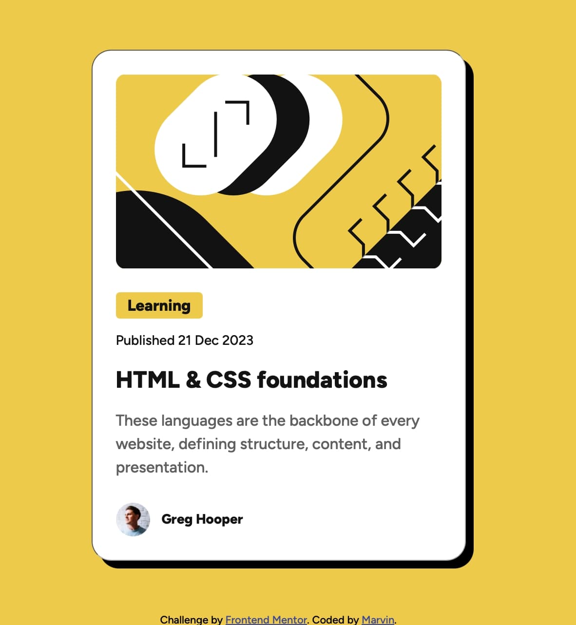
📌 Frontend Mentor - Card Component Challenge
📄 Project Overview
This project is a card component built using HTML & CSS, inspired by a Frontend Mentor challenge. The goal was to create a well-structured and visually appealing card with proper alignment, typography, and hover effects.
🛠 Technologies Used
HTML5 – for structuring the card content. CSS3 – for styling, layout, and responsiveness.
🎯 Project Features
✅ Custom Design System using CSS variables (:root) for colors, font sizes, and spacing.
✅ Centered Layout using display: flex; justify-content: center; align-items: center;.
✅ Hover Effects for interactive elements like buttons and headings.
✅ Mobile Responsive design with a media query for smaller screens.
✅ Box Shadow & Borders for a modern card appearance.
📷 Project Preview
📌 Process & What I Learned
1️⃣ Structuring the HTML
Used semantic HTML elements like <button>, <p>, <h2>, and <div> for better readability.
Organized the card into sections (image, text, button, and avatar).
2️⃣ Styling with CSS
Applied a CSS reset to maintain consistent styling across browsers.
Used CSS variables (:root) for colors, font sizes, and spacing to improve reusability.
Implemented flexbox (display: flex;) for easy layout and alignment.
Added box shadows and border-radius to enhance the card’s visual appeal.
3️⃣ Centering the Card
Used Flexbox on <body> to center the card both vertically and horizontally:
body {
    display: flex;
    justify-content: center;
    align-items: center;
    height: 100vh;
}
Ensured that the card remains responsive and adapts to different screen sizes.
4️⃣ Adding Hover Effects for Interactivity Changed the header color when hovered:
.container .card-details .card-header:hover {
    color: var(--clr-backround);
}
Added a button hover effect to swap background and text colors. 5️⃣ Making it Responsive Used media queries to adjust the card’s width on smaller screens:
@media (max-width: 357px) {
    .container {
        max-width: 327px;
    }
}```

Ensured that text and spacing remain readable on mobile devices.