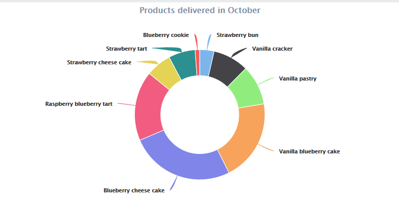
Pie chart label connectors look bad.
Closed this issue · 2 comments
The label connectors in pie charts, and possibly other chart types, look bad in Charts 6.

The connectors have both a stroke and fill, when they should have only a stroke and no fill. In vaadin-chart-default-theme.html#L825 there are all the colors that define strokes and fills for all colors, which are correct:
.highcharts-color-0 {
  fill: var(--vaadin-charts-color-0, #7cb5ec);
  stroke: var(--vaadin-charts-color-0, #7cb5ec);
}
There is also a rule to remove the stroke when it is rendering label connectors, chart-default-theme.html#L298:
.highcharts-data-label-connector {
  fill: none;
}
The problem is that the colors are defined after the special rules for data label connectors, and thus the colored stroke gets priority. To fix the issue, move the copy snippet avove in line #L298 to after the color specifications, to #L874.
Thanks for pointing this out, the idea with repeating the styles in the end was to be able to replace the highcharts css as a whole, keeping our rules with custom styles in the end.
If that's the only affected style we can re-add
.highcharts-data-label-connector {
  fill: none;
}
after vaadin-charts custom properties
Otherwise we can move each highcharts-color-# to it's original place.
This was fixed in 6.1.0-alpah3 and 6.0.0-beta3