Theming instead of photo, use photo for quest description
JudithStrunk opened this issue · 3 comments
For usabilty/readabilty reasons, do not use an image as a background, because it make readability difficult. Instead, use a theming (background in one color or slighty patterned and a corrsponding font color) for more readability.
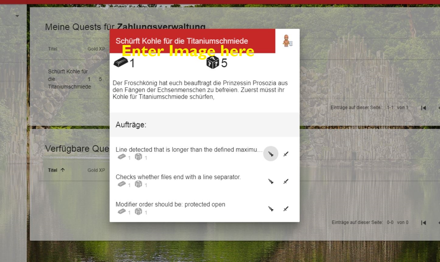
Use the various images you found for the quest/adventure description
Sorry, but in that case I mainly disagree. Without the background screens the frontend would loose lots of the coolness. (even though thats a very personal view).
But I agree that the white transparent view is difficult to read.
Try making the 'full' transperancy with white colored text the default.
And think about extending the background toogle possibilities.
There could be a theming background and / or a high contrast view as an enhencement.
That does not mean, that other dialogs like the quest-description should not be improved :)
I agree with @ithinkispider here - I really like the background image, it adds so much flavour <3
But the quest/adventure descriptions should have an image in the place described. It would look much cooler!