svg stroke-dasharray、stroke-dasharray
Opened this issue · 0 comments
xiaotiandada commented
2020-03-15 00:45:54
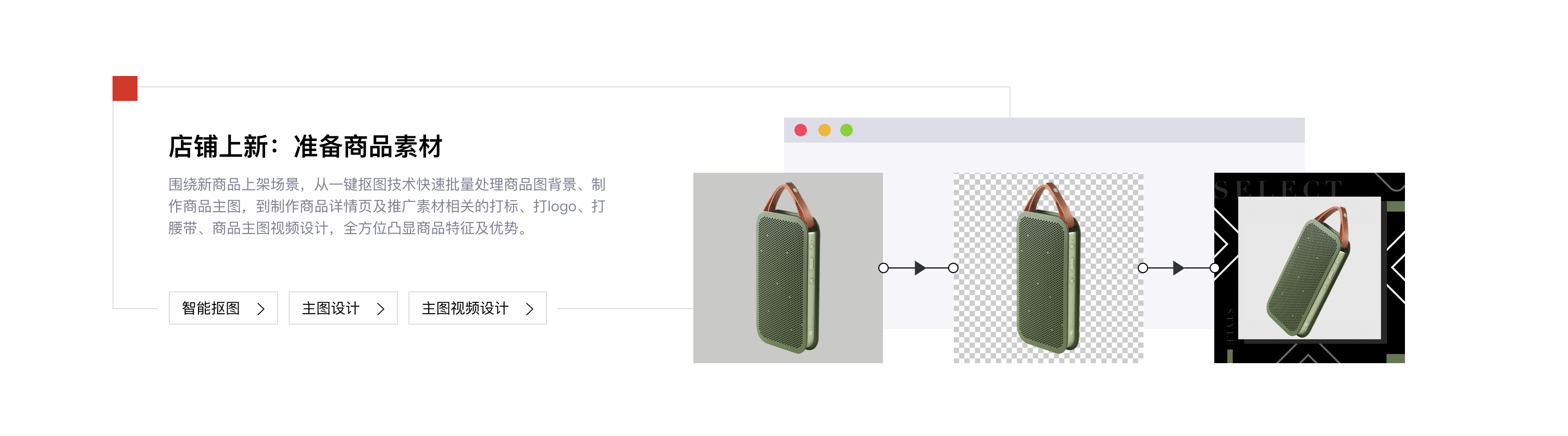
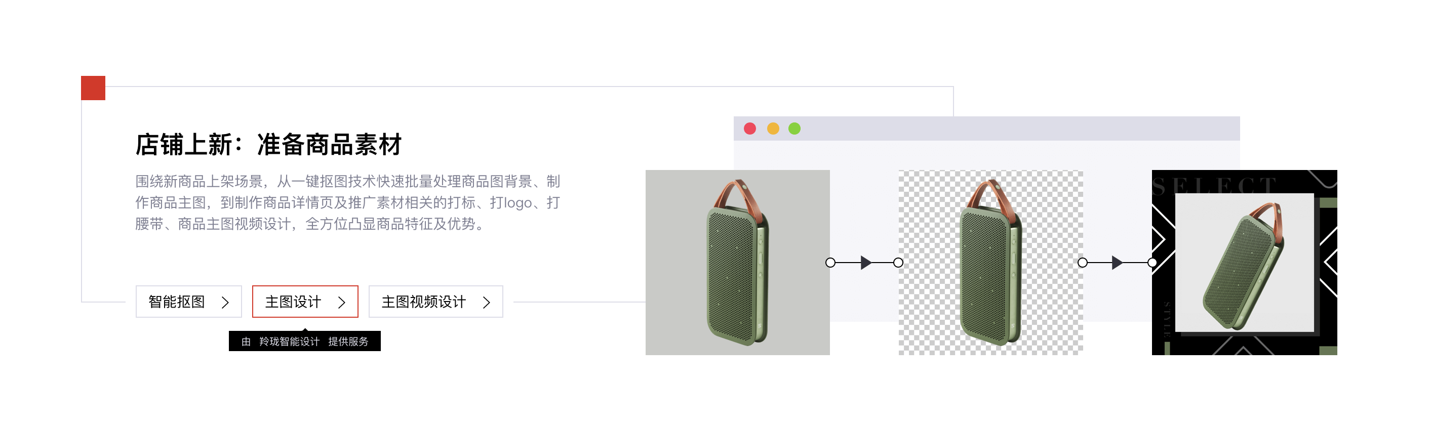
svg stroke-dasharray、stroke-dasharray的学习 京东零售设计服务平台在这里看到一个按钮 里面用到了这两个属性 于是找了资料学习一下
资料
SVG学习之stroke-dasharray 和 stroke-dashoffset 详解
<iframe height="265" style="width: 100%;" scrolling="no" title="svg stroke" src="https://codepen.io/xiaotiandada/embed/RwPMmbJ?height=265&theme-id=dark&default-tab=css,result" frameborder="no" allowtransparency="true" allowfullscreen="true"> See the Pen svg stroke by xiaotiandada (@xiaotiandada) on CodePen. </iframe>这片文章我觉得讲得很不错 👍
  <svg id="line">
    <line x1="30" y1="30" x2="300" y2="30" stroke="red" stroke-width="20" stroke-dasharray="300"></line>
  </svg>

  <svg id="circle" width="200" height="200">
    <circle cx="100" cy="100" r="50" stroke="red" stroke-width="5" fill="green"></circle >
  </svg>

  <svg id="box">
    <polyline points="0,20 0,0, 100,0, 100,20" stroke="red" stroke-width="1"></polyline>
    <polyline points="0,20 0,40, 100,40, 100,0" stroke="red" stroke-width="1"></polyline>
</svg> #line {
stroke-dashoffset: 300
}
#line:hover {
stroke-dashoffset: 0;
}
#line line {
transition: all .3s;
}
#circle circle {
transition: all .3s;
stroke-dasharray: 314;
stroke-dashoffset: 314;
}
#circle:hover circle {
stroke-dashoffset: 0;
}
#box polyline {
fill: transparent;
stroke-dasharray: 360;
stroke-dashoffset: 360;
transition: all .3s;
}
#box:hover polyline {
stroke-dashoffset: 0;
}下面是jd的按钮style
鼠标经过
我在这个cui项目里面也写了一个这个效果的小组件 具体可以自己查看 🍑