A storybook addon that embeds Adobe XD specs in your addon panel for better design-development workflow.
- Forked from https://github.com/pocka/storybook-addon-designs
- storybook@>=5.0.0
This addon should work well with any framework. If not, open an issue.
-
Install
npm install --save-dev storybook-addon-xd-designs
or
yarn add -D storybook-addon-xd-designs
Make sure you have these peer dependencies installed:
@storybook/addons@storybook/components@storybook/theming
-
Register the addon in
addons.js// .storybook/addons.js import 'storybook-addon-xd-designs/register'
-
Add your spec to the story!
import { withXD } from 'storybook-addon-xd-designs'

storiesOf('My stories', module)
  .addDecorator(withXD)
  .add('My awesome story', () => <Button>Hello, World!</Button>, {
    design: {
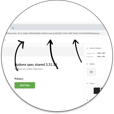
      artboardUrl: 'https://xd.adobe.com/view/ae7472ea-b4ac-47c4-4eb9-7aff91446d91-d845/screen/ca95c951-f010-498f-84c6-1cf10f344616/Desktop',
    }
  })

   // Or, if it's 2019, you would have to use two urls like this:
  .add('My awesome story', () => <Button>Hello, World!</Button>, {
    design: {
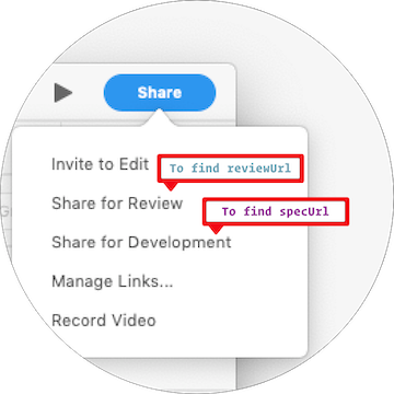
      specUrl: 'https://xd.adobe.com/spec/181eaf80-9e7a-4ea6-7dc8-e21dfd9b2d80-6e2f/screen/58270c9e-502b-4737-be32-a5dfe9523bb5/Color/',
      reviewUrl: 'https://xd.adobe.com/view/813cbece-c467-47ce-67e3-b60caacc2ff8-f70d/',
    }
  })
In short, create a "Development" url to share. Then view it in a browser, find the specific page you want to use in storybook, and copy that URL.
Detailed instructions here. It looks something like this:
Add withXD decorator then put design parameter after your story.
NOTE: If you omit
designparameter, the addon does nothing.


